To kick off, I conducted an onboarding teardown and data analysis. I cleaned up inaccurate measurements to ensure reliable tracking going forward, reconciled data sets, and collaborated with the product team to set up new funnels. I built an onboarding funnel and analyzed it alongside other key insights to guide improvements and strategic decisions.
Product research and design case study
I spent my time with Vygo resolving a number of specific challenges for an excellent app supporting students and program administrators.
Vygo was growing across anglophone countries and was pushing growth into US colleges and UK universities. As more students came onboard, I worked with the team to resolve challenges particularly in onboarding, engagement, and data through research, data analysis, and design.
To protect company confidentiality, data and numbers have been obscured, altered in graphics, or use placeholders, unless the number is specified to highlight a change as a result of the work. If you're working in the education space there's so much to do - I'd love to hear from you.
2023 Project
The scope
Worked on this project part-time with Orbit29 over the course of six months to resolve numerous challenges, design new solutions, and support product and marketing.
My role
Researcher and designer working directly with the product and engineering team, crossing over with partners and marketing as needed.
Systemic problems
Many of the issues related to dropout rates are strongly tied to racism, poverty or financial challenges, and mental health.
Audience
College students
Mentors
Program administrators
Universities / colleges
Investors
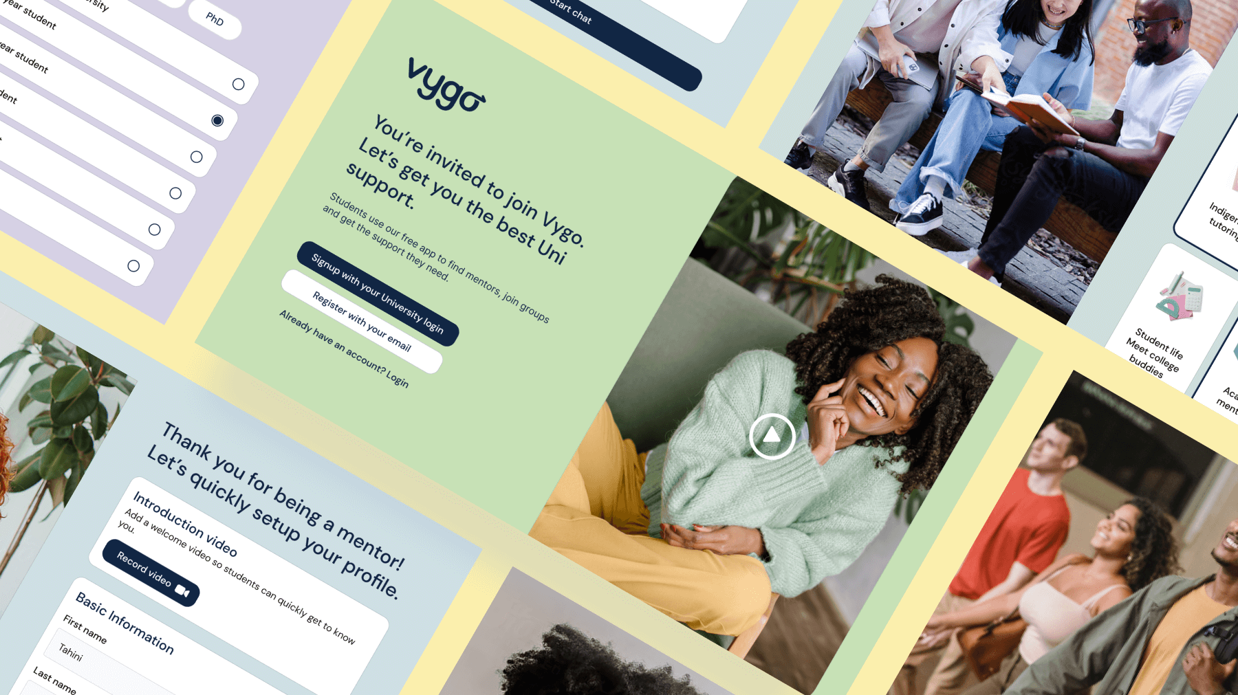
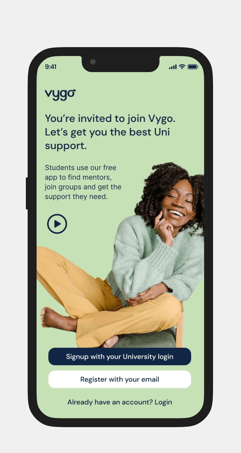
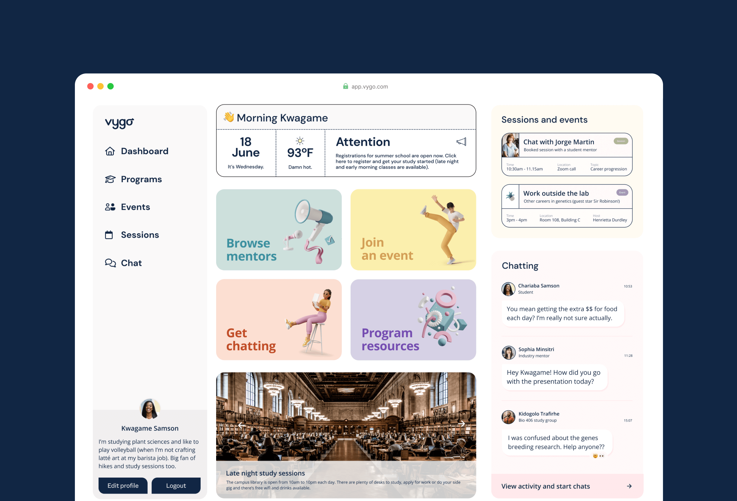
Breathing some life into a refreshed UI and new UX journey for onboarding
Approaching each challenge of the app one by one
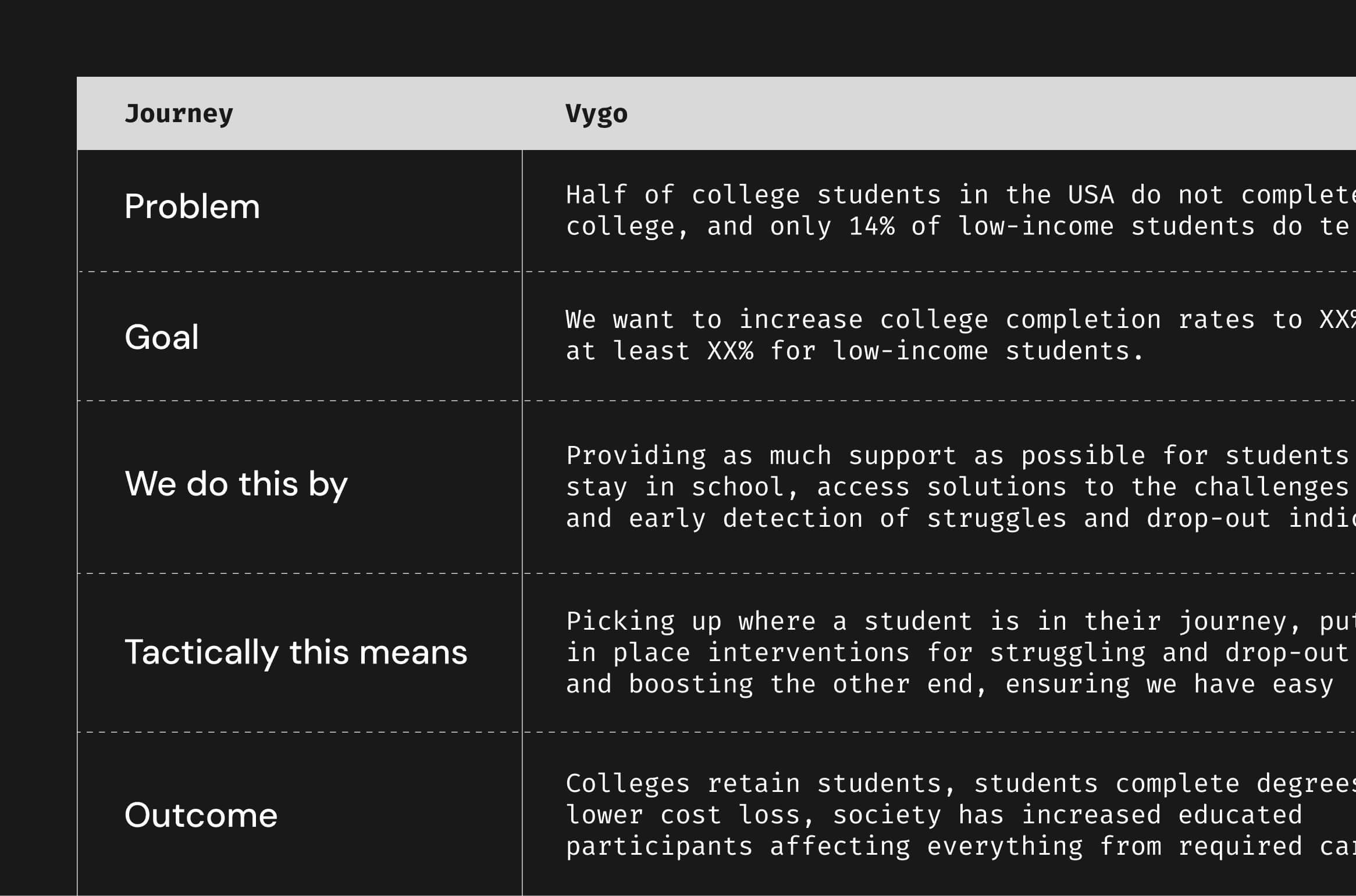
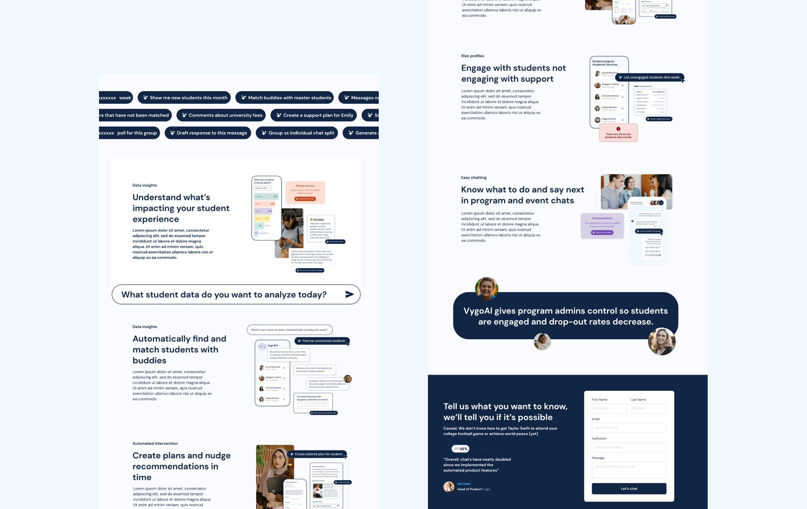
Vygo had specific and normal startup problems they needed fixes for. We worked methodically, challenge by challenge, so I could lead and support the product team in resolving these. I started by getting a quick lay of the land of this space, Vygo's vision and goals for the coming twelve months, and dove into a few competitor products and research papers. At this stage Vygo was pairing students with mentors and helping administrators manage their online and campus programs and participation. Half of college students in the USA do not complete college, and only 14% of low-income students do. In Australia, one in four students dropout.
Dropouts are expensive. For universities, they impact finances, reputation, and the ability to attract top faculty and research talent. For society, they widen class, wealth, and racial gaps, and represent potentially significant unrealized benefits. For students (unless the decision is right for them), dropping out can reduce networking, mentorship, friendships, new activities, skill development, pursuing or expanding interests, and job opportunities. We agreed decreasing dropout rates, and making administrator lives easier, would be our north star.
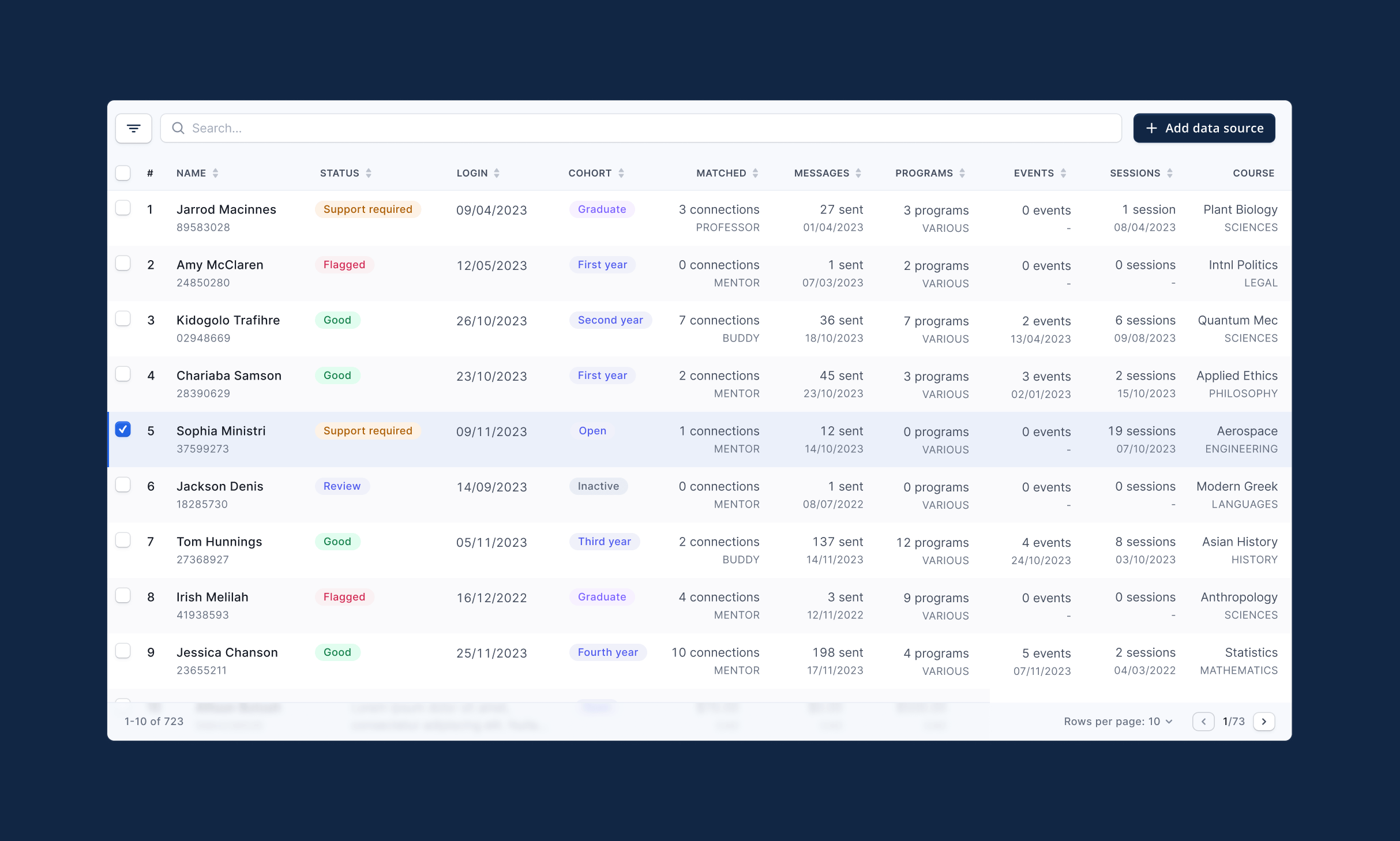
Understanding the onboarding problem with data
Teardown shots from the app
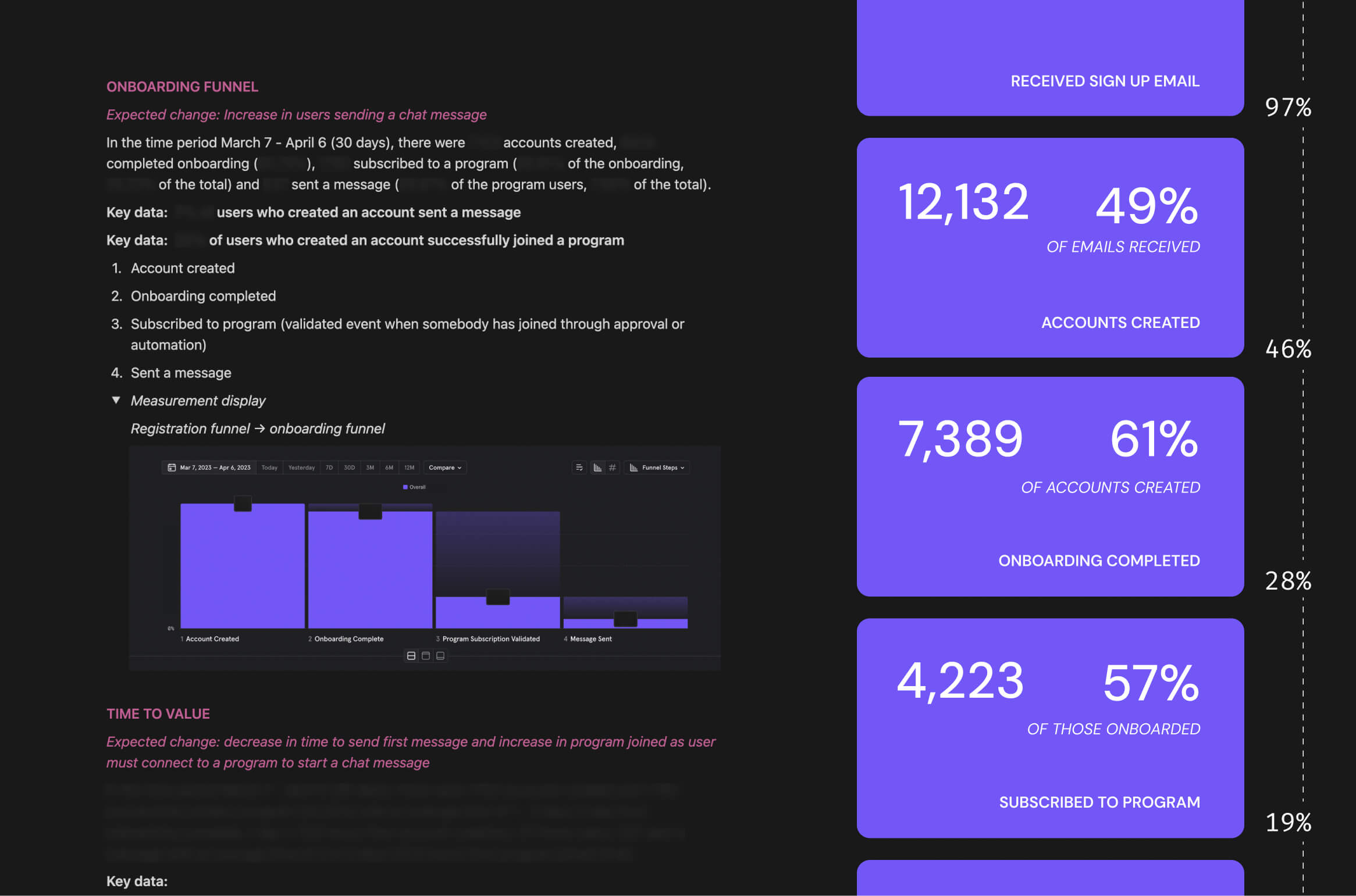
Creating a funnel with verified data and insights
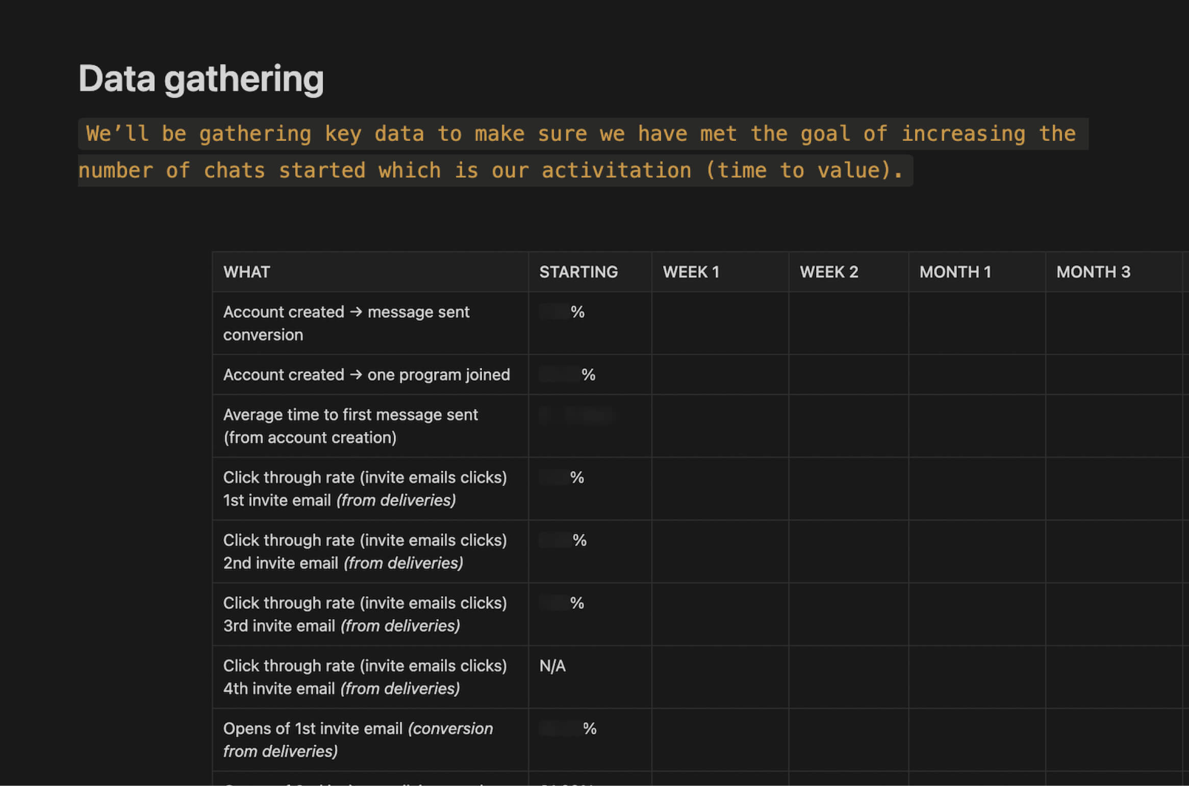
Quick table of goals and measures to track our progress
Working out where to focus our time
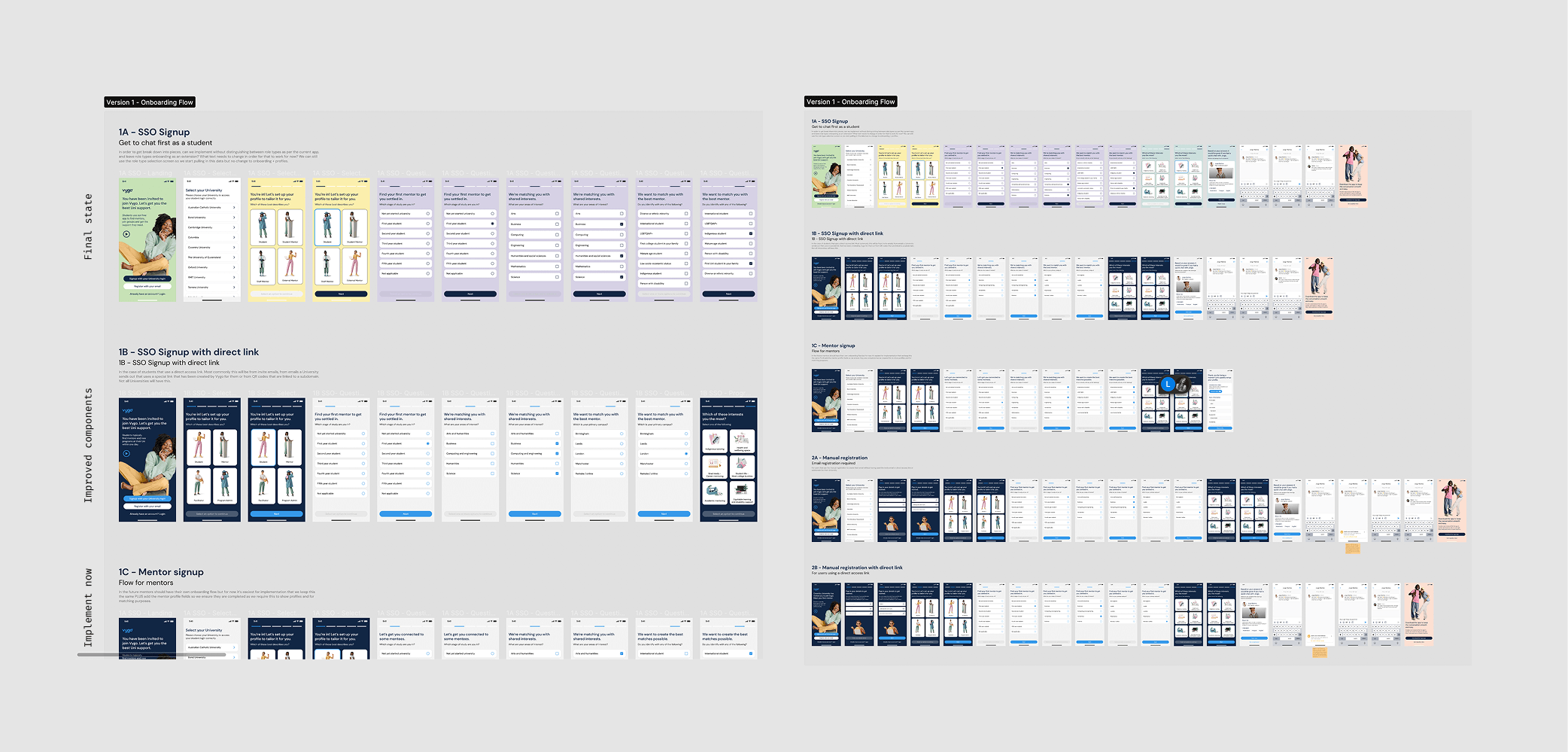
Based on this data, past interviews, and my experience, I quickly iterated from sketches to a complete onboarding flow. I designed it to fit within the current app while anticipating the engineering work needed for implementation. Adding a video to the landing screen came thanks to interview insights and was a great student idea.
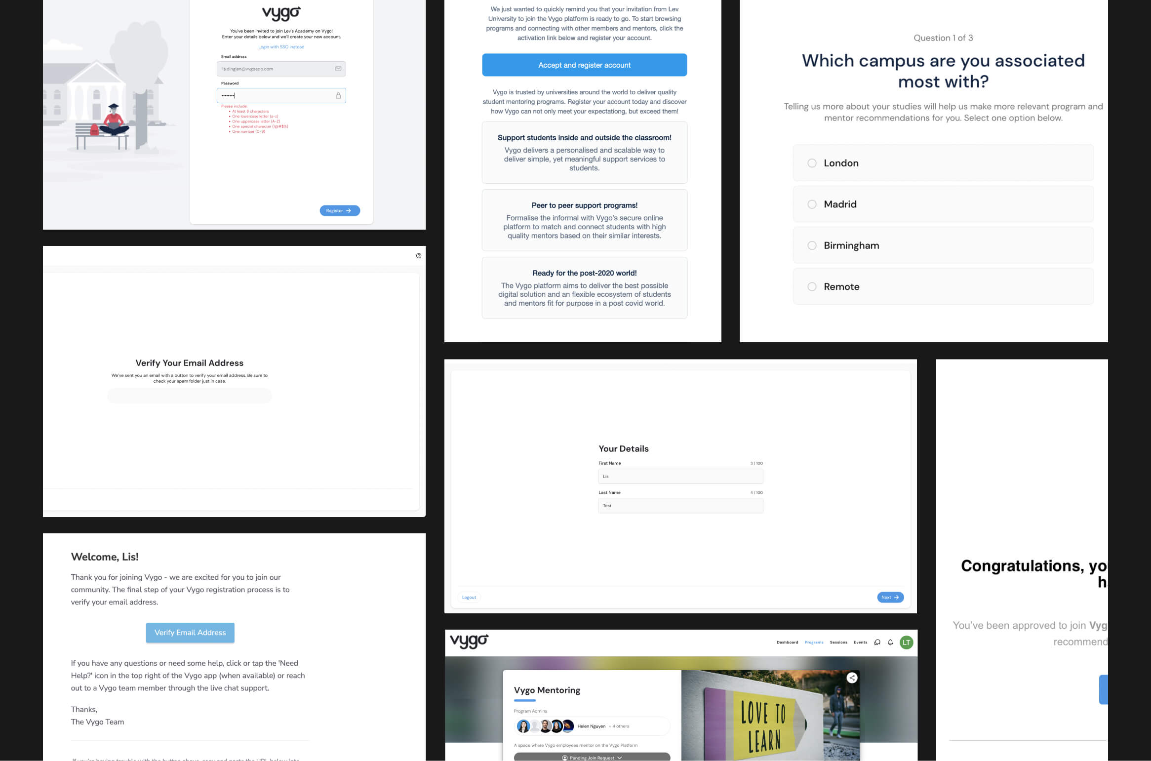
Creating a new onboarding process
Providing an async walkthrough before we discussed details together. The first part of this was a goal to increase the value in the First Time User Experience (FTUE) and decrease the Time to Value (TTV).
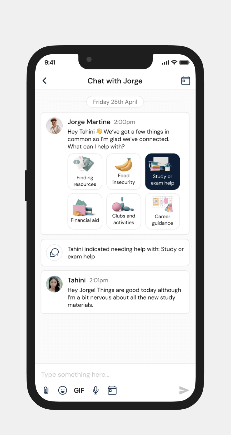
We needed students to get through onboarding to chat, and actually start a chat, so I did a lot of work in changing the onboarding steps so we would have more effective mentor matches and numerous ways of getting chats going (by either a student or a mentor).
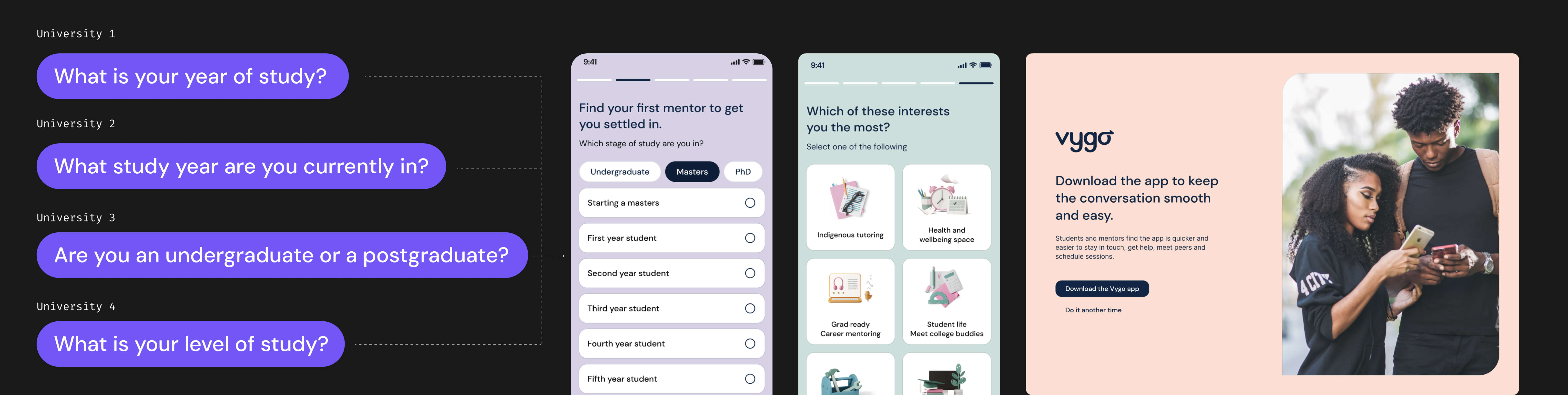
During this process, I standardized the onboarding questions, which had previously varied by university and were set up independently. This new system is easier to maintain, reduces engineering and admin effort, and allows us to compare data, generate reports, match mentors and programs, and personalize the experience. I also added this prompt screen to the onboarding flow to encourage app downloads, since chats were more active in the app.
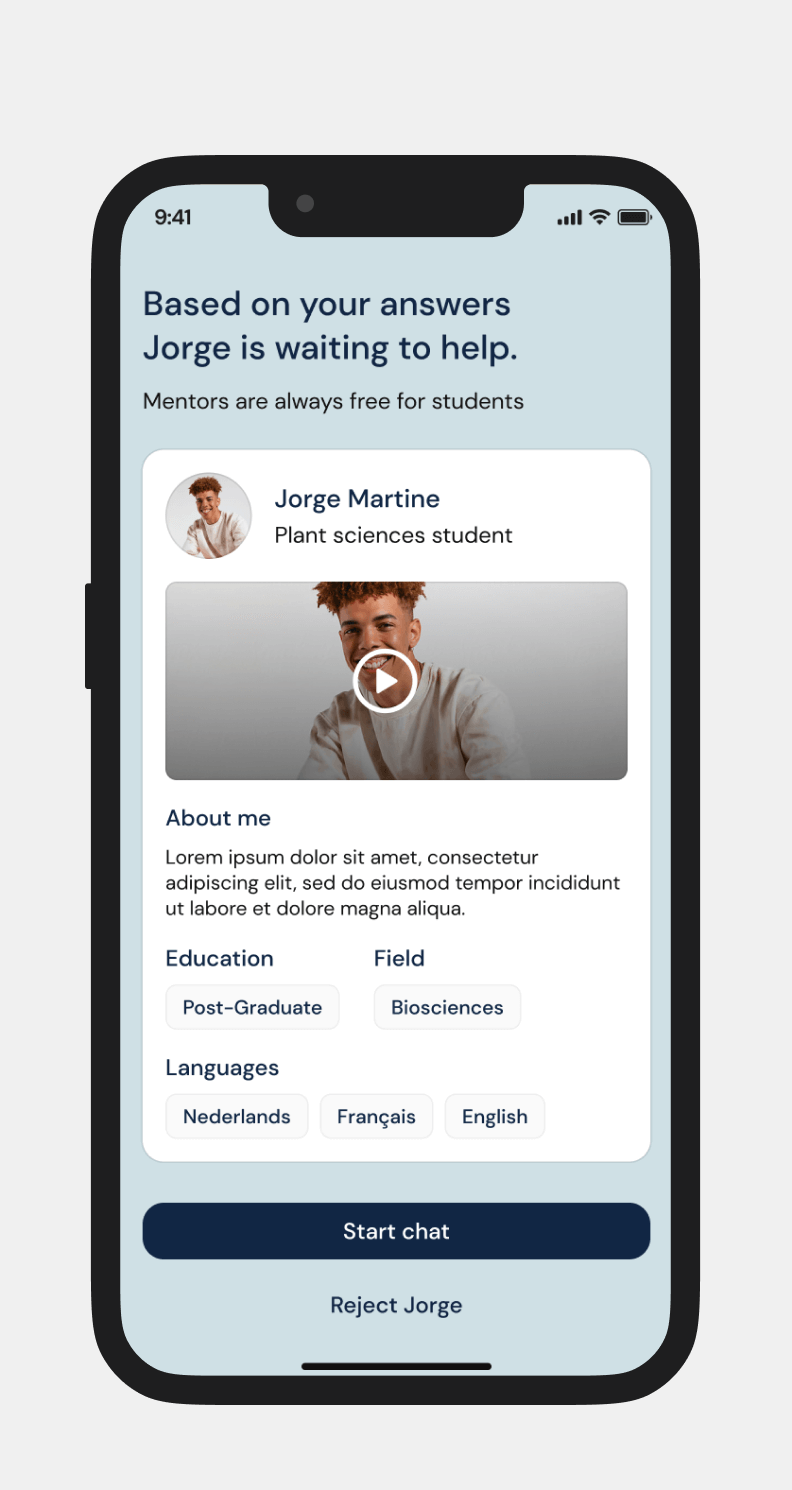
The new onboarding flow for students
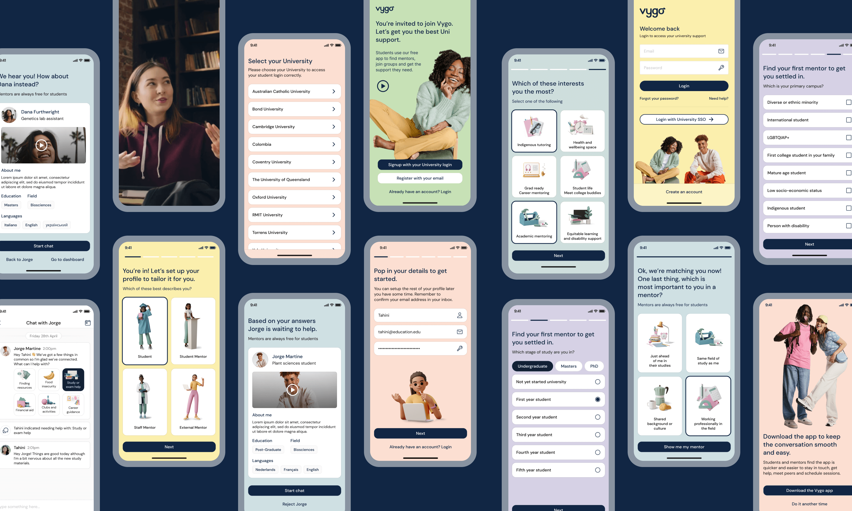
I worked to create new onboarding screens with a refreshed UI while largely maintaining current components
Kind words
Orbit29’s key deliverables included a detailed product audit report[...] and the successful launch of three new product features that significantly enhanced user experience and engagement. As a result, our metrics have seen a remarkable boost, with weekly active users increasing by nearly 200% year over year. The team was highly organized, systematic, and responsive. They were proactive in seeking feedback and making necessary adjustments.
J. Di Trapani
Co-Founder & CEO
Fixing activation challenges through redesigning the process
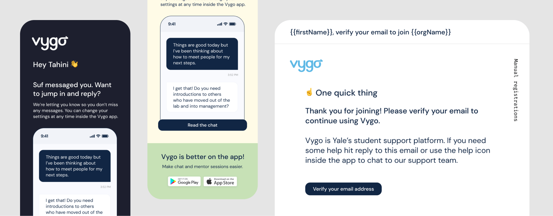
One major drop-off point was getting students into the app - unsurprising given they largely don't independently seek out the product. Most used student emails systems and we couldn’t send SMS until signup. Push notifications weren’t possible until activation so I focused on breaking the onboarding journey into activation emails. I rewrote all communications to better resonate with Gen Z students, cutting through generic emails while still appealing to the smaller but important group of later-life students, before handing it off for final marketing edits.
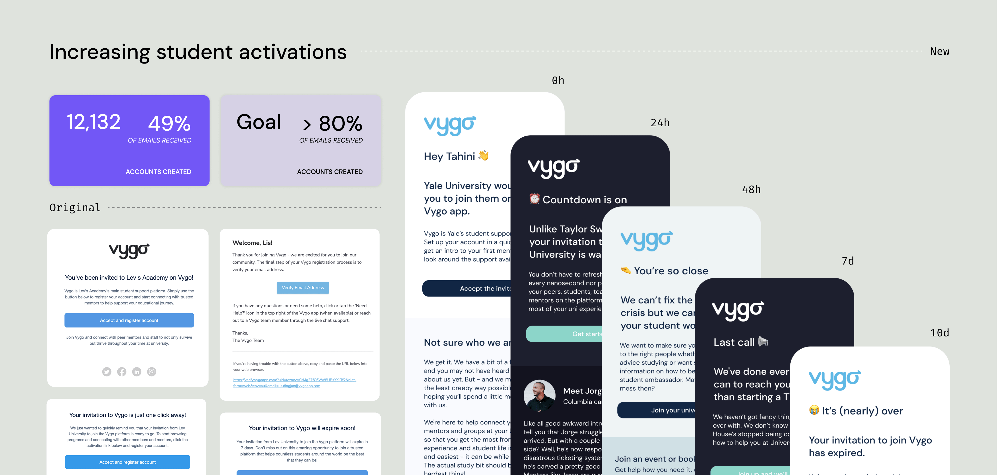
I included missing information that would help students onboard (who is this and why will it help me?), created a dark mode, and ensured we had specific designs for mobile which were being increasingly used. We pushed it out to one university first to make sure the rates were higher and we could hit our goals.
I discussed with the Product Director and engineering team the opportunity to re-engage a large group of students who had never signed in. They hadn’t been contacted beyond the initial app emails, so this was a strong chance to reintroduce Vygo and drive signups by guiding them toward mentors, programs, and resources.
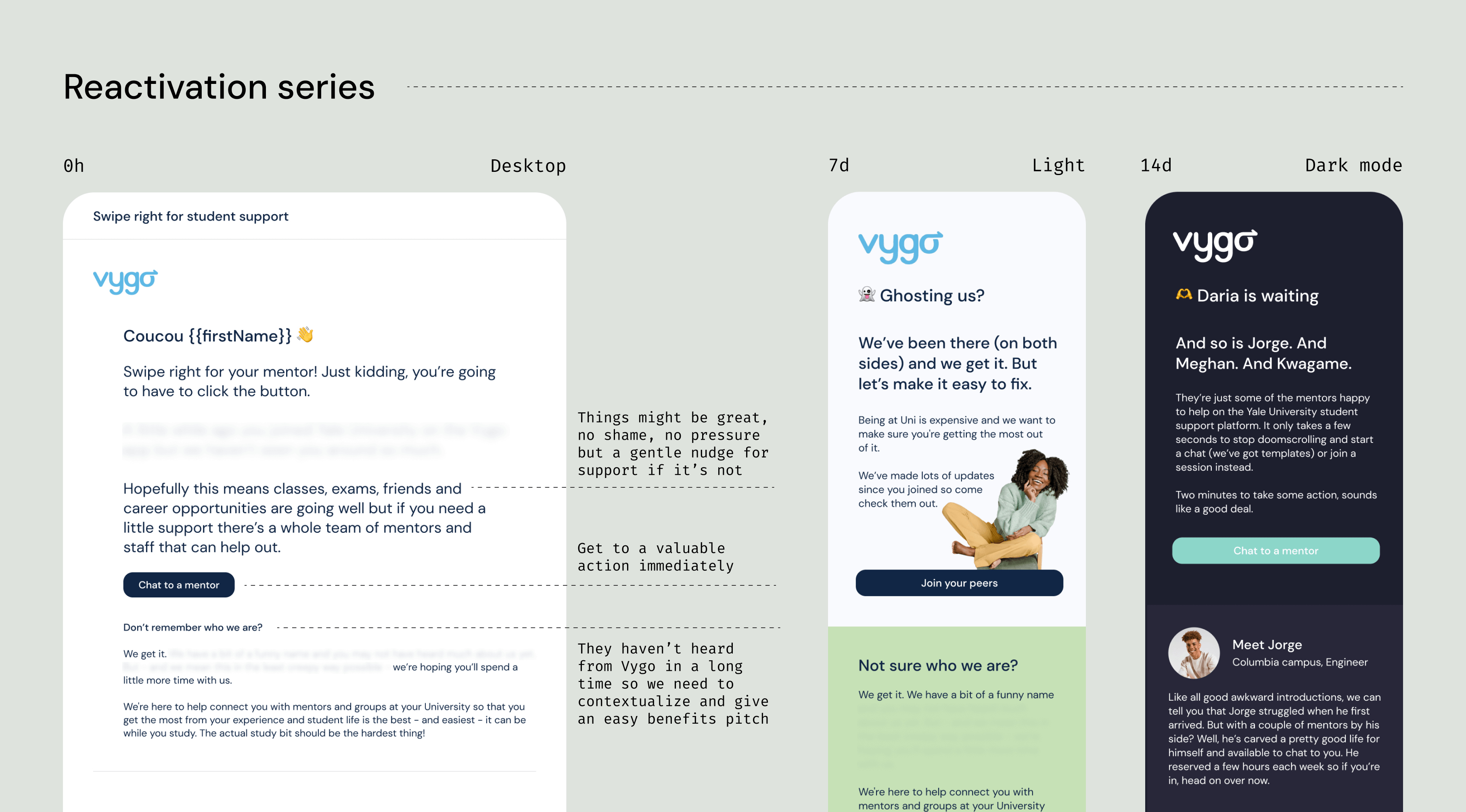
Coming up with a reactivation sequence for the thousands of students invited but not yet registered to boost numbers - it worked!
Finally, we needed a path for “other” users. The existing app didn’t support roles, so the flow had to accommodate all non-students. Mentors and program admins are very different user types, so we conducted research and found that program admins were often the ones reaching out about non-activation. They had a critical need to access the system, which helped us instead prioritize mentors in the new onboarding activation flow.
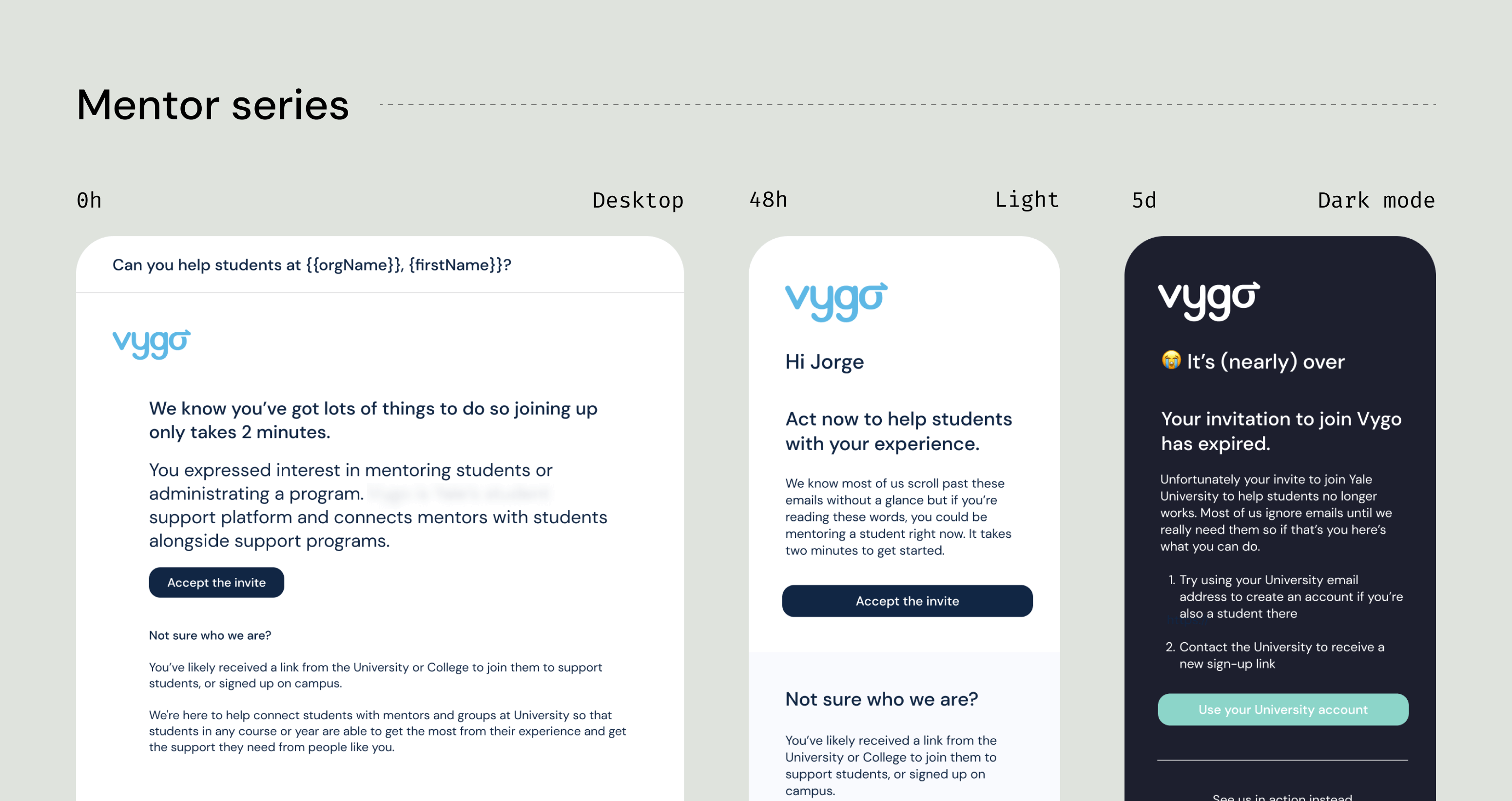
Creating an email series to ensure mentors jumped onboard once invited.
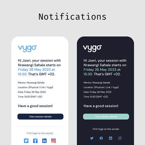
Finished it off with other product notification emails we needed to cover that we could quickly update with similar templates, particularly everything related to chat (while allowing people set their notification system).
Moving students to a valuable point more quickly
The Product Director had assessed that for the current version our most valuable feature was a student chatting with a mentor and getting a small support network going, so we set starting a chat as the first time to value moment. How quickly could we get the student into a chat and start? What was blocking this?
Students struggled to find the right mentors, had to start conversations cold, and knew little about the mentors themselves. This led to awkwardness, uncertainty about what to say, and a general lack of motivation or clarity on how mentorship could help them.
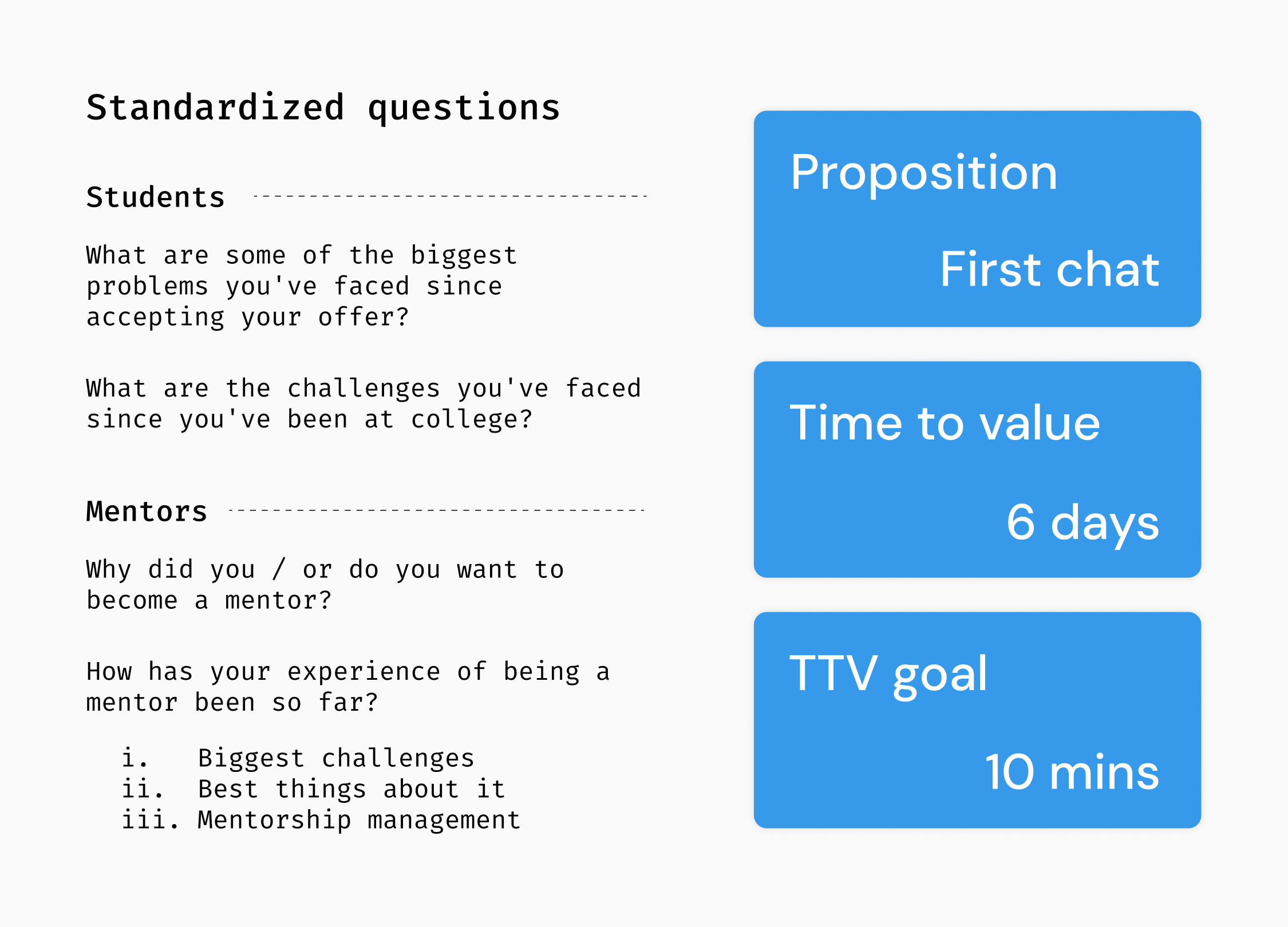
We knew we needed deeper insights, so we set five mandatory research questions to be asked in every student and mentor interview, regardless of who was conducting it. We also analyzed our current time-to-value (TTV) and set a clear goal for where we wanted to be.
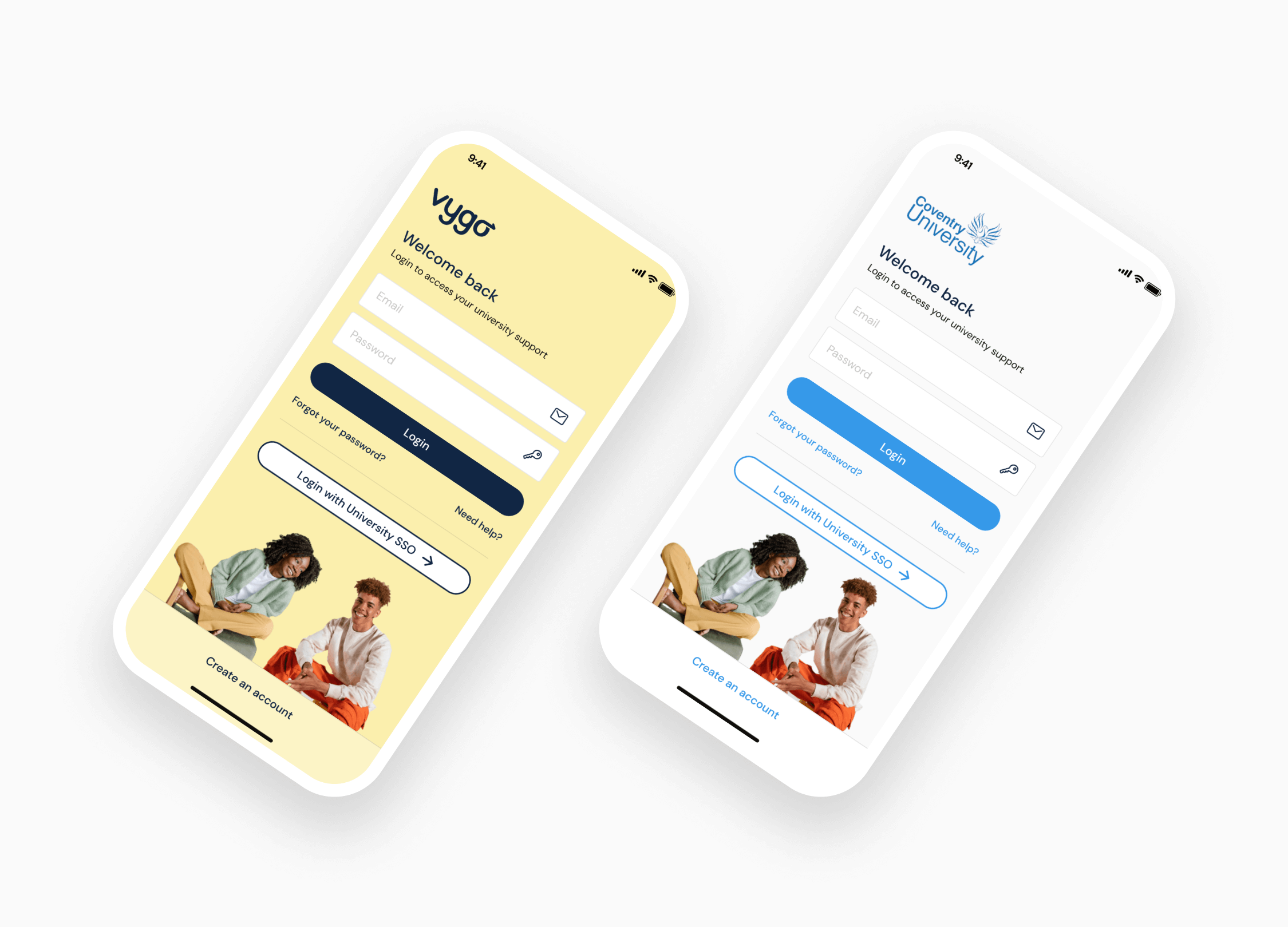
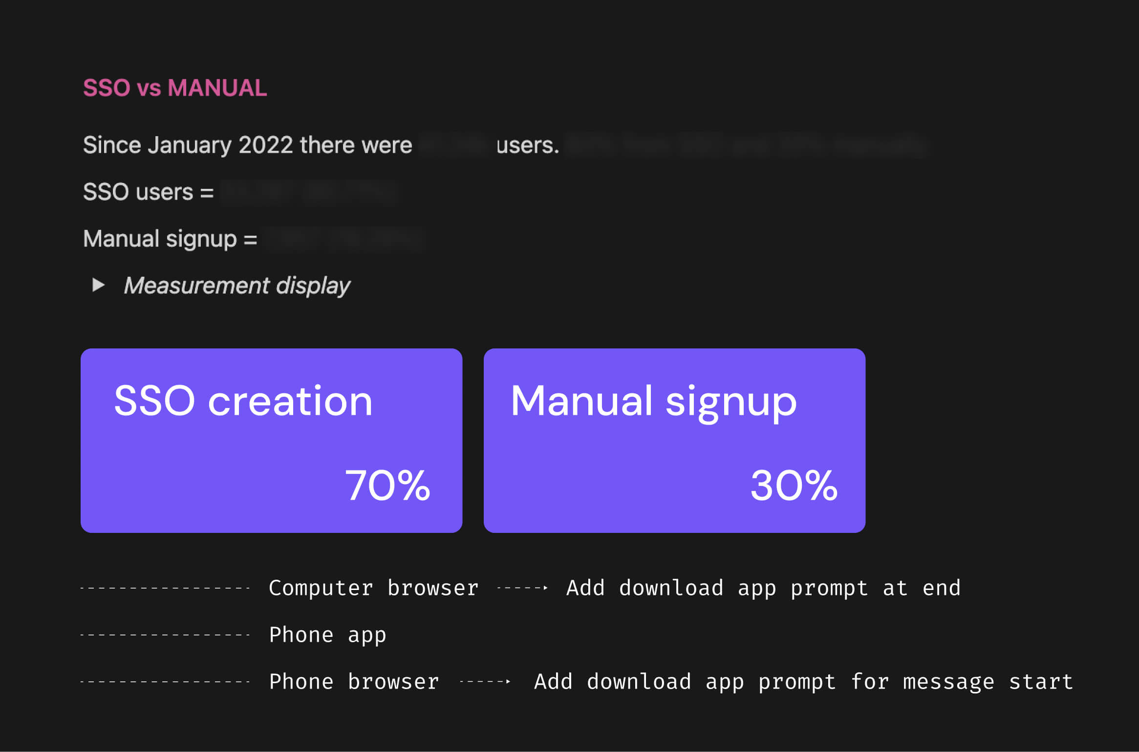
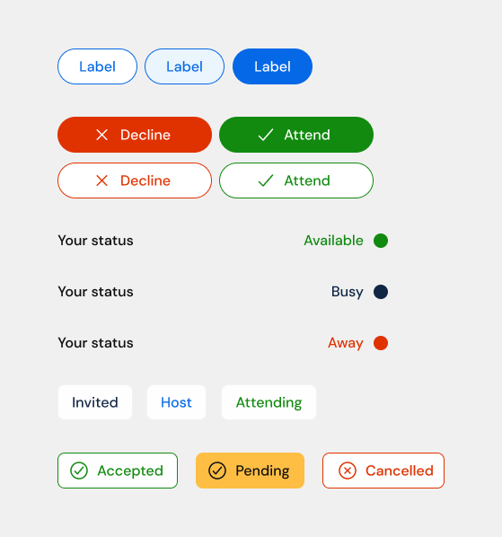
Creating two login versions so Universities could customize for their brand, and so there was a fallback as certain registration flows needed this
After building a functional prototype with basic videos and some ideas to test, I recruited students in the UK and USA to start conversations. I really enjoyed speaking with them and made several updates based on their feedback - and I picked up a few Gen Z influencer names!
Drawing up ideas and running user test sessions
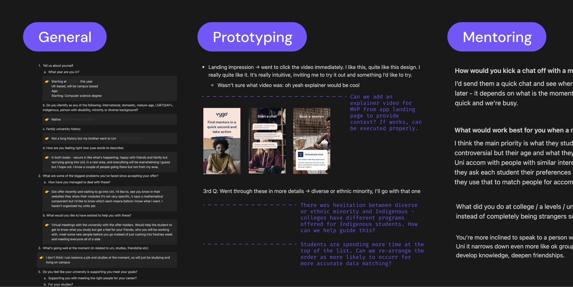
I ran through many popular Gen Z brands to check their appeal and new strategies and marketing changes - this area of the internet is much more inclusive, bright, bold, and fun.
A few insights from the sessions
- Rushing through apps is common, clicking as fast as possible to reach their goal. They pause only when encountering something unique, confusion or unnecessary friction.
- A lot of students asked whether this app was free or paid, and financial aid came up (resulting in a line on the signup that this was free and provided by their college).
- In the first semester, students have to navigate how to get started, find resources, get support, and understand who helps with what.
- Masters students have more specific needs - they focus on projects, tracking updates, career options, and niche subject details, though many needs overlap with the broader field.
- Most students expected to be able to browse mentors or match with others if they reviewed a profile and it didn’t feel like the ideal fit rather than just being matched.
- Students who are first-generation attenders in their family require more support, they don't have the same network for questions and successfully navigating college life.
- Language can create confusion. Localization (or lack thereof) caused some detachment - is it for people here? As did Indigenous and ethnic / diverse minority wording for example : should I be selecting both if I'm Indigenous?
I have many more findings, insights, and ideas. Working in education or with Generation Z? Please contact me to discuss.Want something interesting to listen to in the meantime? This American Life has a fantastic podcast episode: Three Miles.
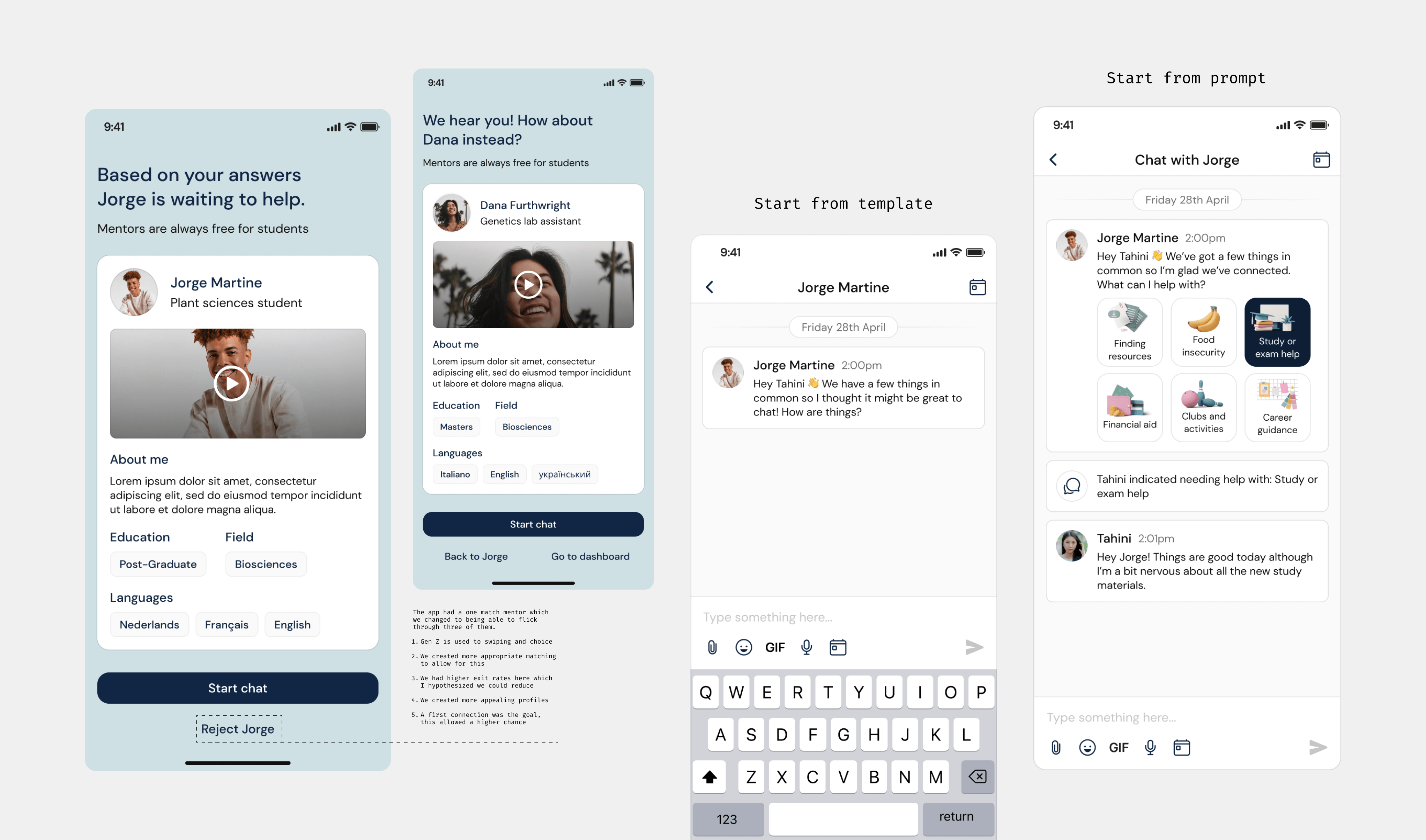
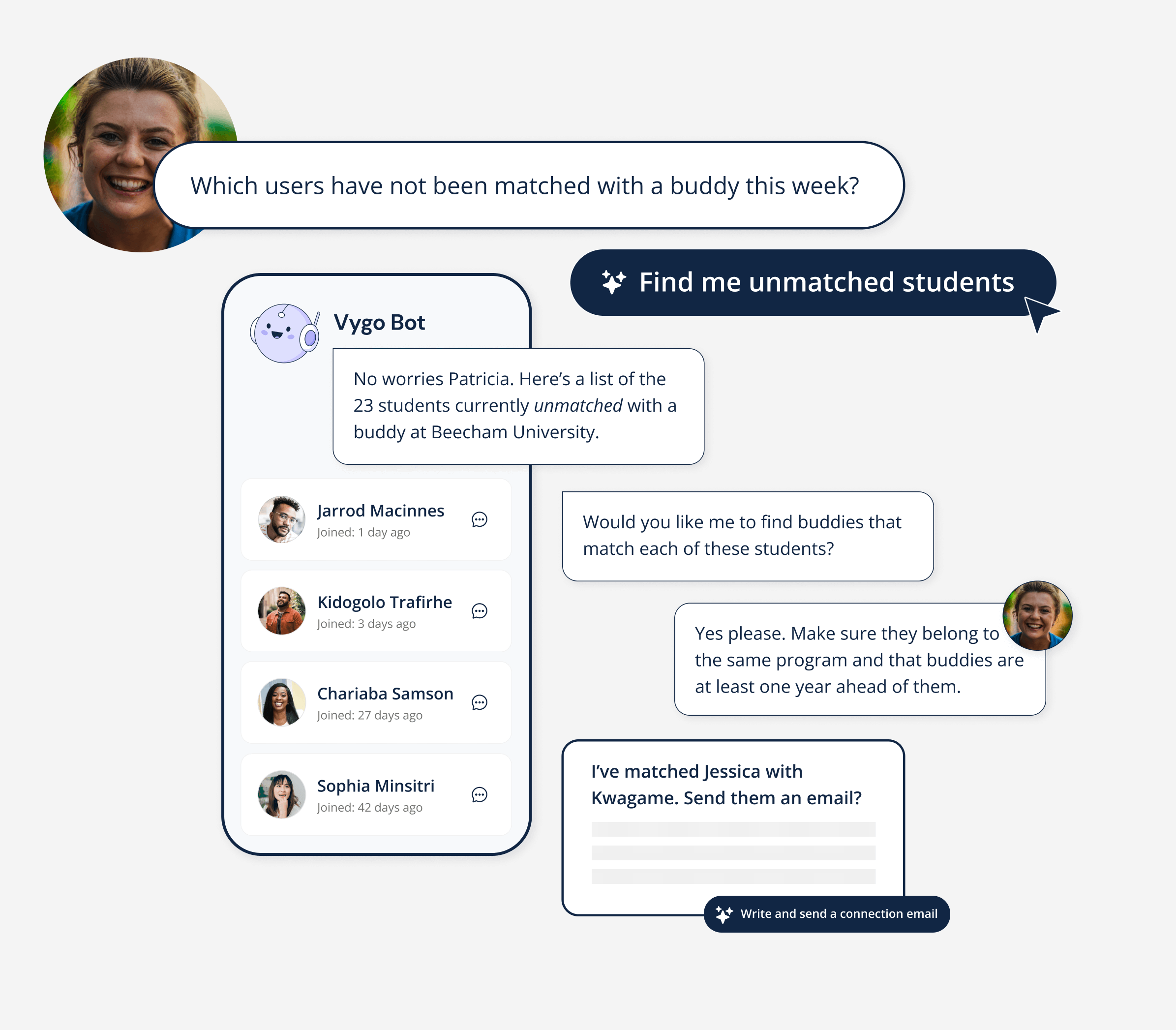
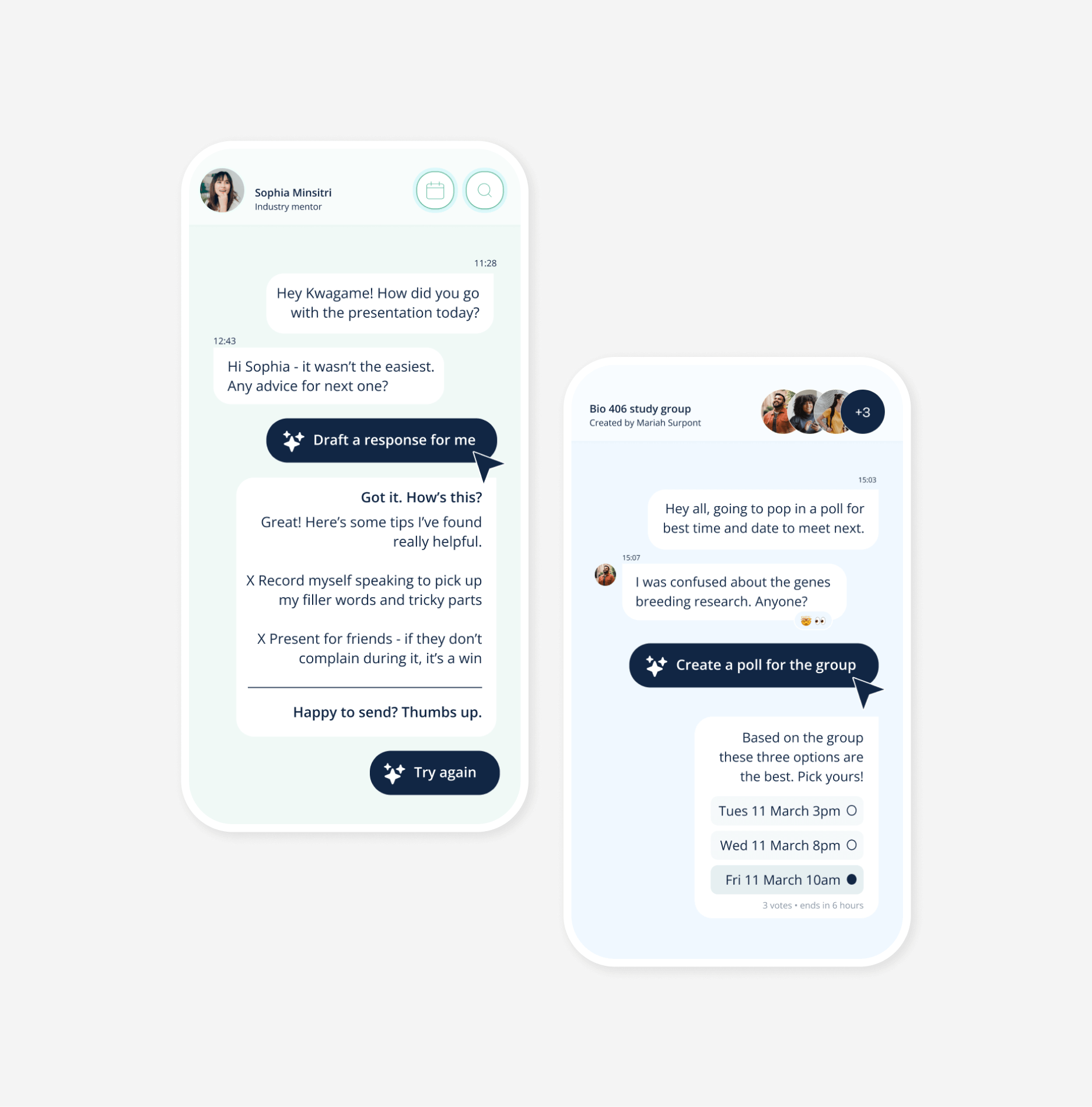
Creating a new mentor matching and chat system
The next challenge was making chats compelling enough to start engagement. Based on student interviews and mentor insights, I designed several ideas and discussed the best approach with the team.
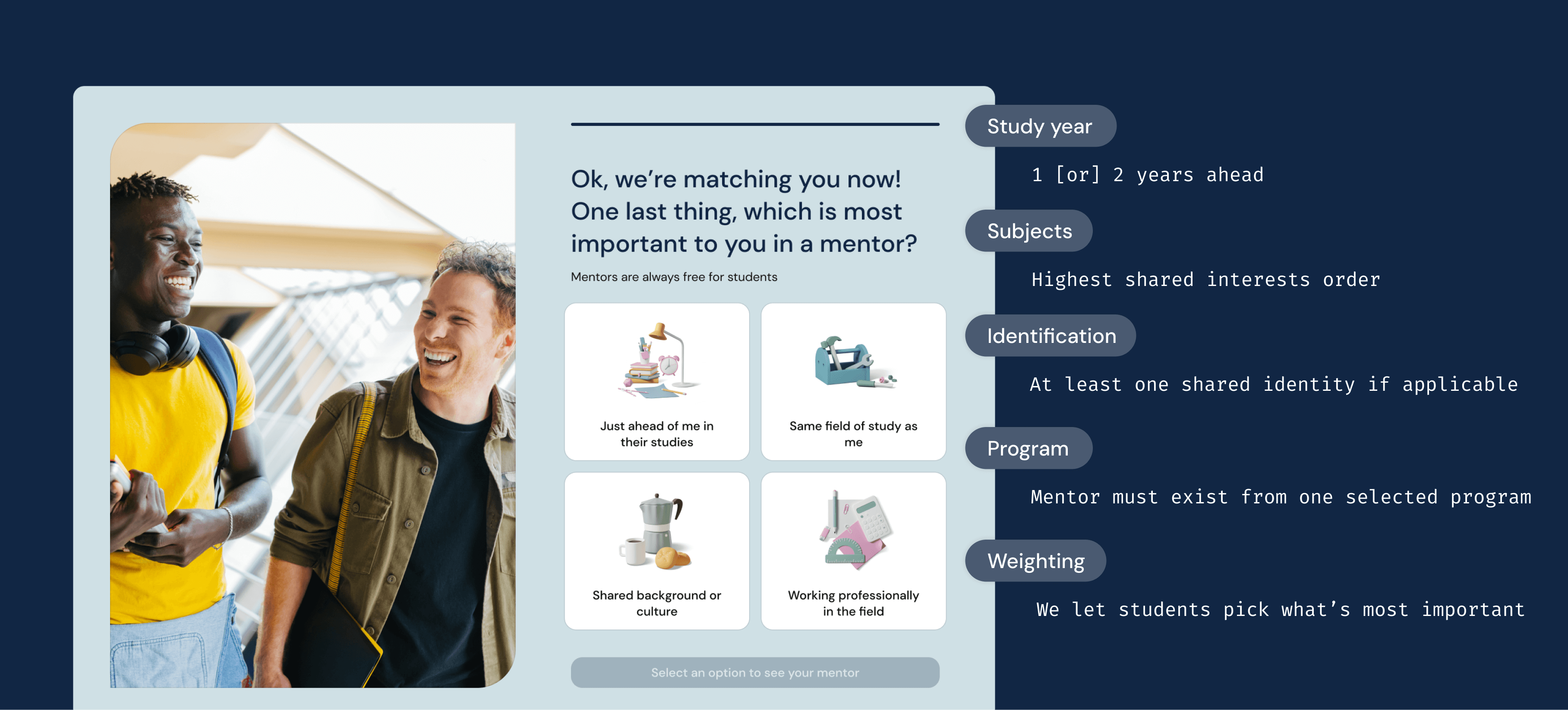
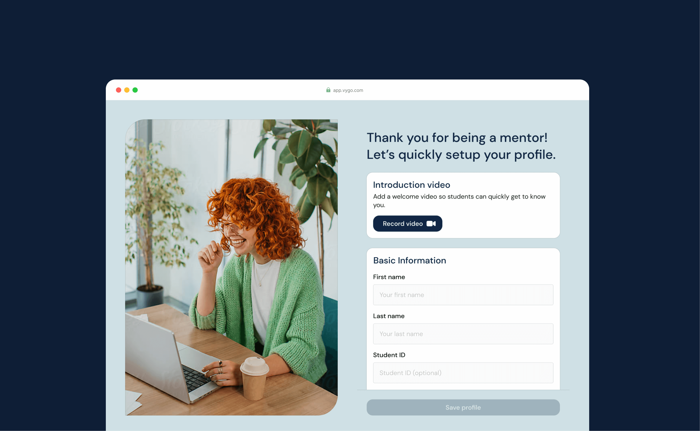
We defined onboarding completion as a student starting a chat. To encourage this, mentors would send an automated message - choosing a preferred template - and student prompts would be tested. Improving mentor matching was key, so we refined onboarding steps, added weighting options, and had mentors complete a similar onboarding to build their profiles.
The engineering team enhanced chat features like reactions to make conversations feel more native, with UI improvements planned for later. I also worked closely with students to create a better matching system that gave them control without overwhelming them. Rather than endless swiping, I introduced a “Reject Mentor” option. If a student didn’t feel it was a good match, they’d see two more options, with a third giving an easy exit back to the app, avoiding frustration. Finally, I designed compact mentor profiles that highlighted the key info students wanted when choosing a mentor.
Based on student insights we worked out how to improve the matching system - I loved chatting to the engineers about this, they were amazing and had lots of ideas
Improving the UX flow and refreshing the UI without creating many new components
Developing group chats and enhanced functionality
With chat as a priority, my next challenge was designing group chat and significantly improving functionality. As a team, we explored different angles knowing it’s always tough to get users to adopt a tool outside their usual flow. That said, services like this require built-in chat due to integrations, monitoring, data, privacy, and security. In college environments, it's somewhat easier, as students and staff are already used to working within an ecosystem of institutional tools. We also know that while study chats might develop into friendships that move off the app, that's a good scenario for that progression. We provide the safe and comfortable spaces for all the other conversations to exist in each context. I was therefore tasked to brainstorm various scenarios and I refined them down to one-to-one chats between students, program admins, or mentors; mentor groups; chats to resource spaces; and event chats. After finalizing these, I designed the new functions and streamlined each chat type and the settings so features could be assigned flexibly based on the use-case.
If people are used to their native chat apps, we need to make the experience as easy, and for purposes they find truly useful.
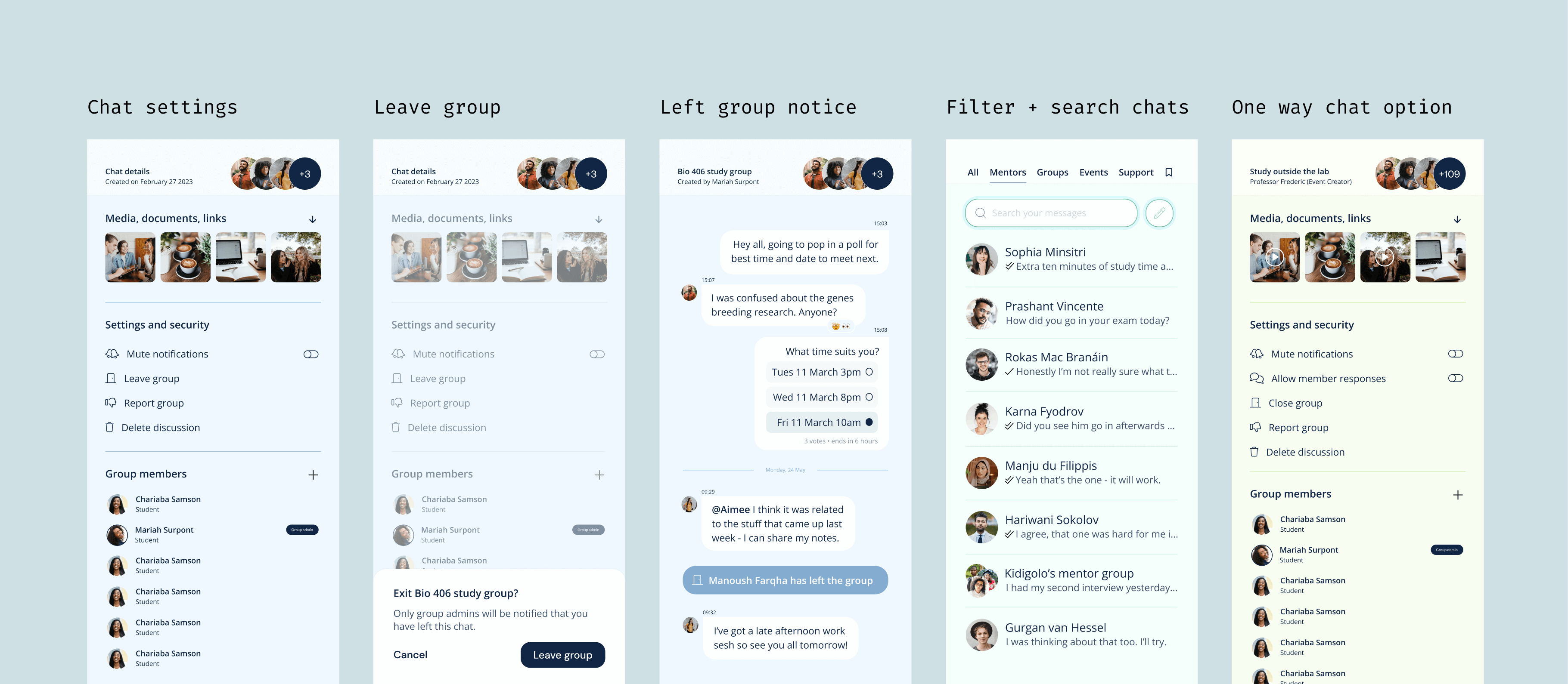
Building out each primary state and action making sure we accounted for student safety policies such as blocking, muting, reporting and leaving groups
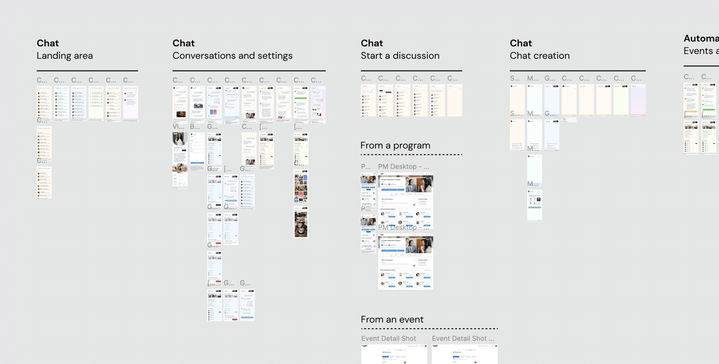
Snapshot of a work in progress
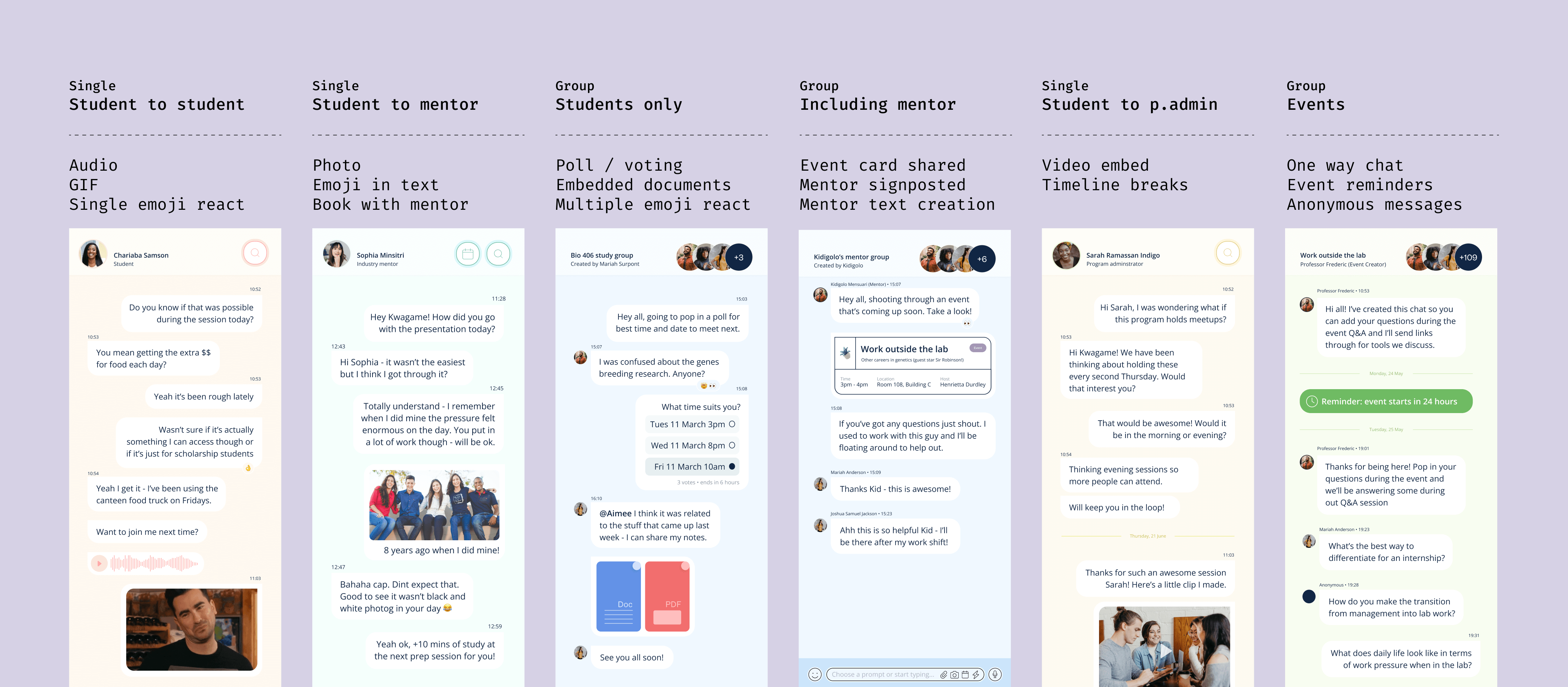
Updating and adding features for a more compelling chat experience, natively embedding other benefits Vygo offered such as event cards, and a better media and search function
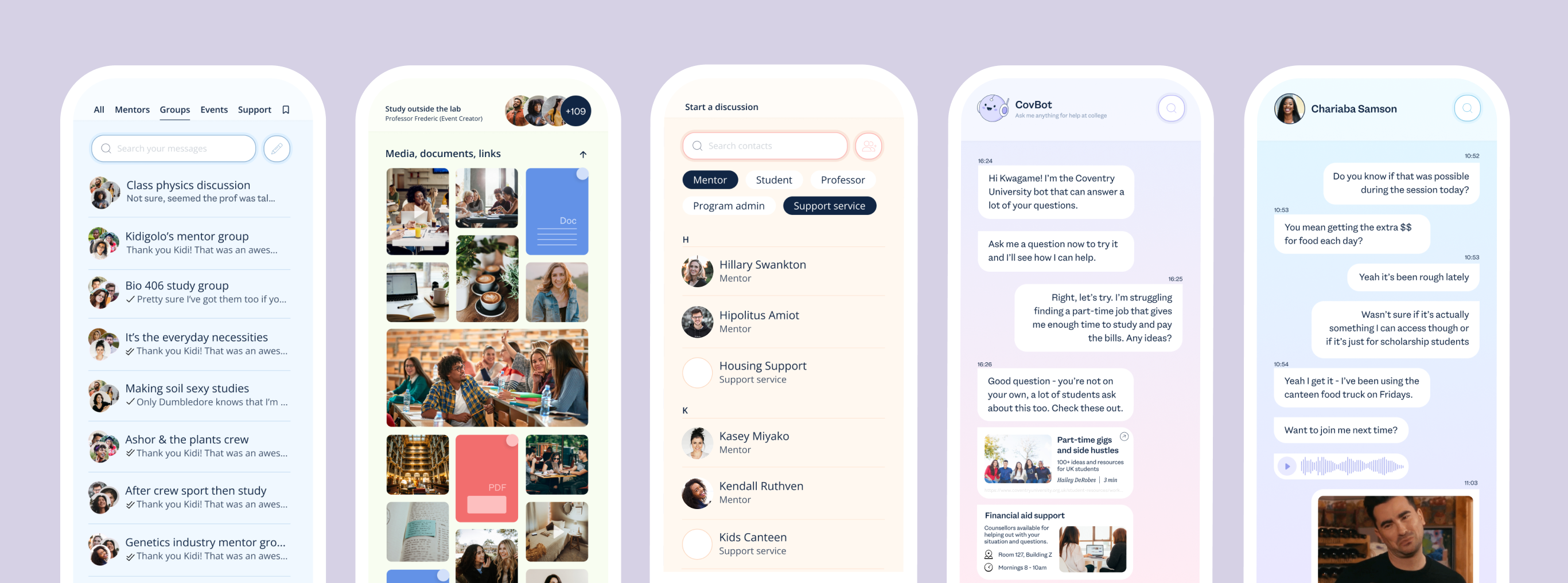
Lots of quality of life updates to move seamlessly between different types of chats, find assets, and eventually working in the option to have a customized bot for each campus to better uncover resources and support.
Improving the design system
A solid design system was in place, developed by the part-time designer. Oover time though, inconsistent implementation across design and engineering led to mismatched components popping up, causing confusion.
Is it a button or a tag? Is this something I'm supposed to interact with or not? I worked with a couple of the awesome engineers to clean this up as we went, fix up some accessibility issues, and enable new features to be built with new components as quickly as possible.
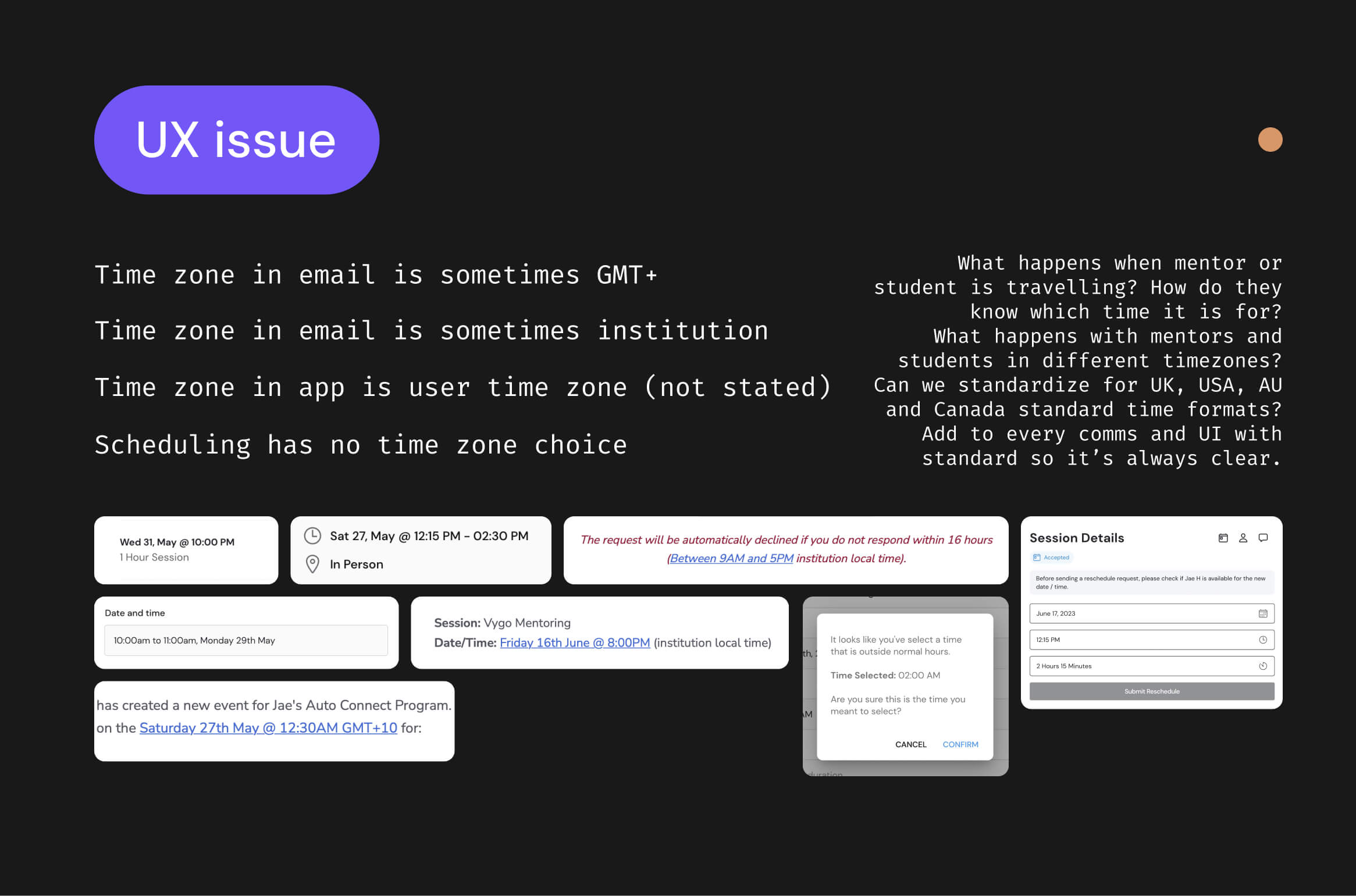
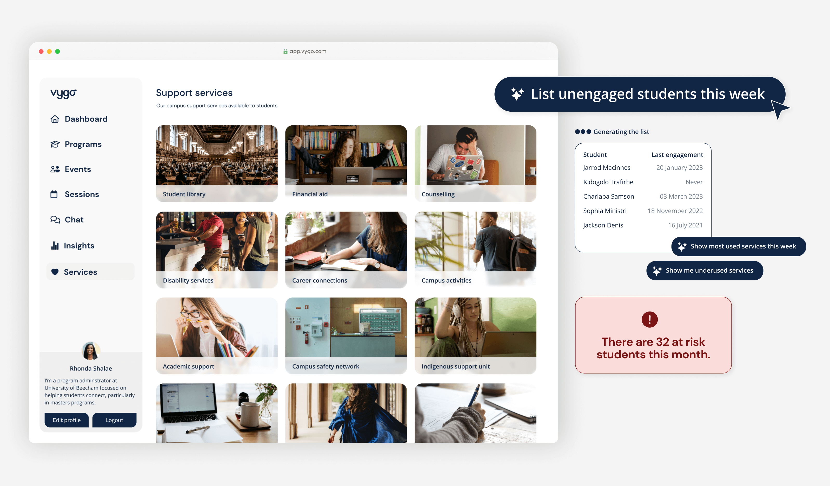
Auditing and teardown across the app
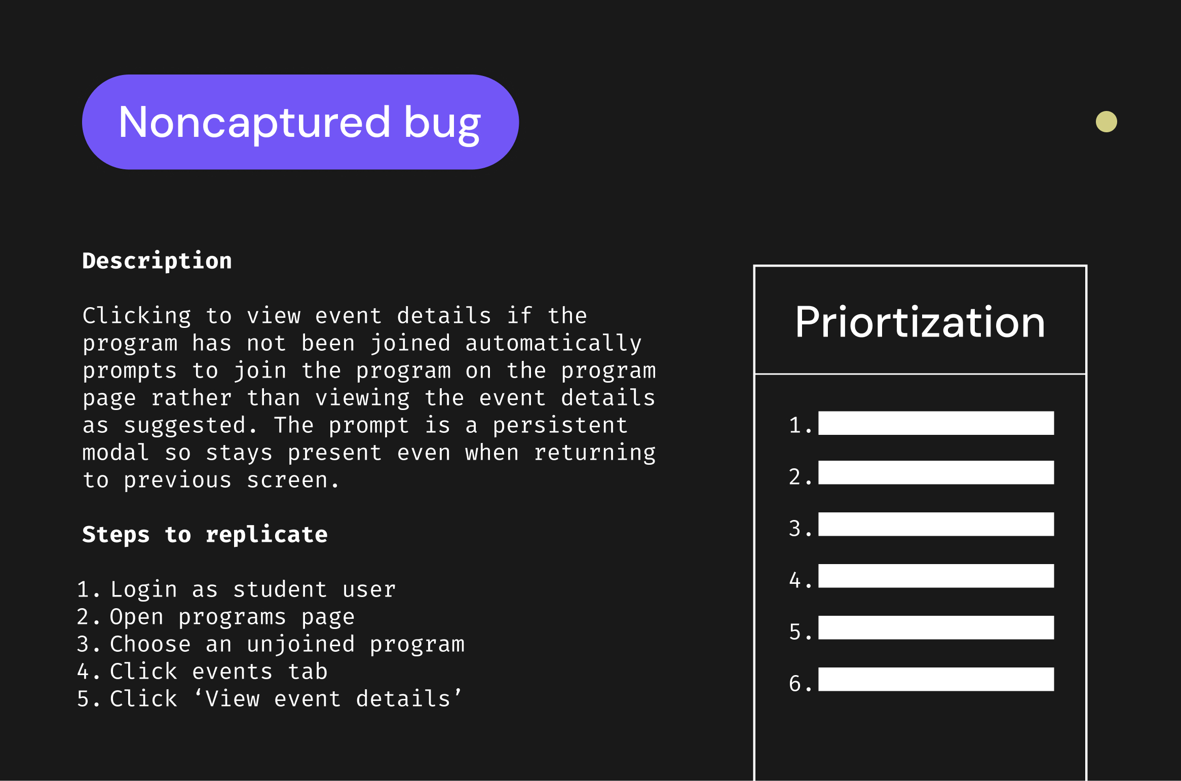
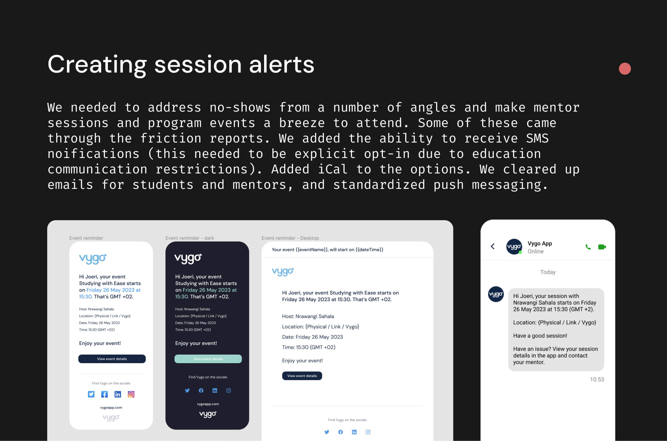
The Product Director asked me to audit the primary app areas and create friction reports to identify issues. I began by outlining eight key student states which helped me group problems, prioritize the most valuable fixes, highlight bigger issues, identify quick wins, and create tickets for all the problems we wanted to address. There were issues which we could immediately implement to address problems such as mentor session no-shows.
- Feeling stressed - starting or studying at college, part-time roles, exams, extra credits, financial issues, time for healthy eating and exercising, hobbies, making or seeing friends, world matters
- Environment changing - campus, at home with flatmates or family, at part-time job, at an organization club / house, at an eating spot, in library, at café
- Barrier support - confusing to navigate, embarassed, annoyed, had no idea it exists, stereotypes, time on social networks and other apps, studies and schoolwork, friends, going out, hobbies, sports.
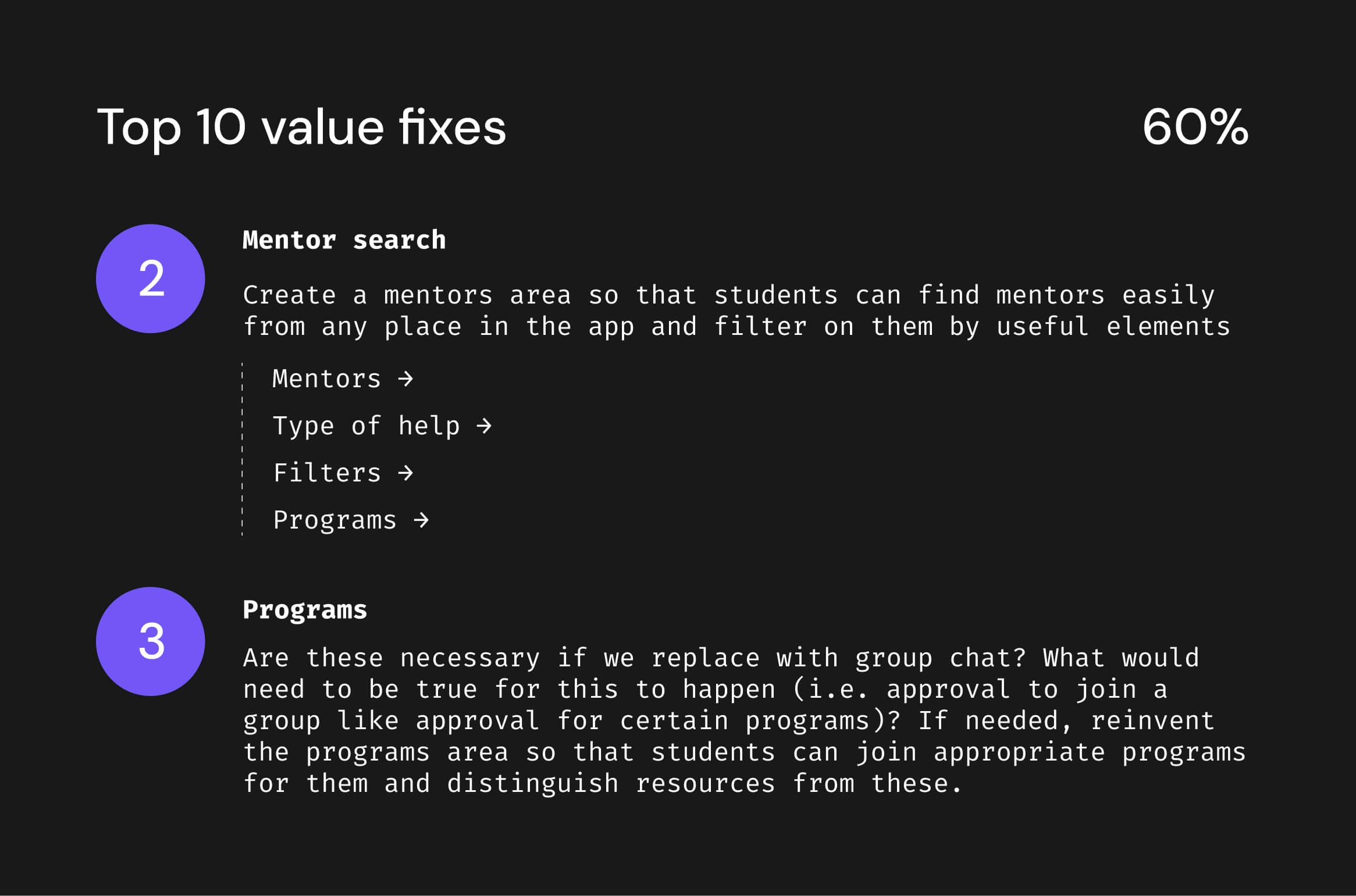

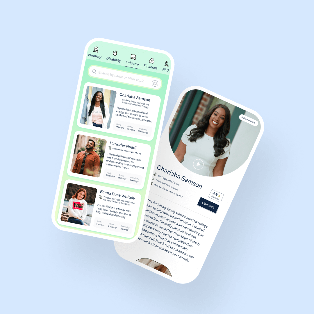
Improving the experience to find a mentor
The audit revealed that the primary mentor area where students find mentors, needed improvement to increase support, chat, and engagement. To address this, I designed several screens showing how searching and matching could be enhanced. This wasn't implemented during my time as it was intended for next phases, but it hopefully provided some solid ground for feature inclusions that could be prioritized.
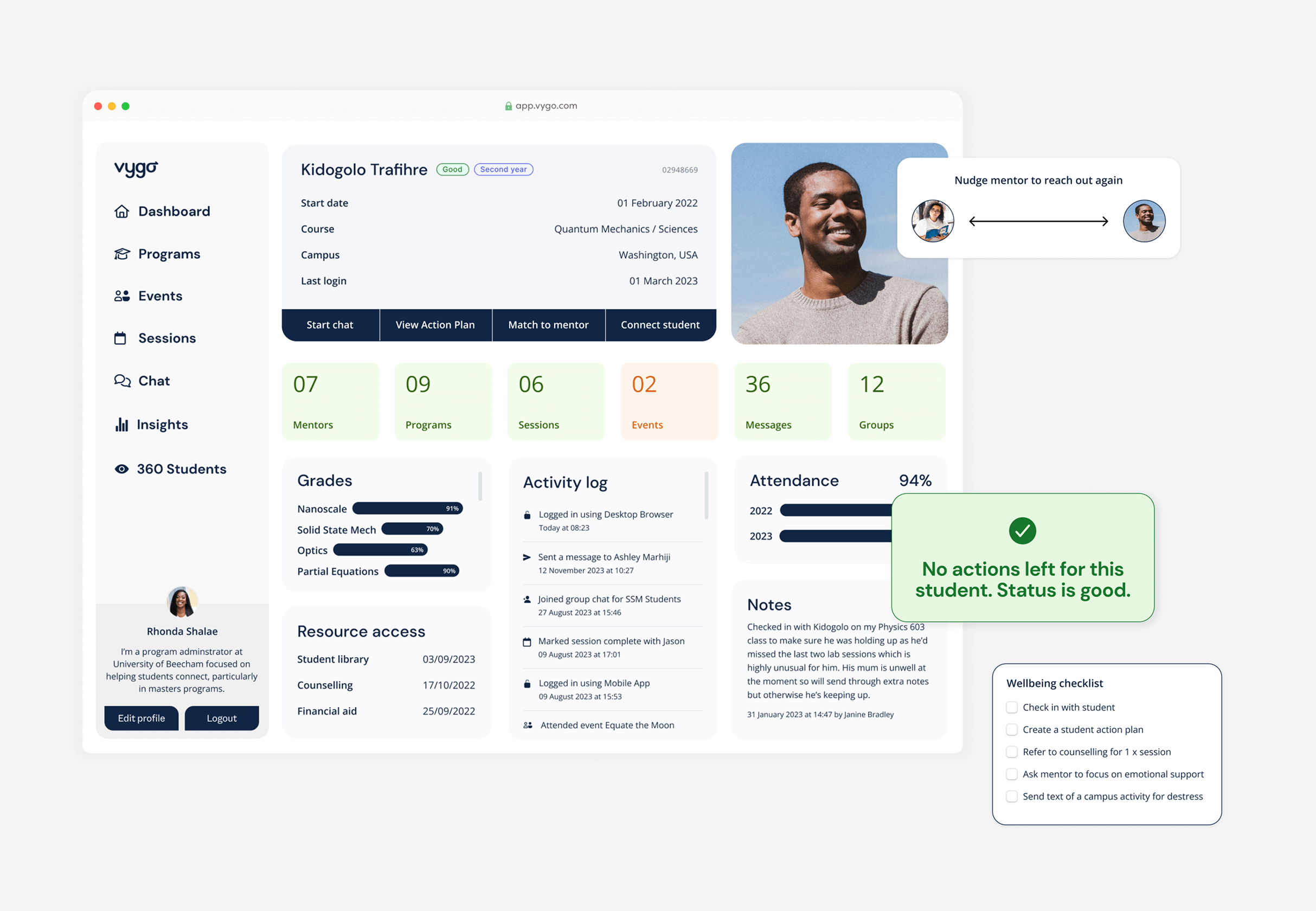
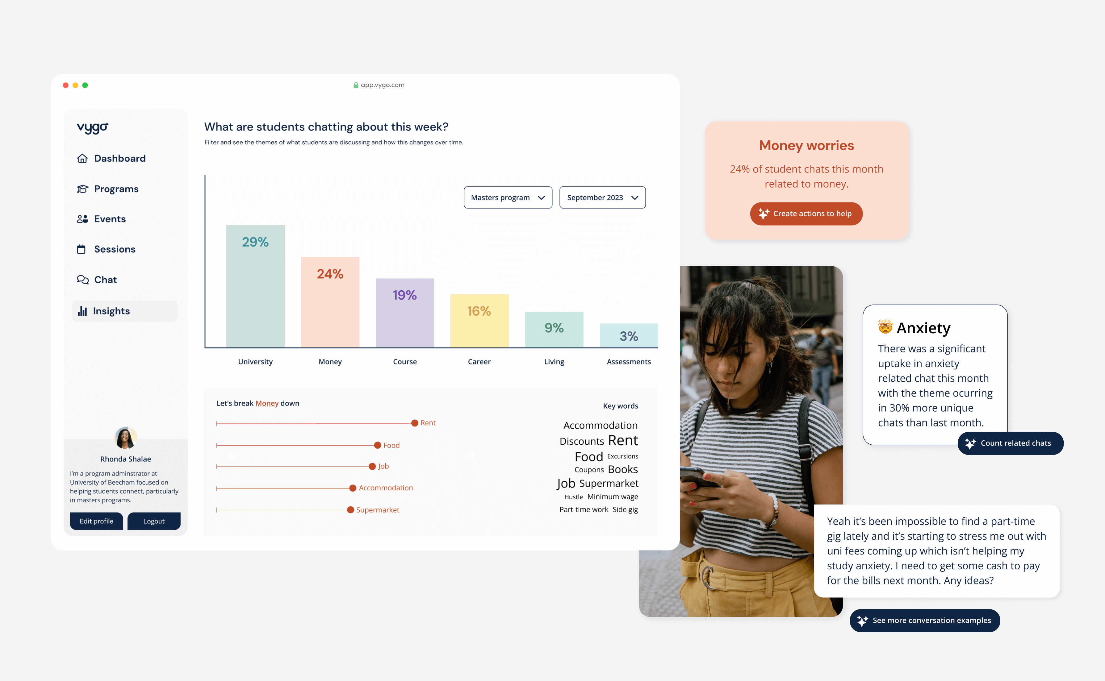
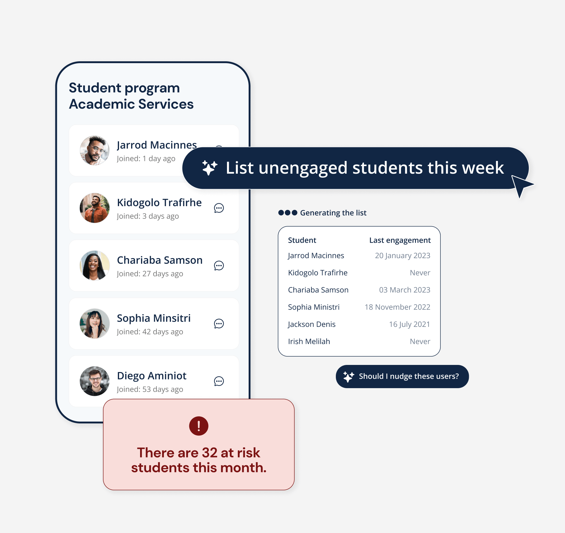
Creating a purposeful dashboard that encourages engagement
The dashboard hadn't been a past priority and it wasn't one of our primary drivers as it saw little engagement, but as everybody consistently landed here we wanted to rethink how we could use this to drive engagement. It had lots of the core components but it wasn't clear what you should do nor what value it was giving you. Could we give the dashboard a purpose?
If our North Star is to reduce dropout rates we need to pick up on earlier signals. How can we help program admins do that?
I developed several support features, including a wellbeing tracker for early intervention, event recommendations, and nudged mentor reach-outs (with mentors not having access to tracker data for privacy). I also highlighted resources based on personal situations and tracker responses. Additionally, I created a customizable announcement feature for program admins, and streamlined sessions and events to make upcoming ones easier to find. A profile update nudge in the desktop sidebar was added to encourage mentors to keep their profiles current for better matches.
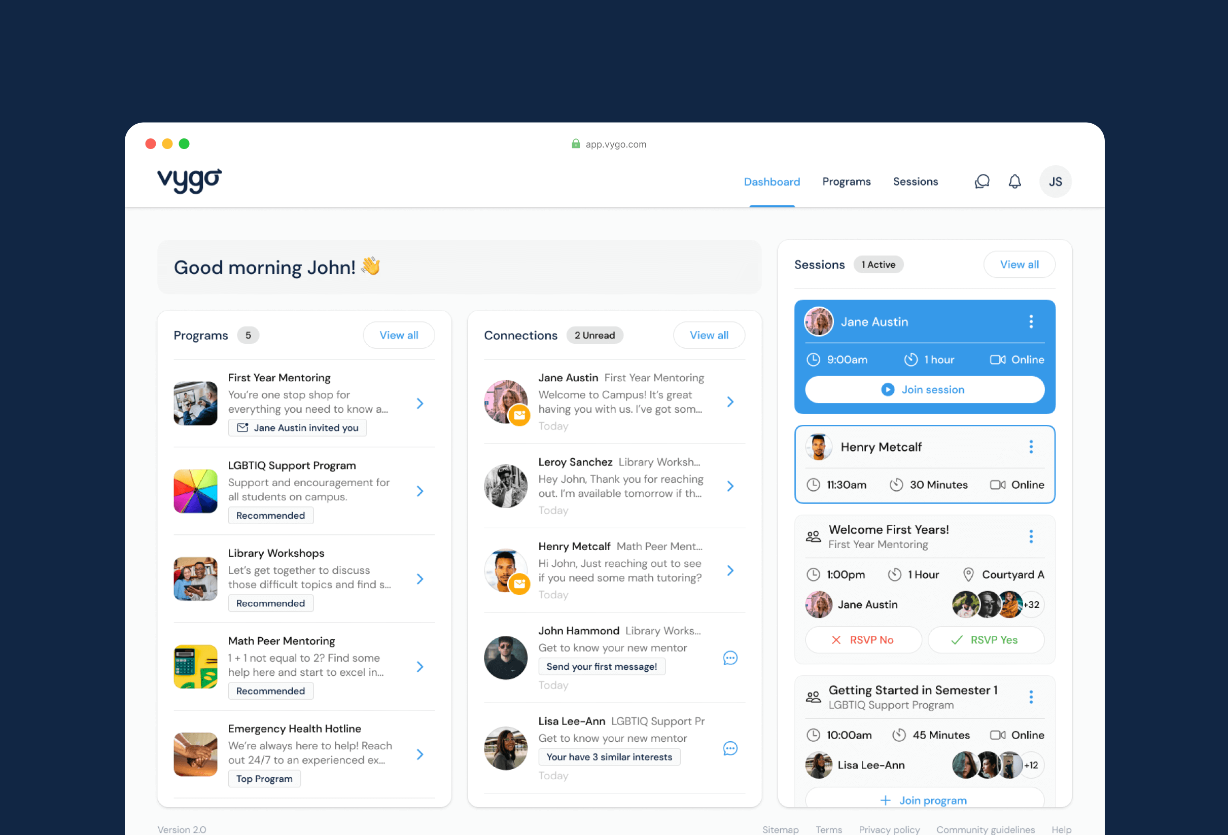
Before and after of the Dashboard directing students so we could provide support and thereby increase engagement
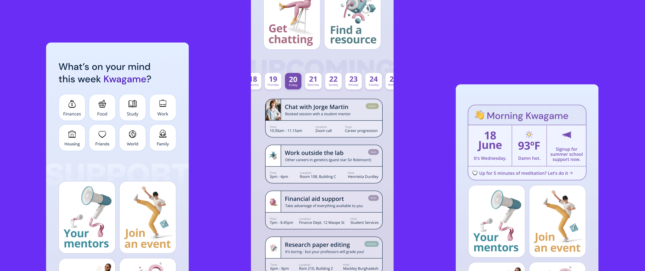
The wellbeing picker also doubles as impact and early intervention and was designed to be weekly only. These screens include future UI ideas we were using in our playground.
Accessible product palette, inclusive branding and progressive enhancement
As I was designing out new screens beyond the initial implementation, I was able to add in a refreshed color palette to create a more appealing application and ensure this met all the accessibility requirements. I worked with the UI designer to find the right palette we needed between the current application which was using the ion system, and where we were heading.
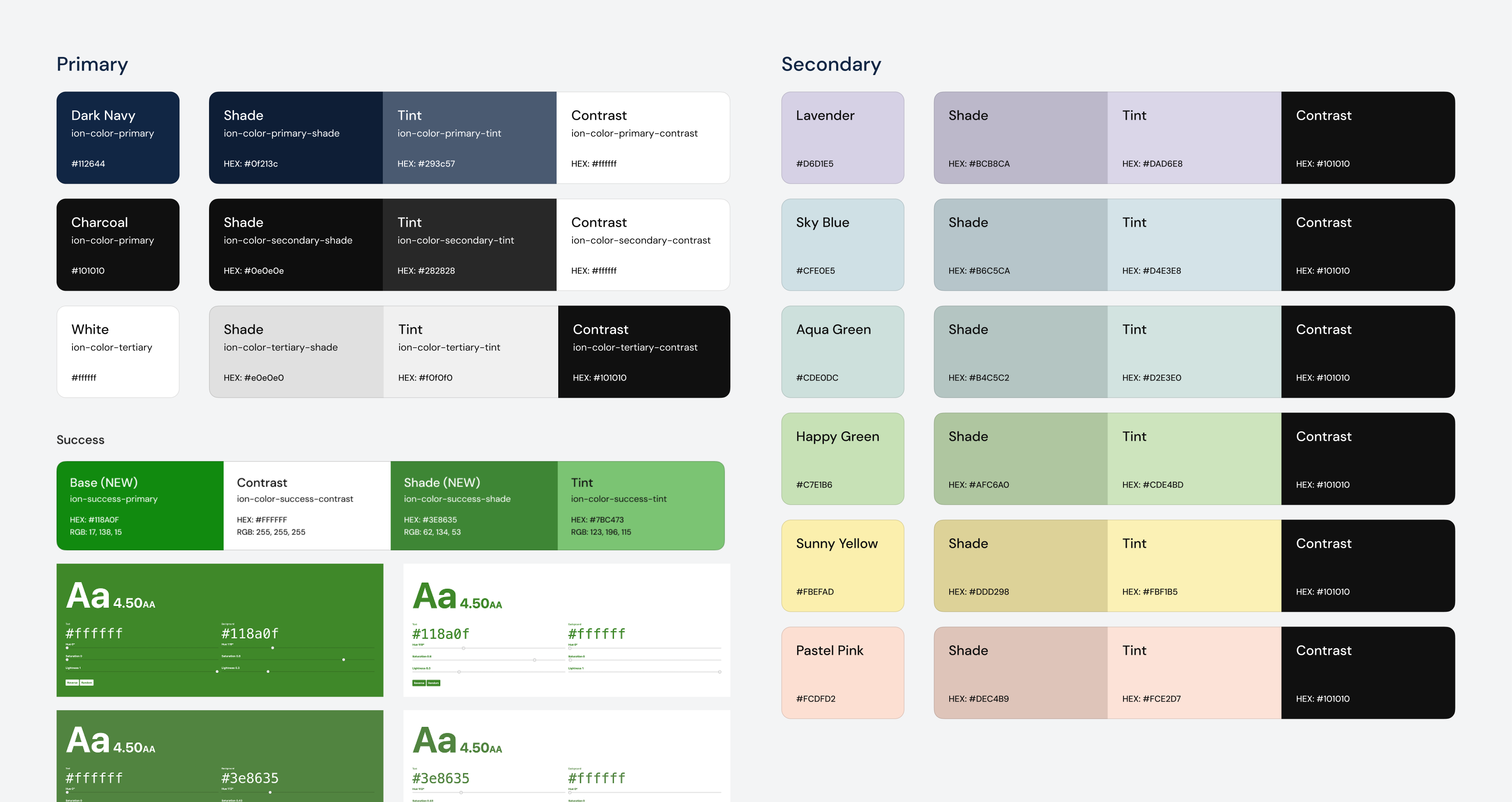

I replaced the previous corporate-style illustrations with inclusive, representative photos reflecting the student and mentor experience. For icons, I introduced a more fun and fitting library that could be swapped out later if branding shifted to a custom style.
Working with UI designer and engineers, we took my designs and split them into phases for implementation so that we could implement functionality, then new or improved components, then a UI update with minimal resources and fewer errors and testing.
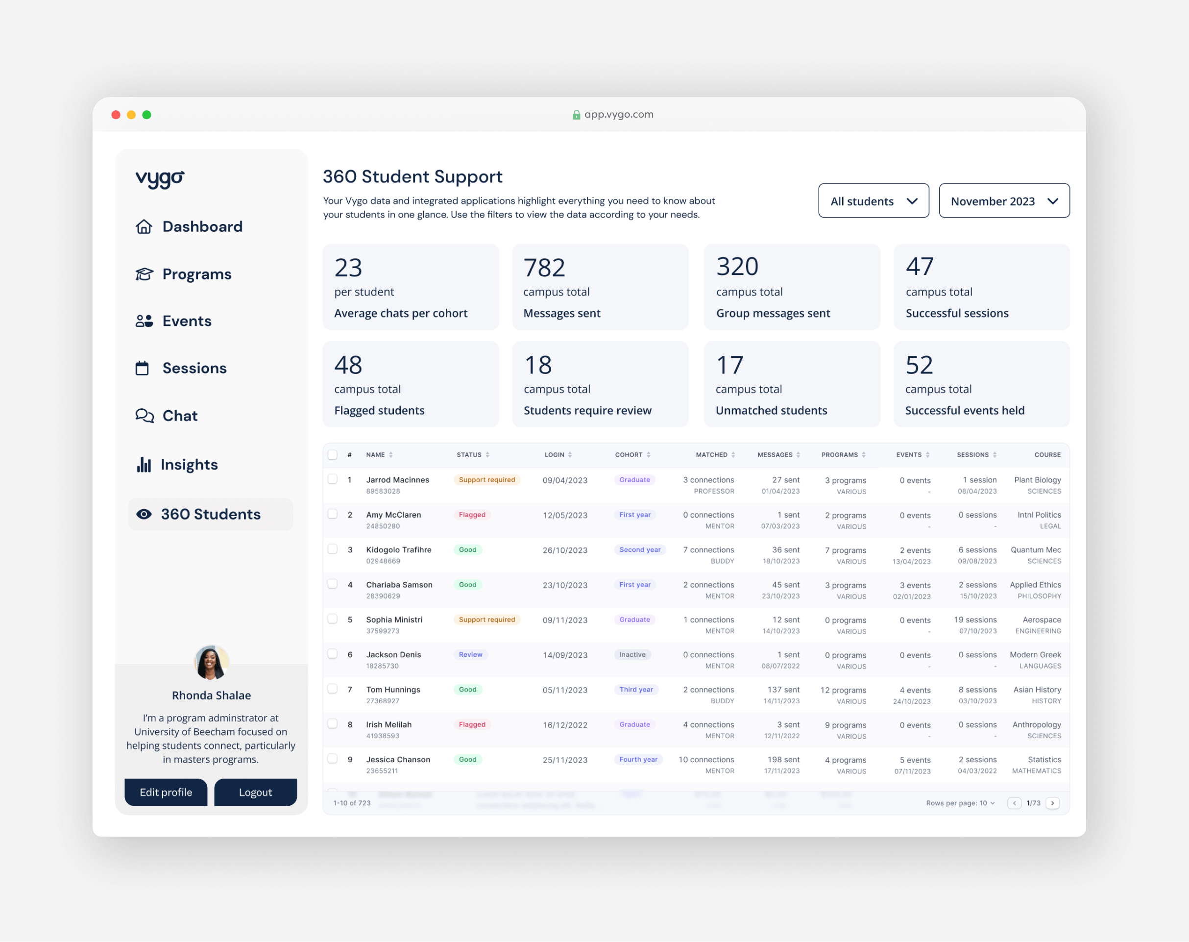
Creating a student learning system from scratch
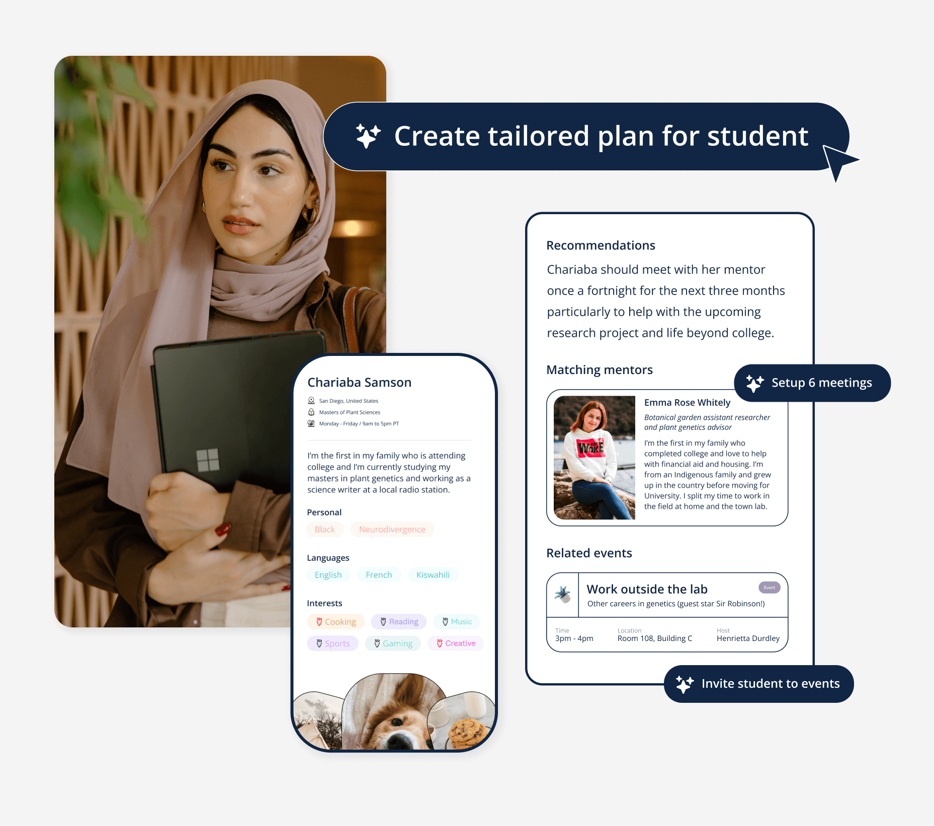
Next, the Product Director and founders were working on a 360-degree student learning system for the platform’s next version. I reviewed their research, current insights, and program administrator needs, then created initial designs to support investment, testing, and feedback. This work would help significantly in early interventions and proactive actions in supporting students and reducing dropout rates.
360 view of a student with highlighted actions for a program administrator
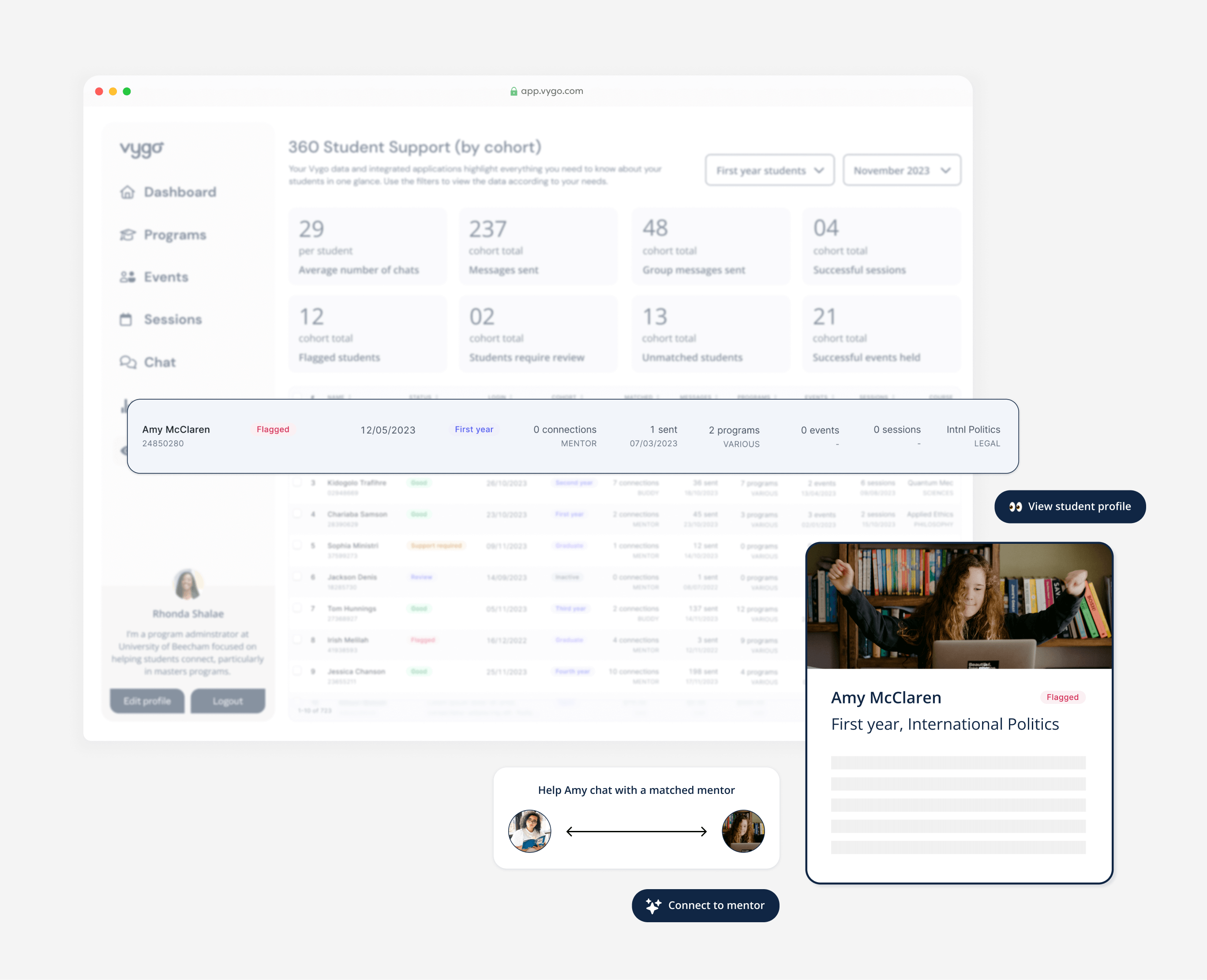
Embedding AI for data mining and personalization
The engineering team identified four primary AI use cases within the app, targeting program administrators. While much of the data already existed, growing AI interest allowed us to leverage this data more meaningfully and add AI-driven personalized actions and outputs. I designed all the actions for product review, while the marketing and partners team used the assets as the work progressed to support conversations.
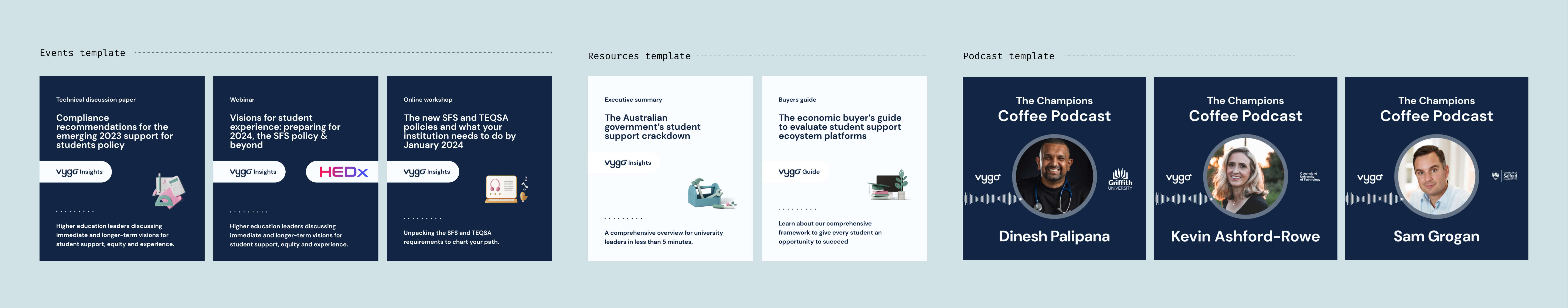
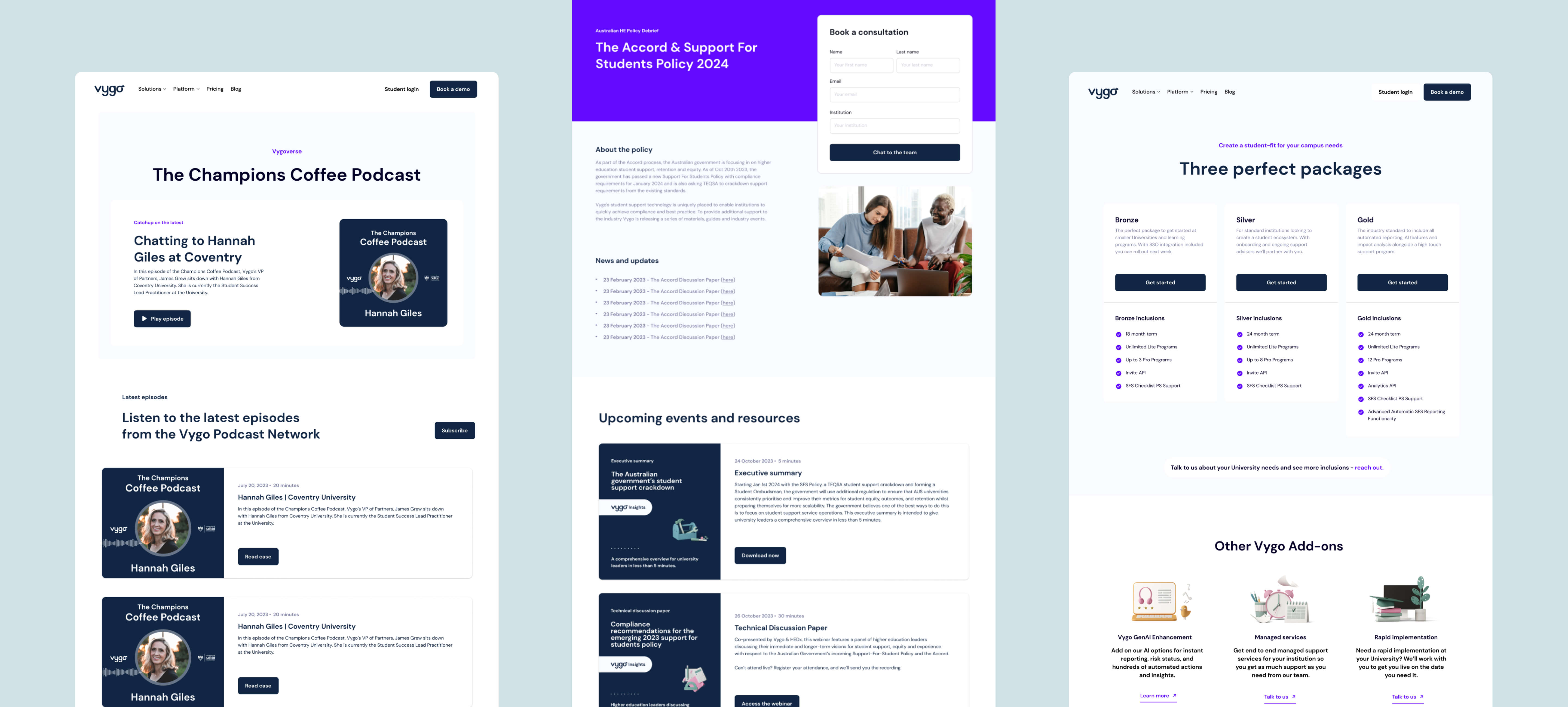
Selling the AI suite of tools
To support sales and test inbound leads, the business needed a landing page. With limited time, I built a Webflow landing page using reusable components, added some visual effects, and created a video to boost appeal.
I grabbed an After Effects template and customized it to create an AI video that Vygo needed for marketing and pitches.
Tying it altogether with a website update
Lastly, with the brand ramping up pitching, we aimed to improve the external partner-facing site and boost inbound interest. We chose a Webflow template, and I set up all the brand variables as the theme didn’t include them. I created layouts, refined brand typography, and designed templates in Figma and Canva to support the team in keeping everything polished, allowing marketing and partners to focus on their core work. A great development team brought it all to life and voila! Vygo had such a lovely group of people to work with, I'm lucky to have played a small slice in the journey.