The name Lisande handwritten in her own lettering
See my availability

Product research case study

I worked on a social impact measurement platform supporting NGOs, charities, education institutes, and government departments to measure their impact.

With seven years of aiding the not for profit sector under their belt, I jumped onboard as the first self service measurement platform was launching. I diagnosed problems and resolutions from onboarding, time to value, and trial to paid conversions while establishing new UX processes. I prototyped a new mobile app for better data collection, developed a resource centre for new leads and customer education, established numerous product operations, conducted ongoing user research, and developed a comprehensive SAAS strategy to effectively grow the product user base and revenue.

To protect company confidentiality, specific data numbers have been obscured, altered or use placeholders, unless the number is specified to highlight a change as a result of the work. I adore impact measurement so if you're working in this space, please feel welcome to reach out.

2020 to 2021

The scope

Diagnose specific challenges and resolve them, start the journey onto a platform with fewer limitations, develop the SAAS model, support setting up product processes.

My role

I worked part-time as the Head of User Experience conducting research, analyzing challenges through data and insights, and (re)designing flows, screens, and a better system.

Challenges

Complex data models, a difficult subject that requires significant customer education, intricate platforms built on Salesforce, shifting product and sales practices.

Audience

Global NGOs, charities, social enterprises, education institutes, and government departments.

User interface design of the new impact dashboard
Creating the new impact dashboard to make administrators lives easier and allow reporting to filter accurately through the organization.

Solving conversion challenges in a new product launch

I began my time here as a new platform intended to simplify impact measurement to grow the audience, was being launched. I needed to quickly figure out where things were falling down from signup through to paid conversion.

  1. I created 10 key questions to answer about the product
  2. Analyzed all the data coming in through various applications
  3. Added an optional phone number to signup
  4. Implemented exit responses
  5. Undertook outreach for qualitative research
A flowchart I created breaking down the onboarding journey into four key areas with a targeted conversion rate to track and meet in each
With a niche product and more organic and targeted marketing, I would expect to have a signup to login conversion of >90% which would increase the paid conversion if value was found and pricing was right.

This work allowed me to set up the first processes to formalize user research and conduct numerous interviews to overlay the insights with quantitative data.

  1. I outlined benchmark and targeted metrics for each phase
  2. Determined that the initial signup conversion was good
  3. Found the login conversion was suffering greatly at 27%
  4. Located a significant onboarding drop-off from the primary social channel, compared to other funnels
  5. Figured out the key org roles, what they needed and reduced onboarding issues
  6. Leared wny organizations didn't convert to paid plans

Using these insights, we were able to more effectively direct marketing spend and focus, and I worked with marketing to create a content strategy to have more incoming leads with higher intent, reducing the high bounce rate from specific campaigns. Finally, I drew the current flow and what we would reasonably expect from this application as a goal to work toward and change the onboarding process for.

Showing the conversion journey and a snapshot into the user research and product feedback

Fixing an onboarding problem

It took approximately 10 minutes to commission a new Salesforce account. When I chatted to potential users that had dropped out of the flow I found that our key target users had many demands on their time. They had taken the time to signup to have a quick scan at a new solution, but not being able to login for ten minutes? Like most of us they were distracted with other priorities, missed or didn't care about the email coming in that their account had been provisioned, perceived it as a sign of the platform quality, and subsequently never logged in.

We had numerous chats with Salesforce, and the engineering team did incredible work to add workarounds to reduce the time to 2 minutes. This is still longer than most platforms we're used to, and the company wanted a range of fast solutions tested. We tested three different ideas:

  1. An email confirmations to success & hold
  2. A “while you wait” resources page
  3. SMS outreach for bringing you back to login

Ultimately, they didn't hit our goal of 80% conversion.

I suggested we instead direct users to a faux platform page for an onboarding step. We would use this to automatically customize the settings after the provision and ascertain key company data. Importantly, this aligned more closely to expected processes and allowed the account to be provisioned in the background while the person was configuring their account. Combined with a loading progress indicator, we hit the solution for now.

A snapshot of various screenshots of the platform journey from sales page to checkout to emails
We also had confusion with the Salesforce messaging and lack of mobile support (a big issue when people on-the-go see an a recommendation for a new platform and attempt to signup via their phone) but that's another story!

Resolving conversion → time to value

While the sales page wasn't particularly modern, it was working quite well for those coming in and signing up. What I needed to figure out next was if people were starting what we considered a valuable event, how many of these were needed to see value, if people were expecting something else, and if they were making it through the trial to know if this solution was for them.

Having such a wide spread and vast array of feedback, I suggested we add a field to the signup in order to determine what that person was hoping for in order to understand their primary need and how the marketing efforts and key messages were landing. With all the data and interviews I was able to work out a typical journey for each key role. For example:

  1. Create a measurement project
  2. Setup a cohort
  3. Add a test beneficiary
  4. Submit a test survey

I mapped the journeys with their conversions, and cross referenced these against global regions. I found things such as one-third of people logging in and going straight to the dashboard - which was empty without data. With this I was able to diagnose key needs, what our time to value metrics should be, and how we needed to move people there.

Showing items from the time to value metrics and investigation work
Was it more important for them to collect survey data (my hypothesis was that this was not a key factor as they were already doing this using a multitude of other tools, including good free ones, unless they were looking for innovative means), to produce impact reports, share dashboards, report outputs, measure the impact of programs, support grant applications, or create custom frameworks?

Pricing and putting trials on trial

Lastly, we really needed to address the pricing model. While trial plans often work and are commonly successful, my research showed that this niche required a different strategy. It is a considerable effort to ask someone to trial a platform for 2–3 weeks that requires significant inputting of data, customizing settings, and conducting surveys in order for them to see value. Without thousands of users and testimonials. Beyond that, as there was no data export available, their data would be stuck within the platform. If they needed to manipulate it, or it wasn't the right platform for them, they had done all that work (with beneficiaries and team members) for nothing, which meant they understandably didn't do it at all.

Consequently, they never reached the reporting stage, which you needed data for in order to visualize it and see this benefit. It therefore didn't work to have a trial structured like this.

I worked with the Head of Product & Engineering and the Senior Product Manager to devise a more appropriate pricing model to test. We developed a plan to shift to a module basis, where all organizations would have access to a free version of the platform and were able to create surveys and report on data at a level required for small organizations to trust the system and receive value from it. We then focused on each additional module being part of a three-tier paid upgrade. This aligned with what we had uncovered of the journey customers move through as they increase their impact reporting complexity. We added in export functionality (tested faux at first by doing it manually to ensure this was helpful, then implemented) instilled the trust required. And of course, started creating demo dashboards and reports to show how the results.

A snapshot of various works from this positionin including a graph of ther market layers and where the products would fall, story mapping features and journeys, and hypotheses we had.

Finding product-market fit and financial models

Once we'd fixed the core problems of onboarding and marketing, we needed to ensure that users actually found value in the product, and would be willing to pay for it. We had audience-fit, but did the product truly solve their needs?

The platform had originally launched in a tight time frame based on one-to-one work with clients. This lower-maturity audience is the vast portion of the market and even language is tricky. Are you at the stage of measuring outputs? Is it even important to know the difference between outcomes and impact measurement yet?

I found the product was not solving a market need in its current state. Impact measurement is complicated, so shifting into a self-serve model requires a different approach and much more handholding in the platform due to the nature of education required. I dove into current users, potential users, and the industry in order to determine the market segments and their needs. Alongside running many interviews, I pulled feedback from customer success from current and past service-led customers, and sales insights on deal losses and churned accounts. Next, I completed a brief sweep of the company history to understand the evolution of the services and platform to see what learnings existed and poured through the last two years of survey results. I summarized all this and fed in industry analysis to create a list of the gaps in the market, solutions that needed to exist, what was already working well for charities, and what these charities and social enterprises desperately wanted support with. I then took these details and translated them into possible product directions.

The company had helped a lot of organizations, but the platform was still largely gathering survey data which could be done for low-cost on UX friendly platforms, and lacked on reporting and insights. These smaller organizations spent much more money on other software; they just had to get real value from it. I created a plan for the development of the product in order to position the product better within the market and meet needs (including why you should select this specialized platform over a suite of well-known survey tools). It also made product direction and sales clearer to advance beyond surveys, which was required for customers to increase their investment (time and money) and find value. There were numerous unknowns that still needed to be uncovered, so I also outlined these and how we could measure them.

My research reached a point where a company decision needed to be made on which market to serve first. In impact measurement, you can work directly with the organizations themselves, or the consultants and practitioners that support the organizations that don't do it with internal employees or teams. What those roles need (and these are split between freelancers, small studios, large consulting firms, and the top four) is different from what you need doing it internally. Because of how specific impact measurement is and how much custom work is required for each organization, to cover both target users would pull the focus of a 20 person start-up too much. With Series A funding, there wasn't a massive budget to pull off two directions. I undertook research into current practitioners in collaboration with the Partners lead, and took a dive into the industry to pull together the potential market sizes and likely financial models. While consultants and practitioners could still continue to work with the direct service support solution, the company was able to decide to focus the self-service platform on the organizations themselves.

I made a recommendation that the company use the new beginner platform for their own impact measurement tool. This would mean that all team members are regularly using the product, finding flaws, making recommendations on improvements, and everybody remains trained and engaged with it. This would also help all departments with their key functions and content creation going forward. Ultimately, if the company making the tool, starting their own journey with impact measurement, couldn't use it consistently or was frustrated, then what did we need to change?

A snapshot of thinking and outputs from my research including an obscured overview of the product development through the historical view, potential product options, and key questions.

Aligning on product principles

In order to know if we were building the right features, I developed a set of product principles in order to be successful in the first couple of years. This delivered 4 key themes the platform would build for and 8 principles that were agreed on by the company, creating a consistent internal goal. It also served to highlight the unique value proposition. I also set two core commandments to ask each time we did something to the journey or with a feature, to ensure we were increasing the value, without adding to user frustration and churn.

"...it's valuable and it is so frustrating. You allow us to collect data but we can't easily see it nor share it."
A white background with black text asking, have we made it easier our harder for our customer, and, have we made it more time intensive or less?

Designing a new survey application

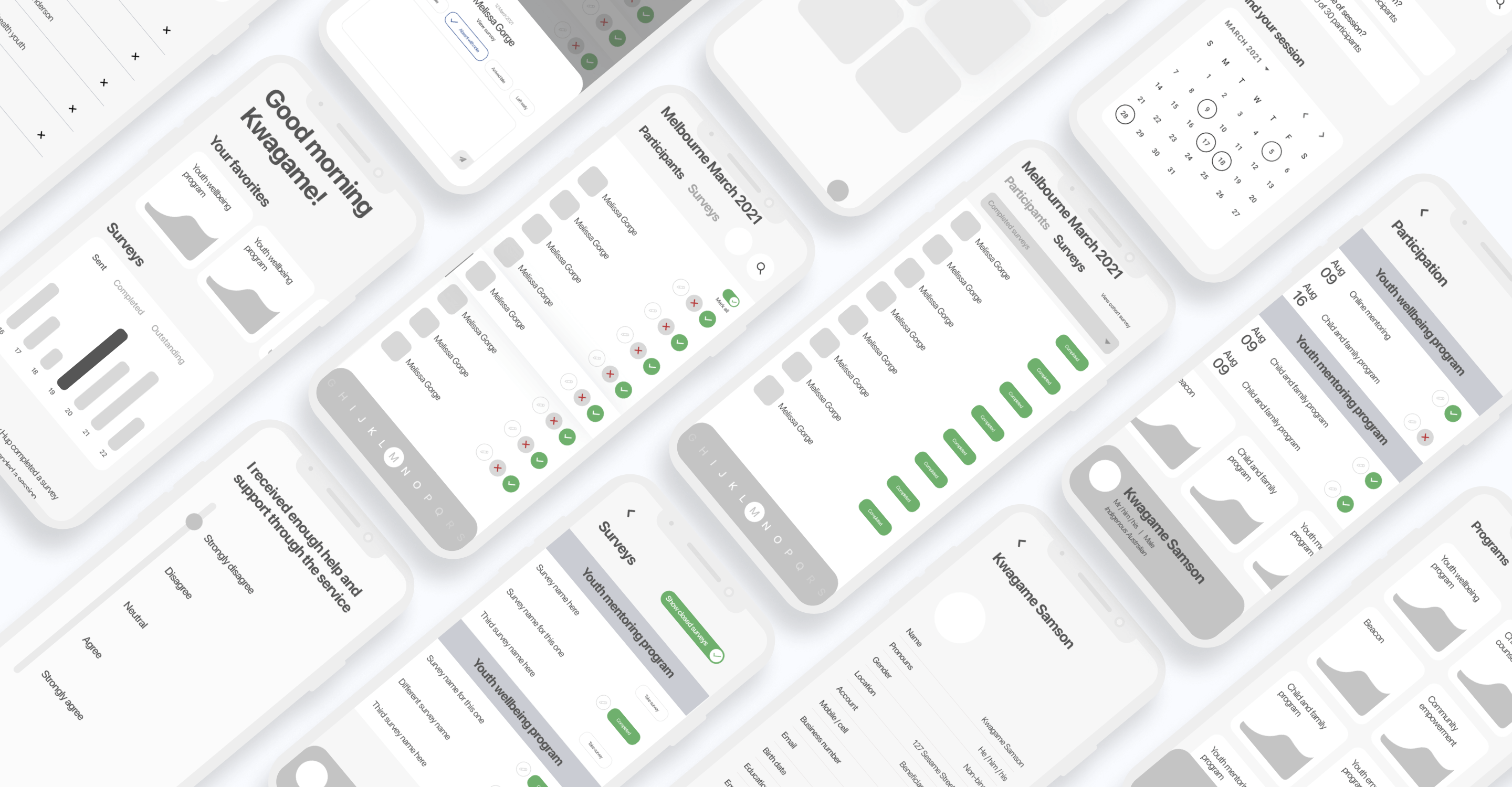
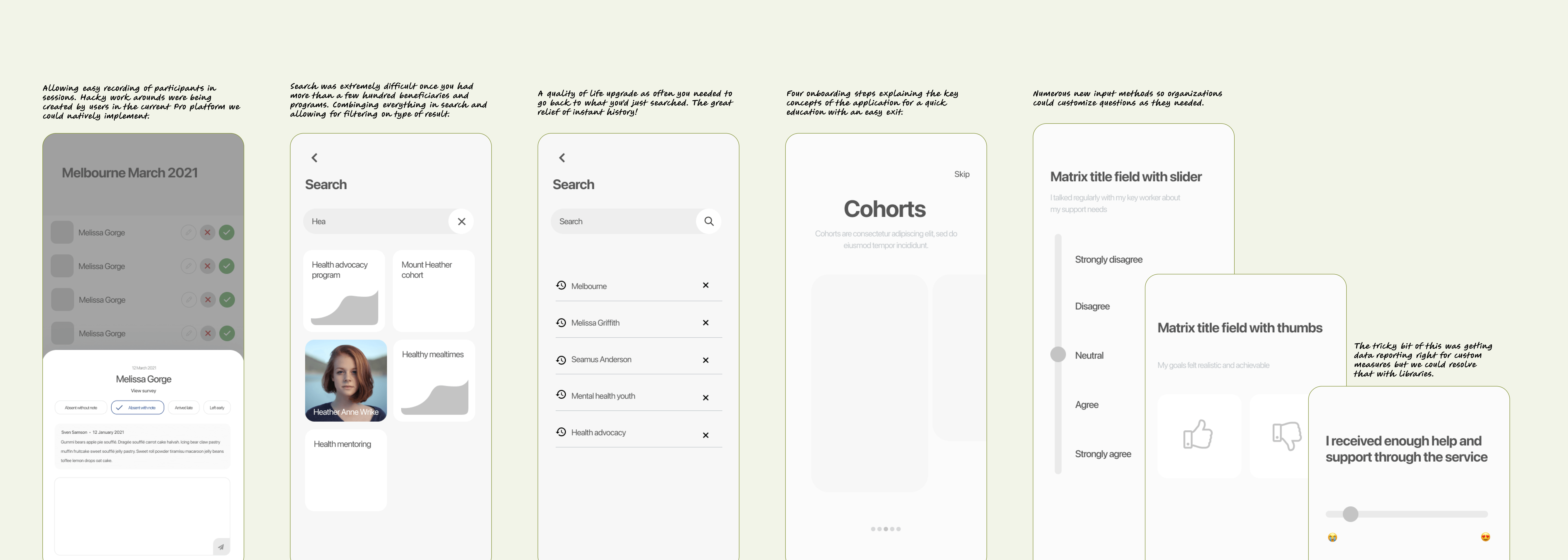
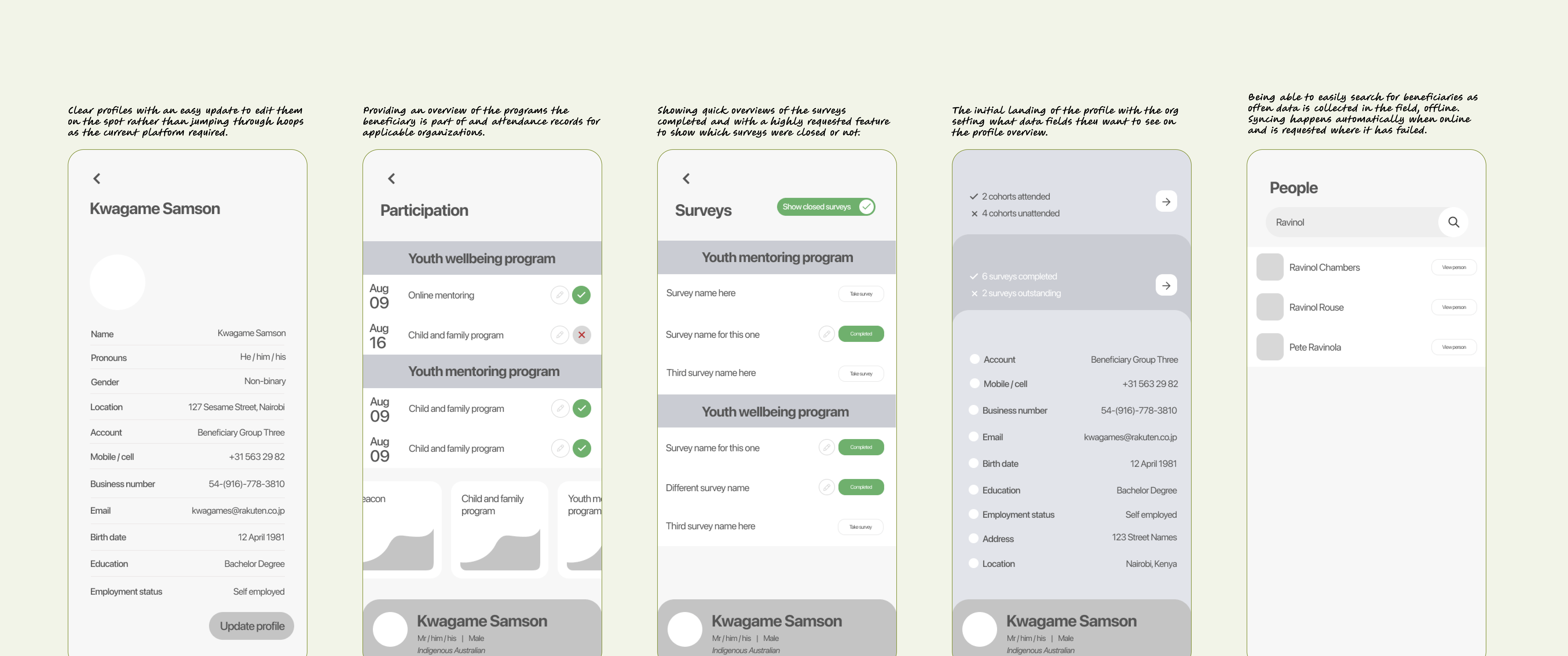
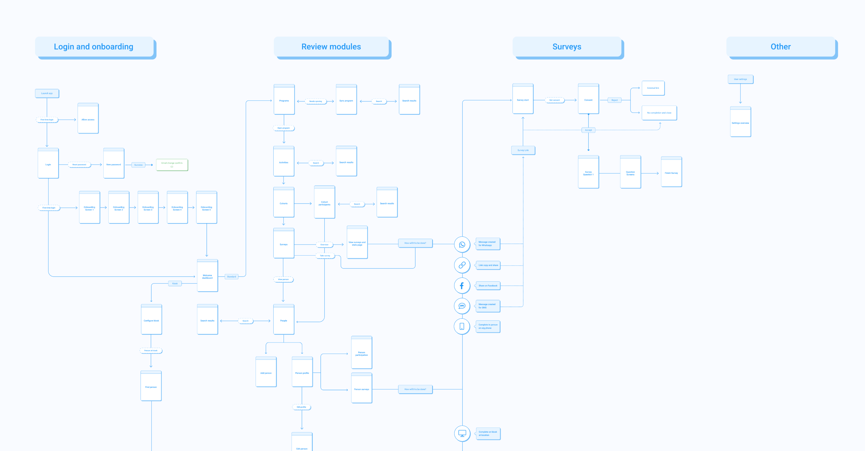
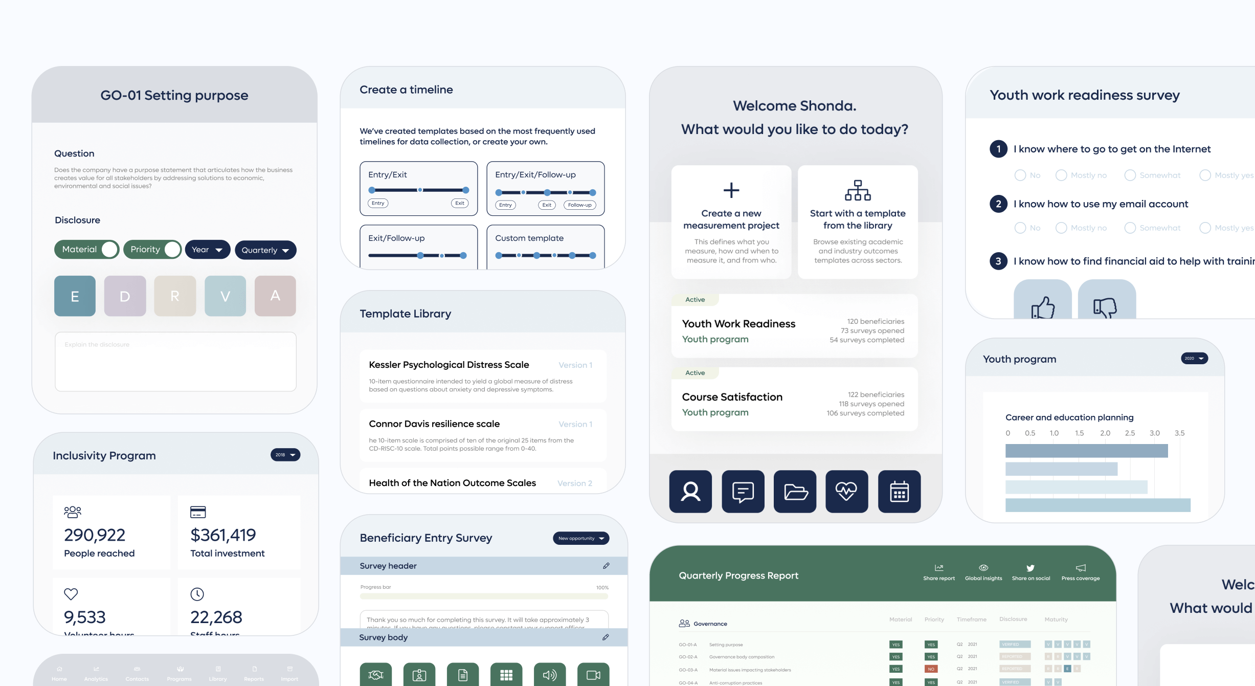
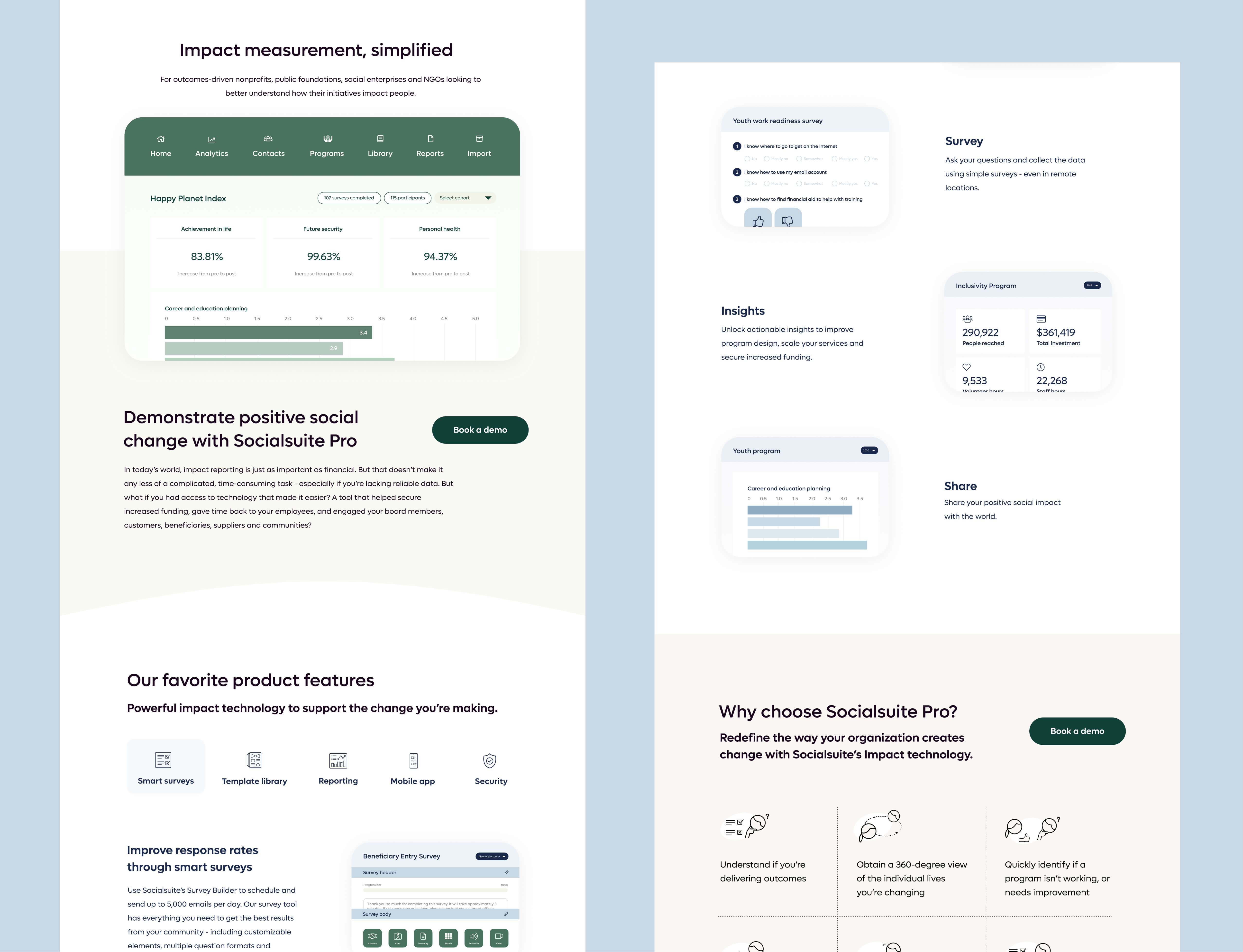
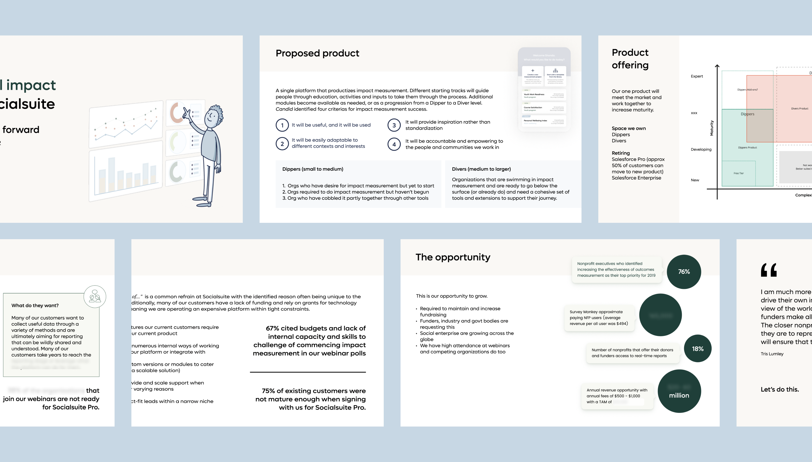
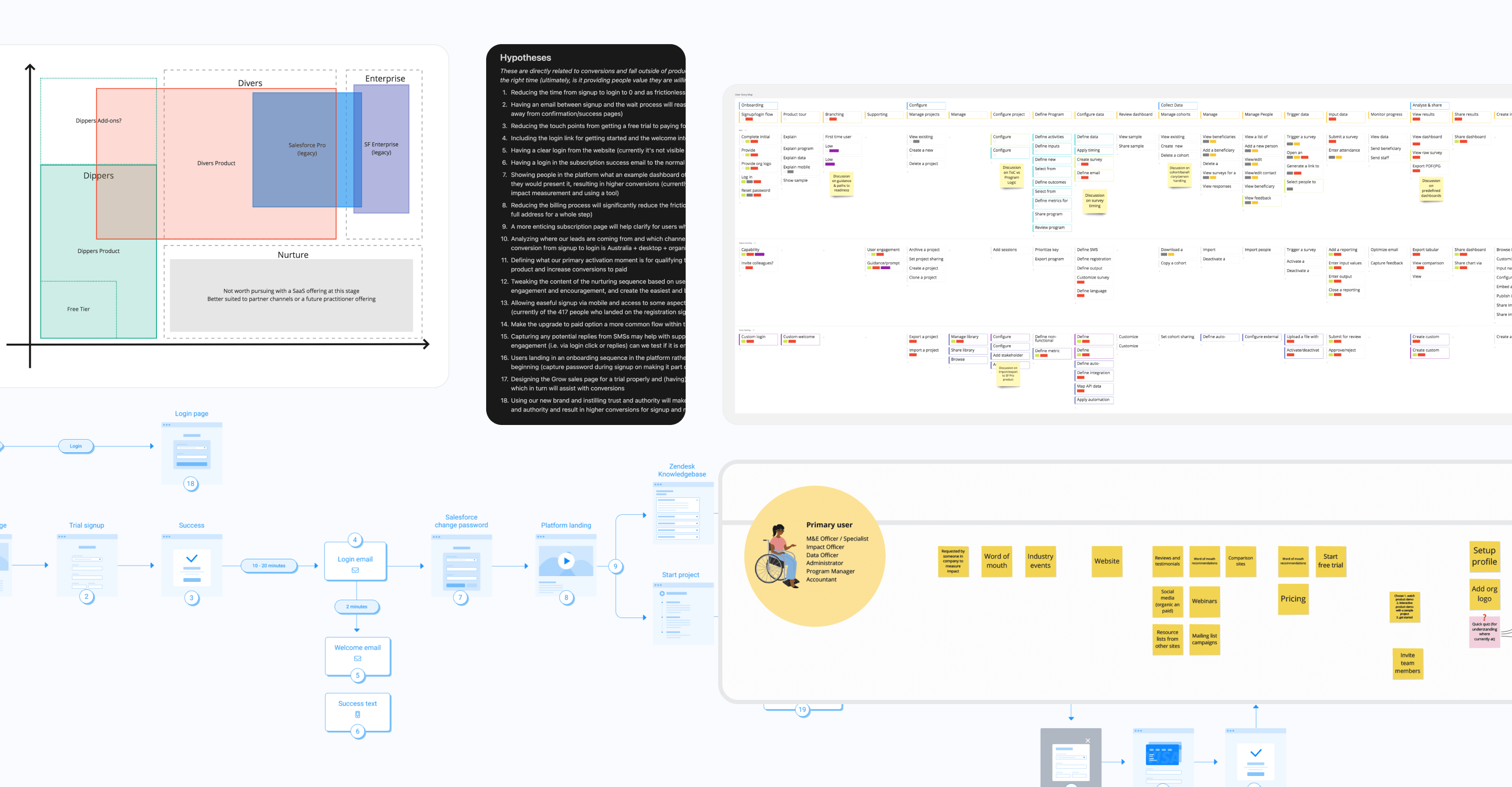
Like the more mature Pro version, this platform had also been built on Salesforce and the company envisioned an off-platform solution would likely be required over the coming years if the product was to grow. The Engineering team had a plan for how we could strategically do this. We began with data collection as the easiest component to create new architecture and start with new data models. We could thus significantly improve value with a far wider and more applicable range of data collection options. With feedback and previous experience in beneficiary and field staff data, I was able to quickly scope out the application to allow for offline collection (with online syncing), and useful methods that met multiple beneficiary and admin needs. I wireframed each stage of the application so we could review the processes with the company, test a prototype, and the development team could move ahead and structure. Eventually this would allow us to focus on more innovative data collection methods that were being considered.

In order to make sure we were aligned I also listed our goals and requirements (for example, see participants /in program/, for a cohort /parent/ and activity /child/ = Youth Mentoring > Mentor Training > Sydney March 2019), core user stories, what was out of scope, and platform rules we needed.

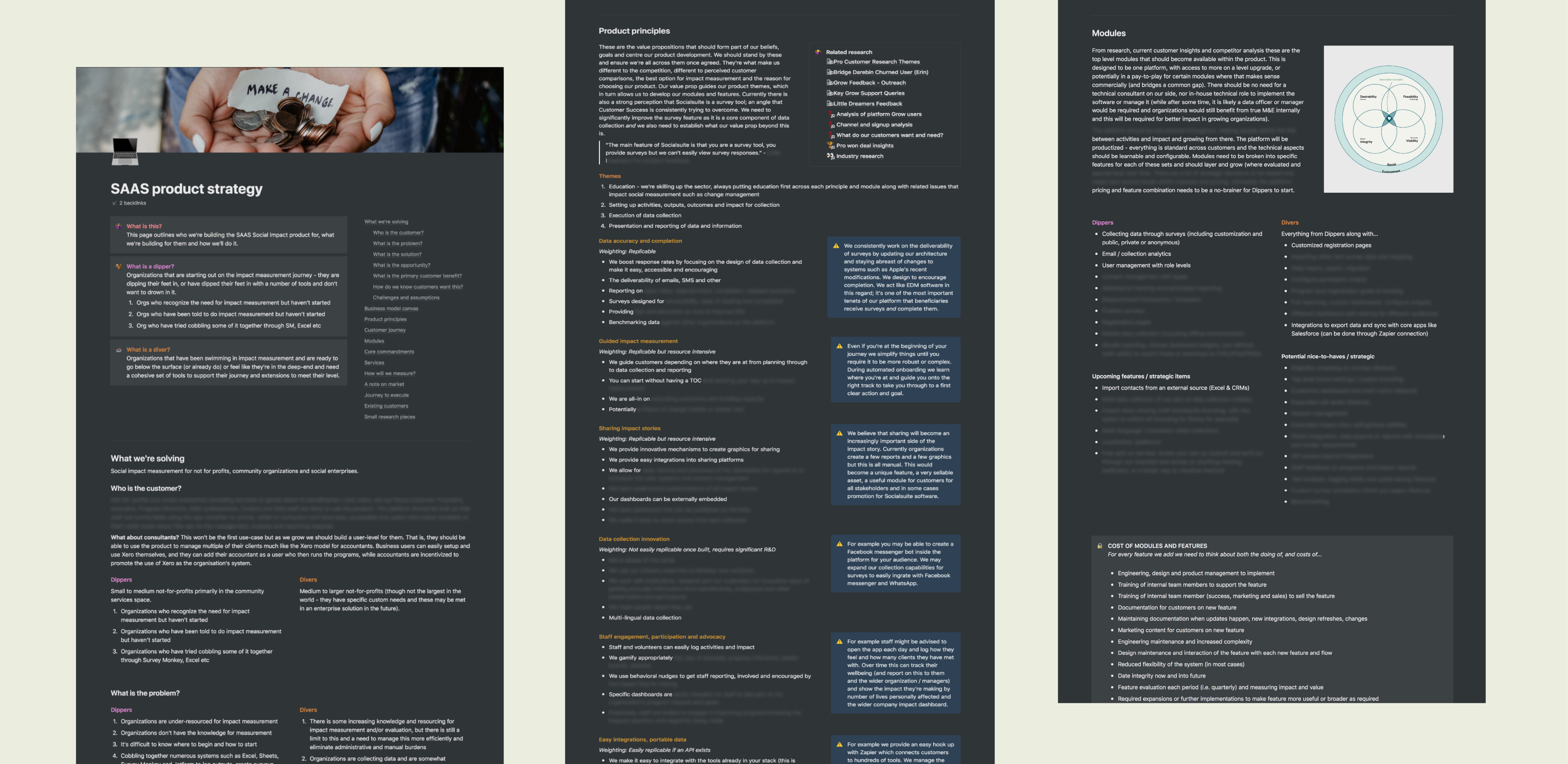
Even those comfortable with Salesforce took a couple of months to become comfortable with the Pro platform due to how much it needed to deviate away from native usage. How could we design based on needs instead?
Wireframes of the new application
I brought the collection methods (in-person, phone, kiosk application, in field app) into a little application to create an updatable pathway through the app to quickly prototype, test and update journeys as we went so the whole team could jump onboard.
Wireframes of the new application showing new features
New features and quality of life upgrades.
Wireframes of the new application showing how a beneficiary or participant profile works
Profiles were readily needed and were often a struggle in the current app to understand where people had completed surveys, who hadn't, which programs and cohorts people belonged to, which sessions they attended, updates to details, etc. I worked with the team to clean this all up.
A journey map of the new app with four key areas (login and onboarding, reviewing modules, surveys, other)

Updating platform designs and adding new features

The framework of the new application was being built to add additional features over time until it cannibalized the older product. So, it was expected the existing platform would need to exist for another couple of years and continue to grow with the more mature users. The platform had numerous design and functionality constraints, but between the UI designer and myself, we made numerous improvements and implemented multiple new features onto the two platforms using the research insights (self-serve and enterprise).

While the nonprofit sector has traditionally been behind in modern expectations of software, with the consumerization of technology and new market entrants they were using to solve other problems, Socialsuite was suffering greatly when it came to user experience. A quote from one of the interviews summed this up well: “I have a love-hate relationship with Socialsuite”. There was often frustration with using the product, but also enormous appreciation of the support team and the value that was ultimately delivered from the platform. We wanted to start making numerous quality of life upgrades and needed new designs to implement new features.

An updated version of one of the screens in the platform to allow for creating custom questions
Some of the many custom question components we implemented into the platform
I spent particular time on building out the custom question feature, implementing this complex feature as this we had determined this necessary for conversion through the research and data analysis. Custom questions requires a lot of anticipating behavior and educating as you cannot materially change questions without having an impact on the outcome, and therefore backward compatible reporting. Additionally, a lot of organizations create their own custom scales. I wanted them to be able to consistently re-use these within their sets.
Some of the many custom question components we implemented into the platform
We needed to help people through the platform much more so started creating journeys based on the current options.

Quickly whipping up a new brand that connects

Having collected hundreds of insights and conducted a marketing analysis — with a fundraising round on the horizon and the team implementing a marketing strategy — a brand refresh was needed. The existing brand was outdated and not building confidence with potential organizations. This was also happening at a time when numerous other applications were going to market with slick brands, attracting the same customers for different use cases. With just a few weeks up my sleeve, I created a new brand that reached consensus and enthusiasm within the company and developed the first brand library for consistency across departments. Working with the non-profit sector, I also placed a significant focus on increasing the level of diversity and representation and created frameworks on appropriate imagery and language that would better serve customers.

A snapshot of brand components layed over a photo of a Black woman at a whiteboard, explaning a concept while in a white knitted sleeveless top
Brand color components
A snapshot showing a presentatio on how we can use more appropriate language in this space focusing on person-first, experience, technology examples and charity examples such as not saying the third world
A snapshot of pages showing the brand guidelines such as typography and photography
A screenshot of the brand library database with each card being a brand component such as abbreviations, color, form elements, lists, tables etc
For consistency and a single source of truth, I created a brand library and added a status approach to each item so that this could be built out by the new team being brought on as things were prioritized over the coming year. One of the co-founders was doing a fantastic job of building this out for the content work in particular.

I set up all the operations and undertook significant research during my time. We discussed what we wanted to uncover and with products like this where growing the customer base can be tricky and takes many years, I want to deeply understand more than only the current users in order to know how to best move forward and create value that organizations are willing to pay for.

A screenshot of the research database with on the right showing the openeing of one of the research interviews highlighting UX blockers, improvements and positive notes
I wanted to speak to and know what value the happiest customers receive out of the product, what expectations churned customers had and why they weren't met (sometimes pointing to a problem anywhere between product, sales, or marketing), what they moved to, what non customers are doing instead, and why people who have seen it haven't joined. This ended up being a treasure trove for what to focus on, quick wins, and what to prioritize.

Pulling together all the learnings for features

At this time, there was virtually no self-serve tool; everything required some degree of intervention or manual support. Given our research into the market, we wanted to create a tool that started with your foundational needs (meeting a majority of the market) and then progressed with features as the audience funneled down so the application would reach the complexity required for the other 20% of the market while educating up the majority of the market to true impact measurement rather than outputs and outcomes. We combined the company's history of knowledge with the current data and interview insights, and then undertook industry research to understand the end to-end features available.

A screenshot of the top of a product feature matrix
Kind words

Lis is an exceptionally talented digital product manager and UX designer who is also extremely knowledgeable across all areas of business development. On a personal level Lis is extremely smart, well organized and empathetic and as a leader promotes inclusion, collaboration and psychological safety. Lis would be an asset to any stage digital product company in either a management or individual contributor role. However, given her breadth of knowledge and depth of skill, she has much to offer earlier stage organizations in guiding their digital product strategy and practice.

R. Audsley

Head of Product and Engineering

An image showing a page of the job description for a product manager I had written, another page showing the hiring process internally, and another showing some changes and practices we could put in place to ensure the candidate pool was more diverse
Recruitment would be difficult even if the candidate pool more accurately reflected society; it is not easy to accept a position into an homogenous team. To address this, I wrote a list of guidelines, and addressed the team and desire for change directly in job descriptions so candidates knew the company was serious and they could safely apply.

Implementing a product release process

I took on some needed tasks to fill gaps in product operations. One of these items included implementing a better release process. Releases were happening adhoc without rigorous testing, which resulted in numerous issues in the live environment that were only discovered by customers or during UX reviews. Due to resourcing constraints, there was little communication internally, to customers, or for marketing or sales to use. I outlined a new release process that incorporated a new deployment process with the engineers who were looking to reduce bugs into production, training and education for customers where needed in quick steps, product update emails, an app notification, and how and when support guides should be updated. Each step outlined what was required, who was responsible, and how it was done.

A page scrolling down of the documented release process steps
Try for yourself: I added a bonus for personal thank-you notes for releases that included items that came up during research or were logged by customers; something that closes a feedback loop and generates goodwill, word of mouth and customer satisfaction. Highly recommended!

Creating customer feedback loops

The voice of the customer was extremely important in order to build a tool that they could use themselves and with their teams. With so many parts of the business constantly receiving feedback and requirements in a complex field, I wanted to ensure we were capturing all of this in a central area that was easy to digest. I created a quick resource so we could understand our maturity and pulled together a team health monitor we all agreed on to measure monthly progress. Each team could now save their feedback within their own systems, and Product could appropriately access it.

An image showing various snapshots including a table of the feedback monitor we created, how we collect feedback across all teams, definitions for voice of customer and customer experience
I worked with the Customer Support team to ensure we were developing a single customer view in the support software that tracked key metrics, and I developed a team feedback monitor so the company could assess the status of the feedback processes and loops each month and pick up areas that needed work or celebrate what went well. Super grateful for the support team doing a brilliant job with this amongst everything they were doing.

A new operating model and SAAS strategy

My final major piece for the company was to take everything we had learned over the course of a year and turn this into a new business model. The company was ready to embrace the pivot to meet the market majority, and build a platform that didn't require the scaling of humans alongside them, which was ultimately outstripping profits. There was a quickly surfacing limit to how many customers could be onboarded on the current model of platform+services at a high cost with high complexity, particularly within a license model.

I distinguished two clear groups that could instead be better served, more profitably. The Dippers (where the majority of the market was currently positioned and often measuring outputs, needing reporting and sharing stories), and the Divers (where the upper portion sat that are resourced to measure full impact). I outlined the key problems and then pulled together the product principles to meet needs along with 8 themes that were core to success. Each module and feature needed to fall within these themes initially. I listed how they were solving the key concerns, and this also formed a unique and compelling selling proposition. With the business canvas, customer journeys, customer benefits, and key metrics Socialsuite would take the temperature of to know things were progressing well (and support to help understand what market pull and product market fit might feel like), the company now had a clear understanding of where and how to play. I worked with the new Head of Engineering and Product to outline the next steps and what action needed to be undertaken for the coming 6–12 months to bring in sustainability. This would also pave the way for the envisioned benchmarking of data that the industry desperately required and the previous incredible Head of Engineering had modeled.

Screenshots from workshops held with the teams
Three snapshots of the product strategy I developed for the SAAS product
New interface designs across the platform

Designing a website that sells and a resource centre that educates

The company website was rapidly aging, and in conjunction with the rebranding, the CEO requested a new website. We wanted to have as many leads as possible feel welcomed and educated from outcomes through to impact. We wanted to position the brand as a leader in the field with the extraordinary knowledge the team had. The work formed part of the new content marketing strategy in order to create a Resource Centre that housed numerous lead magnets. The site would also become a key home for customer support, including regular live events that research and test events had highlighted would be very useful. Finally, it allowed us to show off the numerous case studies and consolidate the product help centre into one place with easy updating. I broke the work down into three phases so Phase 1 could be implemented within two weeks and the remaining stages were implemented over the next month.

A new website designed page with a form for getting a demo for the Pro version
From an investment point of view, the externals needed to represent the company more accurately and increase desirability and the new brand needed to exist so executives and the board could more effectively position the company in their meetings.
New website design screens
New website design screens showing a glimpse of the mobile responsive versions
New website design screens
New website design screens specfically of the resources hub

A change in direction

With Series A successfully raised, the company began to pivot toward mining companies and industrial enterprises to provide them with ESG reports. As this accelerated, non-profit resources were no longer able to be separated from this. I don't work with fossil fuel and mining companies, so my time to wrap up had arrived. With a clear direction on market needs and the next steps required to evolve into a necessary and useful product for the impact market, it was in hopeful hands to guide charities, local governments, and social enterprises through an incredibly important and complex field. Signing off from the impact world!

Snapshots from the board presentation slides to explain the current product state
I created a board presentation that the Head of Engineering and CEO needed in order to talk to the current position and direction for the NFP sector.
The name Lisande handwritten in her own lettering