Physical product design, manufacturing and eCommerce
Teaching kids environmentalism and social justice through facts, stories, and design. Plus puzzles for tweens and adults.
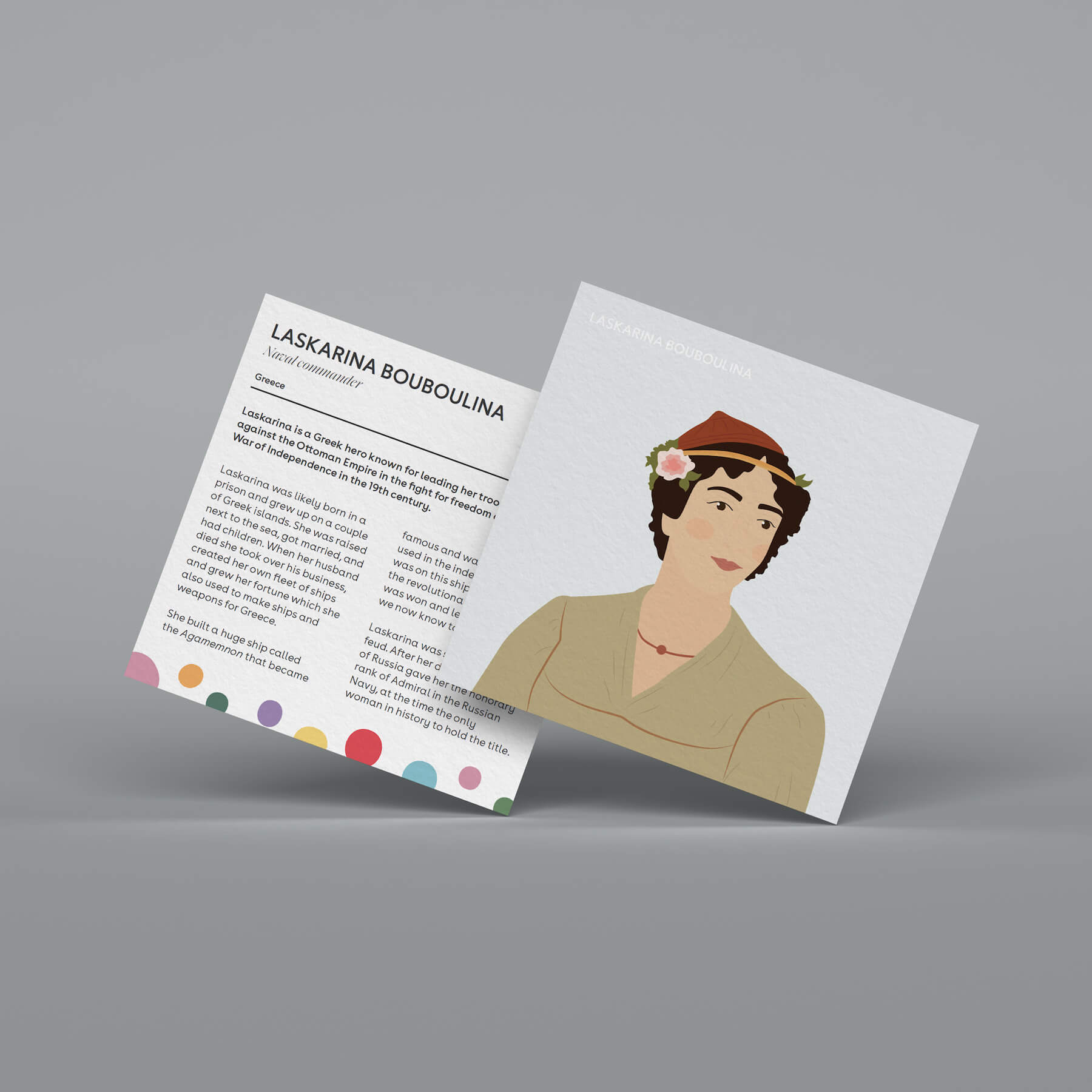
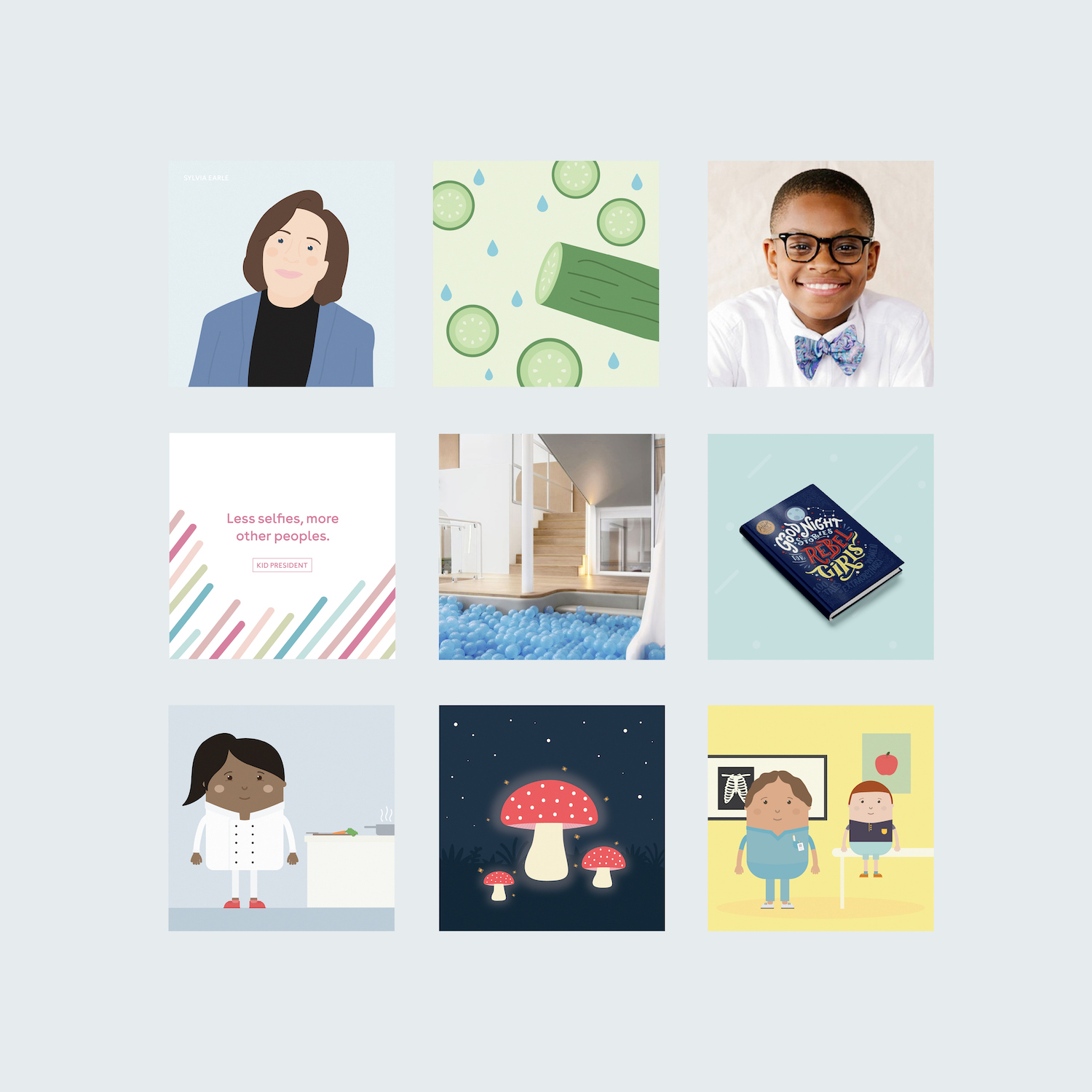
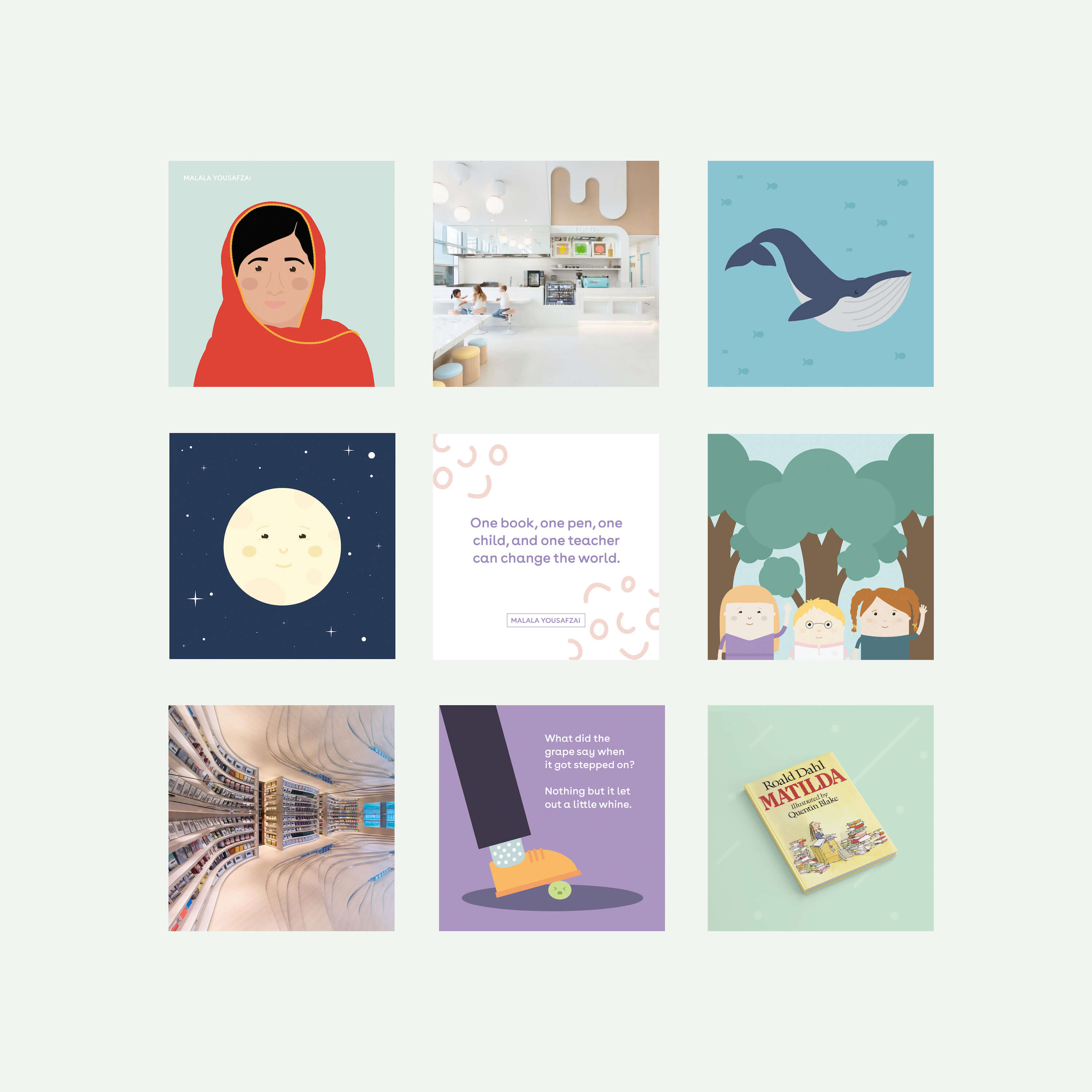
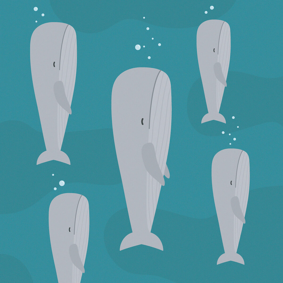
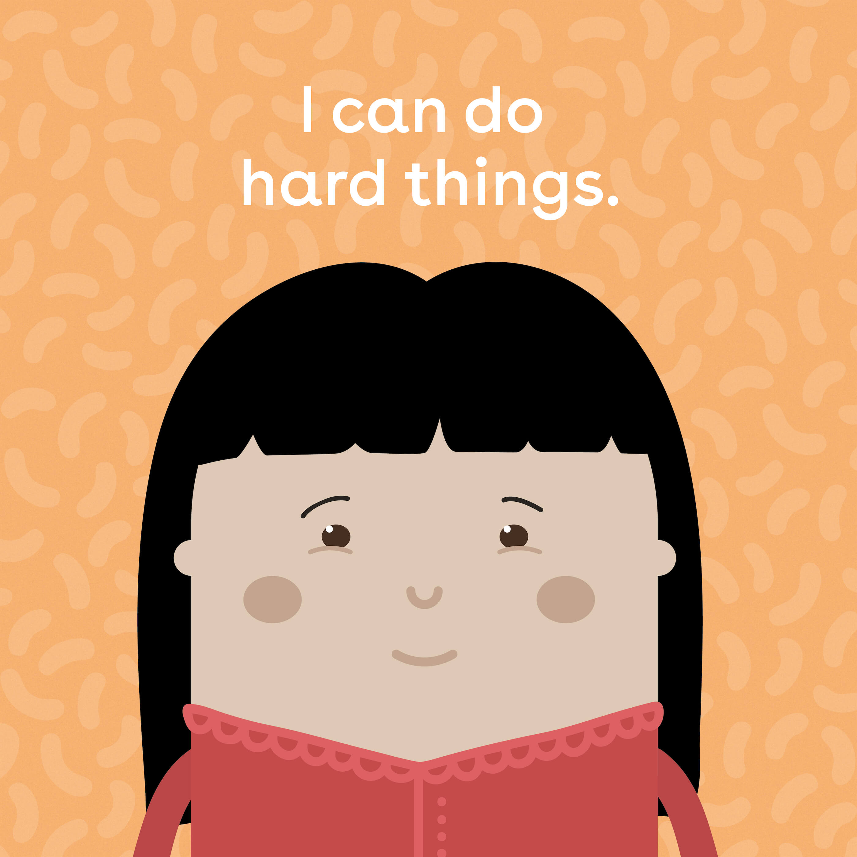
I wanted to use communication design and storytelling to elevate topics to create a more hopeful, diverse, and just world for children. I wanted to showcase women we should know that our school books didn't feature. I wanted kids to be engaged with the natural world by experiencing awe and learning facts. And I wanted to strongly push back against the stereotypes children grow up with, in order to change who we are as adults. Skwoodle (a mix of school, squiggles and doodling) was born!
2018 to 2021
The business
A social enterprise I setup with sustainability and transparency, where profits were used to support work with families in Cambodia.
Challenges
Ethically manufacturing and selling goods during a pandemic, and making sure everything was as sustainable as possible within our economic system. Hundreds of hours in Illustrator.
Audience
Any form of parent or caregiver, relatives, schools and educators, professionals who work with children, and anyone who cares about the world we're shaping.
The big idea
The biggest part of this enterprise was learning through beautiful and accessible design. The products were for schools and adults to purchase, but the content was designed to engage children. We were careful to design in a way that was inclusive and embraced kids and adults no matter whether they were biological parents, foster parents, step-parents, grandparents, teachers, aunties & uncles, friends, caregivers, or professionals.
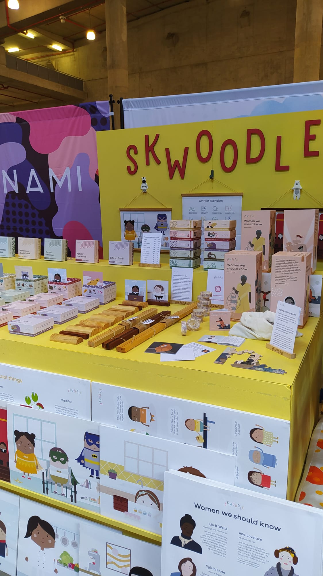
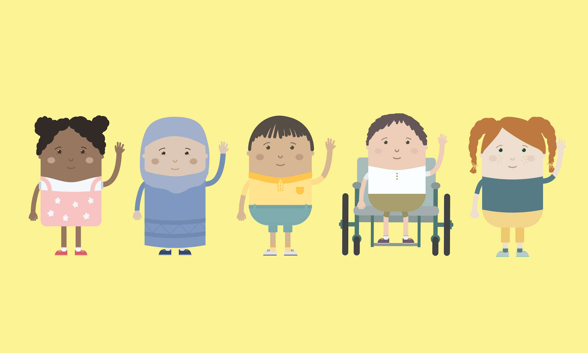
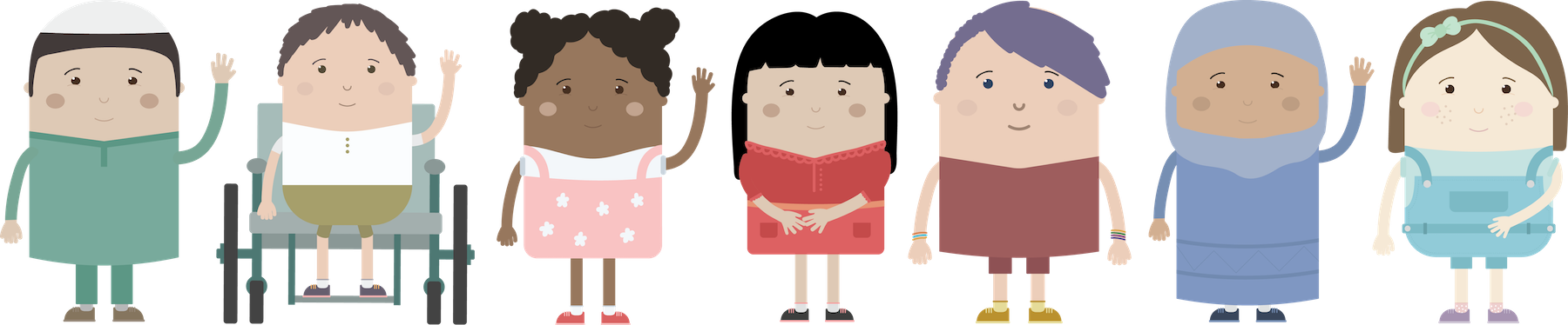
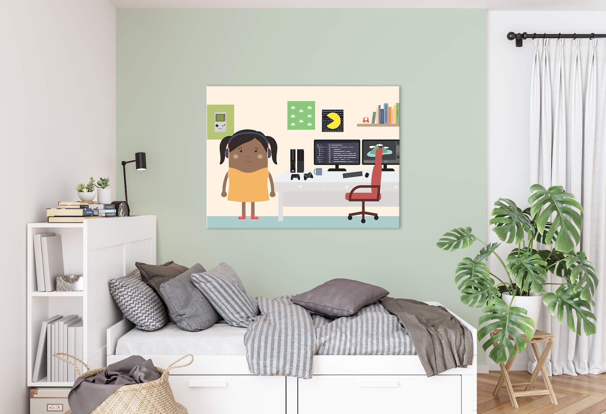
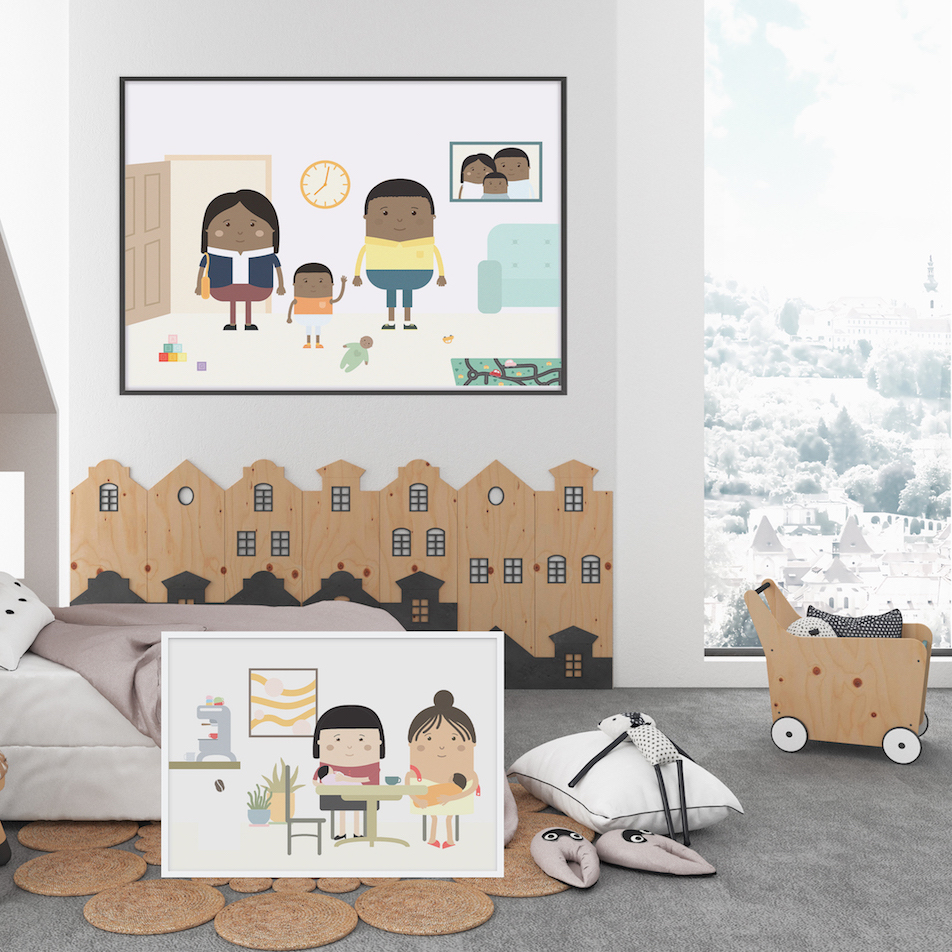
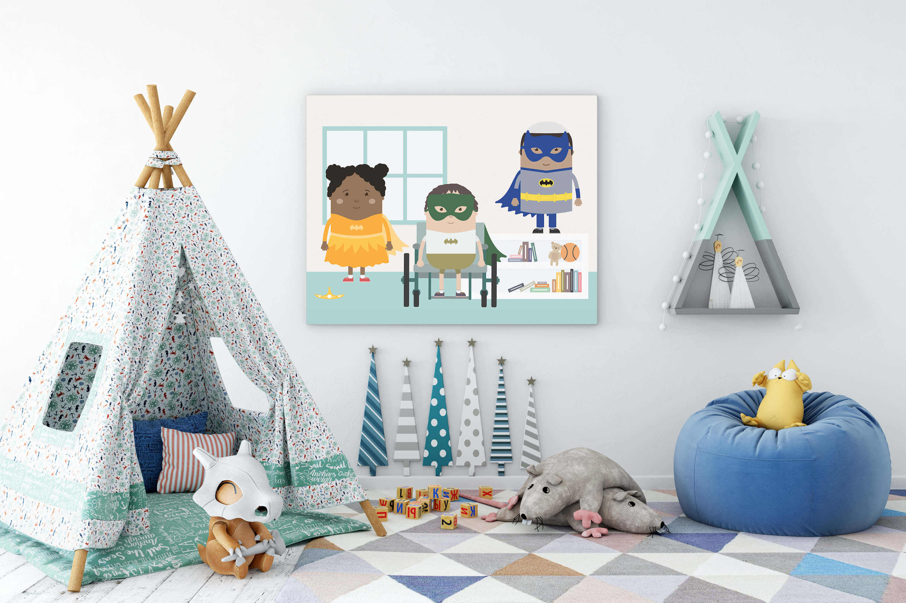
Developing a truly inclusive brand
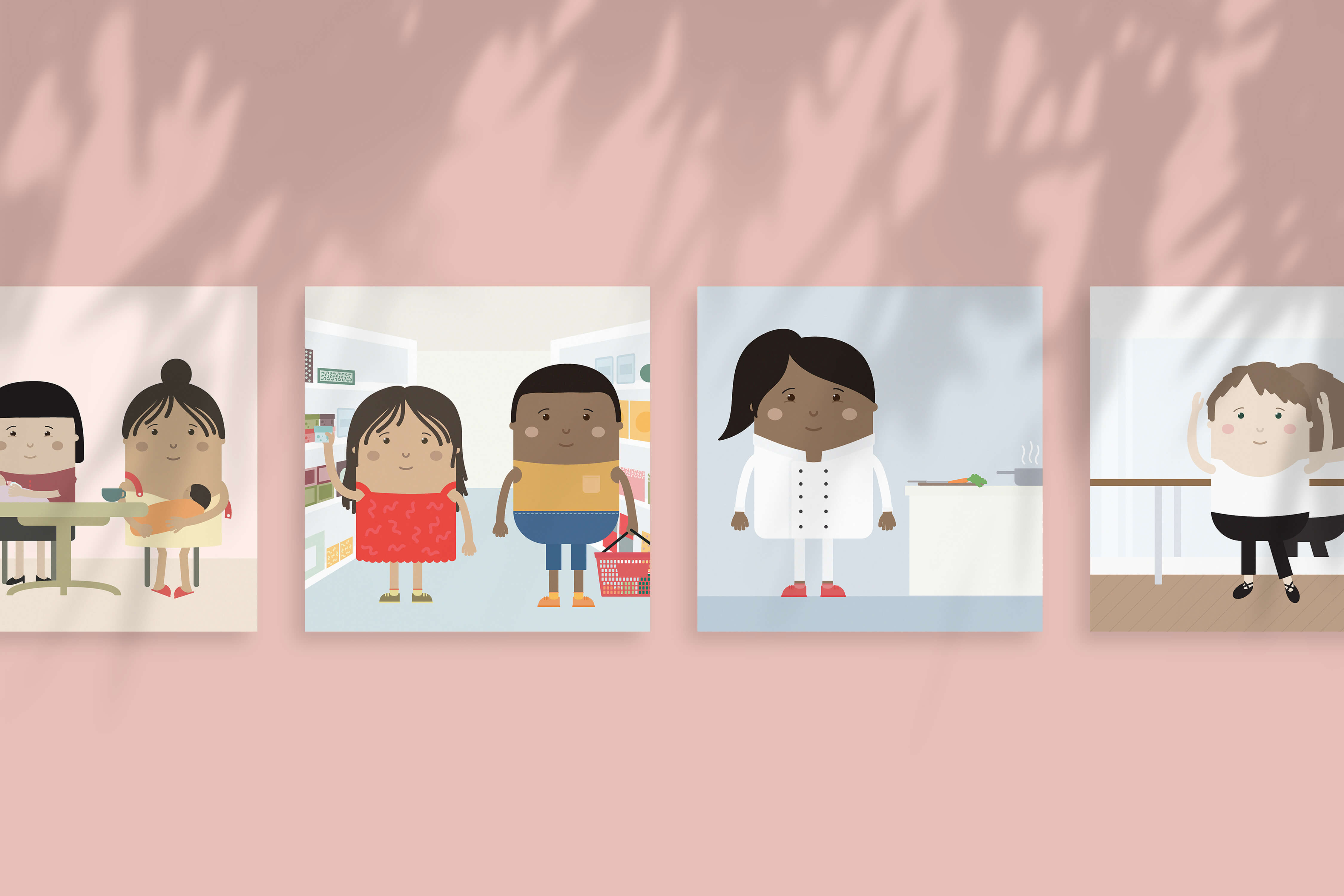
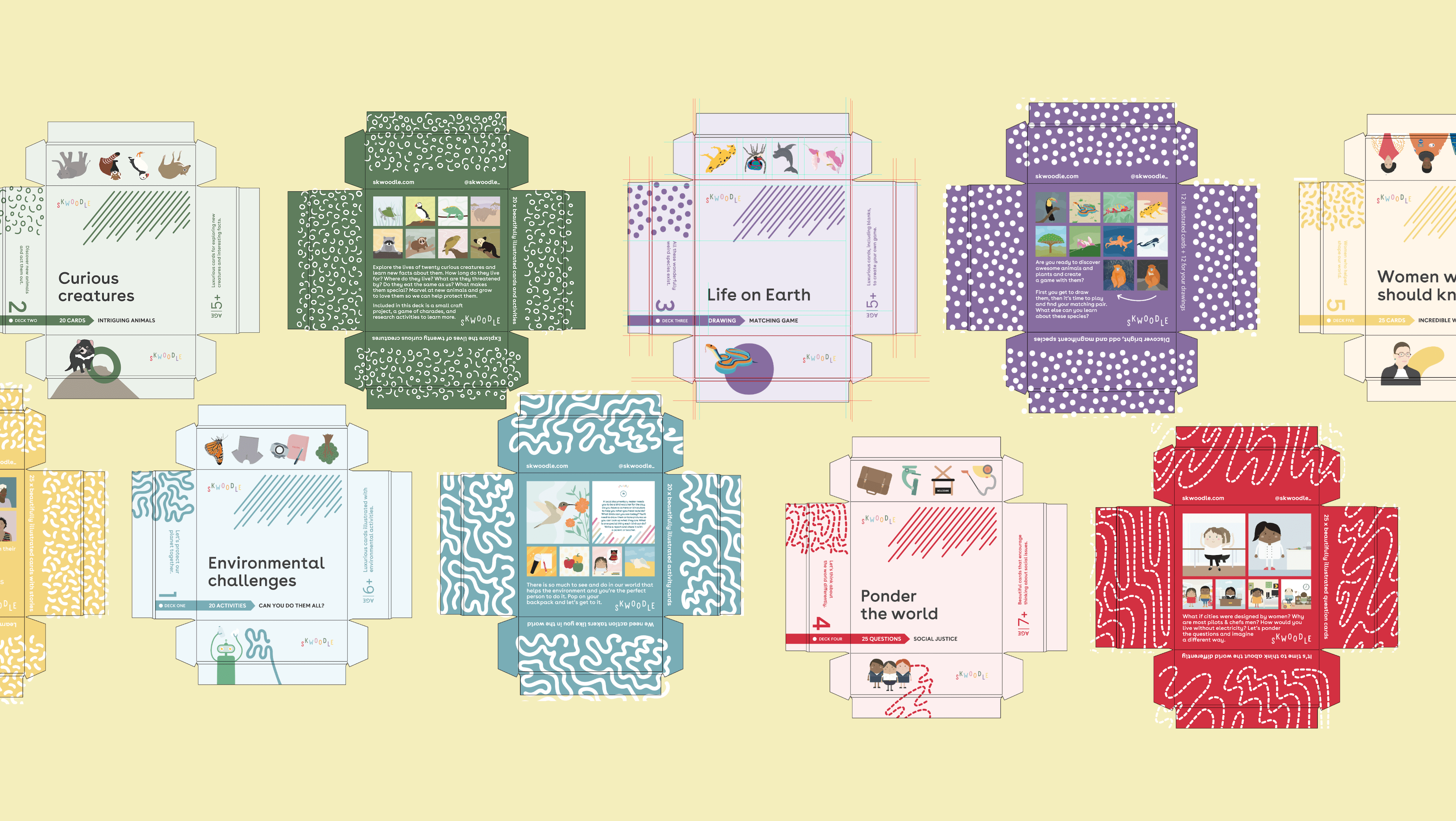
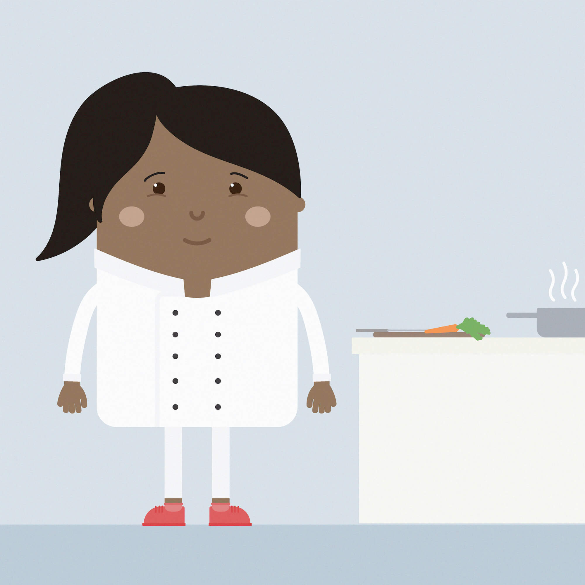
I wanted to create a fun brand that was easy to engage with and that both kids and the adults in their lives could enjoy. We designed out a range of characters - our Skwoodle family - that we could use across the brand and products in various scenarios and positions. I worked on the colors while our illustrator worked on patterns so we could tie this across all the online and offline elements of the brand.
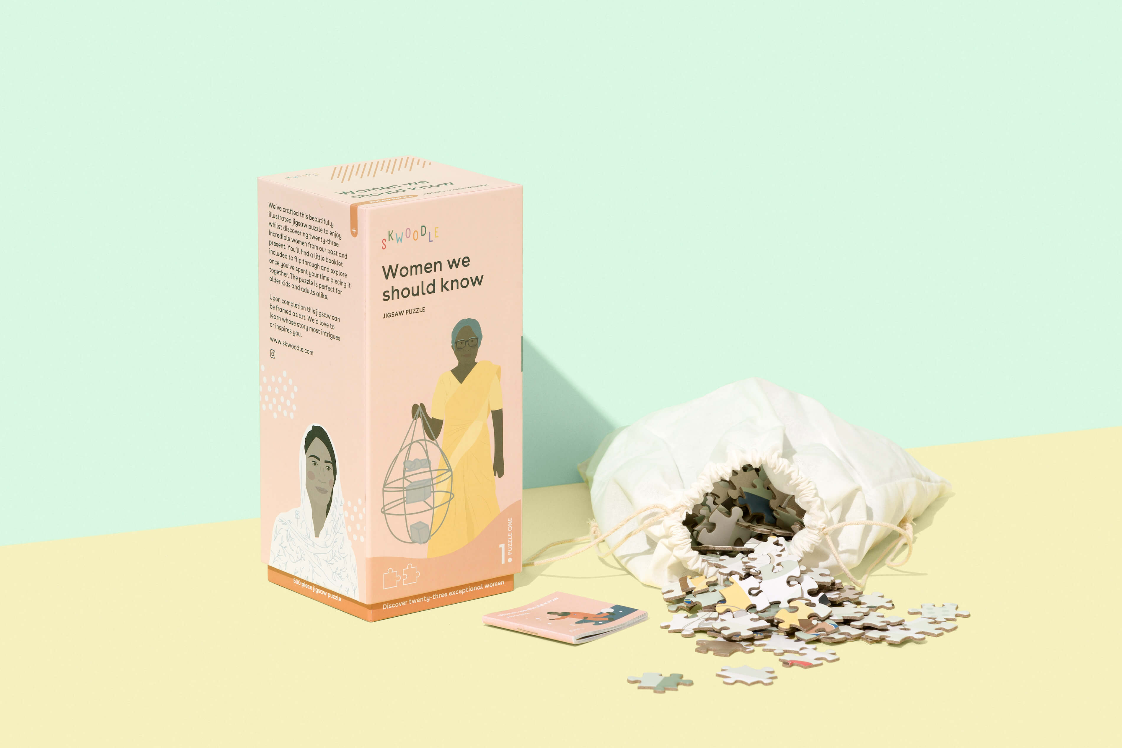
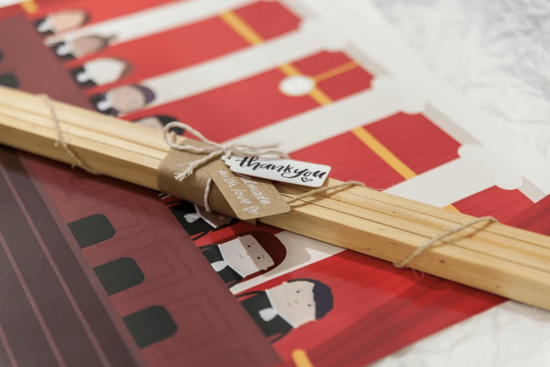
Designing and manufacturing a puzzle
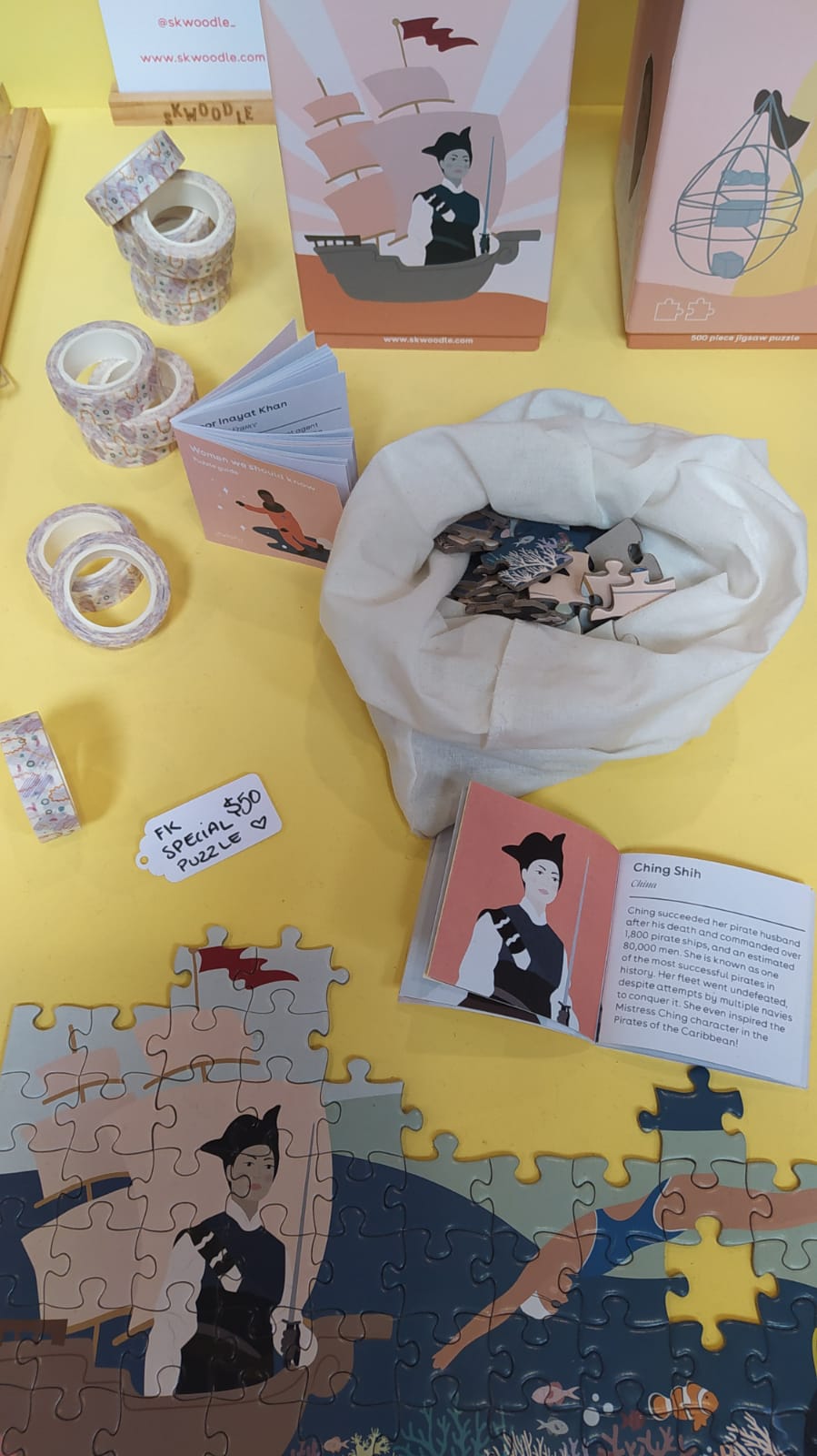
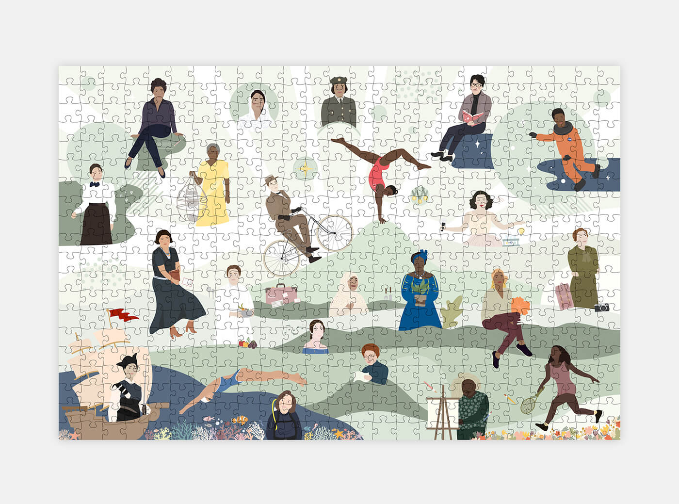
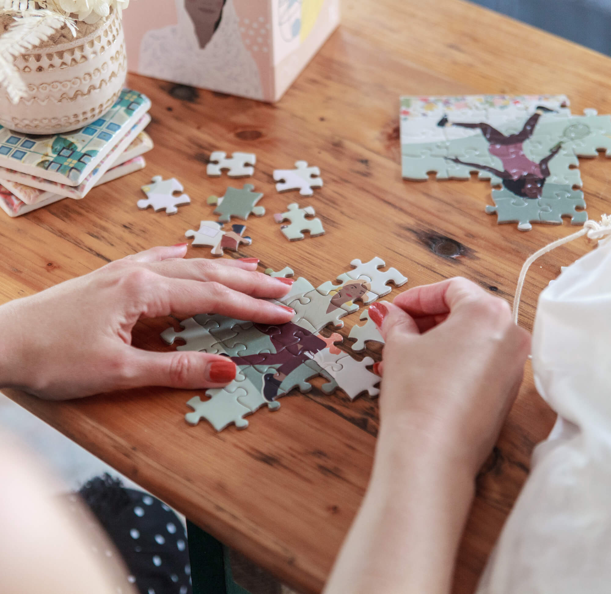
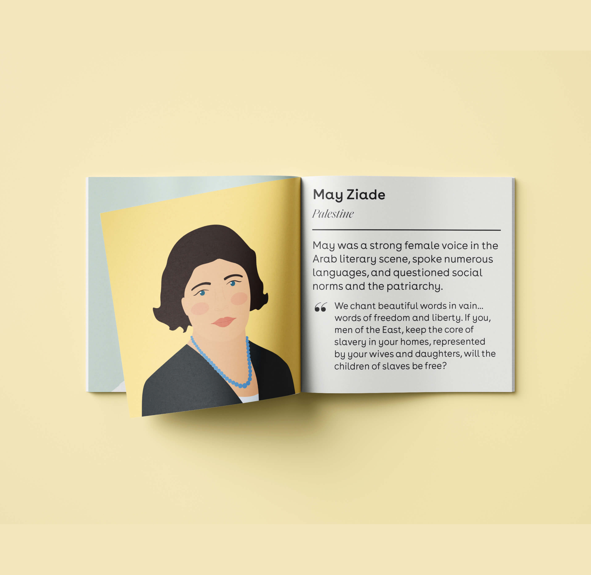
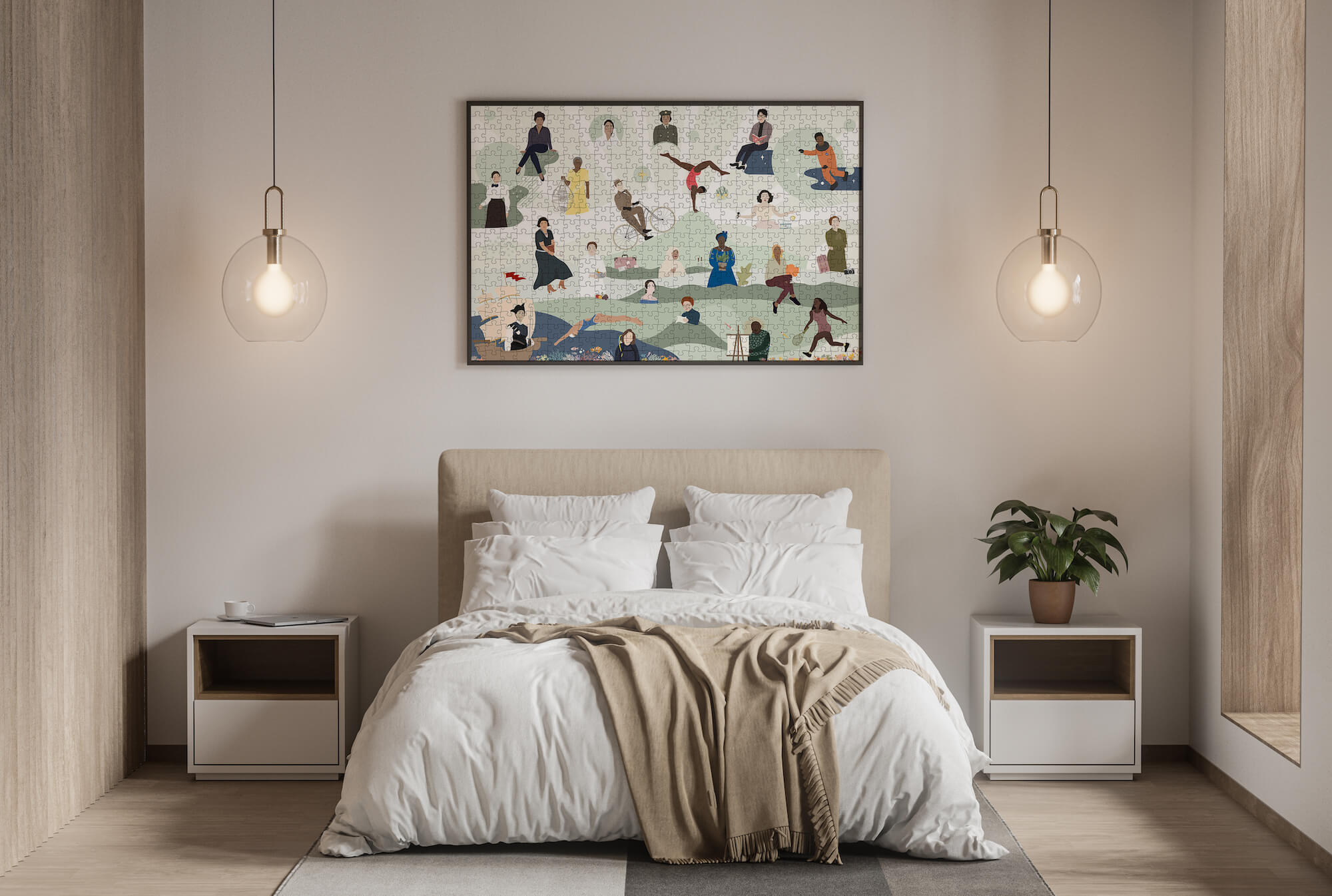
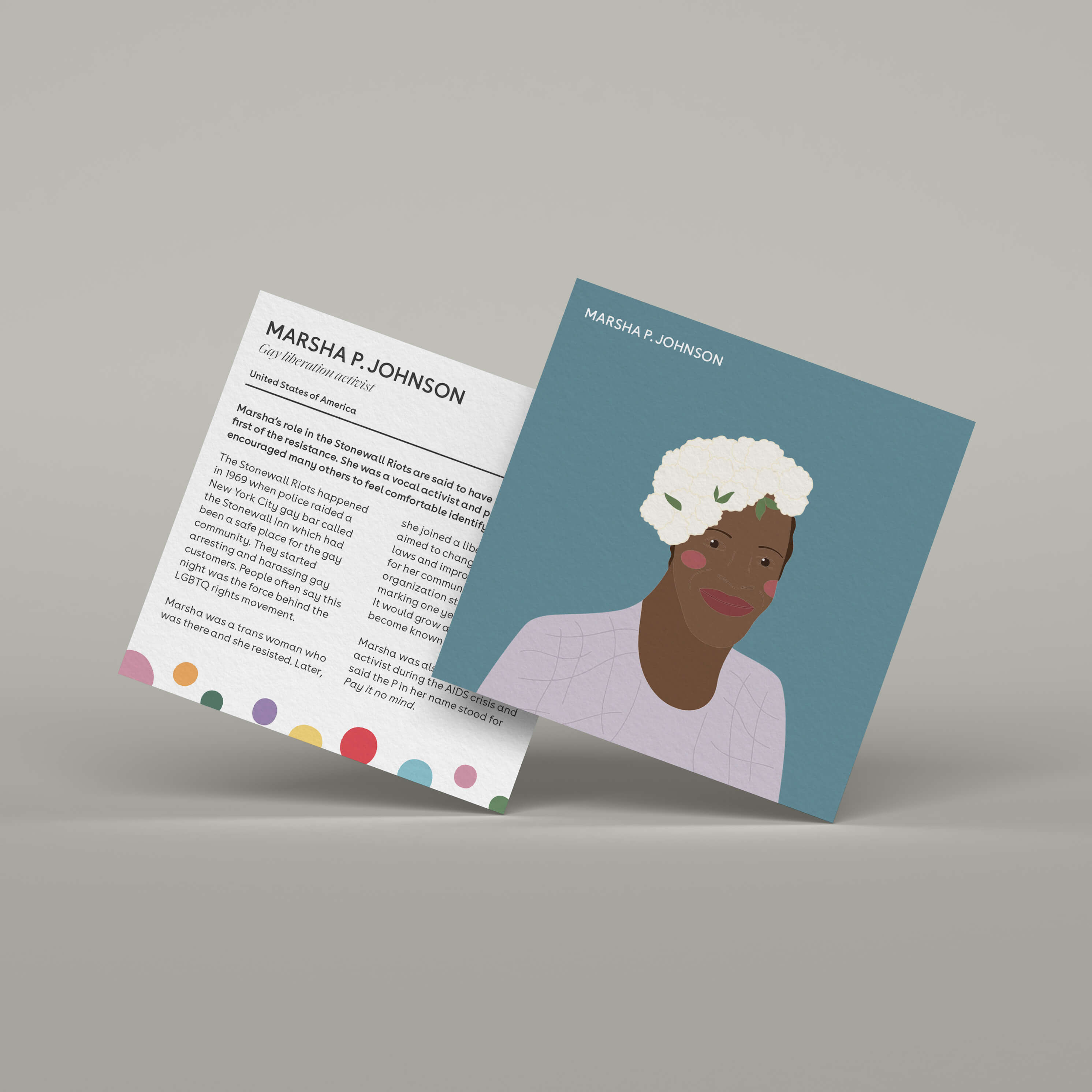
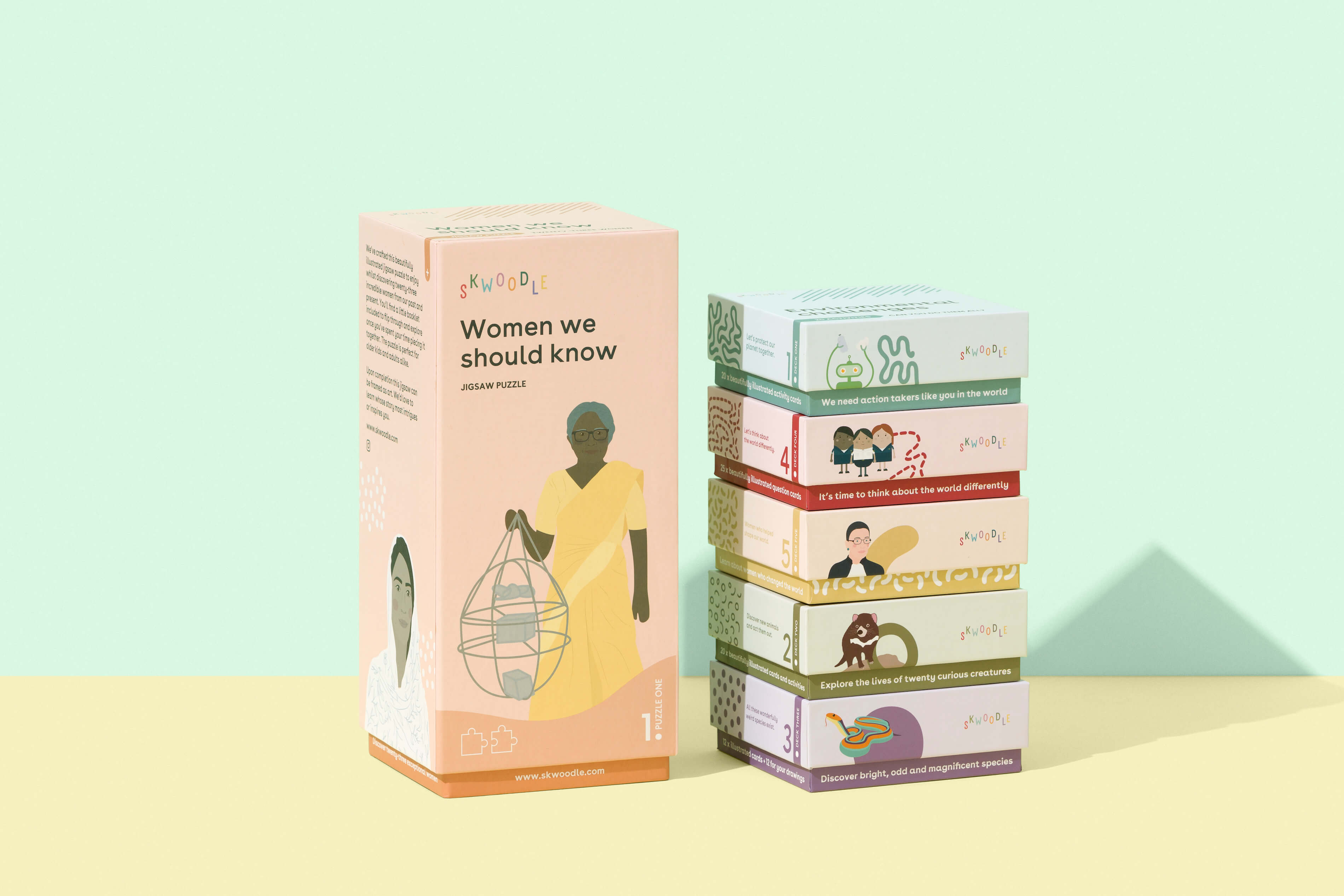
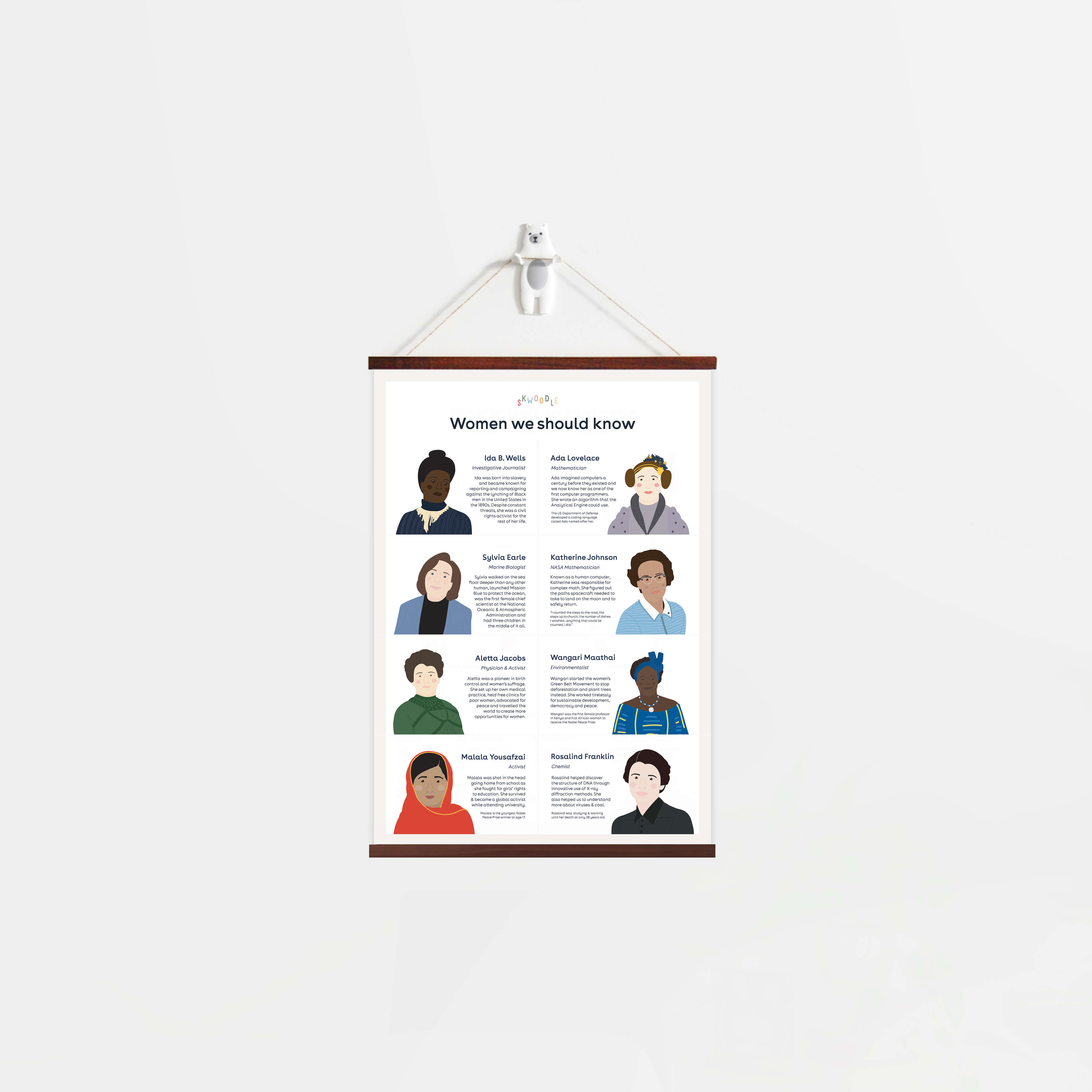
I had started a #womenweshouldknow series that was resonating well with our online audience, and sketched out a range of related products. We had already been crafting stories about hundreds of women and our designer had been drawing up wonderful portraits. The first product off the ranks for this concept was a puzzle - something that could easily draw in the teenagers and adults too. The designer and I split up the work and created half each to make this puzzle illustration, and I spent the following weeks finessing each detail. Something that's hard to avoid when going to print as it's permanent.
Endlessly prototyping dimensions and feel
I scouted every possible local manufacturer (ultimately no local capability existed) and then turned overseas for a woman-run manufacturing enterprise that understood our vision and could ship our puzzles. We used recycled cardboard for the puzzle, and replaced the plastic bag with a 100% cotton bag. I dedicated several months to the design of the puzzle box, opting for a long rectangular shape as opposed to the industry-standard shallow landscape boxes or cylindrical designs. The dimensions of the boxes were aligned with the upcoming product deck range to ensure they fit together and stack, allowing the items to stand out whether displayed at home, in a classroom, or on retail shelves. Additionally, I designed accompanying booklets for each puzzle, which featured short histories on each woman.
Try for yourself: Always, always print your packaging, play with it, adjust, print again, refine, and repeat as needed until you finalize (make sure all your files are in CMYK and you're printing with decent ink and coverage when checking colors).
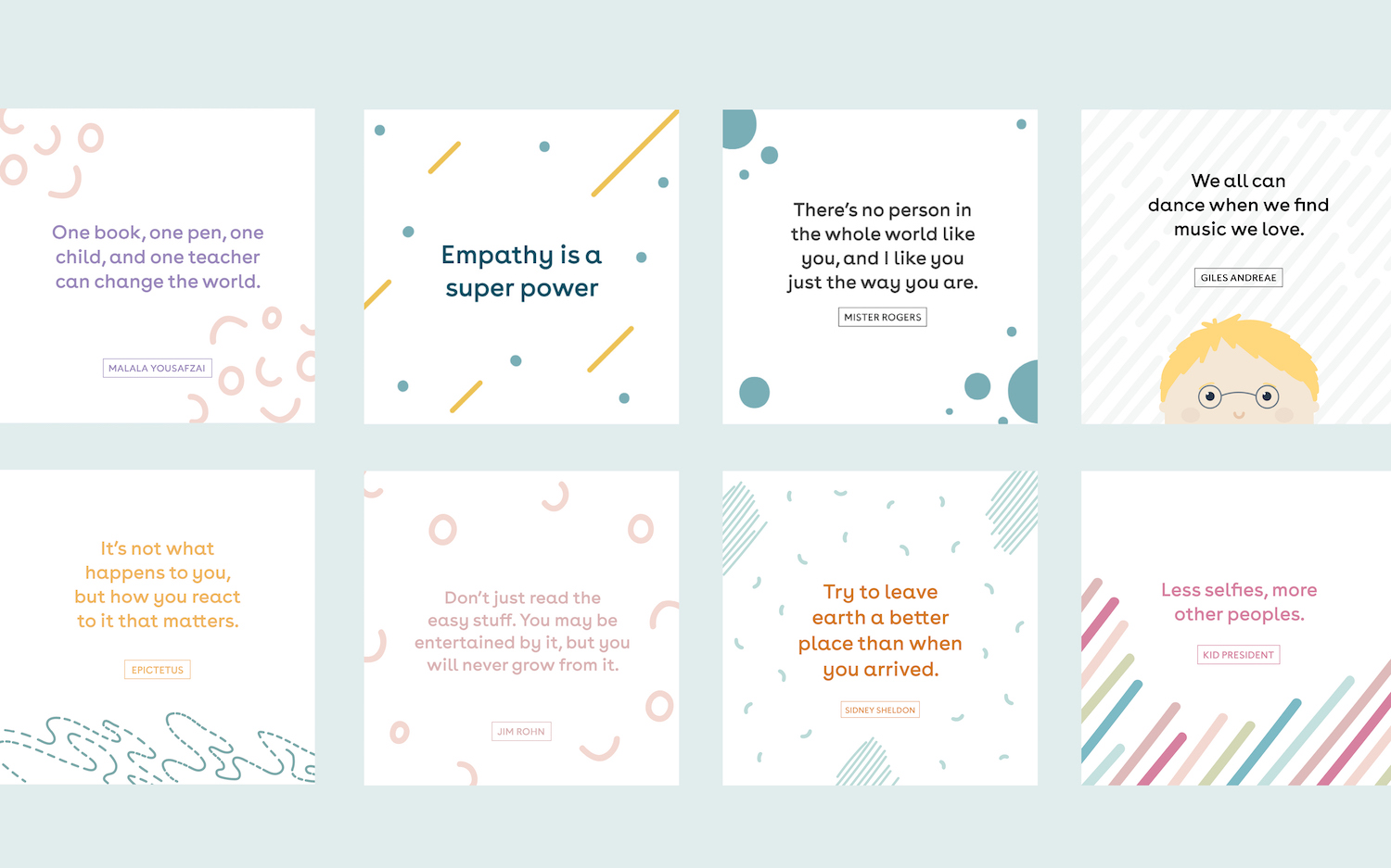
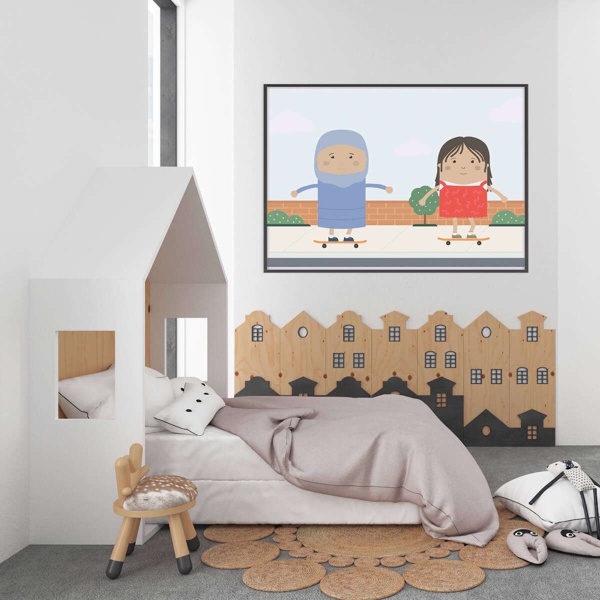
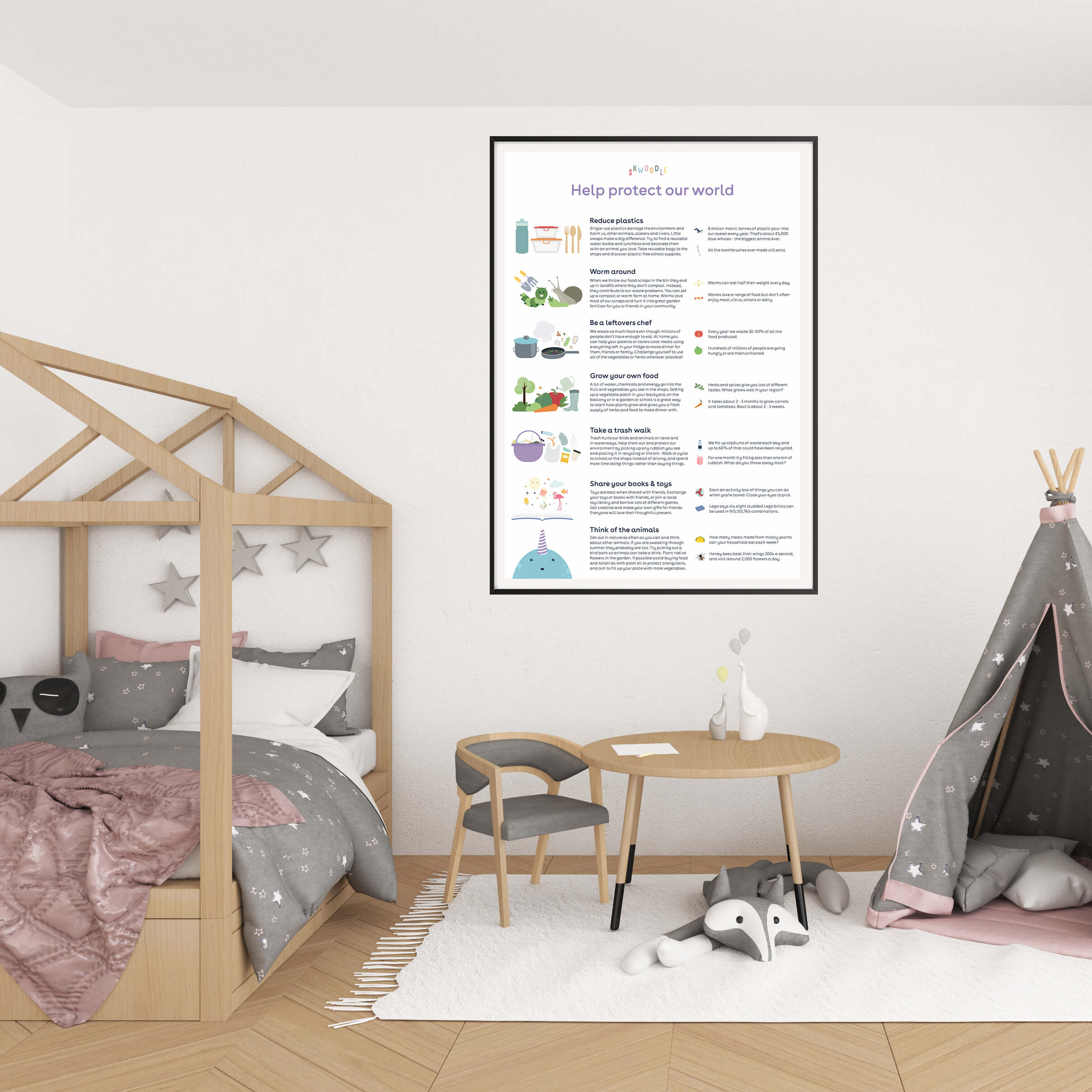
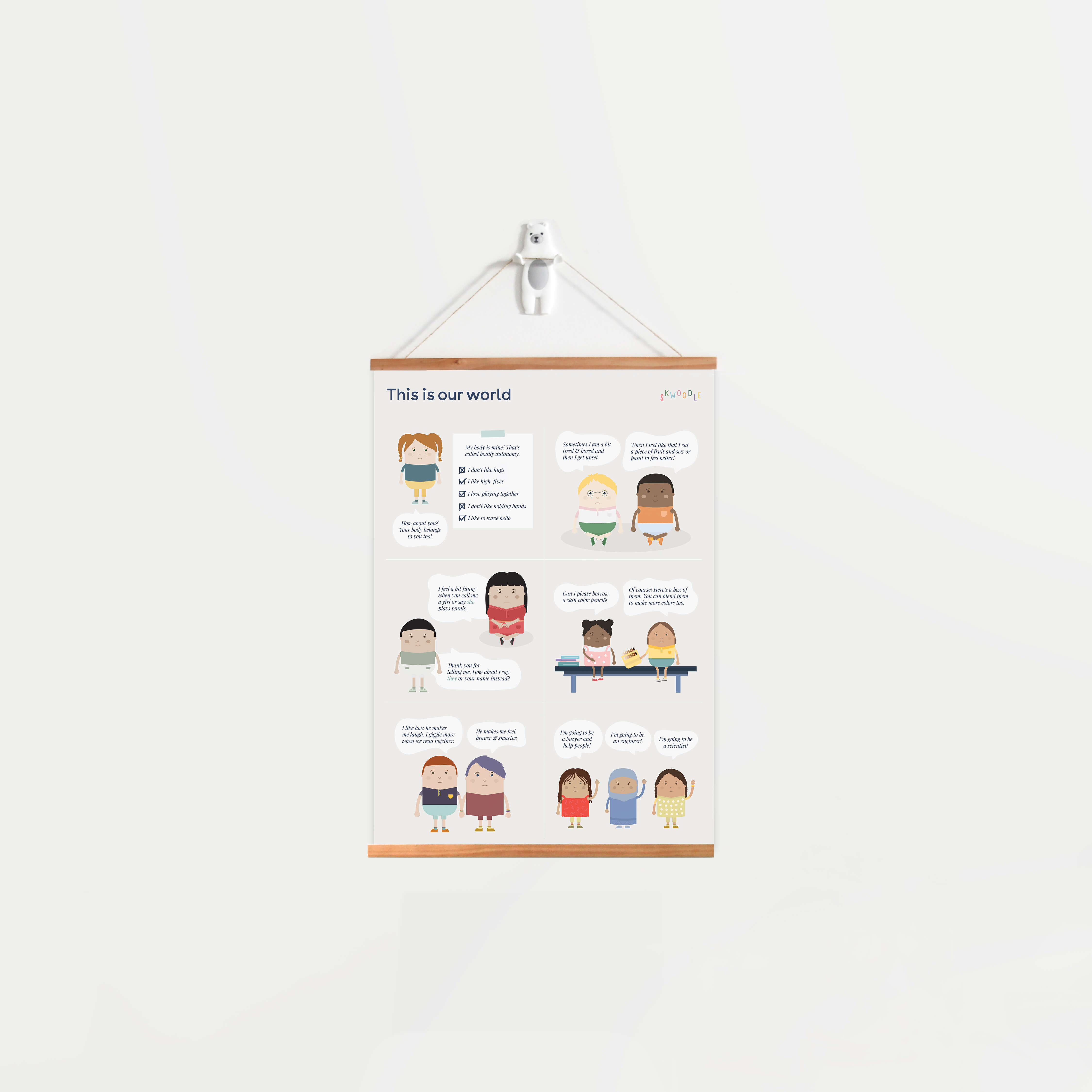
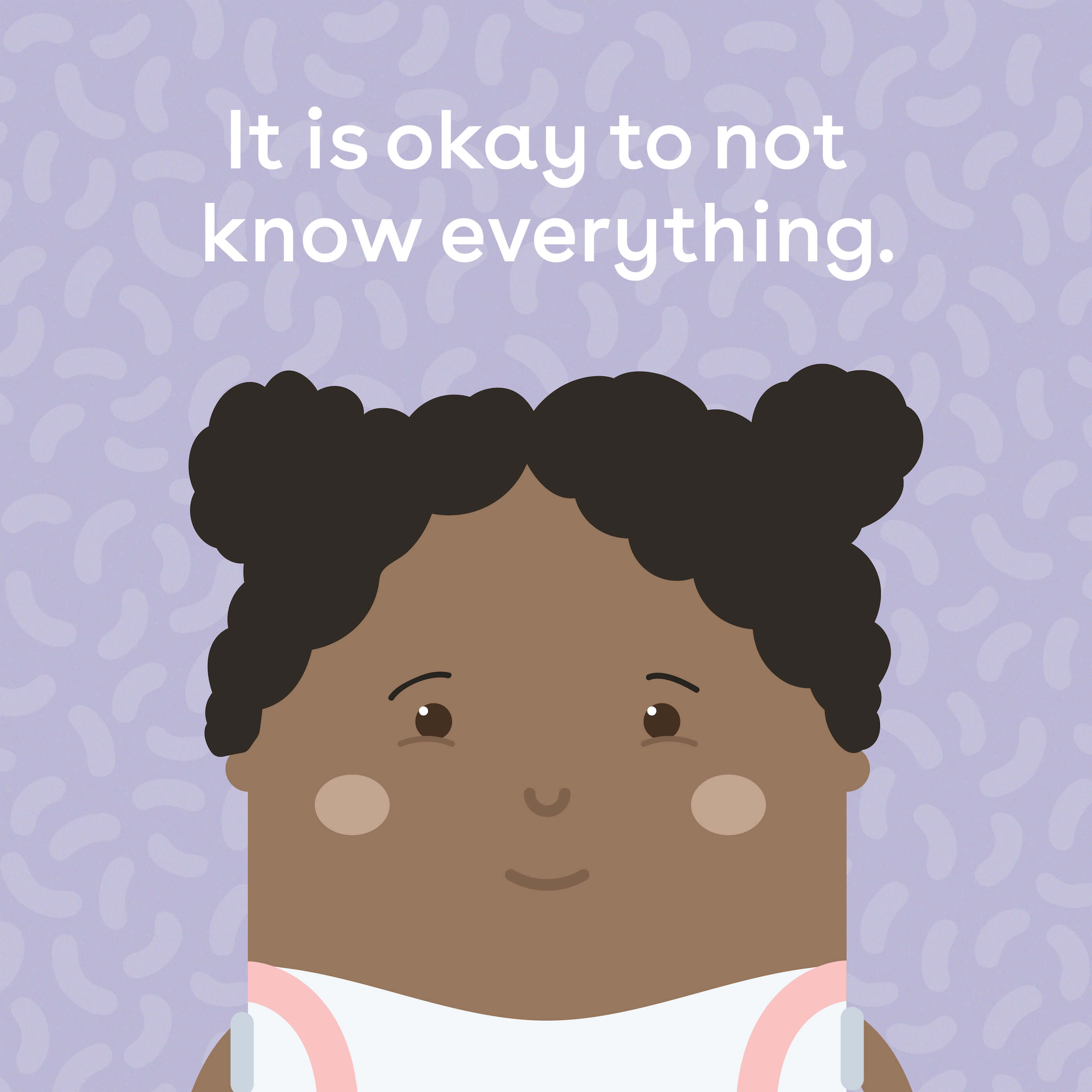
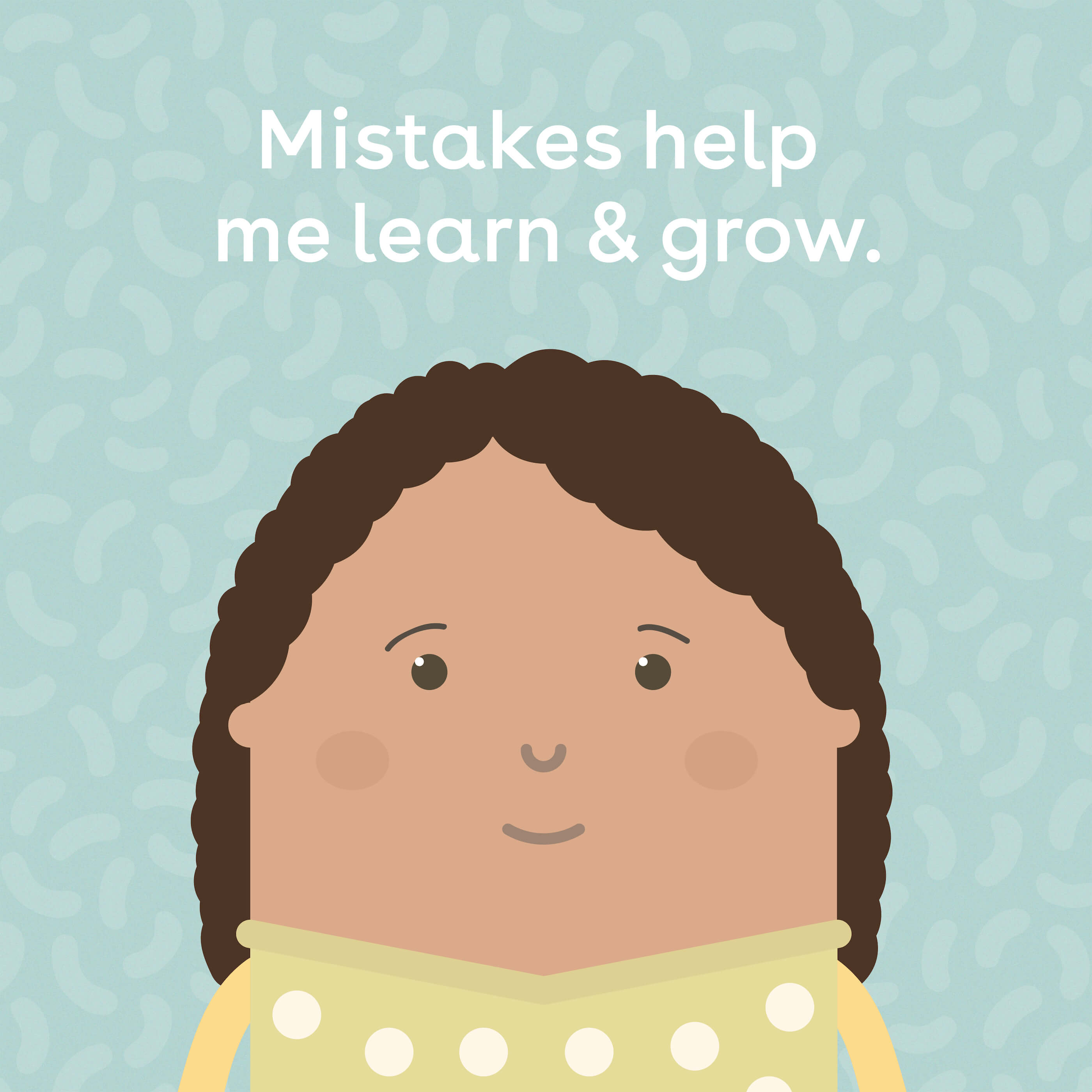
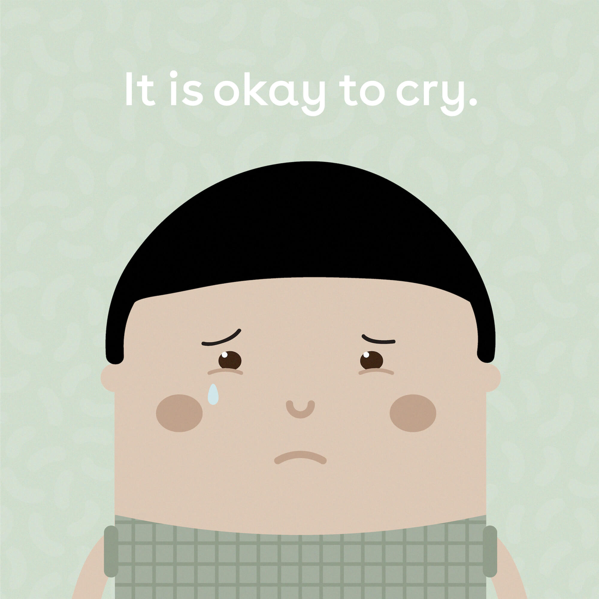
Posters that break stereotypes
The next product was creating posters. The point of the posters was to give parents, teachers, and professionals working with children (i.e. speech pathologists), representative posters with the concept of “what we see, we can become” in my head driving this product idea. I outlined the initial range I wanted us to create focusing on breaking stereotypes, and our designer got busy with our Skwoodle family. I worked on the text and reviewed the copy and designs thoroughly with an anti-colonial bias advisor and two editors. During this I arranged ethical manufacturing from a local, woman-run organization, using recycled paper and vegetable inks. The organization was a social enterprise which donated a percentage of their profits. Their work was immaculate and after the test prints, we produced the first batch of prints for sale.
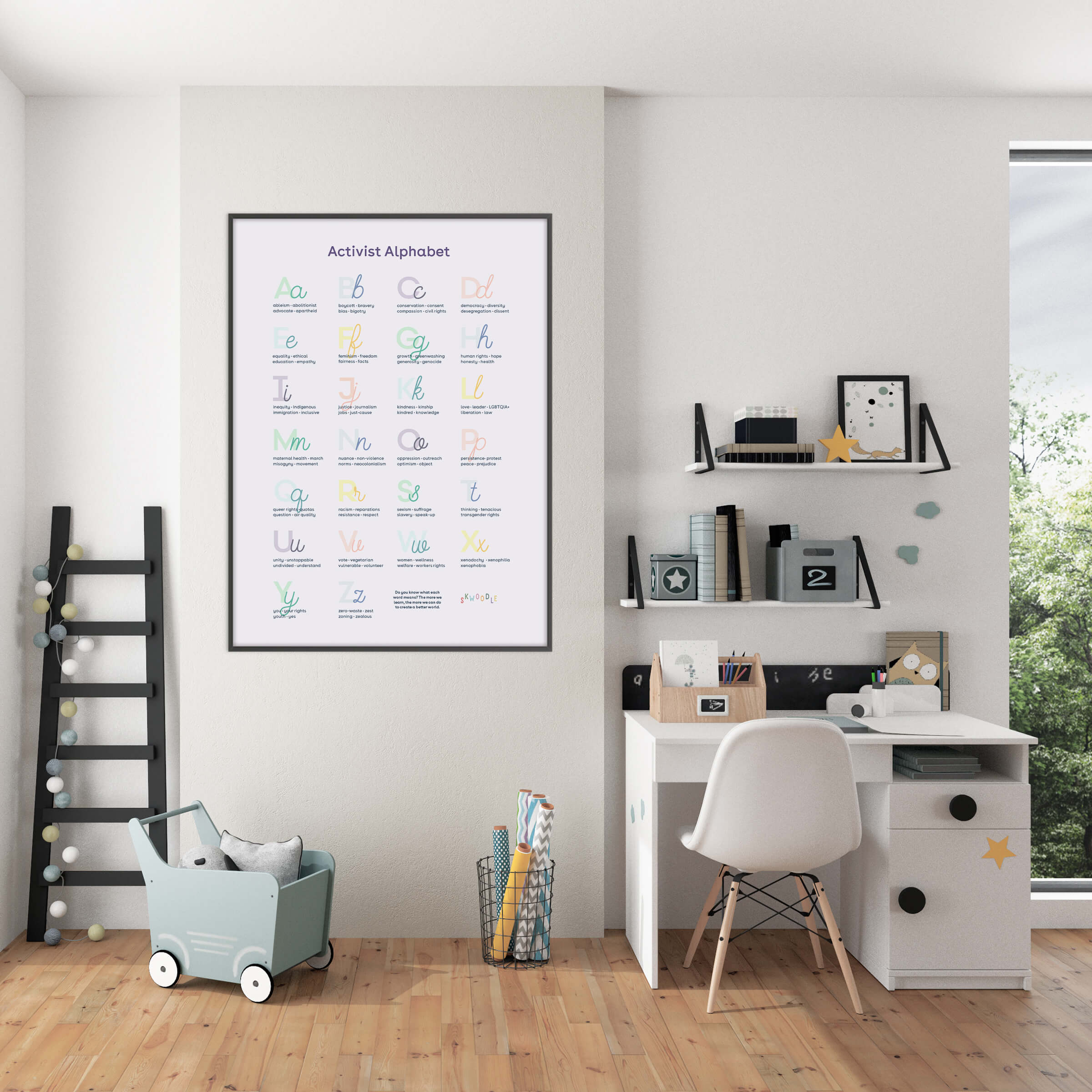
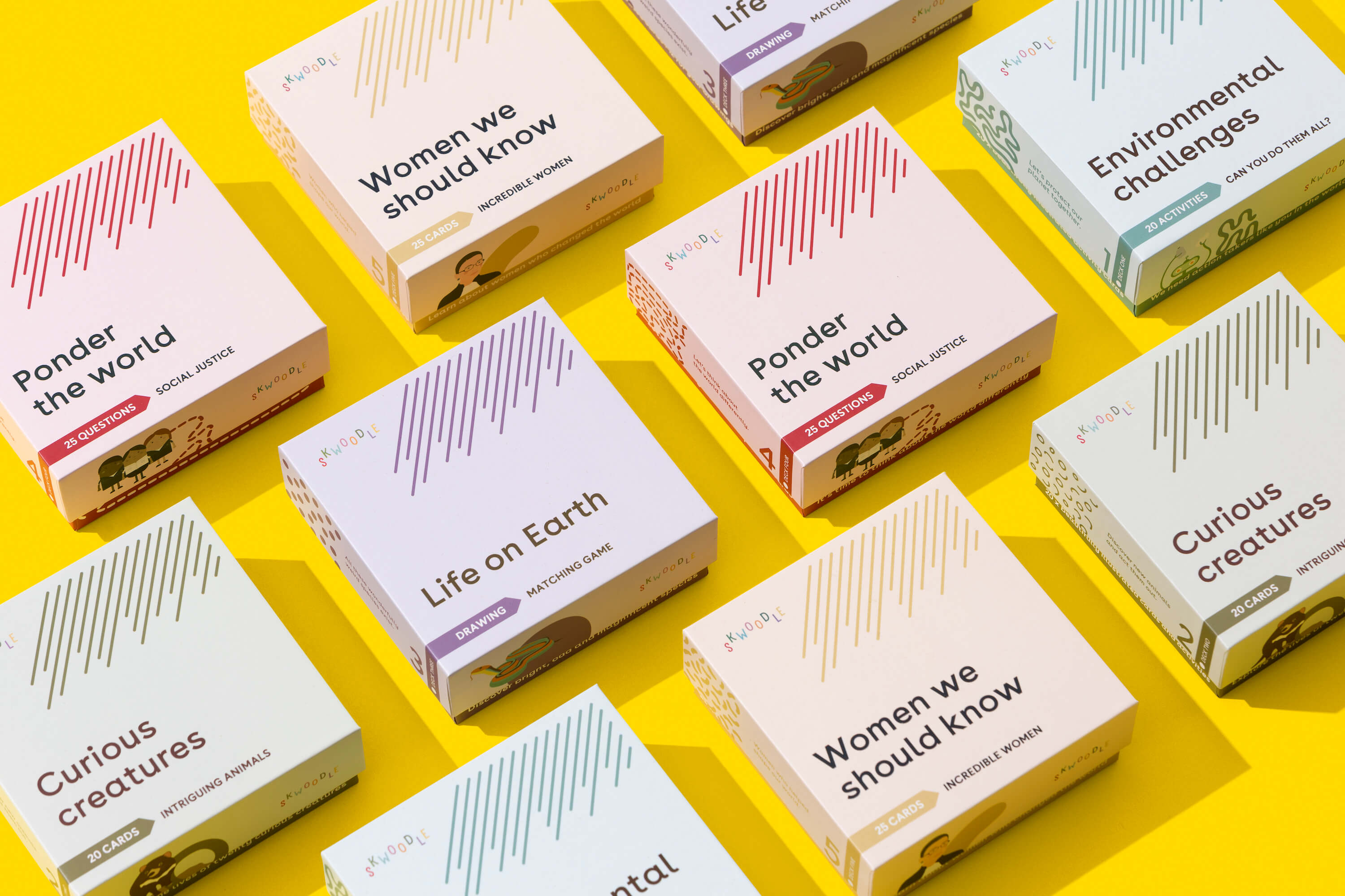
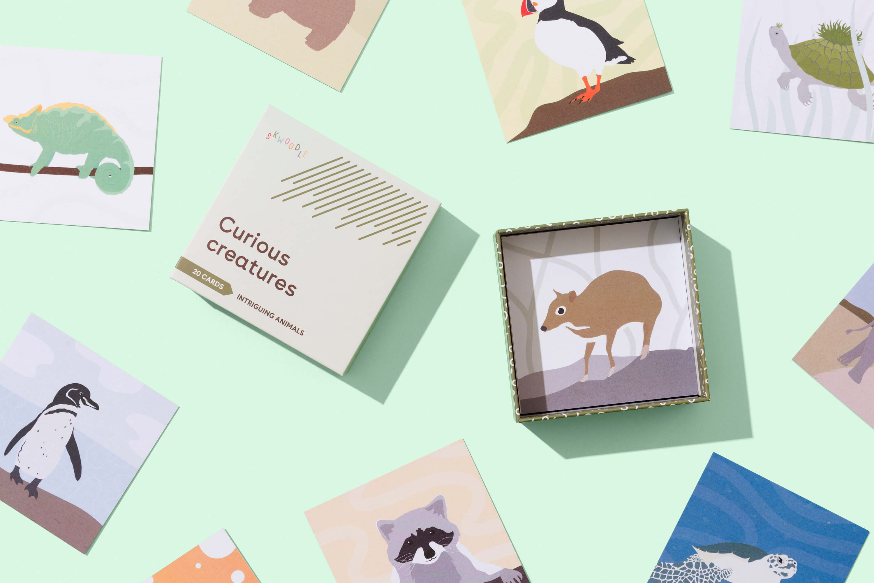
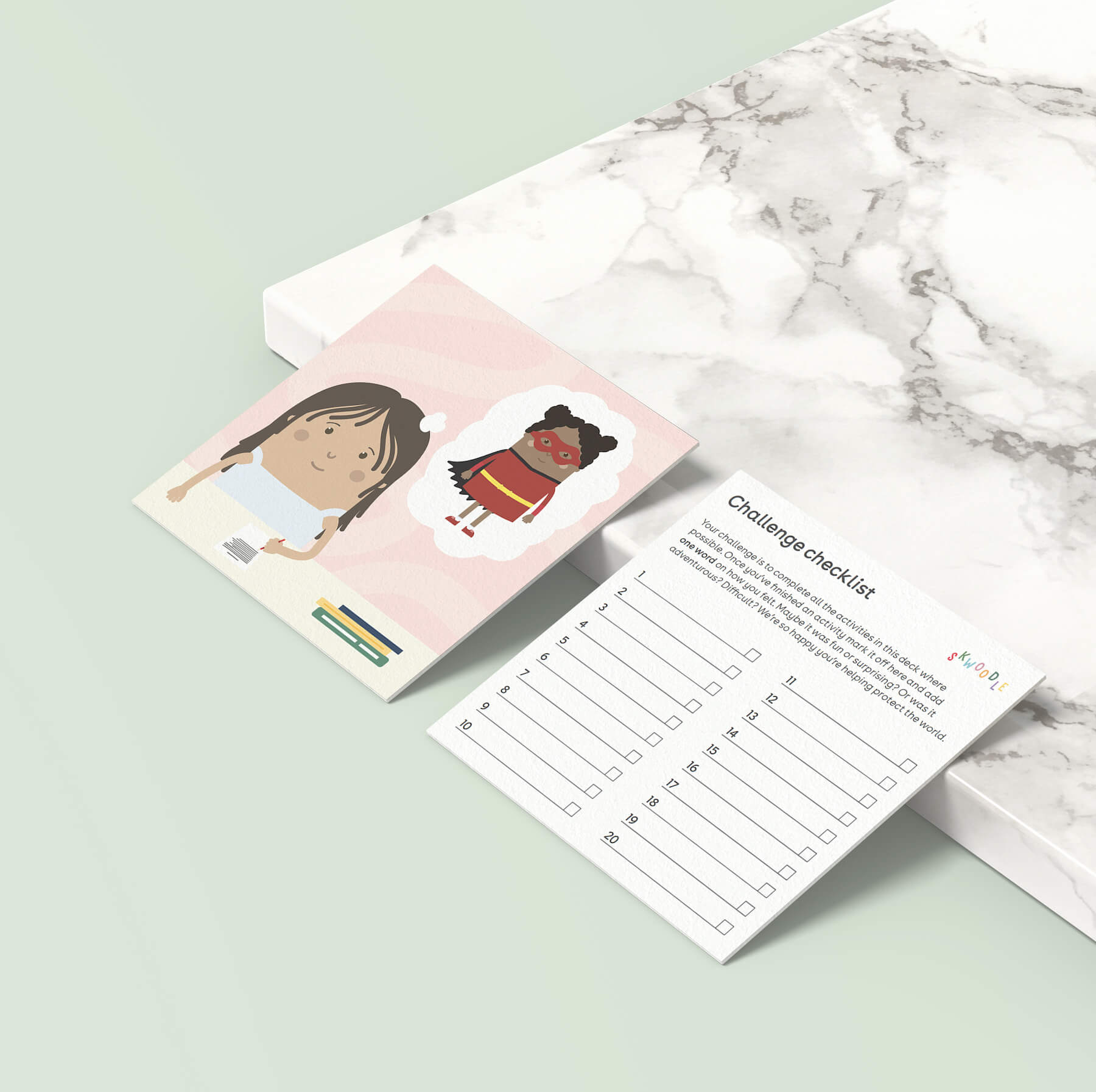
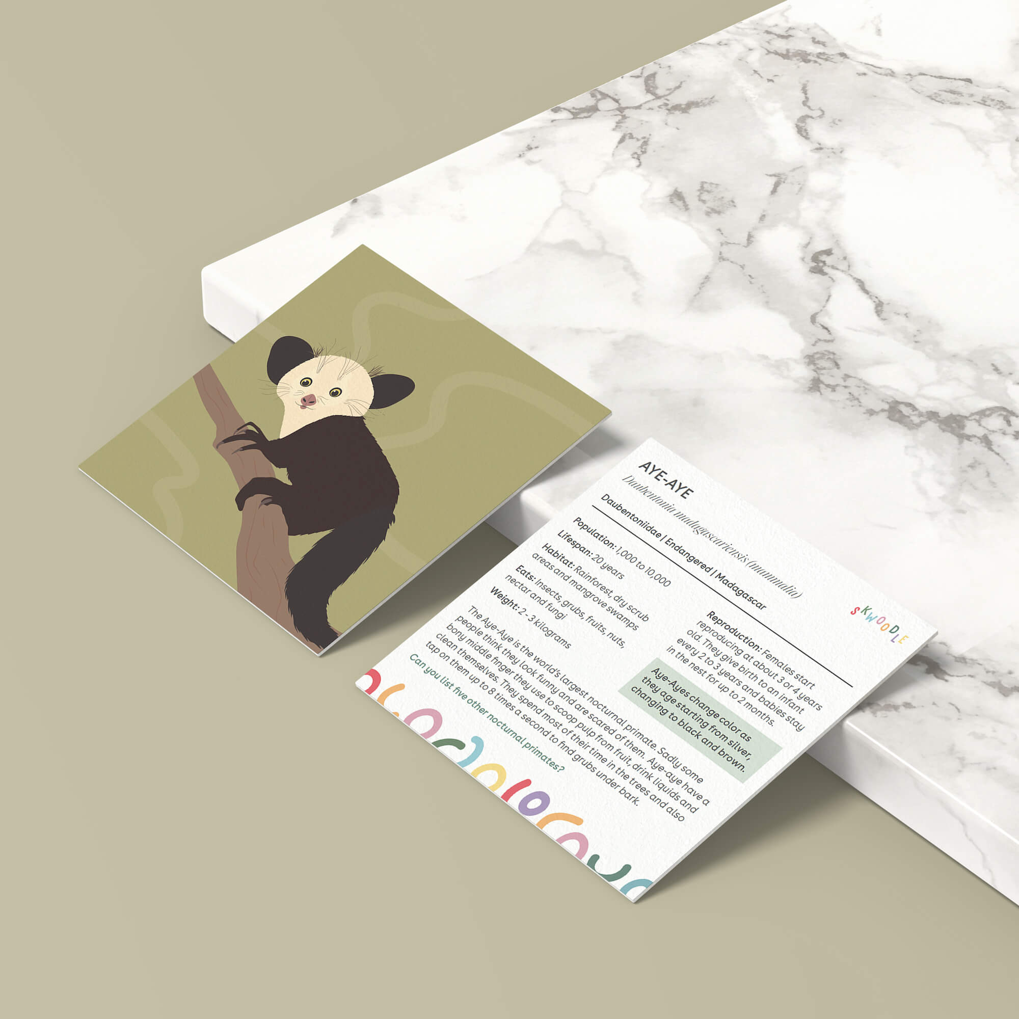
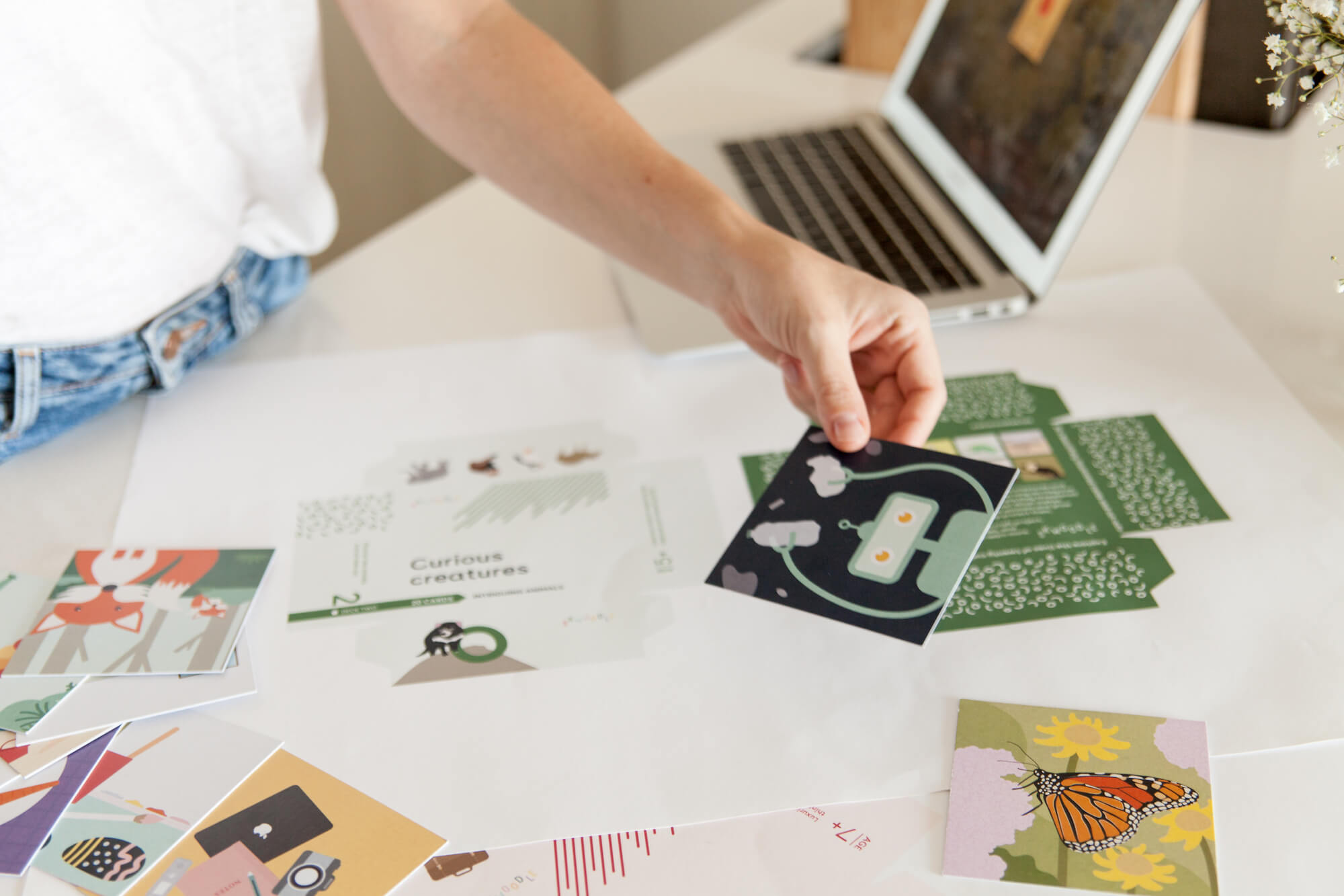
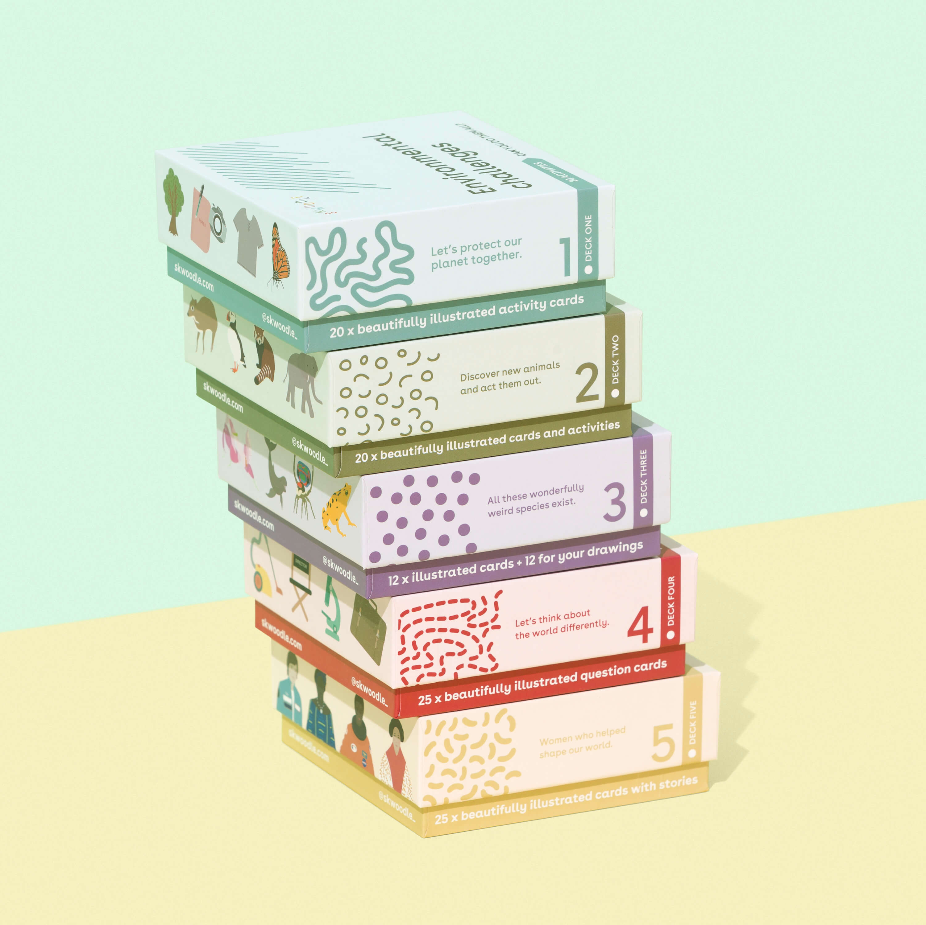
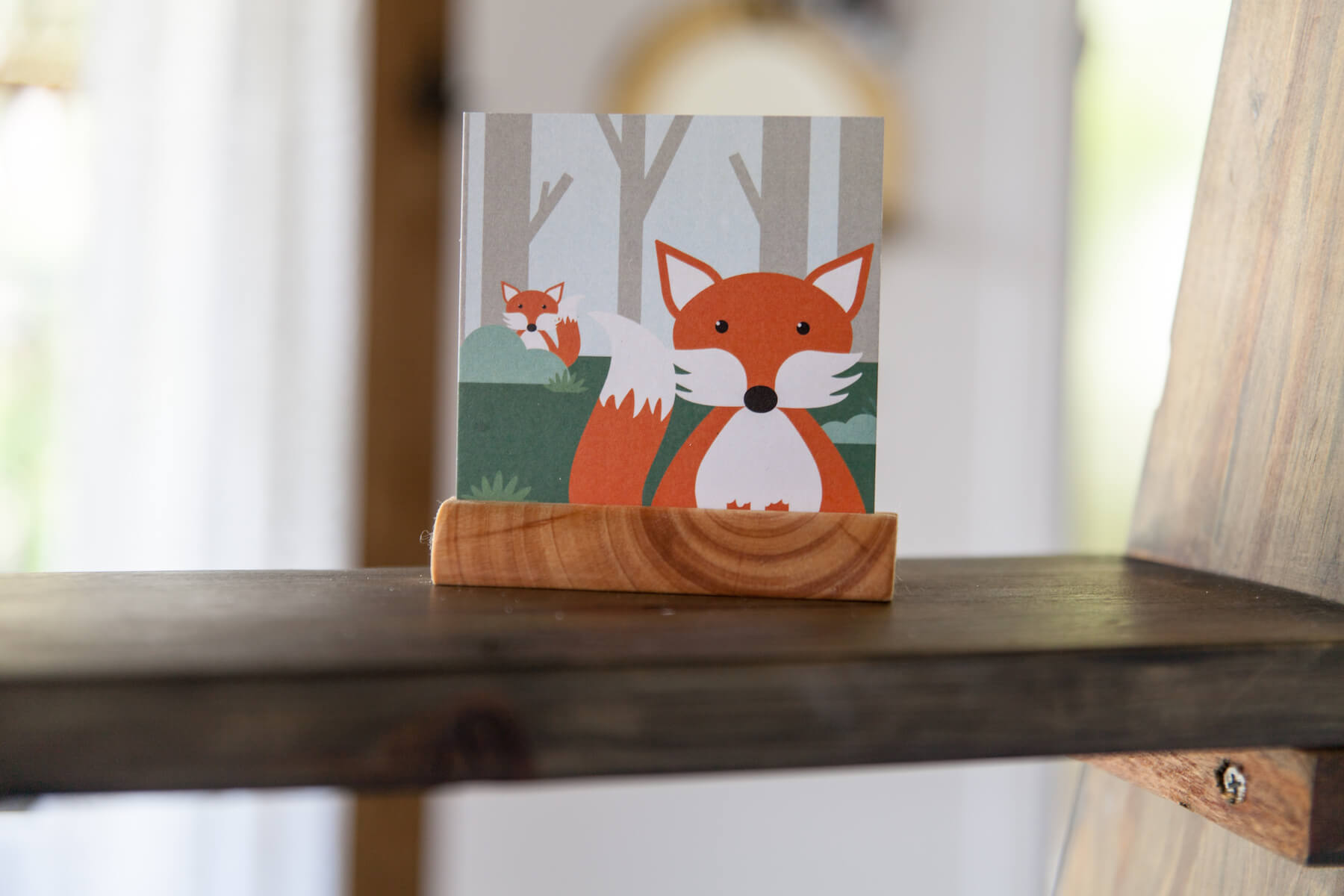
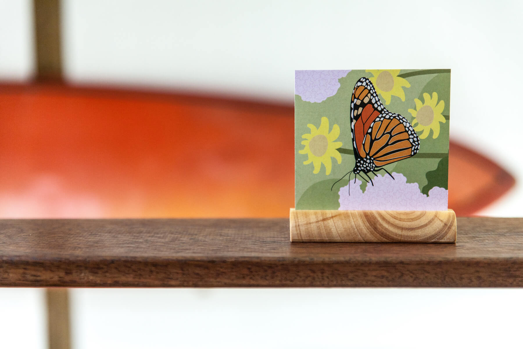
Crafting card decks, games, and activities
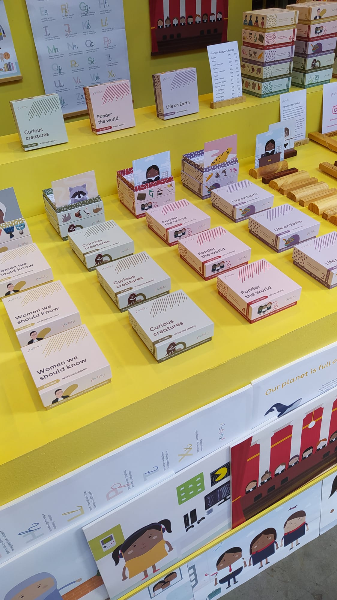
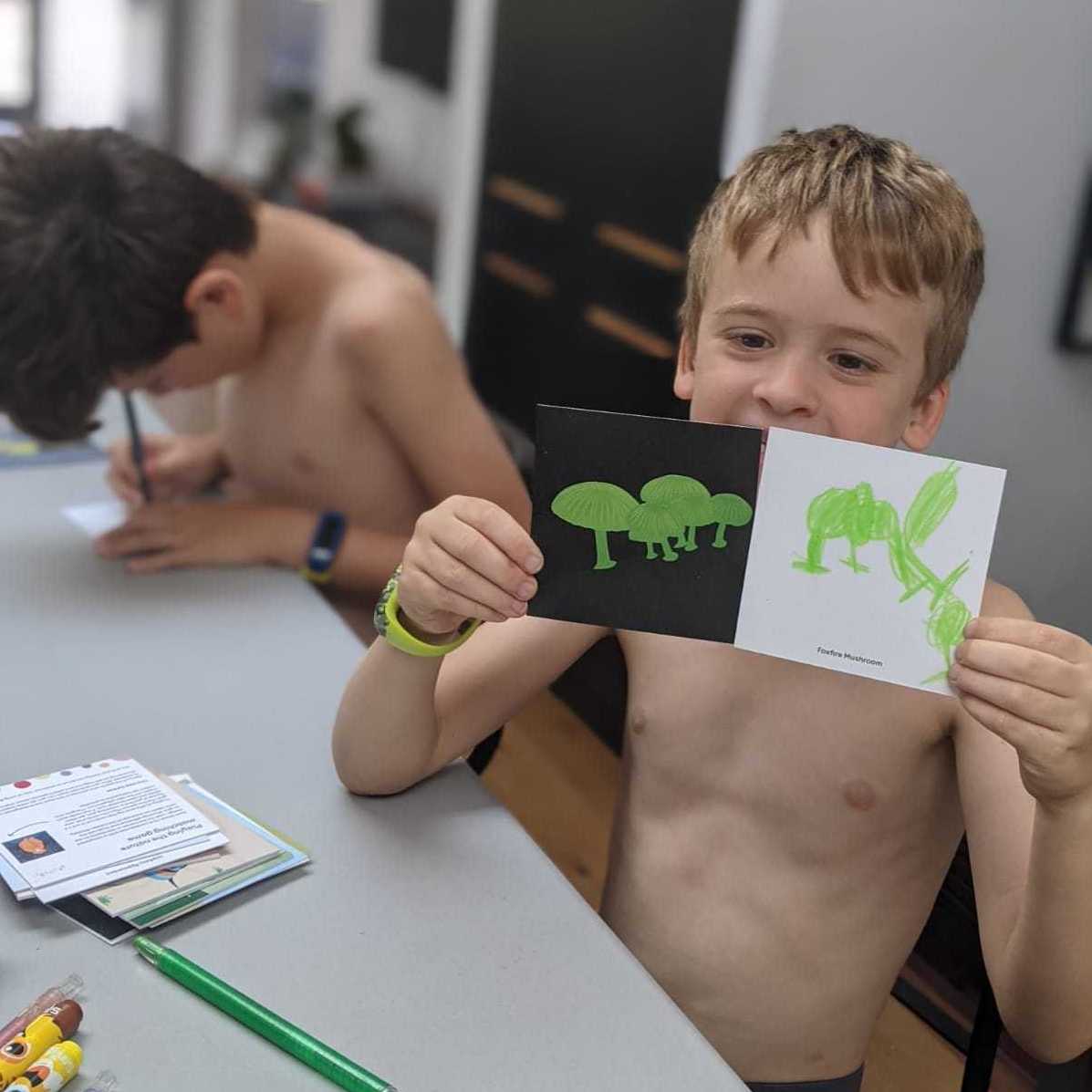
A more education specific line of the first launch was creating card decks that encouraged active participation. I designed five of these for the first line and focused on engagement and wonder with the natural world, and fighting prejudice and stereotypes (particularly relating to sexism, racism, and ableism). Each deck was always designed with engagement to ensure kids could actively participate with each card and extend their learning. This was also designed to provide teachers and parents additional activities to broaden out from. I spent far too much time on the deck packaging making sure we could grow the collection infinitely, and that each held their own pattern and illustrations whilst working together in stacks.
I wanted to ensure our products were as ethical and environmental as possible. While we needed some accessories I cared deeply that these were limited to useful applications and treaded as lightly as we could.
Sustainability, transparency, and crafting accessories
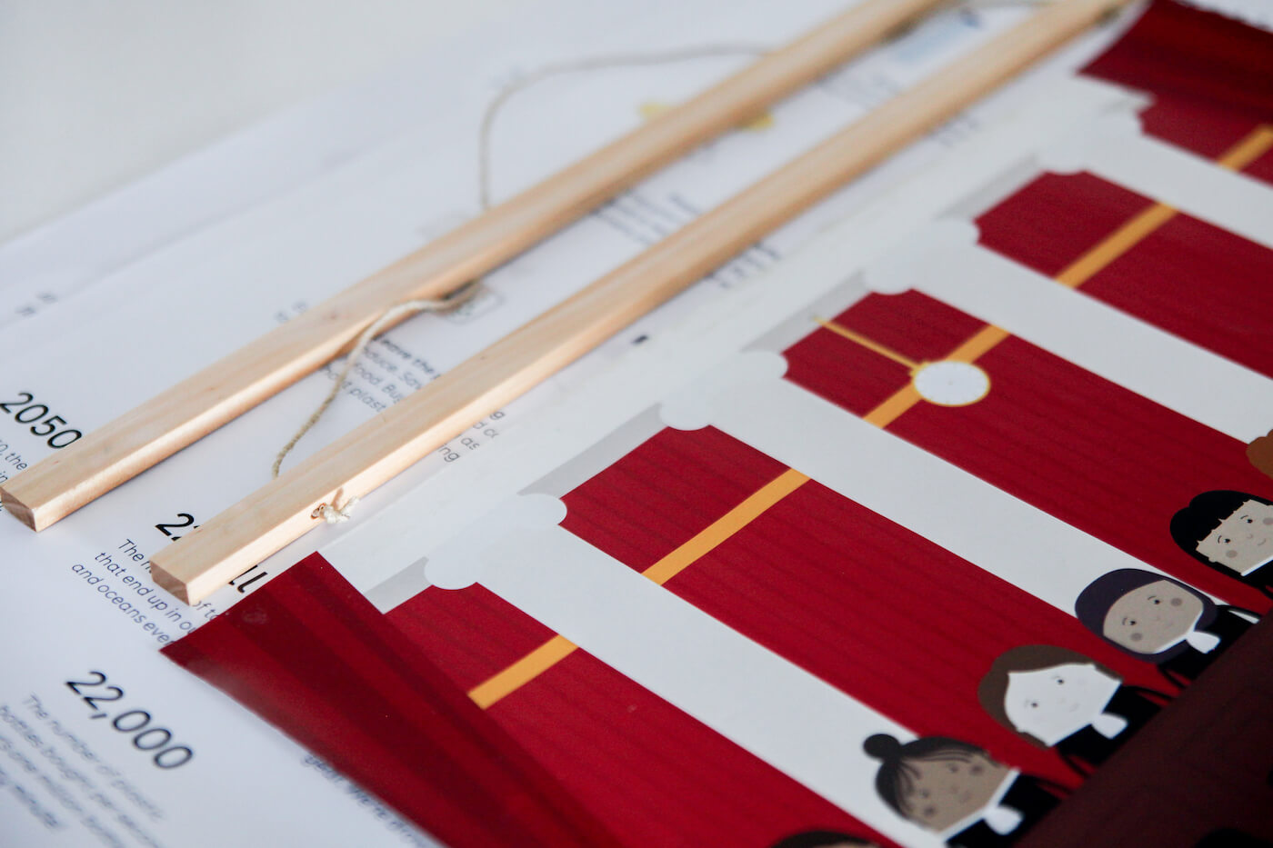
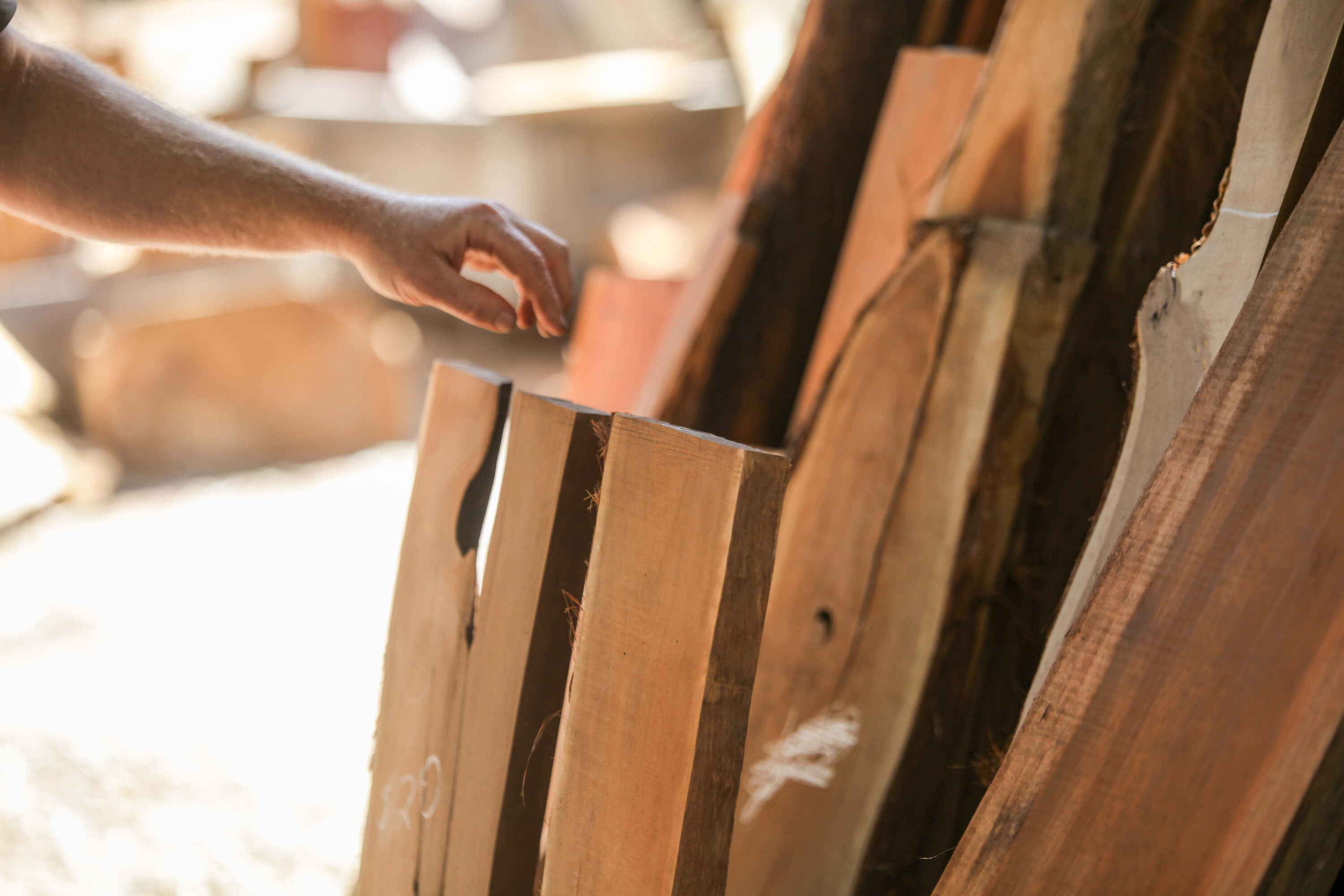
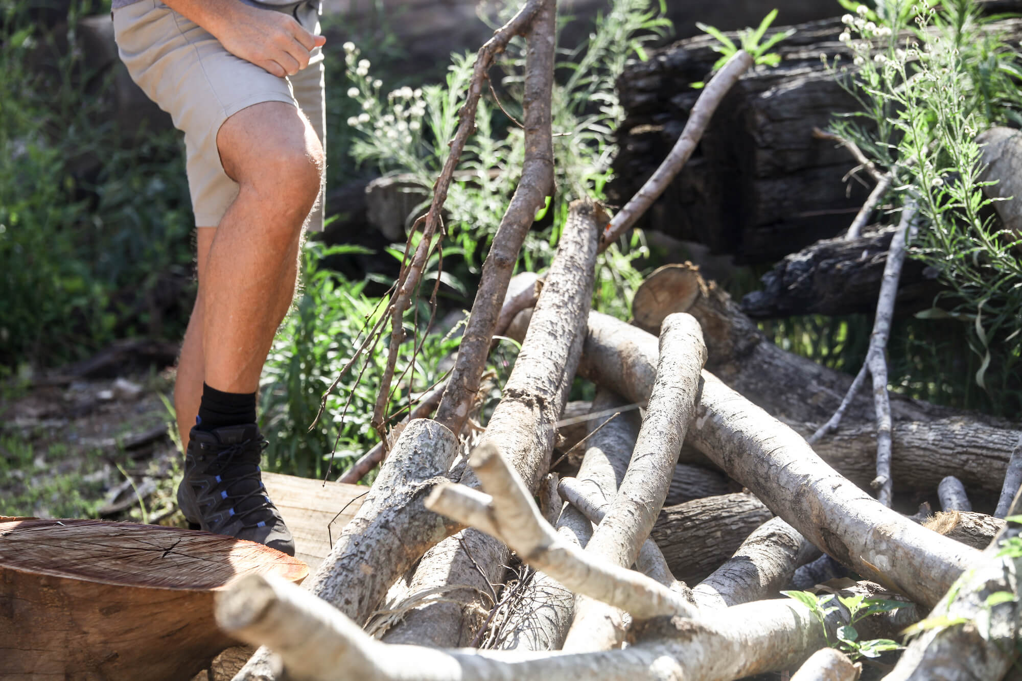
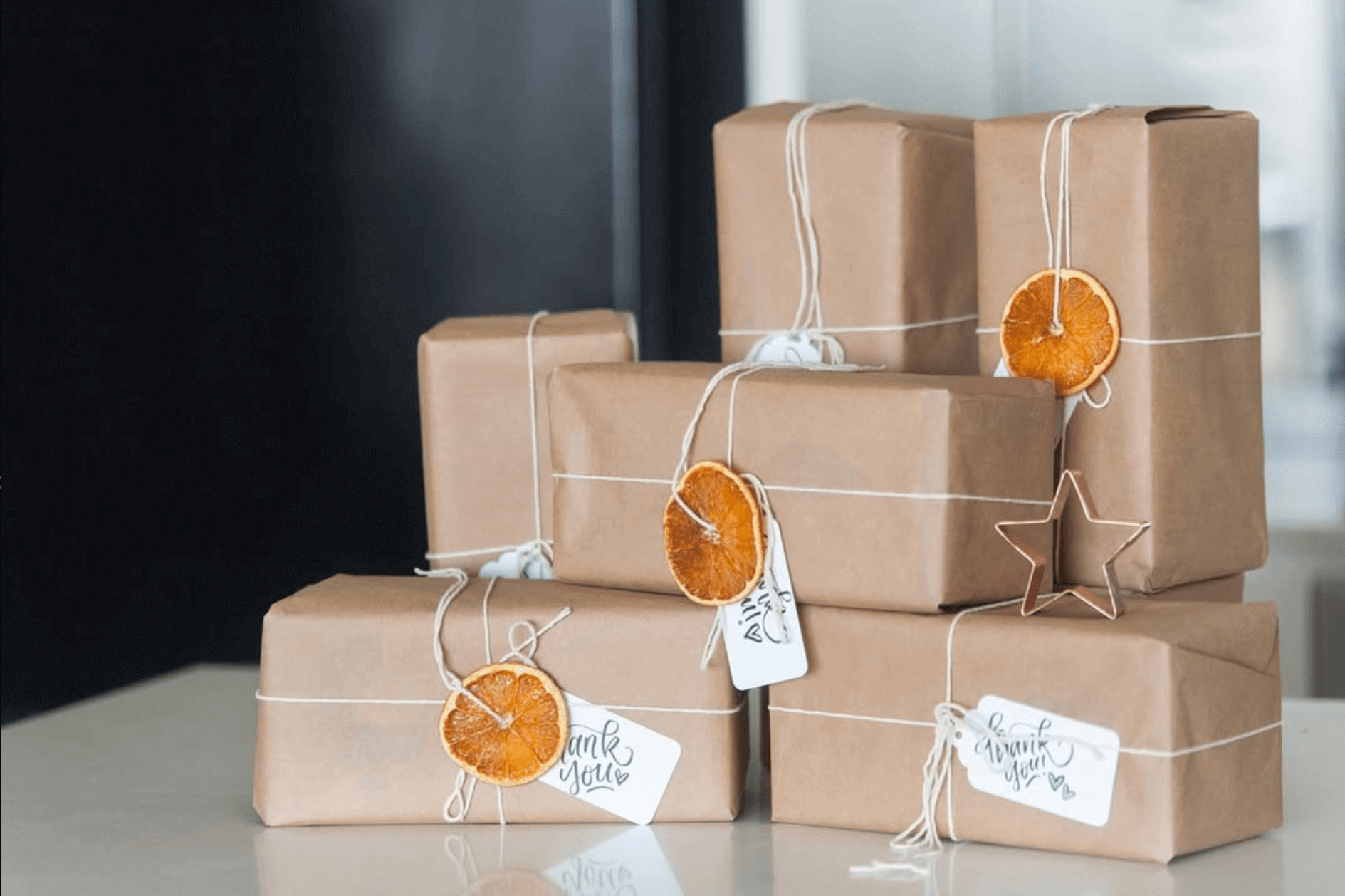
Composting for businesses often means industrial composting, rather than at home, rendering its application largely useless, which I wanted to limit. I contacted a local small business who salvaged and recycled wood - largely from properties as asked or received from Indigenous groups and organizations removing non-native species. We used this wood to handmake our own frames and blocks, using a shared workshop, and they could be home composted when required. I opted for Japanese washi paper using recycled materials, cotton and hemp, that could all be garden composted. I wrapped puzzle orders using a Japanese technique too that largely didn't require any tape usage. All inks used were vegetable inks. Our twine was 100% hemp for yard composting, as were our mailer bags.
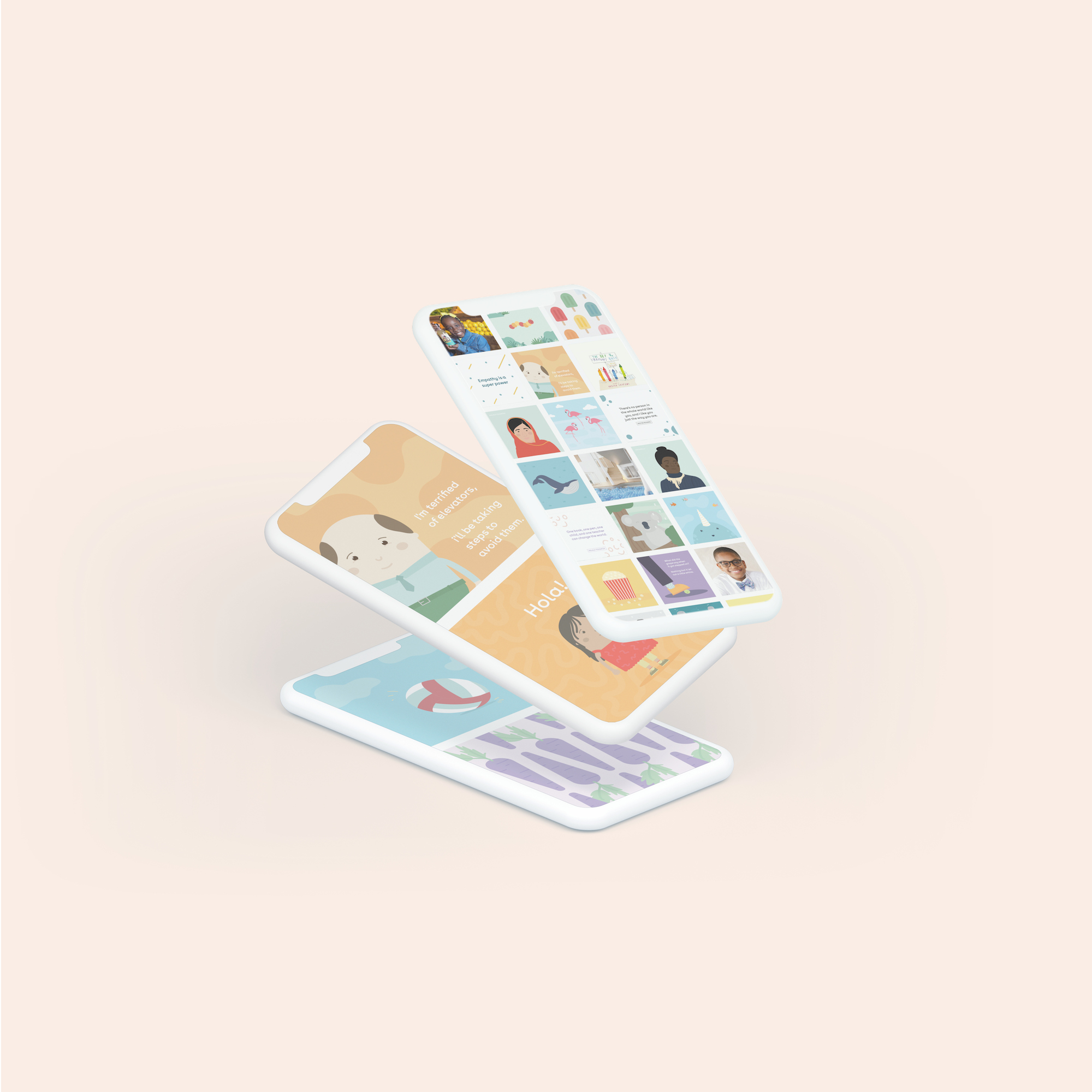
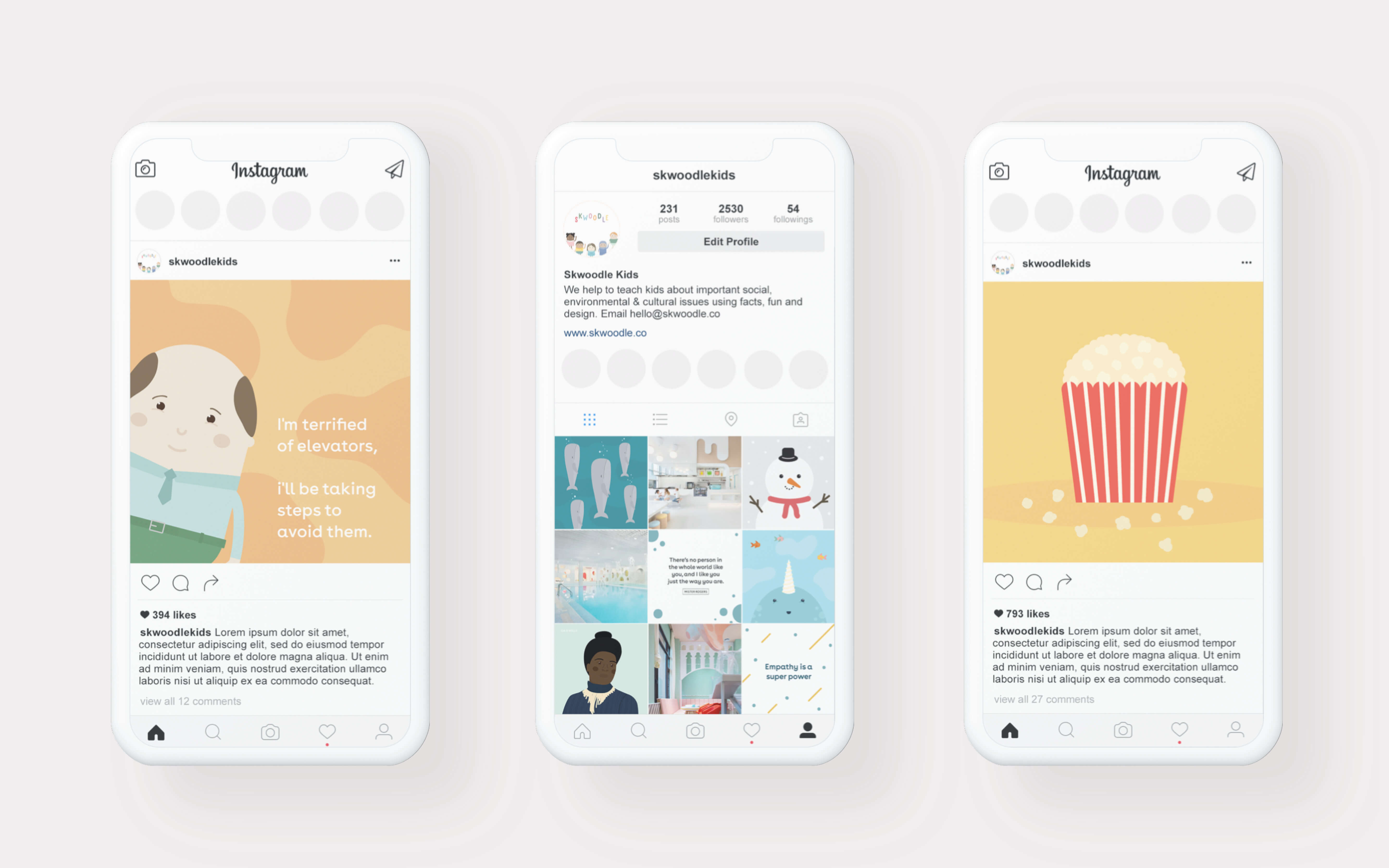
Online marketing strategy and design
Given how important it was for us to communicate stories, facts, social justice, and environmental topics, it was essential that our design and storytelling were well put together. Our focus was primarily on the visual platforms of Instagram and Pinterest, where we ensured that every post adhered to a cohesive and appealing aesthetic, and that maintained consistent updates. This included a balanced mix of product photography, real-world projects, stories, and affirmations, designed to resonate with our audience without taking all our time away from product development. All non-photo posts were illustrated and written by us.
Levering social media into extended learning resources
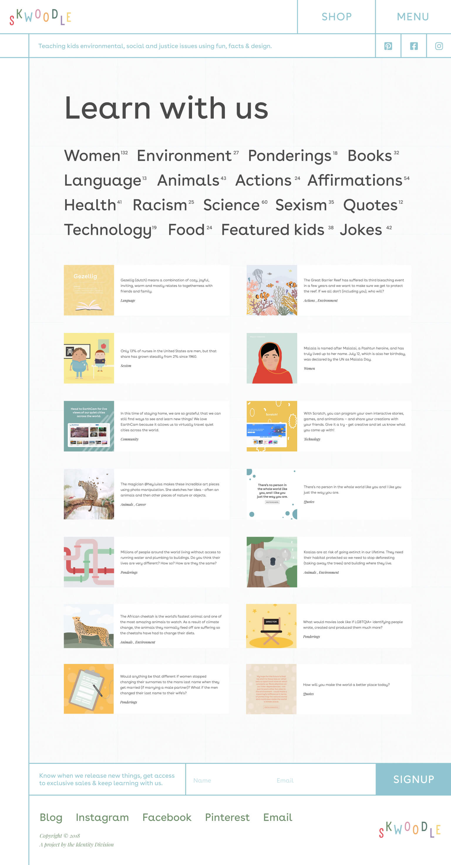
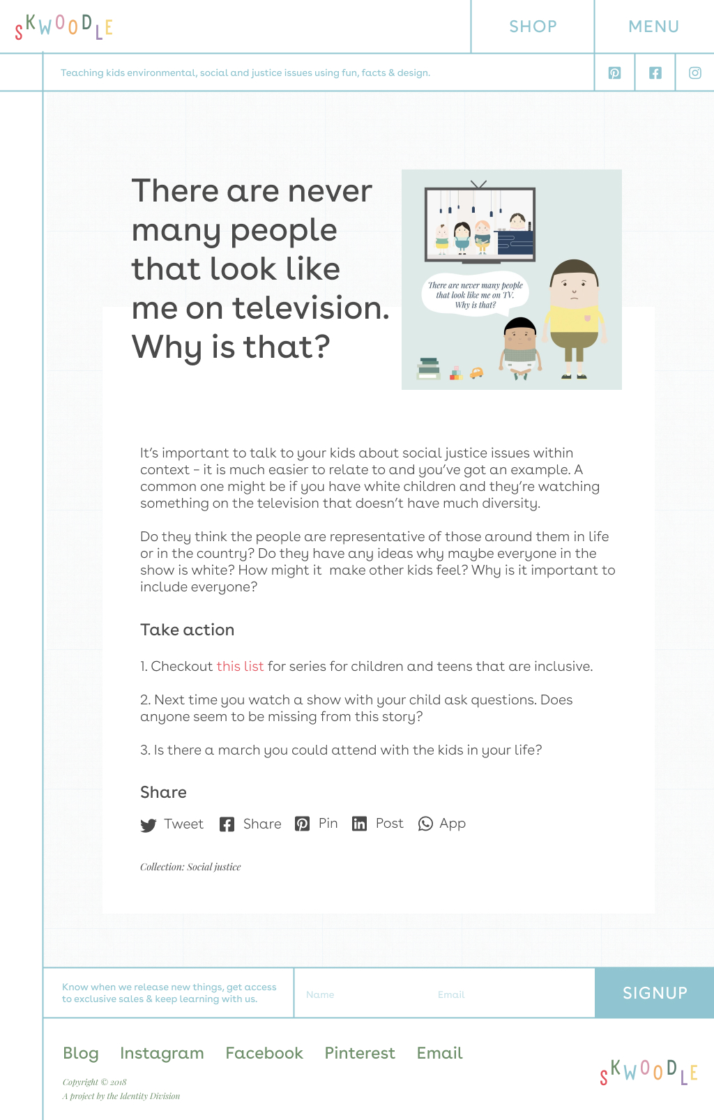
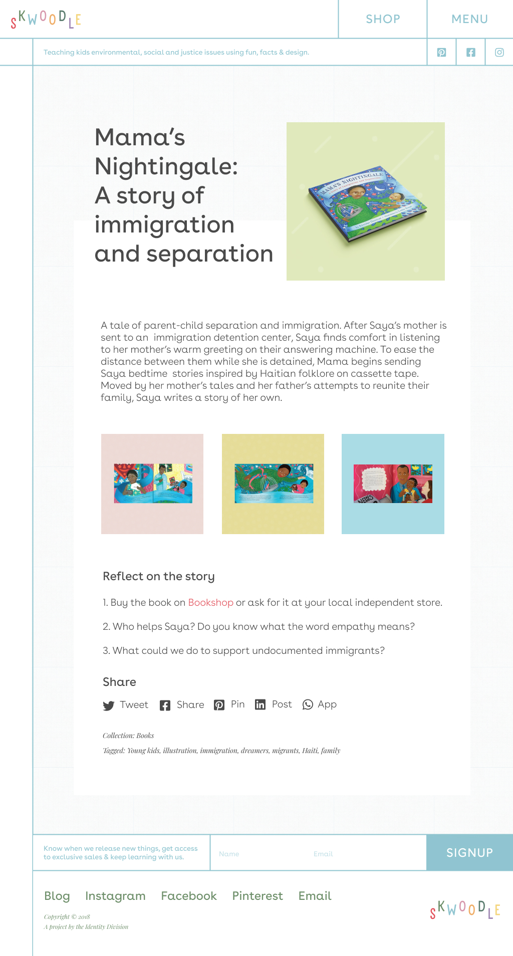
The website launched with a blog to make the most of the content shared on social media. The brand focused on learning, connecting or empathizing with others, and exploring topics in a way that both kids and adults could relate to. The blog therfore served as an extension of our socials, offering actionable steps from each post and linking to relevant resources and experts for further exploration. This was also a boost to our SEO as we had niche and specific topics. Several blog post formats were developed to accommodate different types of content, making it easy to use depending on the category. I set it up so each post was automatically created as a draft after it was published on the socials, we added the extended learning and then scheduled it for regular publishing updates.
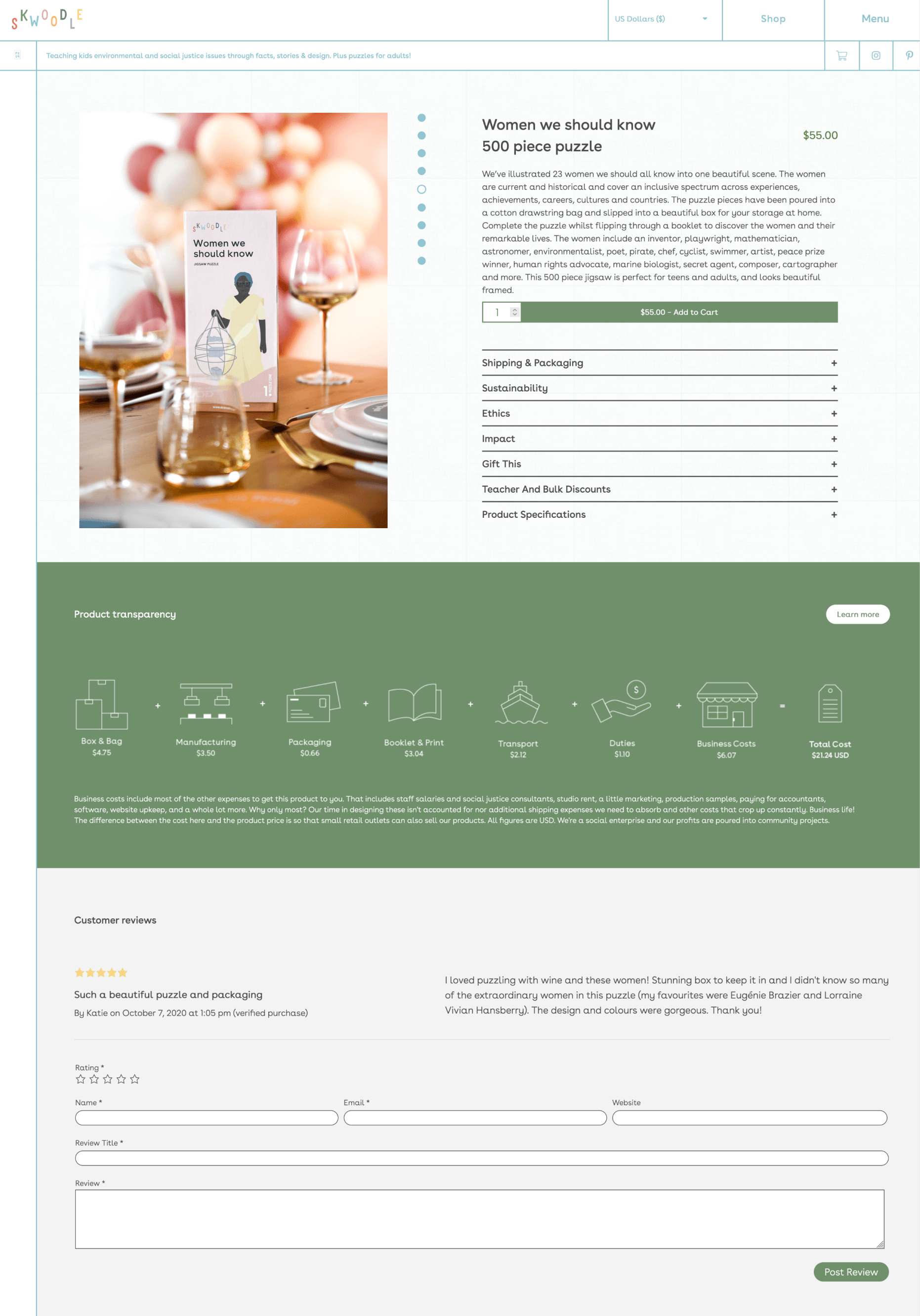
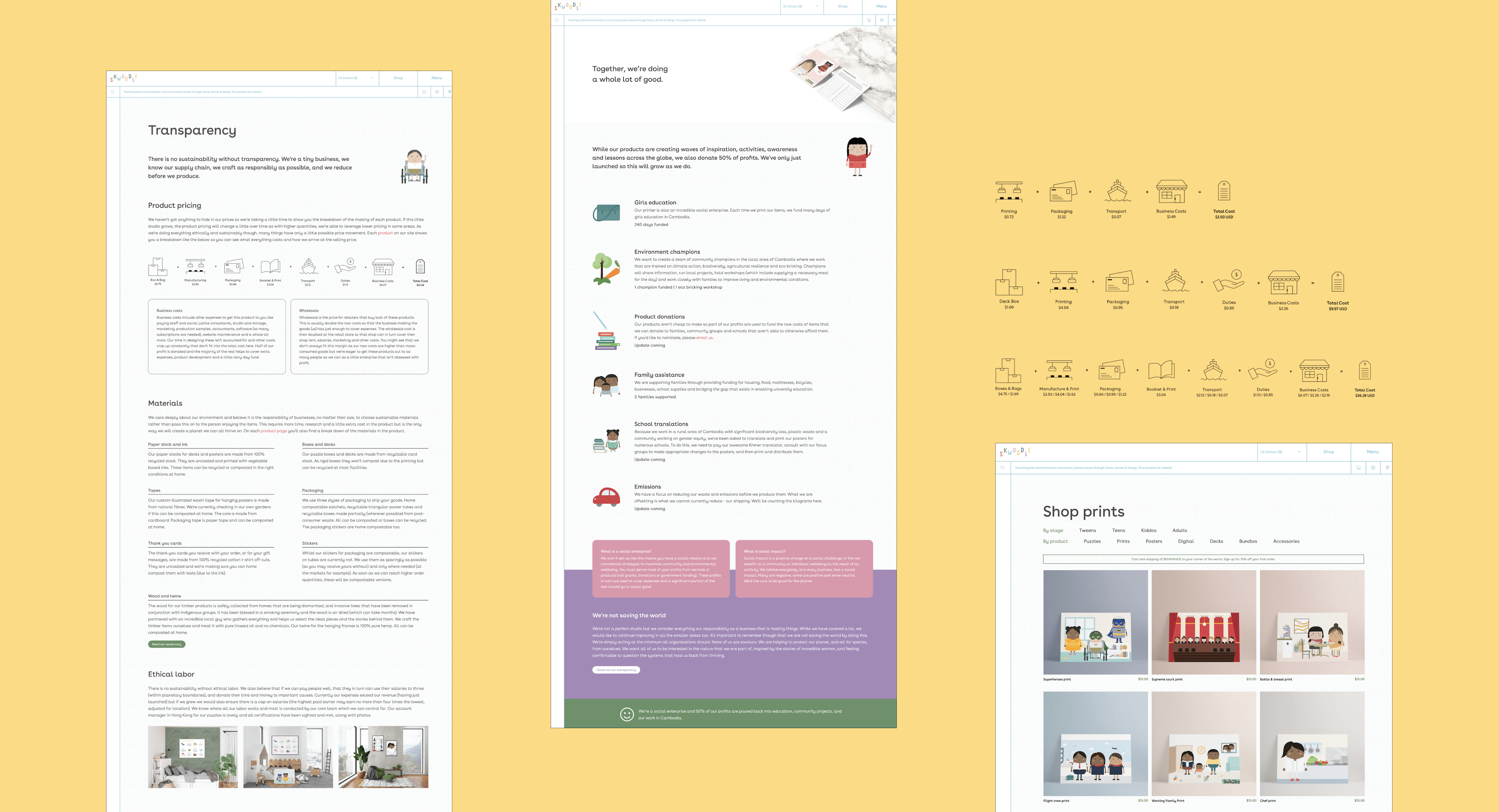
Ecommerce design, development, and product transparency
I designed and developed the website with a focus on price transparency for the products. I'm a big believer in this and as all business owners have to know each product cost in any case, making this information available is not tricky. I carried out the calculations of each product and chose icons or created my own for each category. I then pulled them together for each product and once I finished coding up the product page template, they were uploaded there. On the product pages I also developed a range of toggles beyond the product description so different audience members could find all the information they wanted for each product in a click.
Better postage and handling
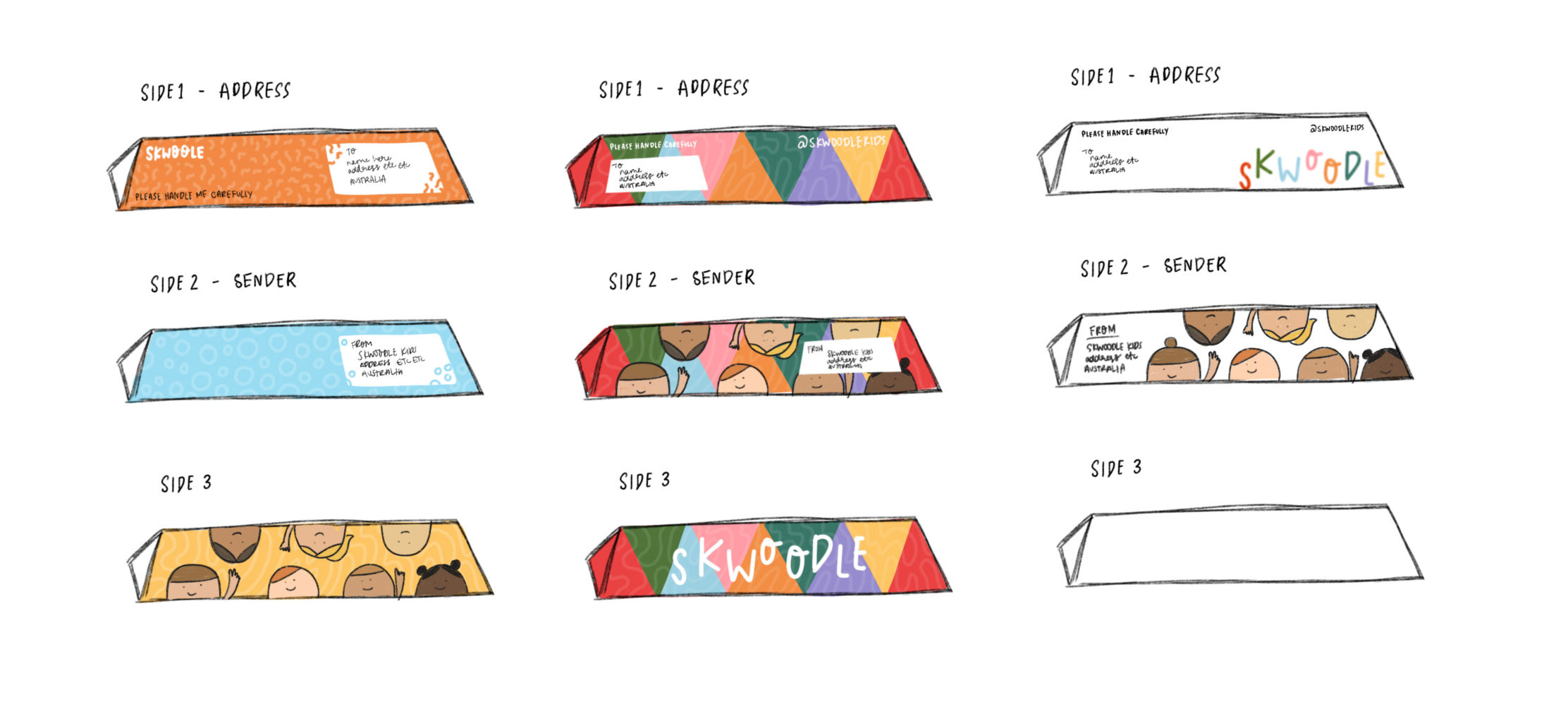
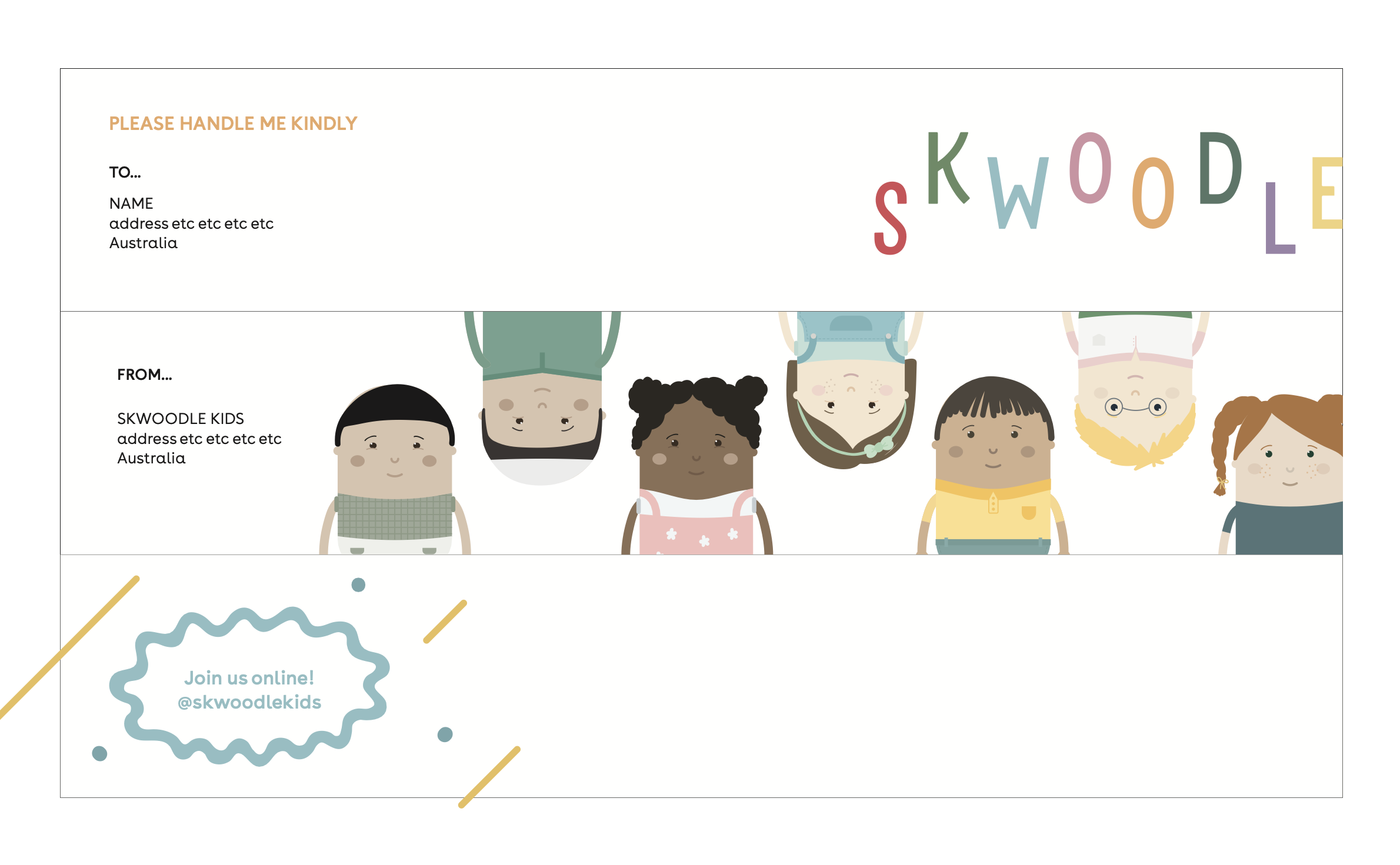
I had undertaken some research in how to best send posters because tubes tend to cause a number of problems: losing their lids on either end (and therefore their contents, or needing to be heavily taped), being easily crushed, and being swept off machines as they're rolling through processing. Circular tubes also meant plastic lids which I was hoping to avoid and significantly more storage space required. I instead designed a triangular tube to avoid the post problems, flatpack, and ensure they were home compostable, and our illustrator whipped up some potential designs. With the base product secured and with print costs in mind (especially knowing this would be a throwaway piece), we pulled together the final design from these options.
Growing an audience at markets
Part of the work was getting in front of the right people so we created a stall (massive thanks to John for his ideas, precision woodwork, and huge recycling efforts) and I hit the markets! I have so much respect for people who do this regularly, it is every emotion from wonderful to heartbreaking.
After a few long years, I left Skwoodle in this little bubble we had created, but I'm so happy with the time we did it!