Small ecommerce website
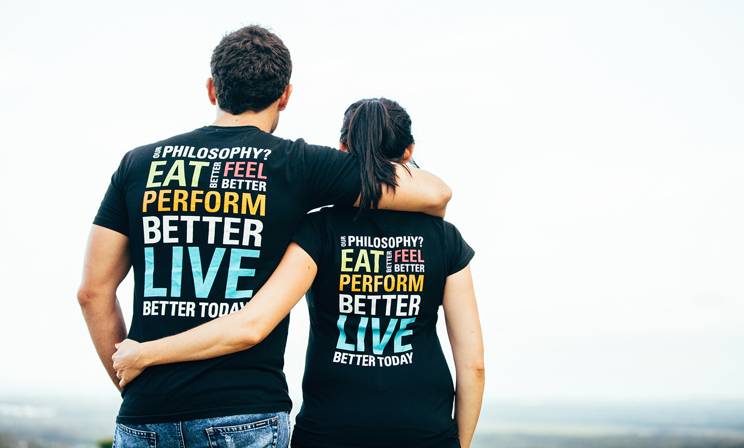
Howzya Week had a brand which we developed out into the digital space alongside spending time working out an ordering system for meal-drop schedules each week.
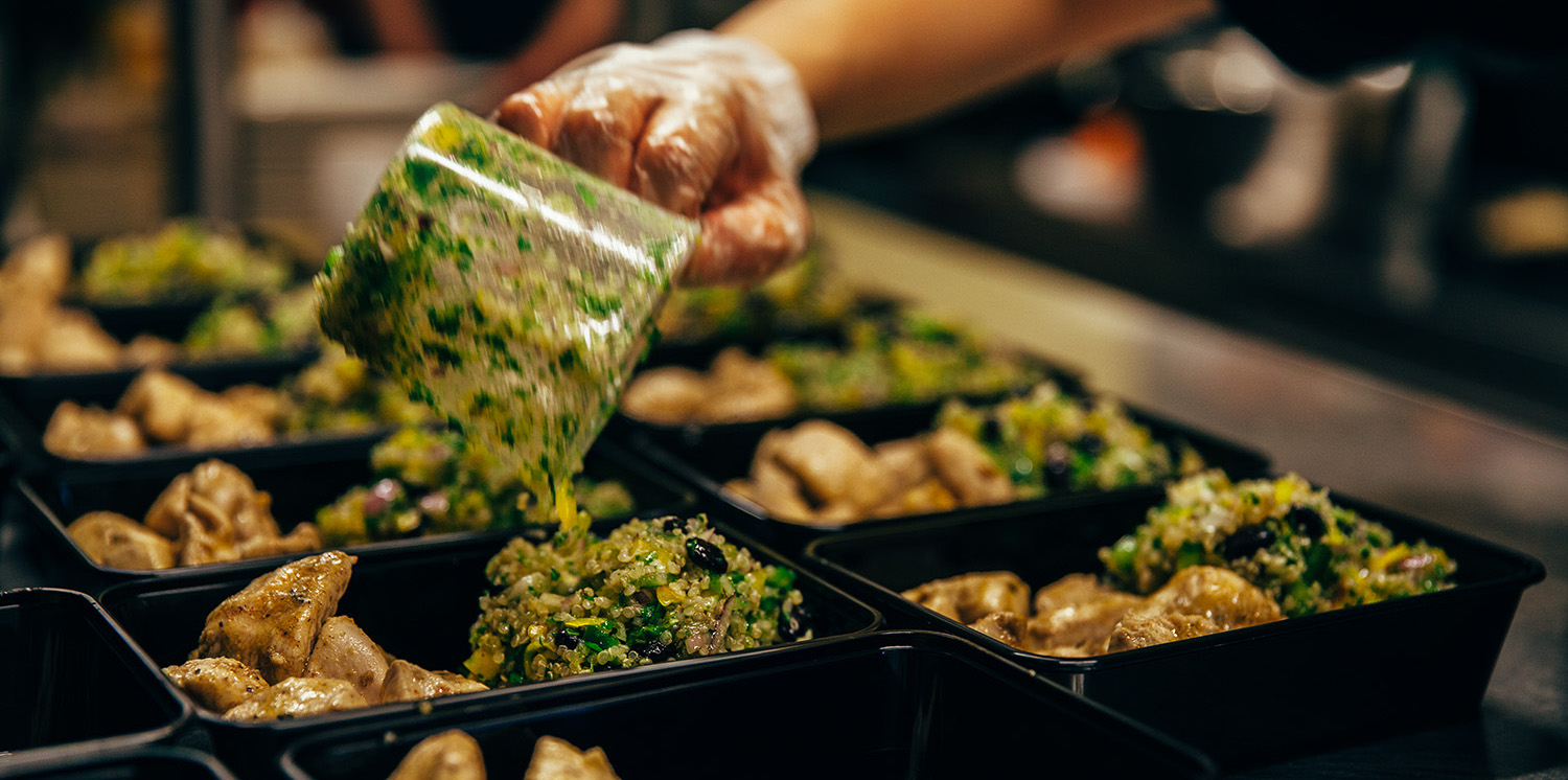
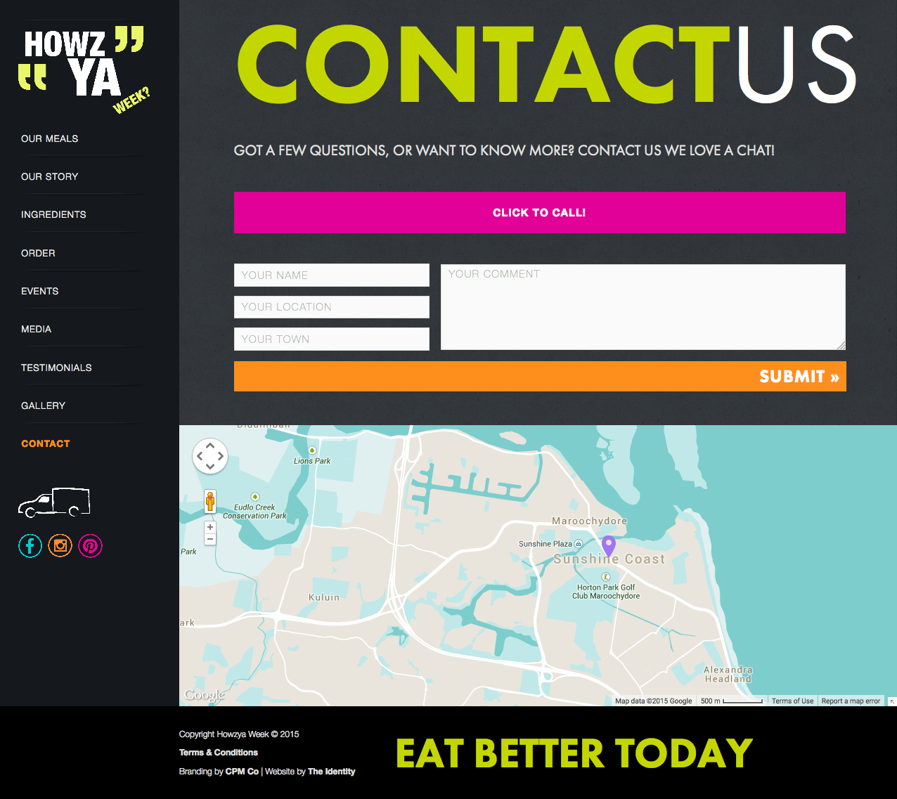
This was a really fun project where we designed a small ecommerce site within a tight budget, focusing on their fresh ingredients. Off-the-shelf ecommerce at the time was nowhere near as mature as it is now, so we spent more time on working on an easy ordering system to meet their business requirements. The brand was quickly in demand, with a waitlist for other cities soon after launch.
2015 Project
The scope
Though I'd design it differently now, this project is a nice example of focusing on a few core items to see what could be achieved in a tight timeframe and budget for a sustainable small business.
My role
Creative director
Website designer
Website developer
Services
Hand lettering
Design and development
Order management
Partners
Logo by CPM Co
Branding by CPM Co
Imagery by Klee Photography
Creating desire for fresh ingredients
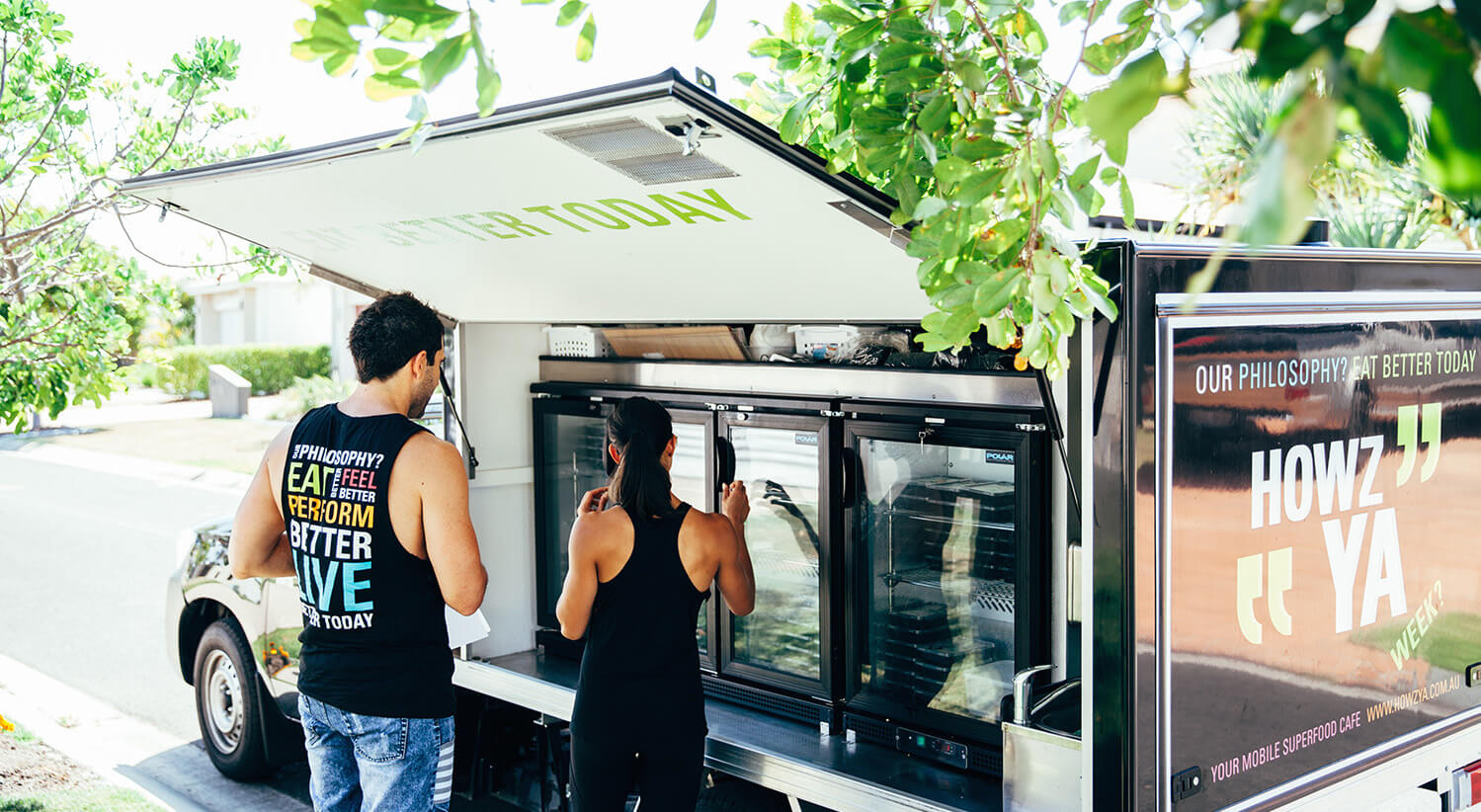
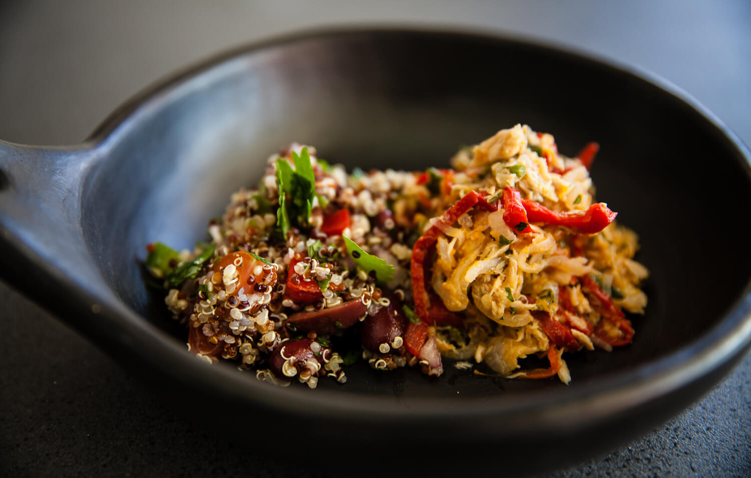
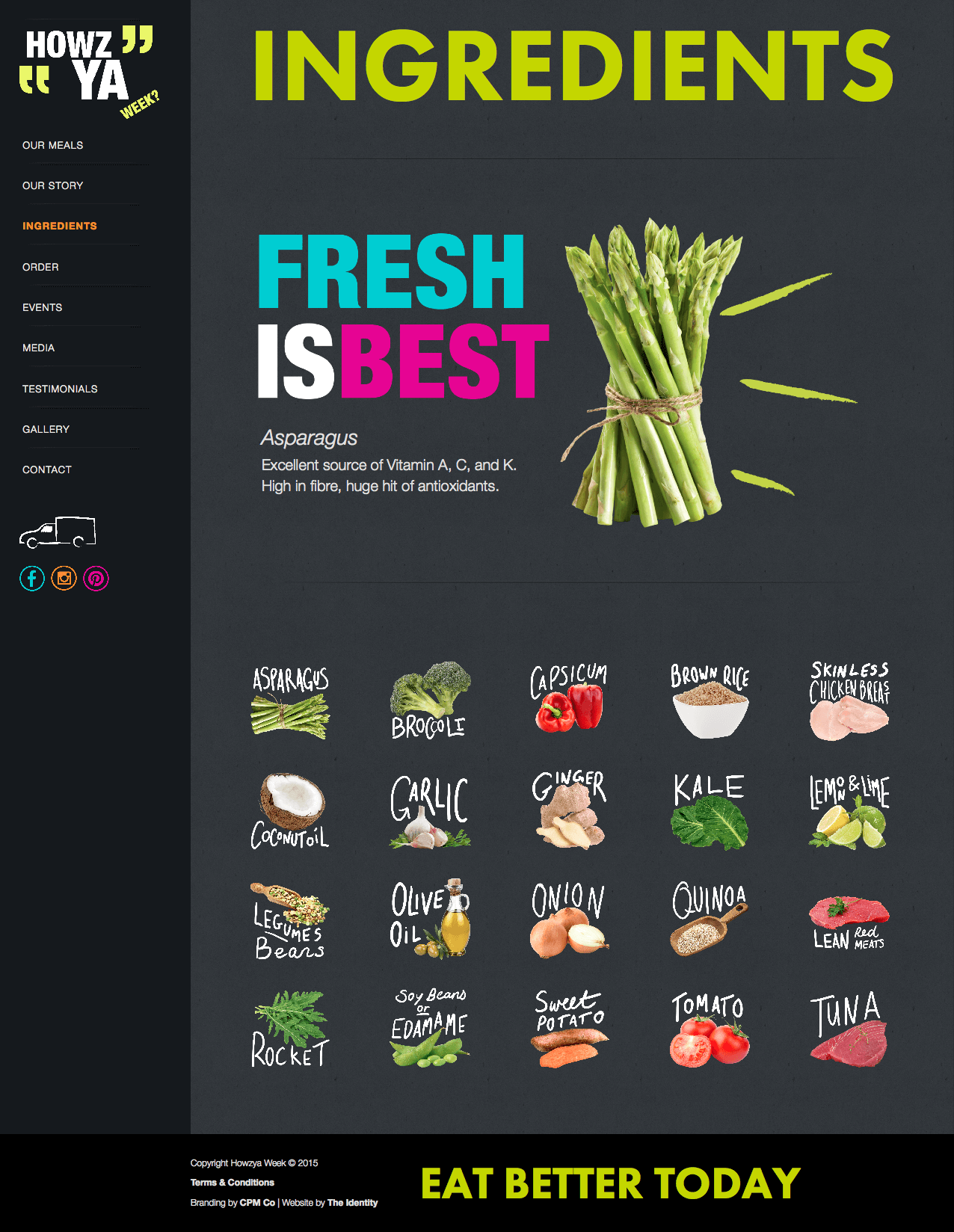
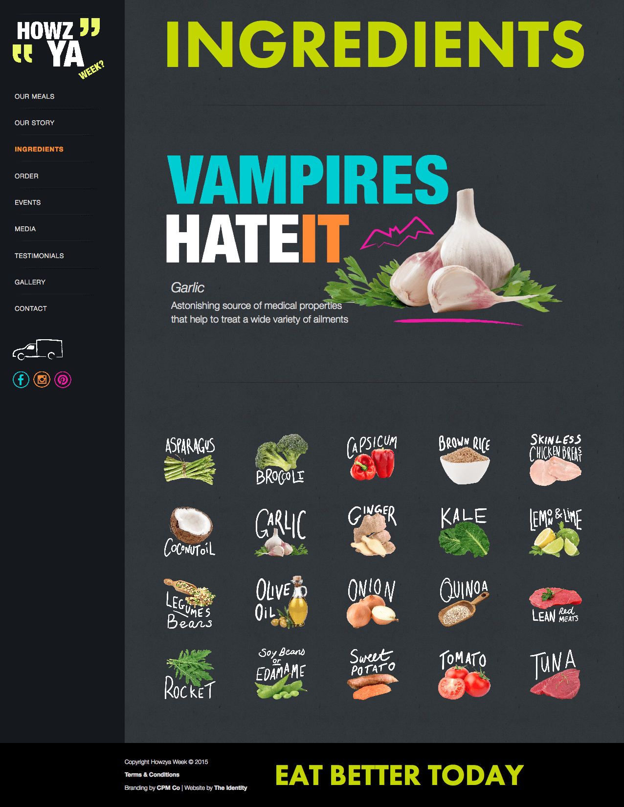
Howzya was determined to give people professionally prepared, healthy meal choices in the local region. Inspired by their vision and photography, we wanted to make sure the ingredients were the star of the show, like their meals. We used their brand colors to complement the item, ensuring it would stand out on their dark base. This was in the days of photoshopping extensively to get some pixel-perfect, background-free ingredients. These could then be used as headers at any stage — across website pages and on print materials such as signage and posters.


Designing and developing the website
We pulled the ingredient work into a page on the site too so people could click on an item, smile and see the health benefit; a little subtle education while hopefully instilling more trust and desire in the meals. Our wonderful designer at the time whipped up some lettering to work alongside the images when they weren't used in header contexts.
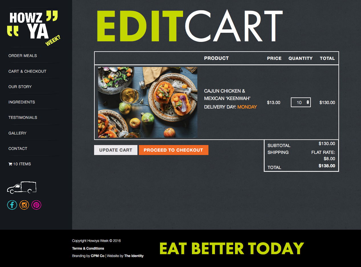
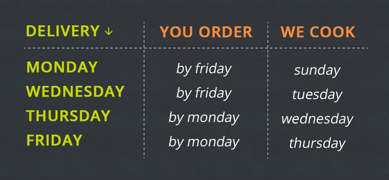
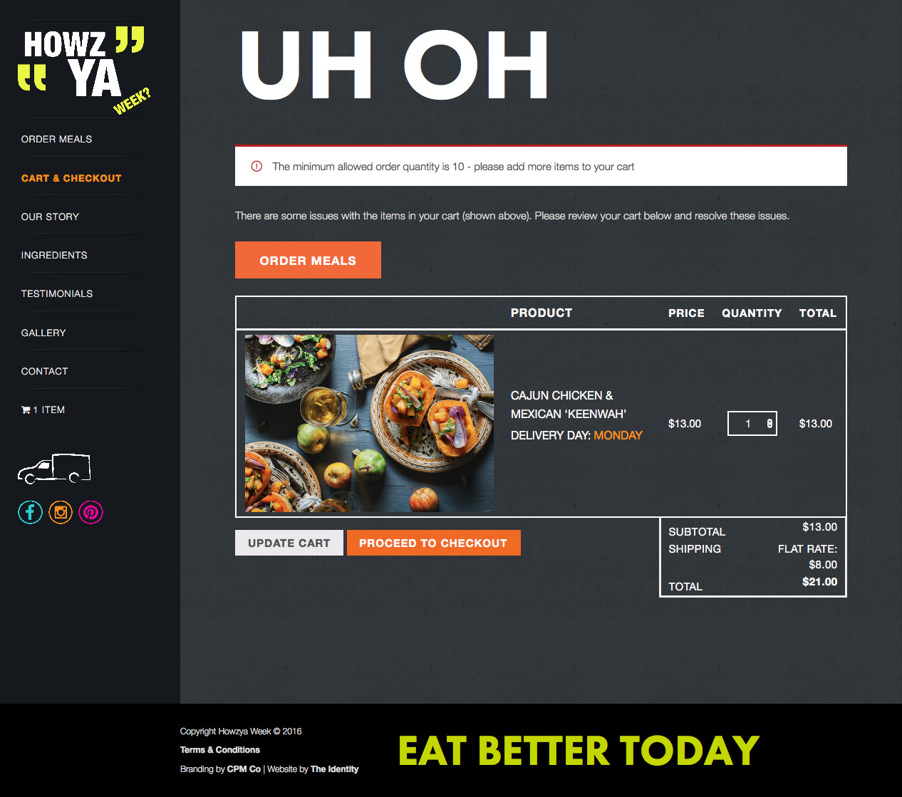
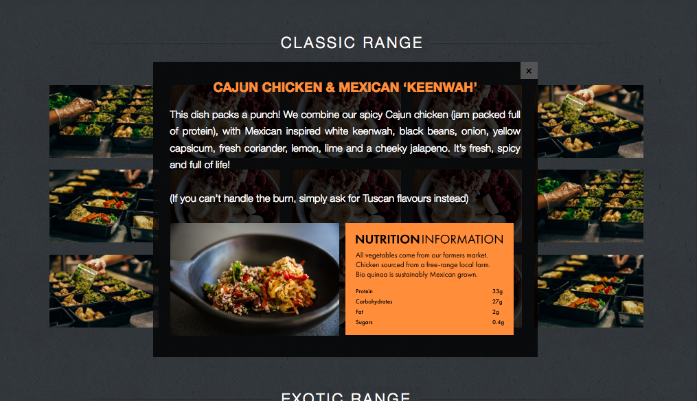
We also developed an online store with numerous special rules and specific delivery time frames and cut-offs to make for an efficient ordering system. This was quite tricky as the business needed to consistently update meals each week, so everything needed to be fully CMS-able. We were able to make it work by adding rules, coding up to restrict to specific suburb postcodes, pulling in lots of error states to nudge users, providing admin options on the backend, and making a lot of the choices feel seamless to the user (such as delivery days). The header text need always scale at full width to keep the design, so I used a bit of javascript to keep this consistent no matter the screen size.
Designing and developing the ordering system
We developed the online store with numerous special rules and specific delivery time frames and cut offs to make for an efficient ordering system. This was quite tricky as the business needed to consistently update meals each week so everything needed to be fully CMSable. We were able to make it work by adding rules, coding up to restrict to specific suburb postcodes, pulling in lots of error states to nudge users, providing admin options on the backend, and making a lot of the choices feel seamless to the user (such as delivery days). The header text need always scale at full width to keep the design so I used a bit of javascript to keep this consistent no matter the screen size.