Brand and website design
With my little studio, I directed (and designed within) the creation of a brand suite, products, and comprehensive website for a new centre of rest.
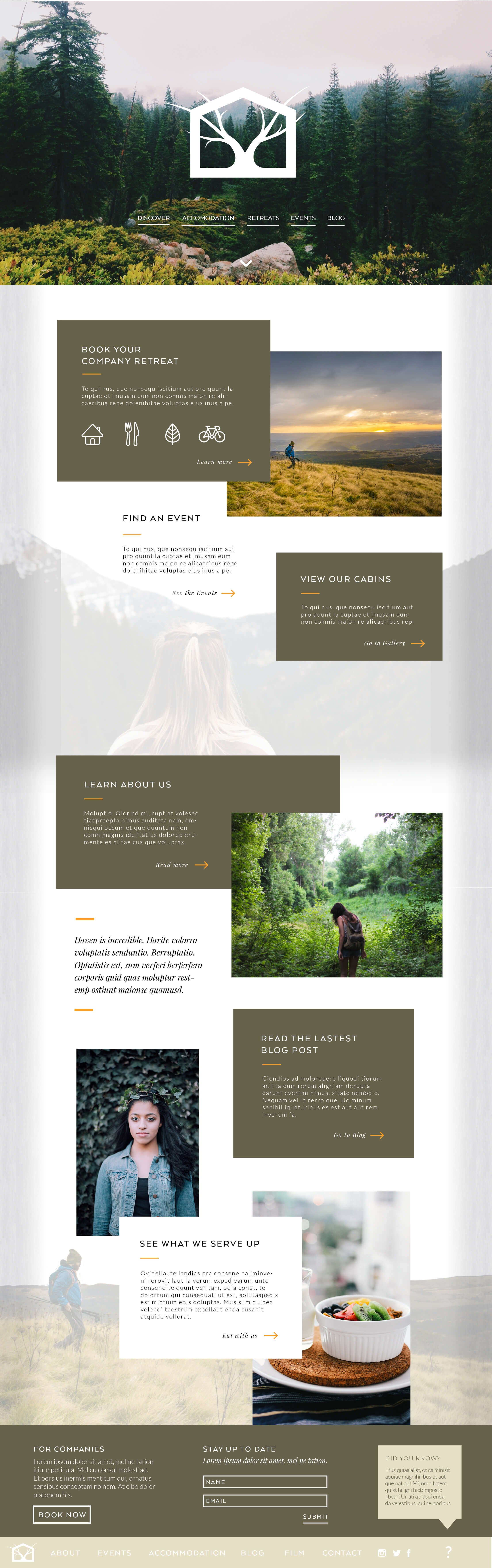
Australia’s newest, and what would be one of the largest, retreat centres was opening up in Queensland in a special spot in the forest just fifteen minutes from the infamous Sunshine Coast. The aim? To connect us back to nature. To welcome in those looking for calm, a break, an escape. To teach urbanites the tools of healthy eating, growing your own food, nourishing your body and mind, and working your muscles in ways that they could take back to their fast city lives in order to slow down.
2015 Project
Scope
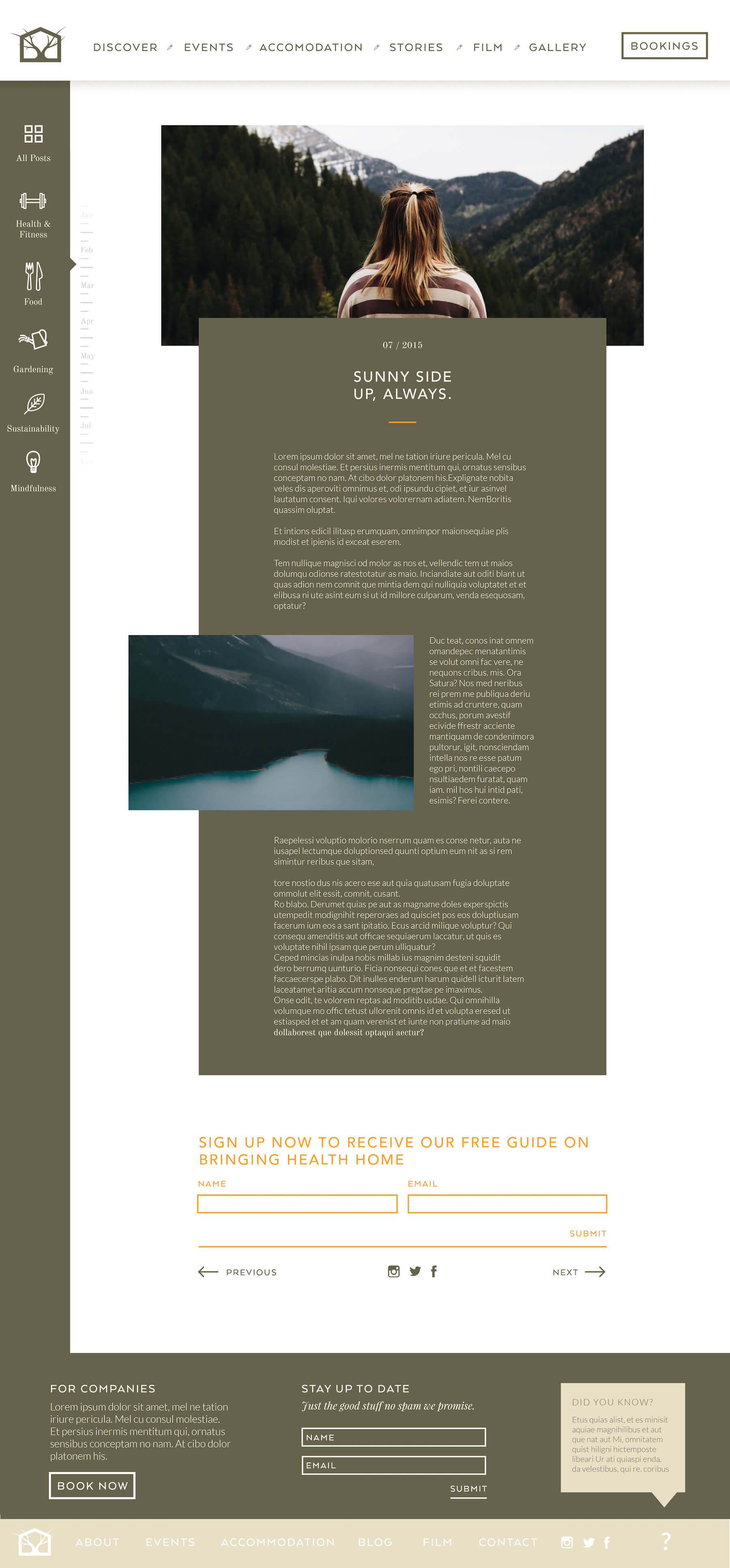
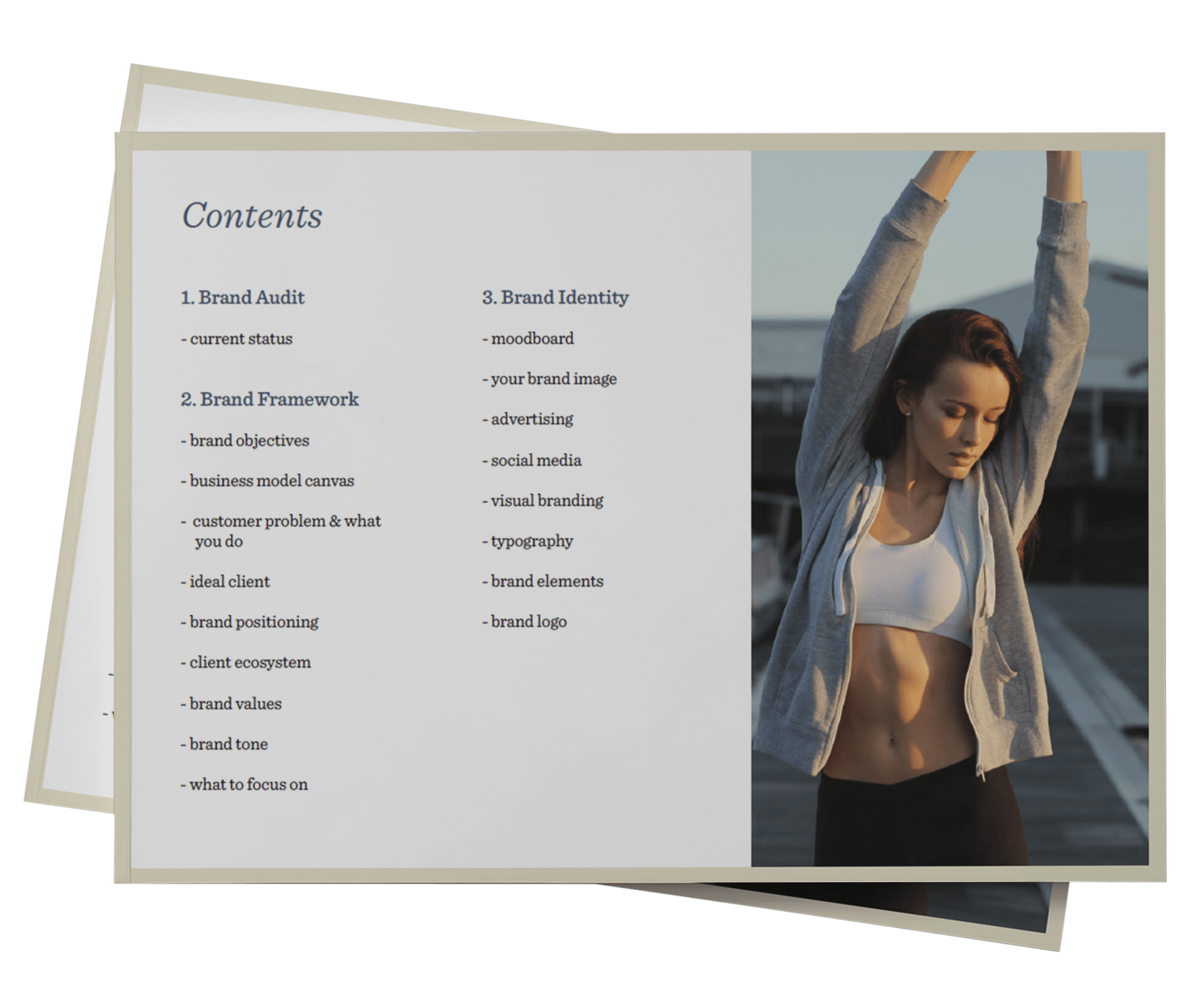
As part of my studio, we created a full brand, website and content strategy for this retreat centre heading to construction.
Role
Creative director
Designer
Developer
Services
Brand development
Art direction
Social media design
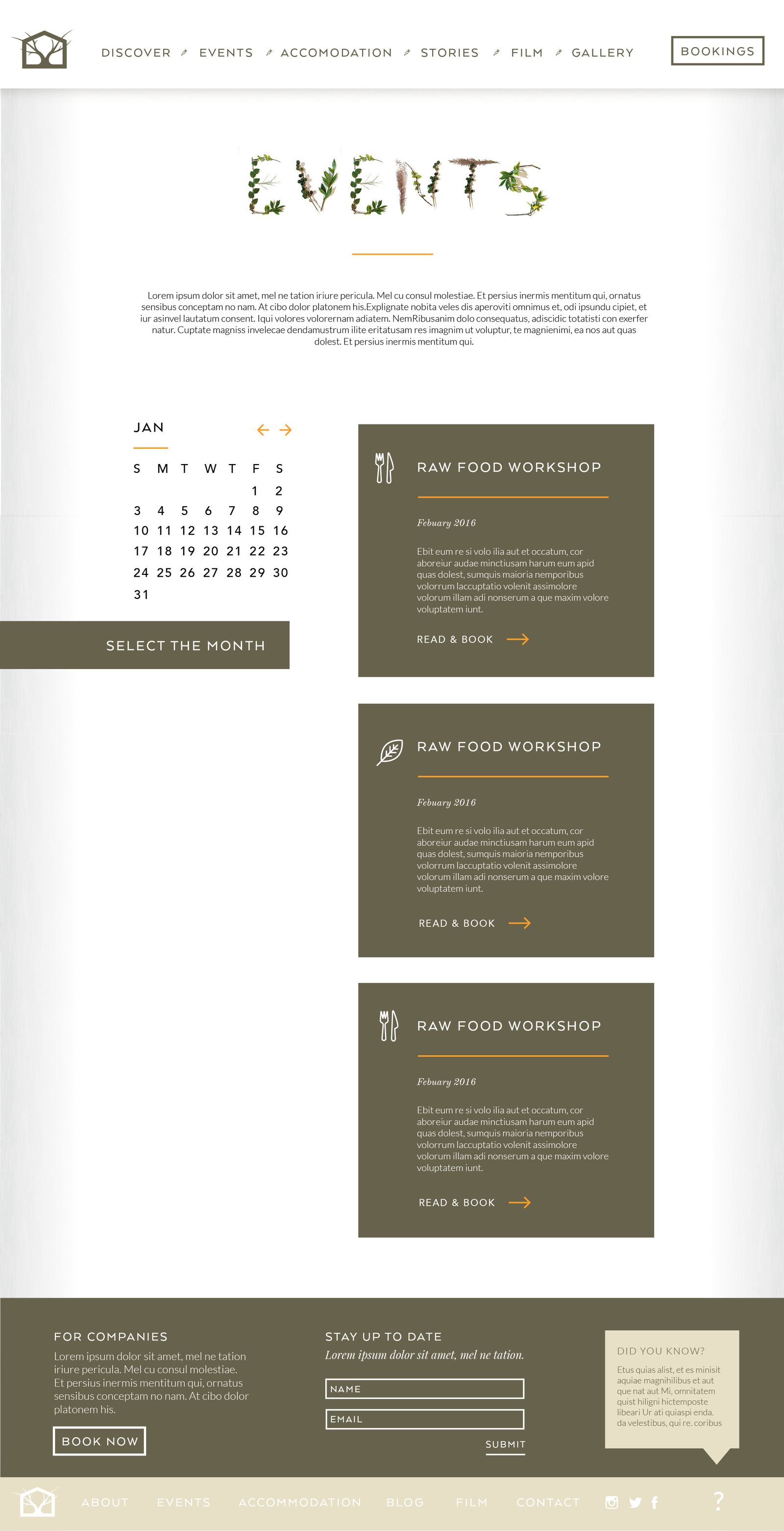
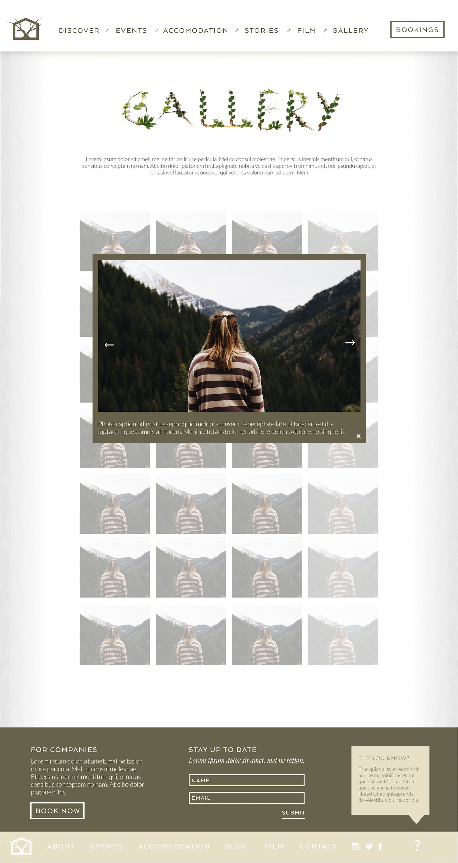
Website design
Website development
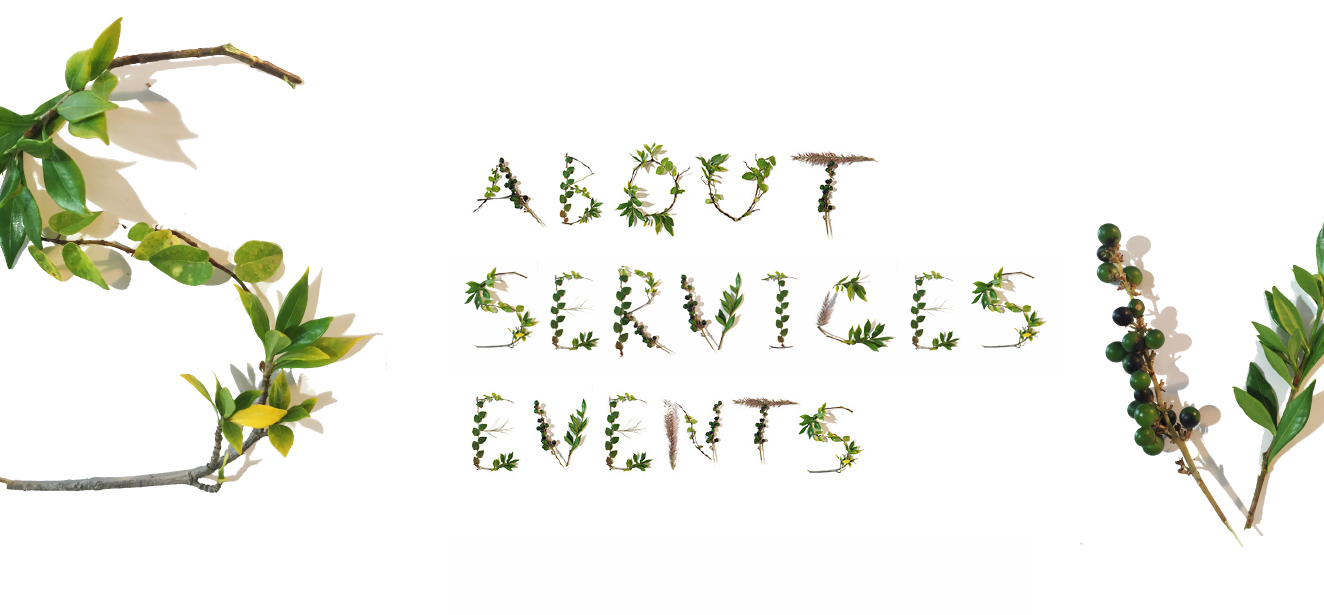
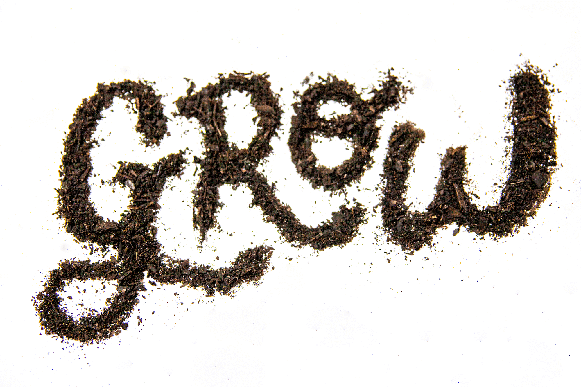
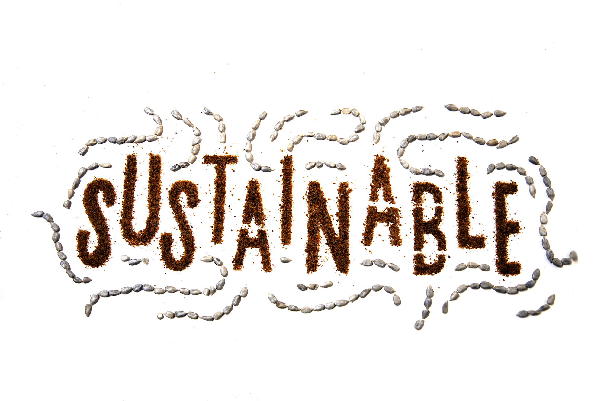
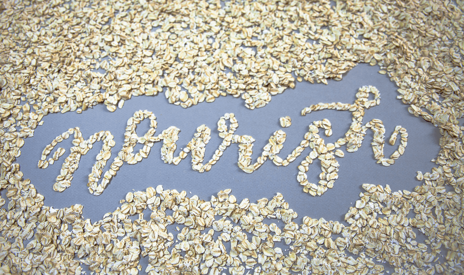
Creating natural lettering
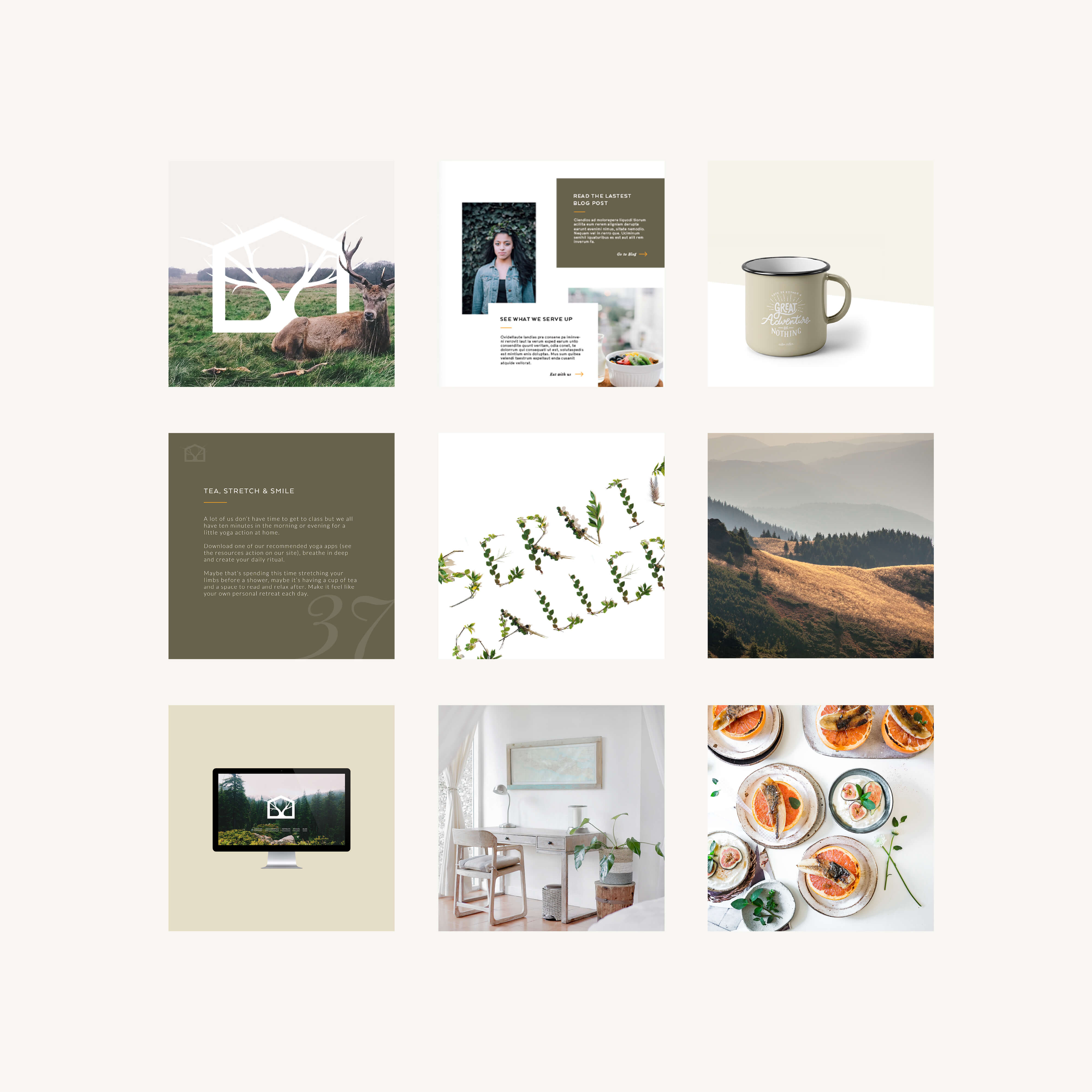
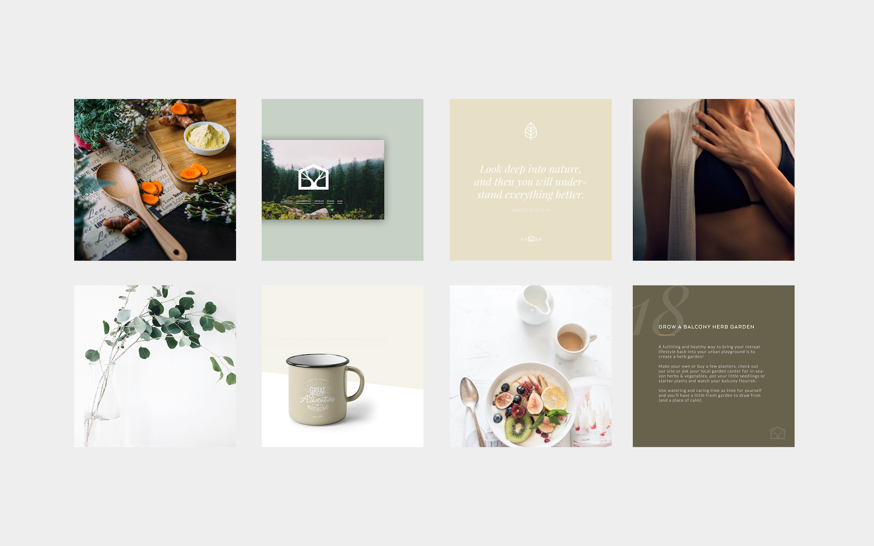
The Haven retreat was being built in the countryside, surrounded by green. I conducted a site visit with the client and using nature as the core of the brand, we brought in various healthy and natural elements to create hand lettered words that connected back to Haven. These were digitally captured to be used across the website, social channels, and for the media. We also extended this concept into other natural materials and created stop motion clips from them. The still shots would also be applied to Haven products.

Strategic product development
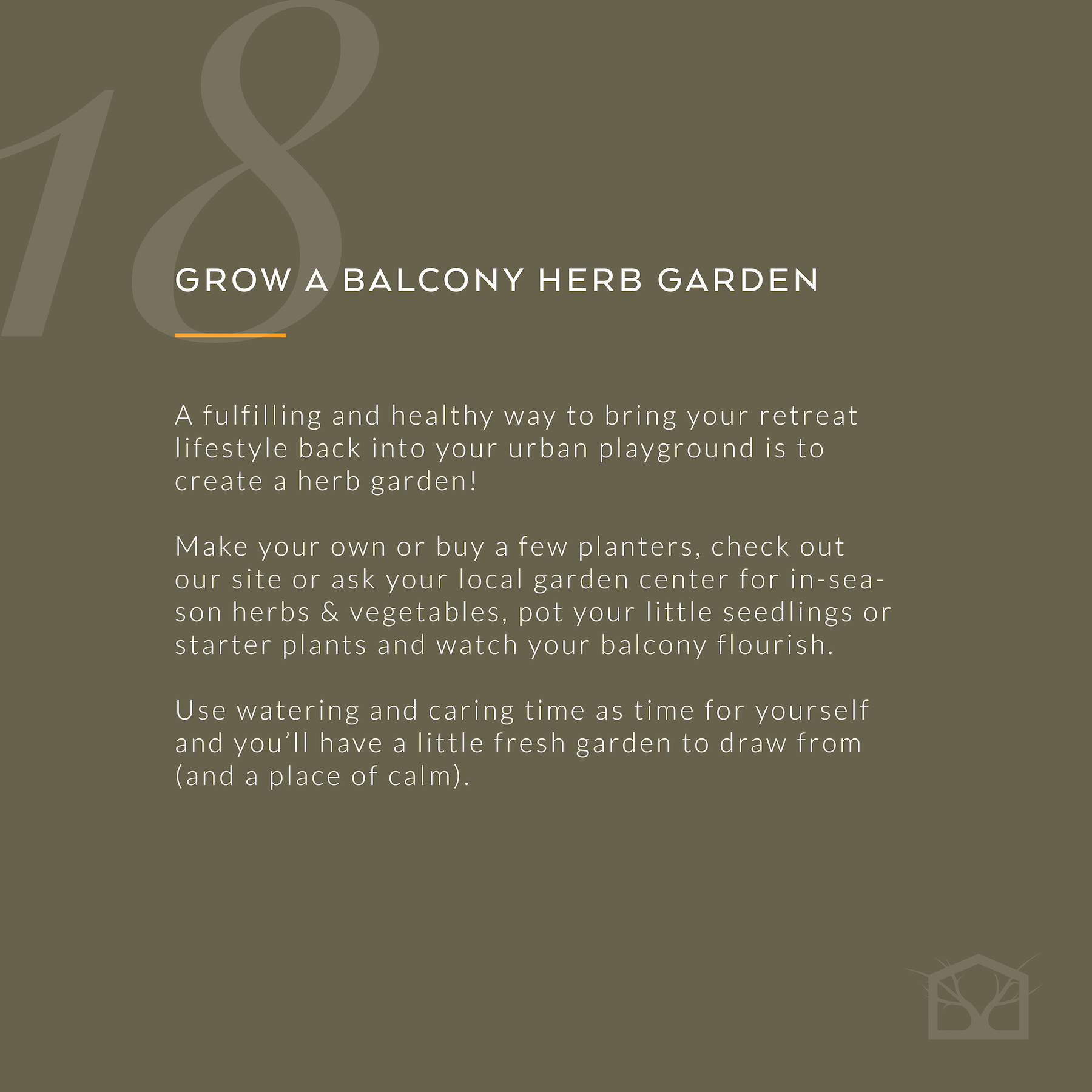
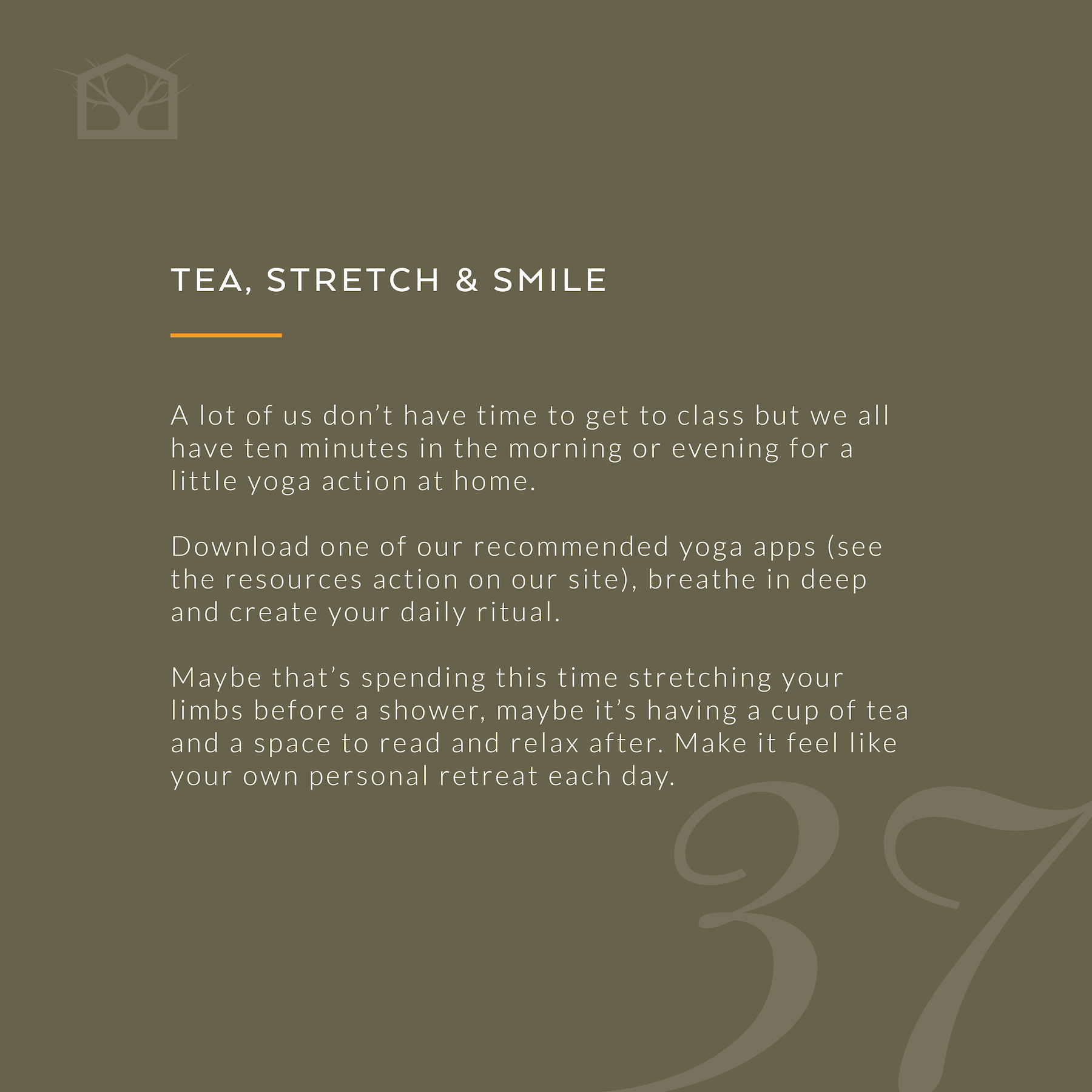
We came up with a number of ideas for how to make Haven a place you want to keep coming back to and create revenue streams beyond that of the centre itself. For this we strategized out a line of products including items that give you the feeling of Haven, resources such as a book for city-dwellers, and products that they make on site themselves such as loose-leaf tea mixes that align with their values and principles.
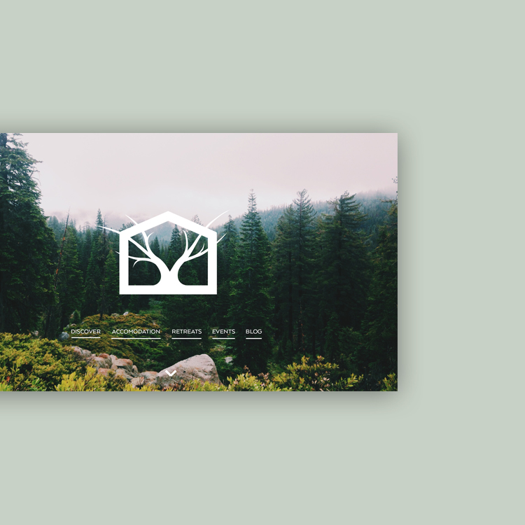
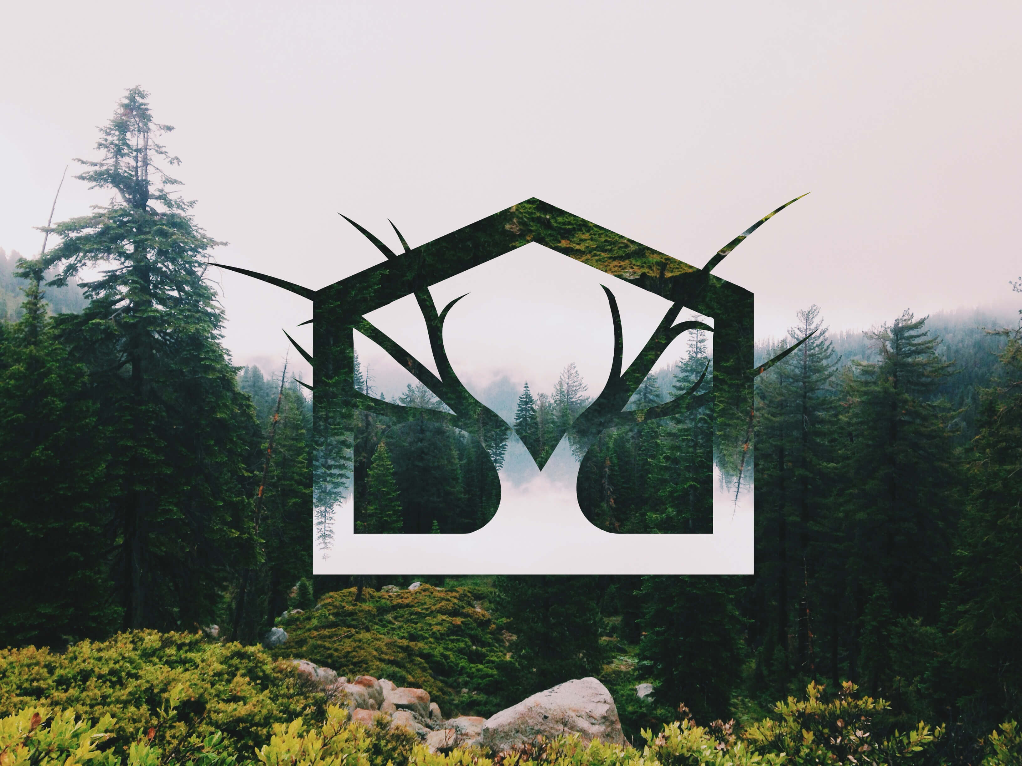
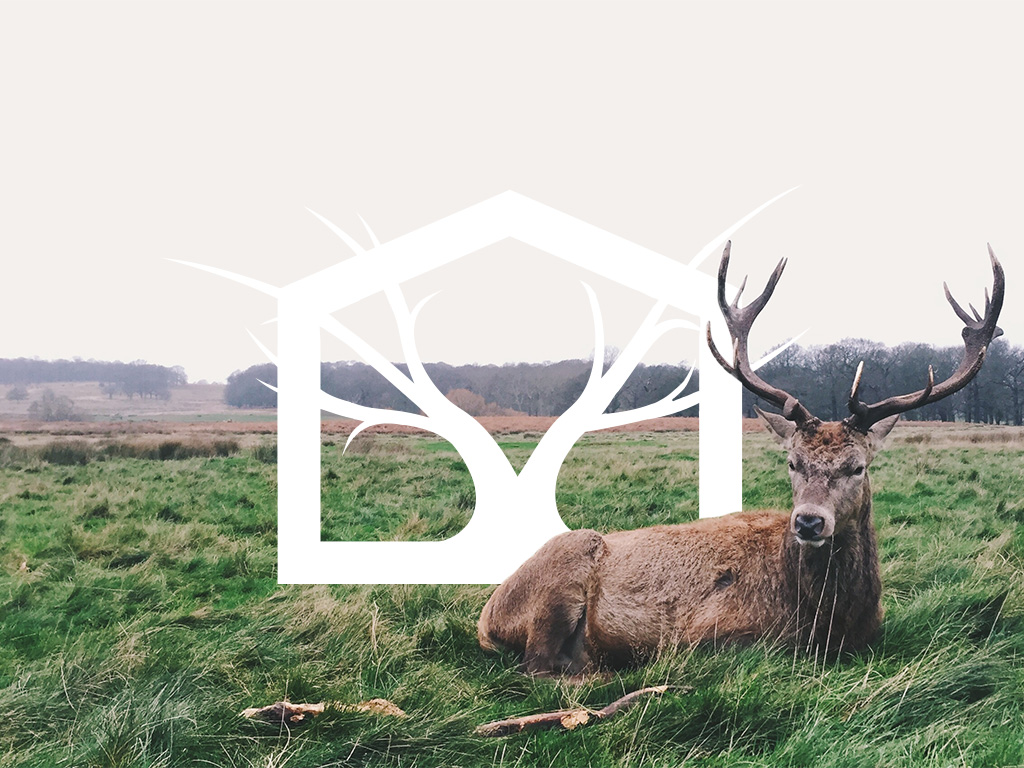
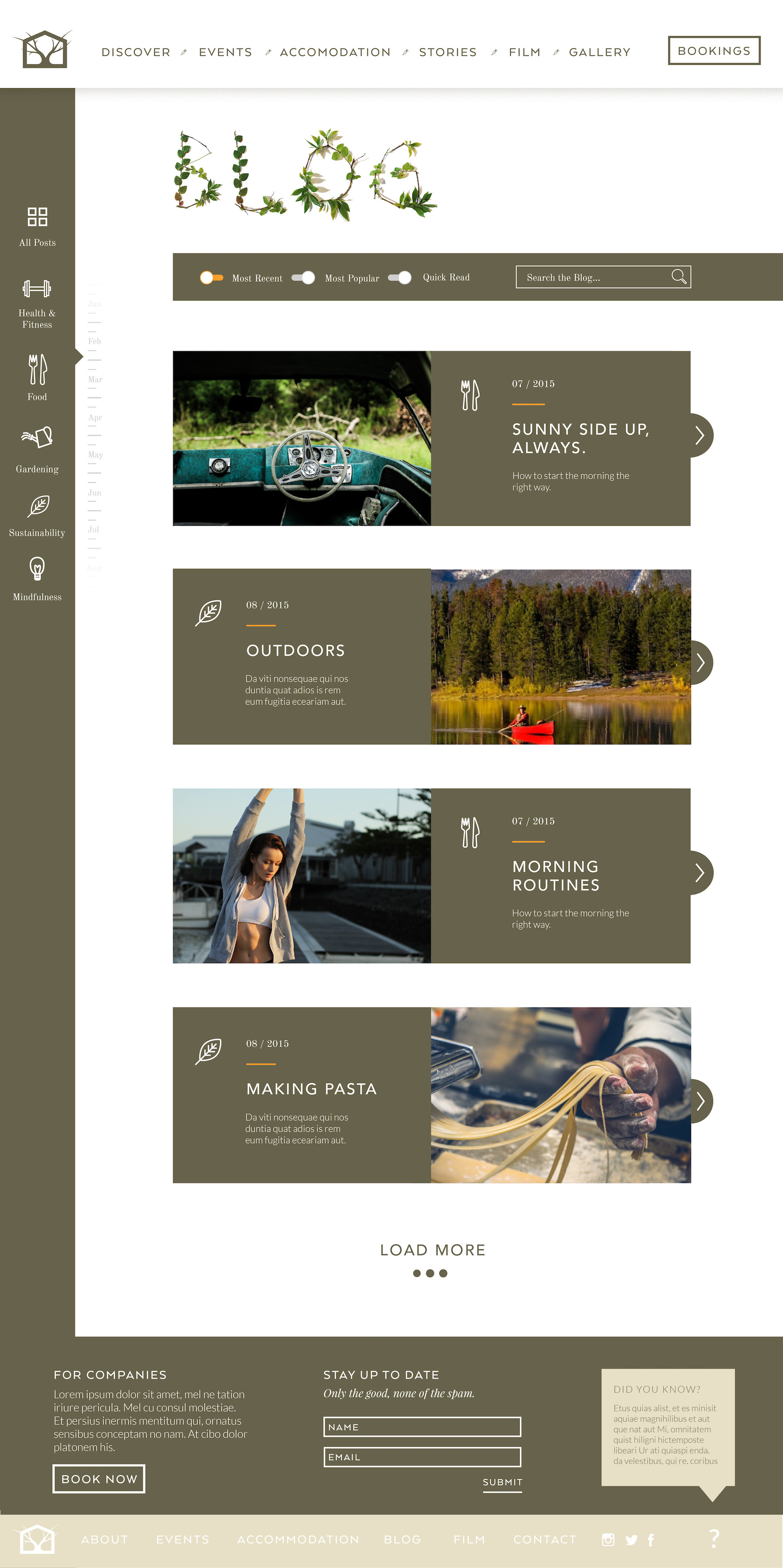
Creating a long-lasting brand and website
We developed out the branding for Haven working a color palette that was both natural and inspiring, a custom icon library, and weaved this all into an extensive website design.
Creating all the collateral and socials
We created a comprehensive social design strategy & content plan. Using a mix of templates for quotes, tips & testimonials in combination with photography and brand features we could create a feed that would be both resourceful and attractive for the audience, consistently providing support for urbanites to slow down, showing off the retreats, workshops, and what Haven aspired to achieve.