Research and product design case study
Crafting CALM's first product to support decreasing youth suicide across the UK in tandem with a missed birthdays campaign.
With a well known suicide hotline and bold support campaigns, CALM was looking at reducing youth suicide rates with their first dedicated digital product, targeted at adults. I researched the space and worked to develop a product alongside education.
On this page you will see references to females and males. This is due to coroner reports recording sex, not gender, so academic studies and my research insights align with this. The product however uses inclusive language and / or gender as sex is not a required determinant. To protect company confidentiality, data and numbers have been obscured, altered in graphics, or use placeholders, unless the number is specified to highlight an outcome of the work. All work is shown in snapshots only to provide an insight. The rest of the page discusses suicide. Please take a break at any time or refer to resources in your country for support. If you are working on systemic change in this space, I'd love to hear from you.
2024 Project
The scope
Worked on this project over the course of four months to launch a youth suicide reduction product during a campaign launch period.
My role
Managing and designing as the Research and Product Head with the wonderful team at Orbit29.
Outcome
Developed the target user, aligned product with internal goals, led conversation design, launched with 100k+ users, significant research insights.
Audience
Adults across the UK, ultimately refined to those with lower mental health literacy.

Why are young people suiciding?
We kicked off the project by quickly consolidating a huge amount of content into just a few pages to get a resources area live in time for the first part of CALM’s missed birthdays campaign. From there we took a pause from the tools to understand the problem space better. We had media reports, but I needed to deeper understand suicide by young people in order to figure out how to best address the problem. Numerous questions were in my head.
Can we back up the narrative of reported youth suicide peaks with data, to work backwards for possible reasons? Are certain young people experiencing low or higher rates? Is it UK specific or a global trend? Are there specific protective and risk factors that appear to lower or increase the suicide likelihood? Should we be looking at individual intervention, population-specific design, or systemic changes? Where could a digital product and CALM’s leverage best fit?
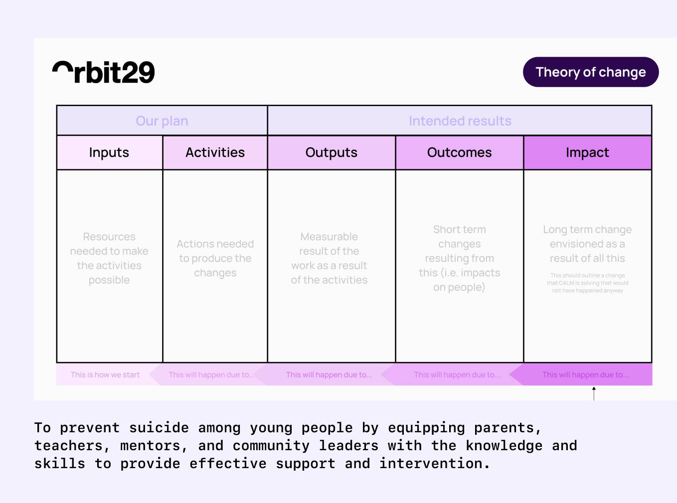
Developing a theory of change
We recommended that CALM use a Theory of Change to establish a clear focus and define related goals. I provided a template to guide the process, and CALM outlined their primary objectives. With a draft framework and the term-specific goals in place, we were able to shape a research plan and begin exploring what to create next.
The North Star was to reduce suicide rates among young people in communities where adults have received training, increase early intervention for at-risk young people, and change the community culture in respect to mental health and suicide discussions.
Data analysis, research findings and implications
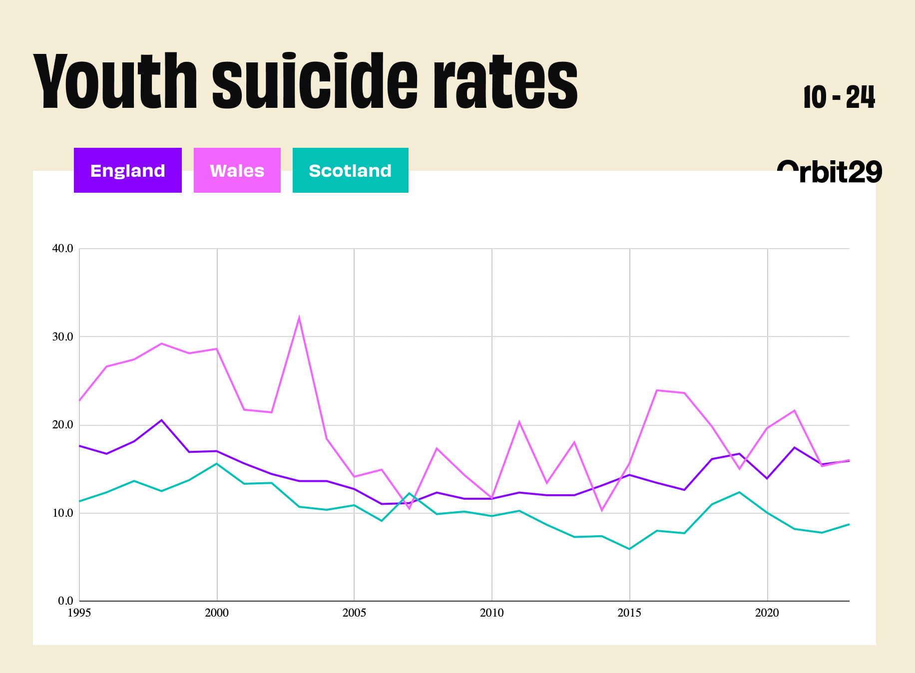
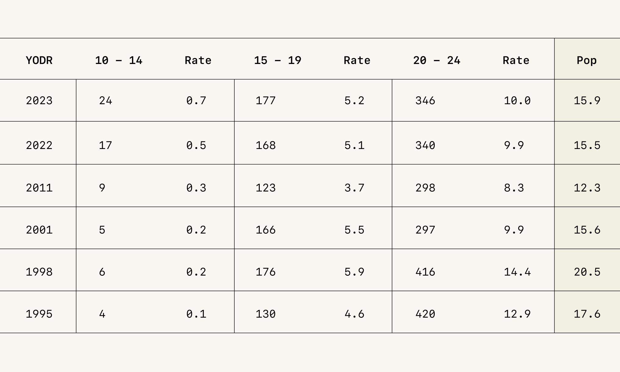
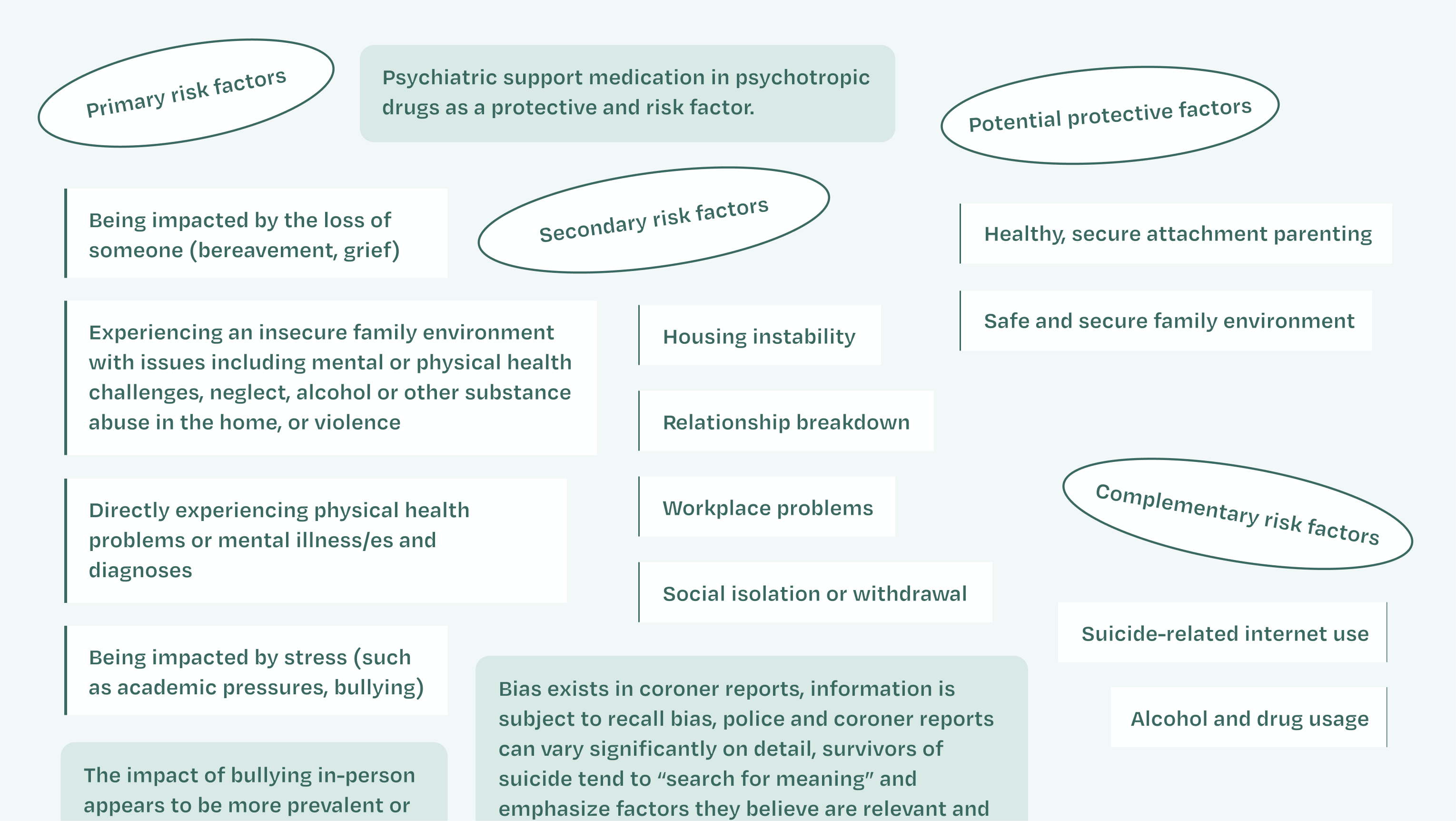
The data for this project was surprisingly difficult to reconcile. Although England accounts for the bulk of the data due to its population size, the absence of a unified database (combined with data disparities and differing methodologies across the UK), meant I had to spend considerable time understanding and normalizing the figures first. Alongside this, I conducted detailed research by analyzing Parliamentary reports, academic studies on coroner findings, psychological interviews and assessments, and research with healthcare professionals.
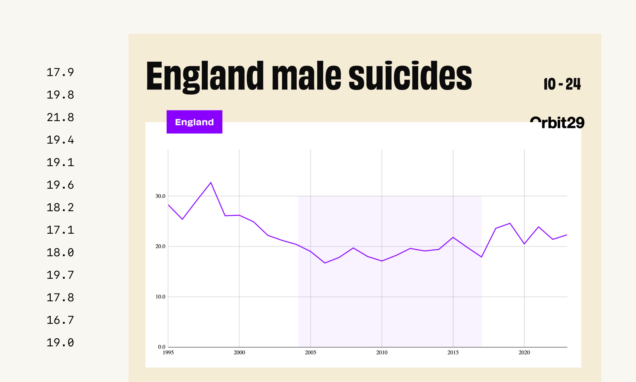
A few foundational findings
- Youth suicide in the UK peaked in the mid-to-late 1990s. Following a lengthy period of fairly steady rates, the rate began rising again from 2017. Though the male rate has not returned to peak levels, young females are reaching new heights.
- Suicide is the leading cause of death for young people. Like suicide at the population level, there appears to be a difference between anglophone countries (rising) and other OECD nations (decreasing or stable) at time of research. Self-harm appears to be rising in young people in global countries however.
- At a population level, it is difficult to pinpoint exact policy change or event impacts to yearly fluctuations because there are significant death registration delays in all countries except Scotland.
- The suicide rate has been consistently higher in Predominantly Rural or More Deprived areas than in Predominantly Urban or Least Deprived areas since 2017.
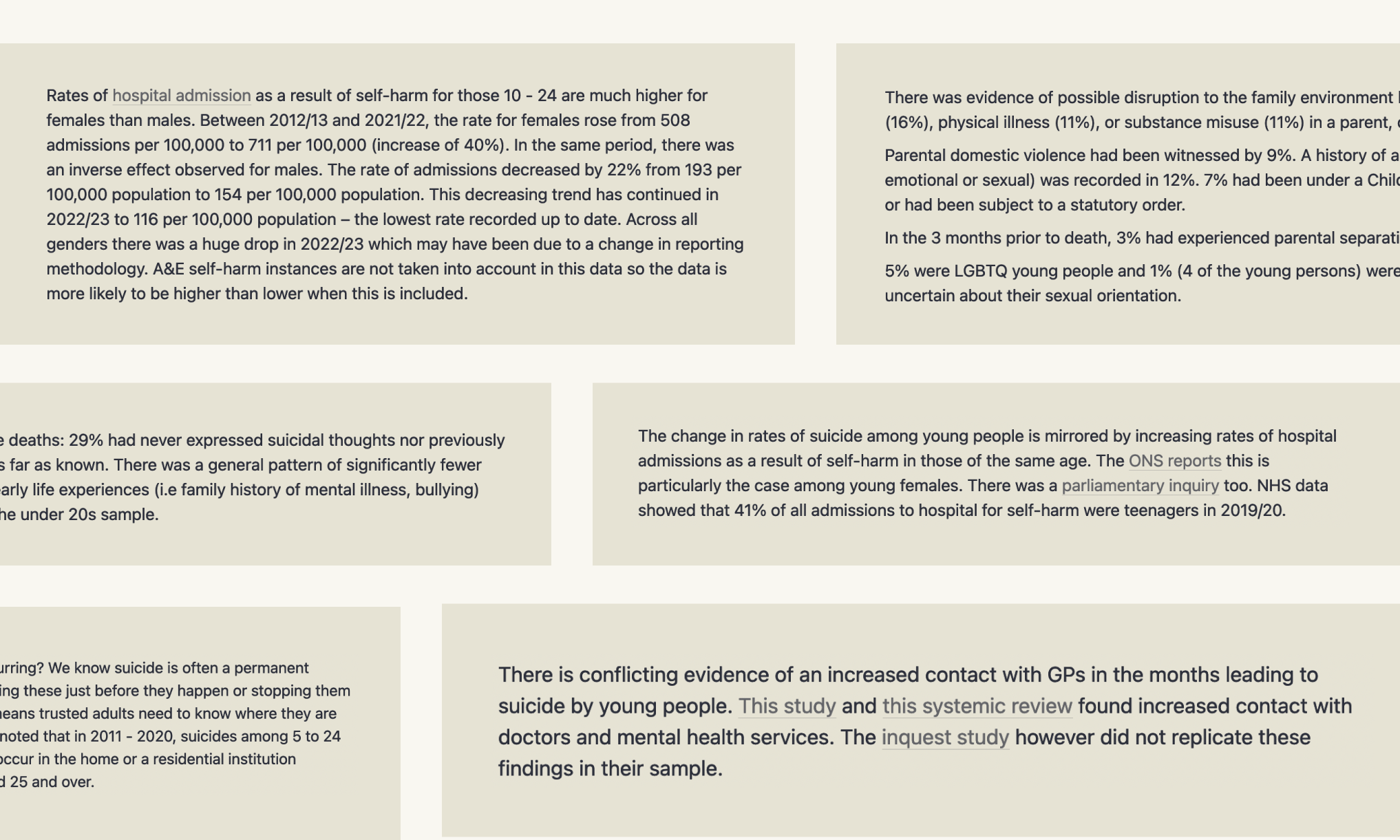
- Coroner reports do not include ethnicity, but the ONS did conduct a study into higher education students, finding numerous ethnicity differences in the suicide rates. I was then able to compare these rates against the population levels, finding that suicide rates amongst higher education students are lower than the same age bracket rate of the population level. But, suicide in students under 20 occurred more often in April and May, conventionally exam months.
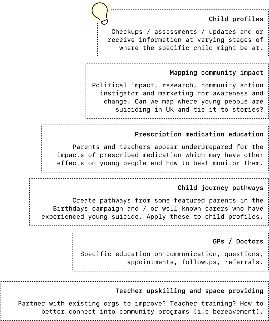
I have significant deeper findings, data insights, and ideas. Working in systemic change for suicide reduction? Please contact me.
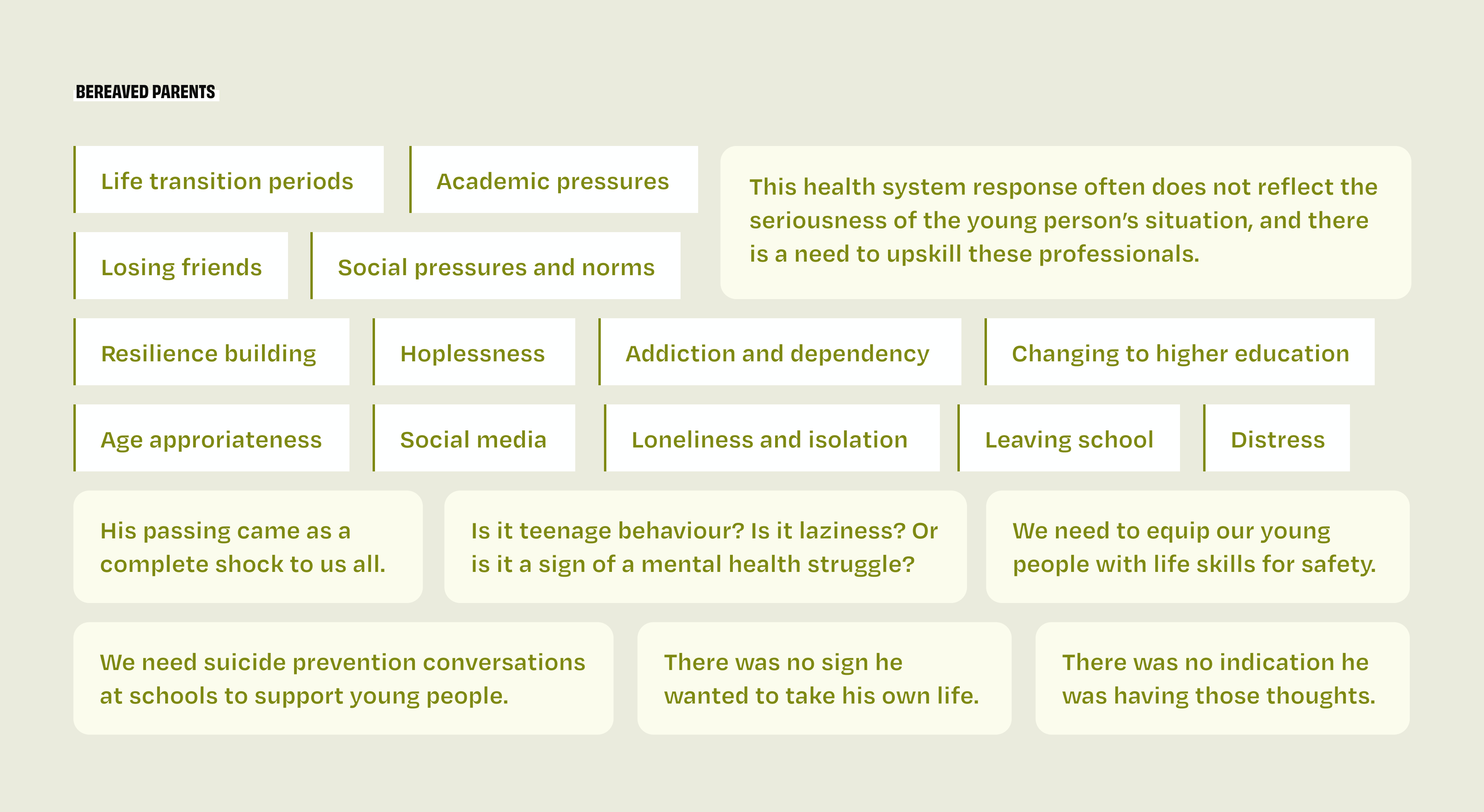
Learning from bereaved parents
To limit bias in the initial research, I held off on reviewing CALM's fantastic earlier work talking to bereaved parents until I had analyzed the data and identified levers in the system. I was then able to review the workshop, other CALM campaigns of collected family member stories, and other bereaved parent testimonies online. The parental insights are sharp; they often align with what the research told us was needed in terms of issue areas, changes we could make, and policy recommendations.
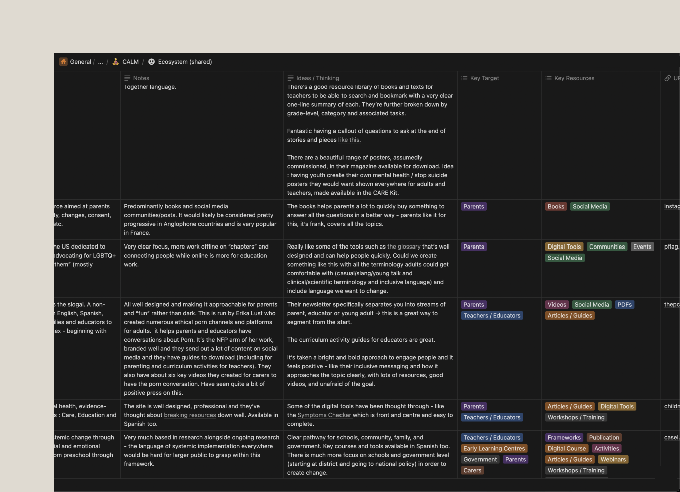
Analyzing the ecosystem
There is some fantastic work being done with young people. While it wasn’t necessary to focus on suicide, my aim was to analyze and highlight how other organizations are achieving success with parents, educators, healthcare professionals, and legislators on a range of issues impacting young people such as neurodiversity, race, sexual orientation, social justice, adolescence and puberty, parenting, pornography, and sexism. By examining their approaches, we could make some shortcuts to what’s working, what works better, and what might not.
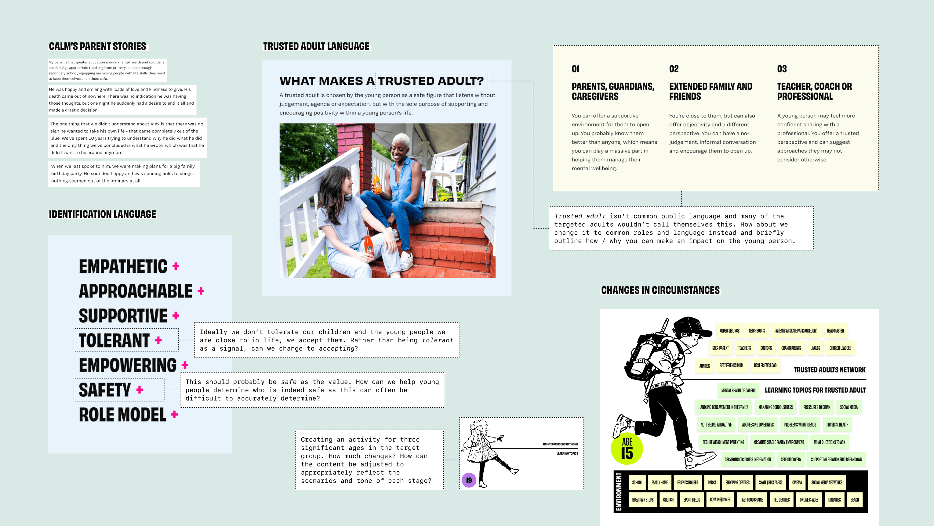
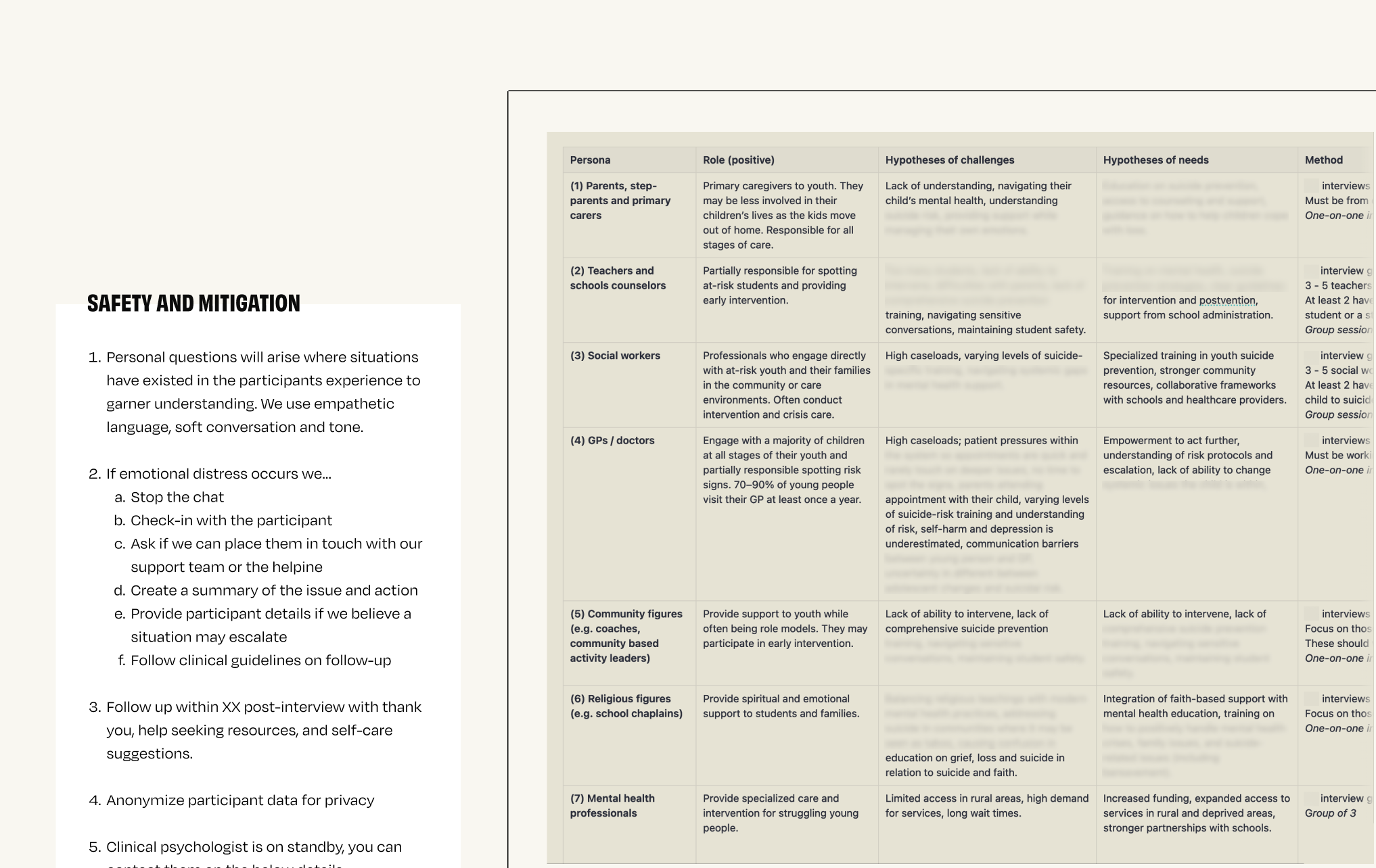
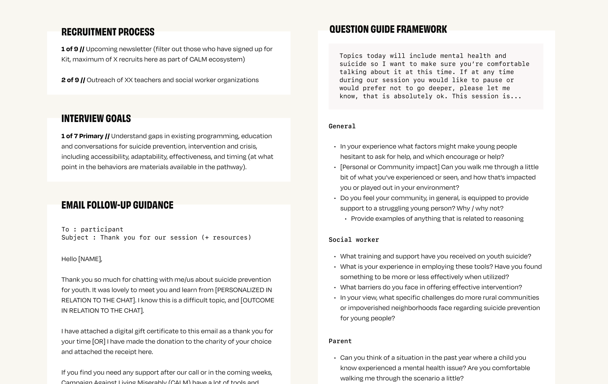
The next phase of research involved interviews. I collaborated with an emerging designer to identify the key participant groups we wanted to learn from. I then developed tailored interview frameworks for each persona, along with safety guidance, a recruitment plan, a modest budget, and outreach templates. Some of the most significant changes occur between the ages of 15 and 24, so I designed an activity to highlight where we would likely need to tailor work to suit different problems.
Defining the product audience
Building in an impact measurement pathway that supports product development
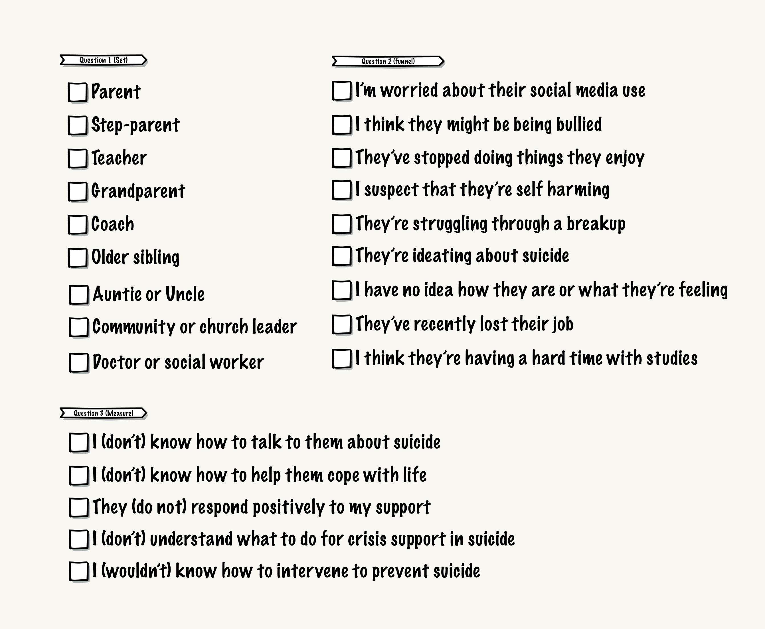
I developed an initial user journey to support CALM’s goal of offering a personalized learning pathway, while also ensuring we embed impact measurement into the product. I began by identifying the type of trusted adult each user was, then created two key questions: one to assess their entry state (for later comparison post-use), and another to understand their initial goals and motivations, which would inform product development.
Together, these three elements form the basis for personalization and measurement: set > funnel > measure.
Adding an effective survey approach
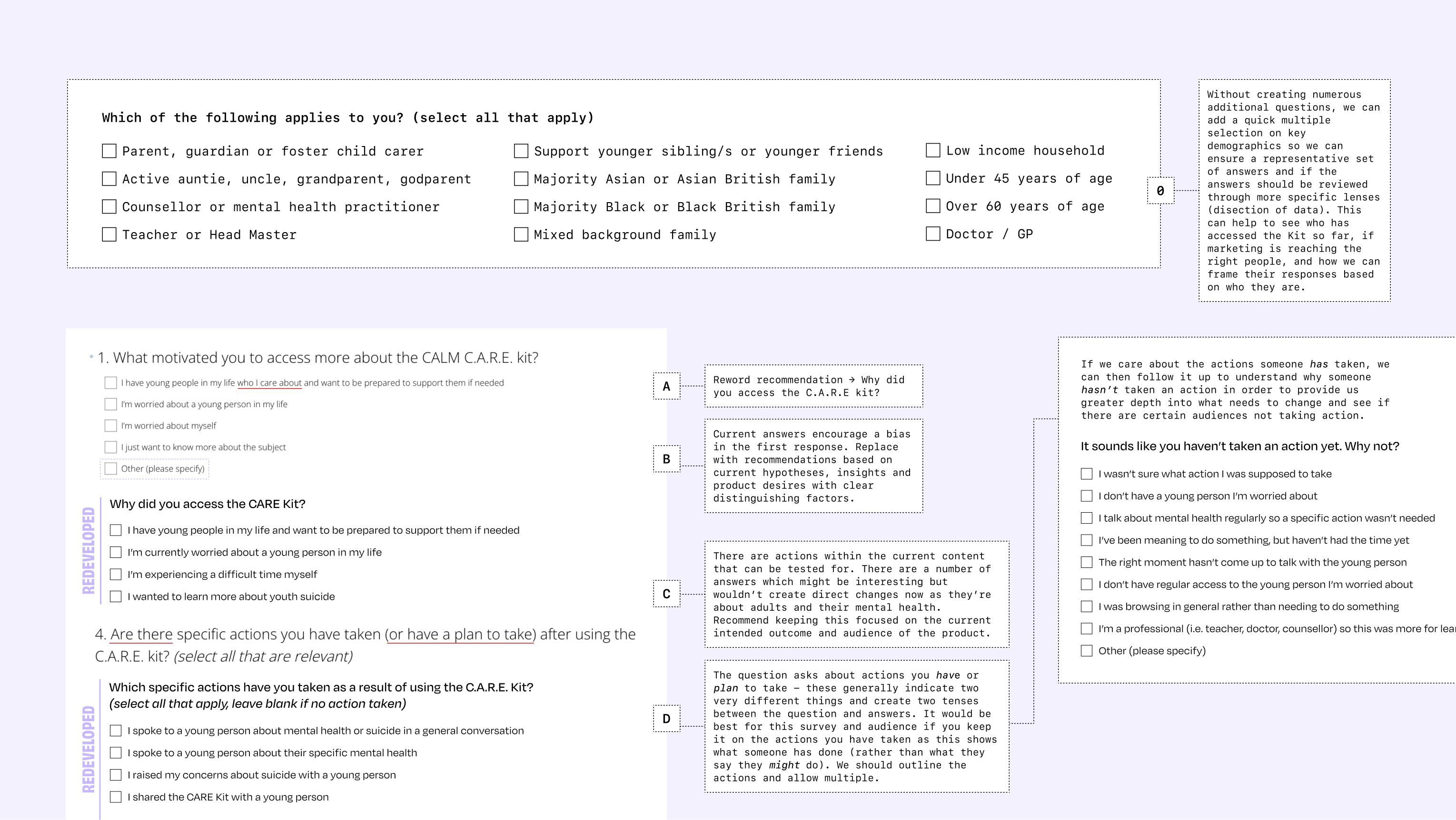
In conjunction, CALM had also developed a survey for the resource kit, so I worked on refining it. We wanted to keep it brief, but I needed to include demographic questions to ensure the data could be properly contextualized and useful. To do this, I distilled the key information we needed into a simple “select all that apply” format that was quick and easy to complete. I also reviewed and edited the rest of the survey to remove bias from questions and answers, reworded or removed items to enhance impact and product development insights, and added new questions where we could gain better understanding.
Refining product ideas and a change of direction
Through this research and the review of existing content, we began developing a range of potential ideas, user pathways, target audiences, and product features. While we were initiating interviews, CALM was undergoing internal changes and was not yet ready to move into solution development within the problem space. A shift in direction was taken. At this stage, the organization was ready to implement existing general content that was well suited to audiences with lower exposure to mental health topics. By building internal capacity, and with evidence of public interest, this would be a cornerstone in securing further product development.
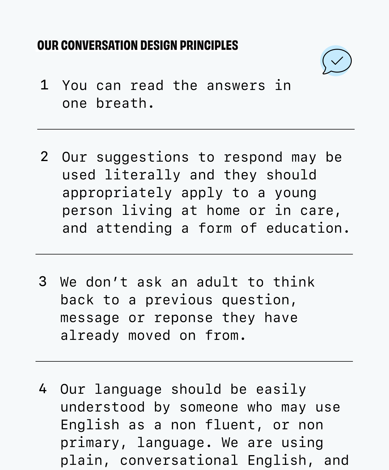
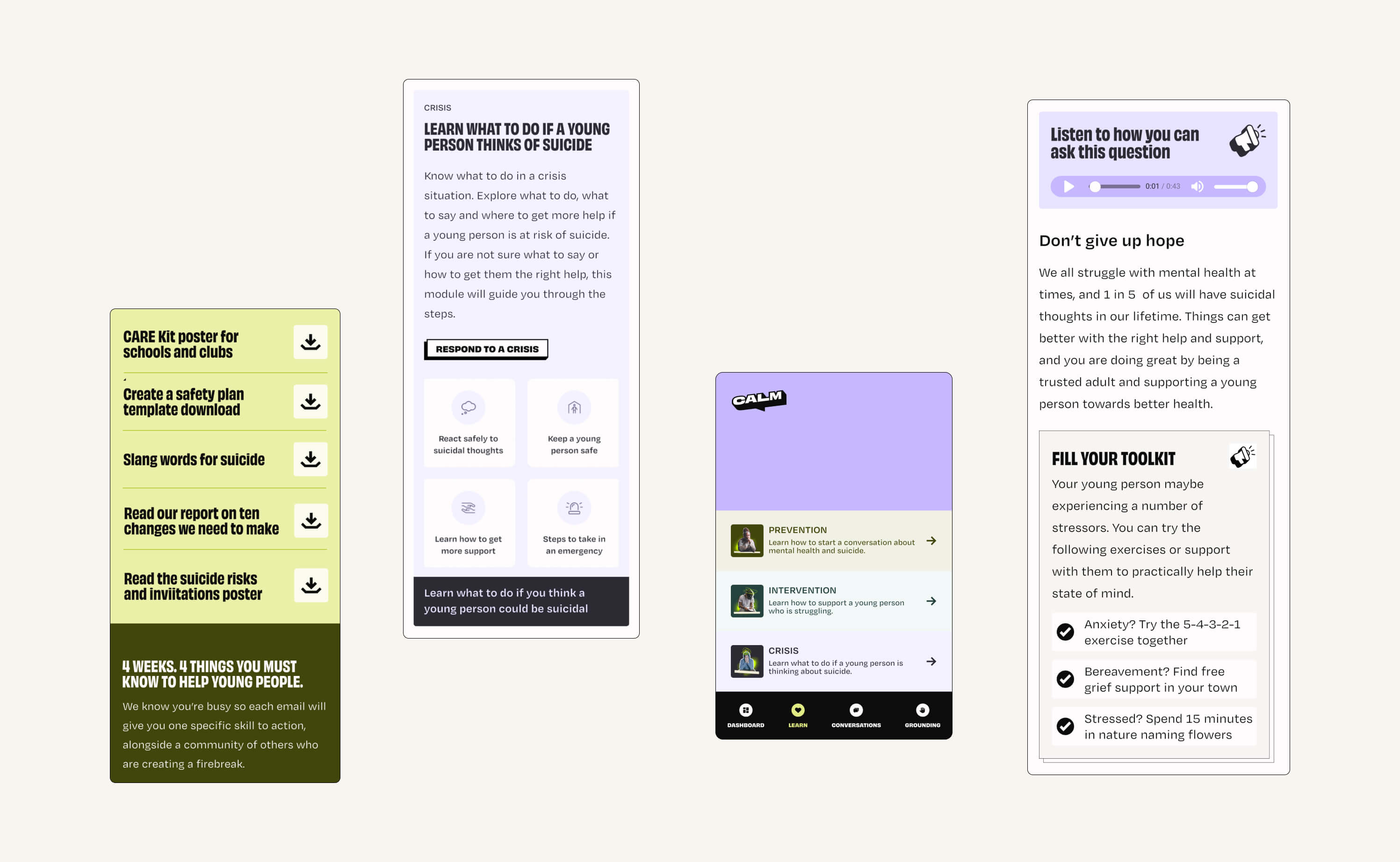
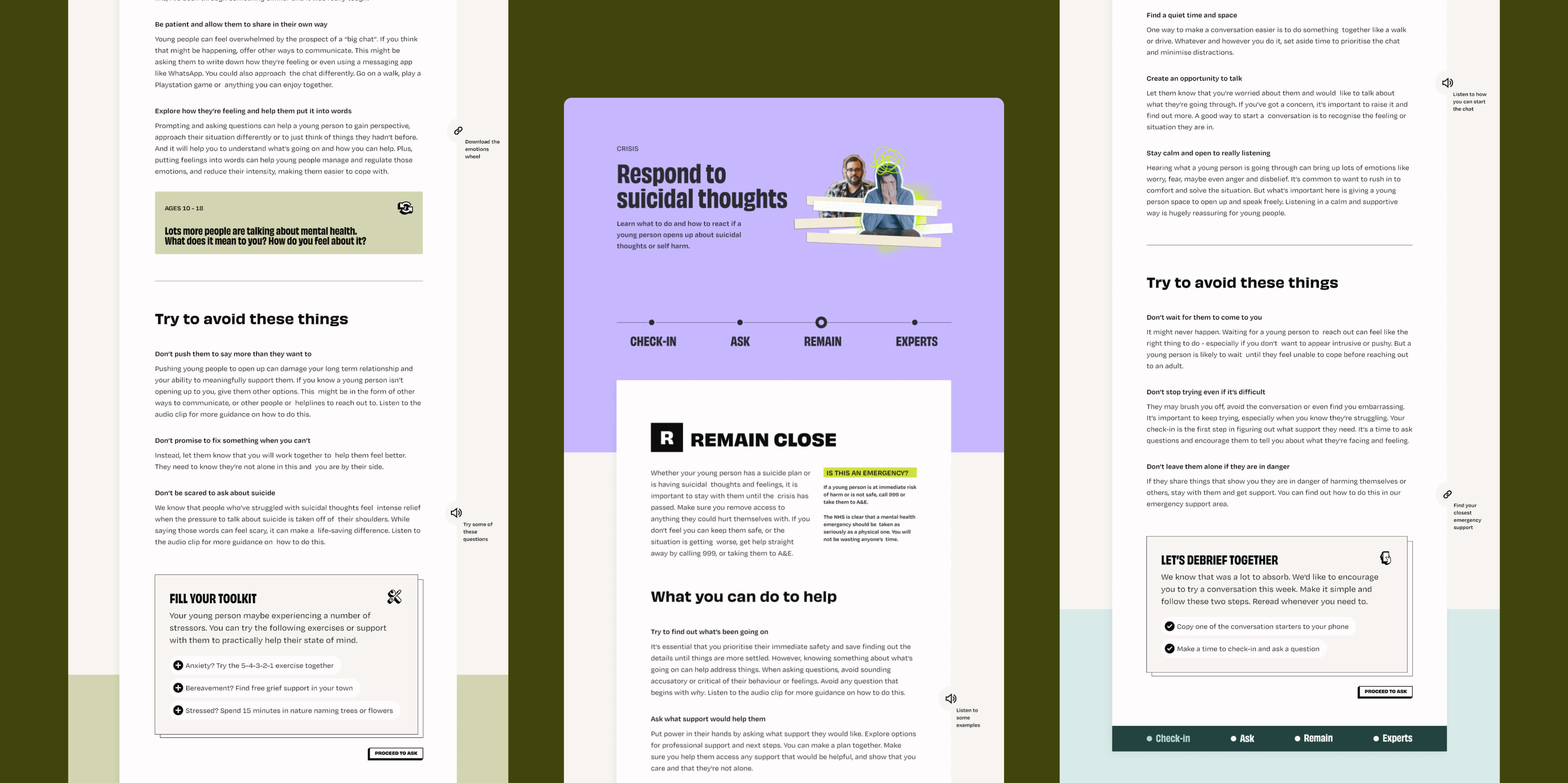
Conversation design principles
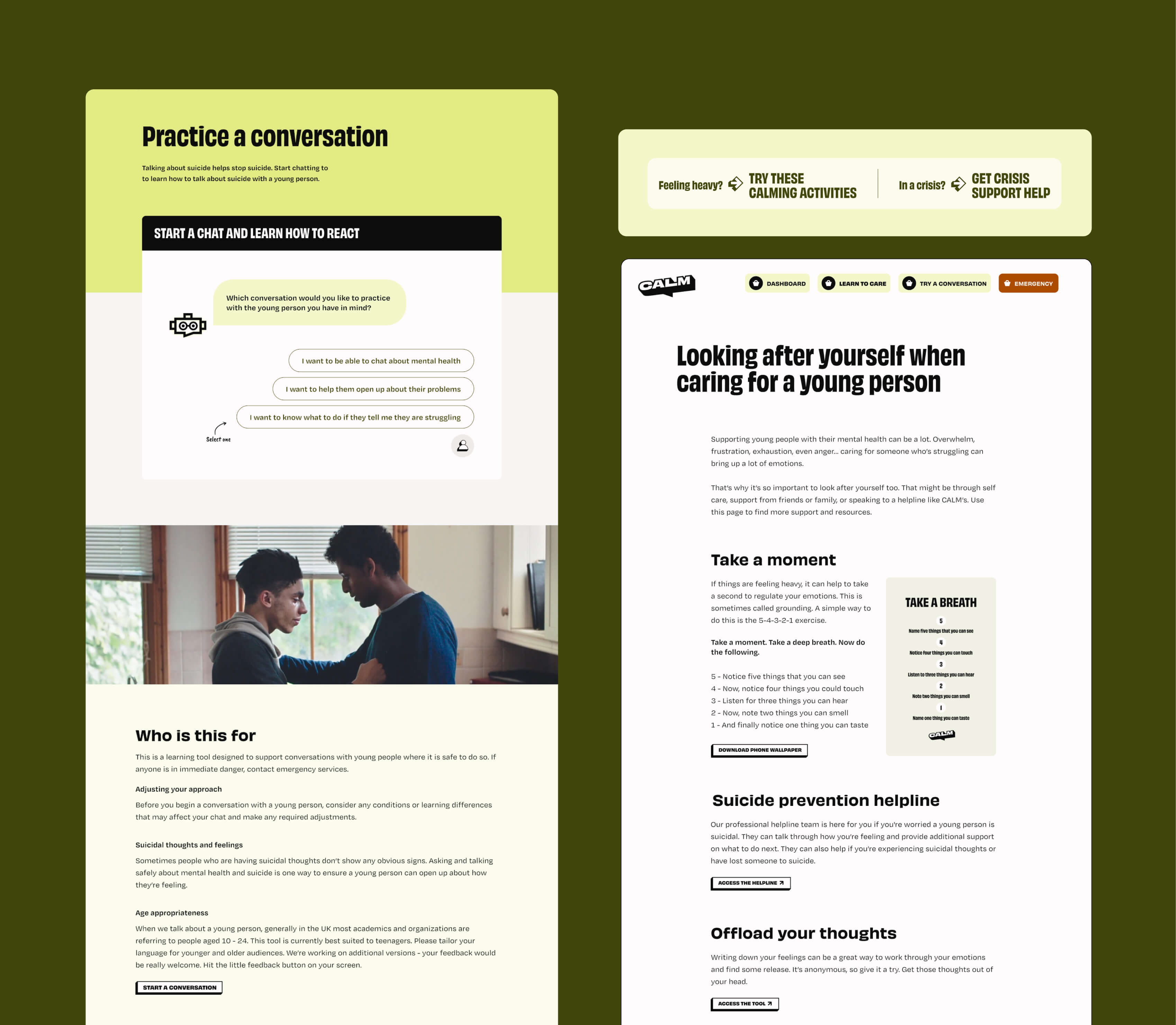
With a smaller product framework outlined, and a target of a broad audience of adults, we wanted to encourage skill-building in the product and suggested a conversation practice to see if this interaction might be useful to this audience, largely those with children within their care. We wanted to build something easy to manage and without needing a custom tool platform so our excellent Orbit engineers figured out how to do this within the existing CMS framework. During this, I spent some time pulling together the design principles for the conversation to help guide the content development, and the learning modules we would be using.
Designing the conversation content
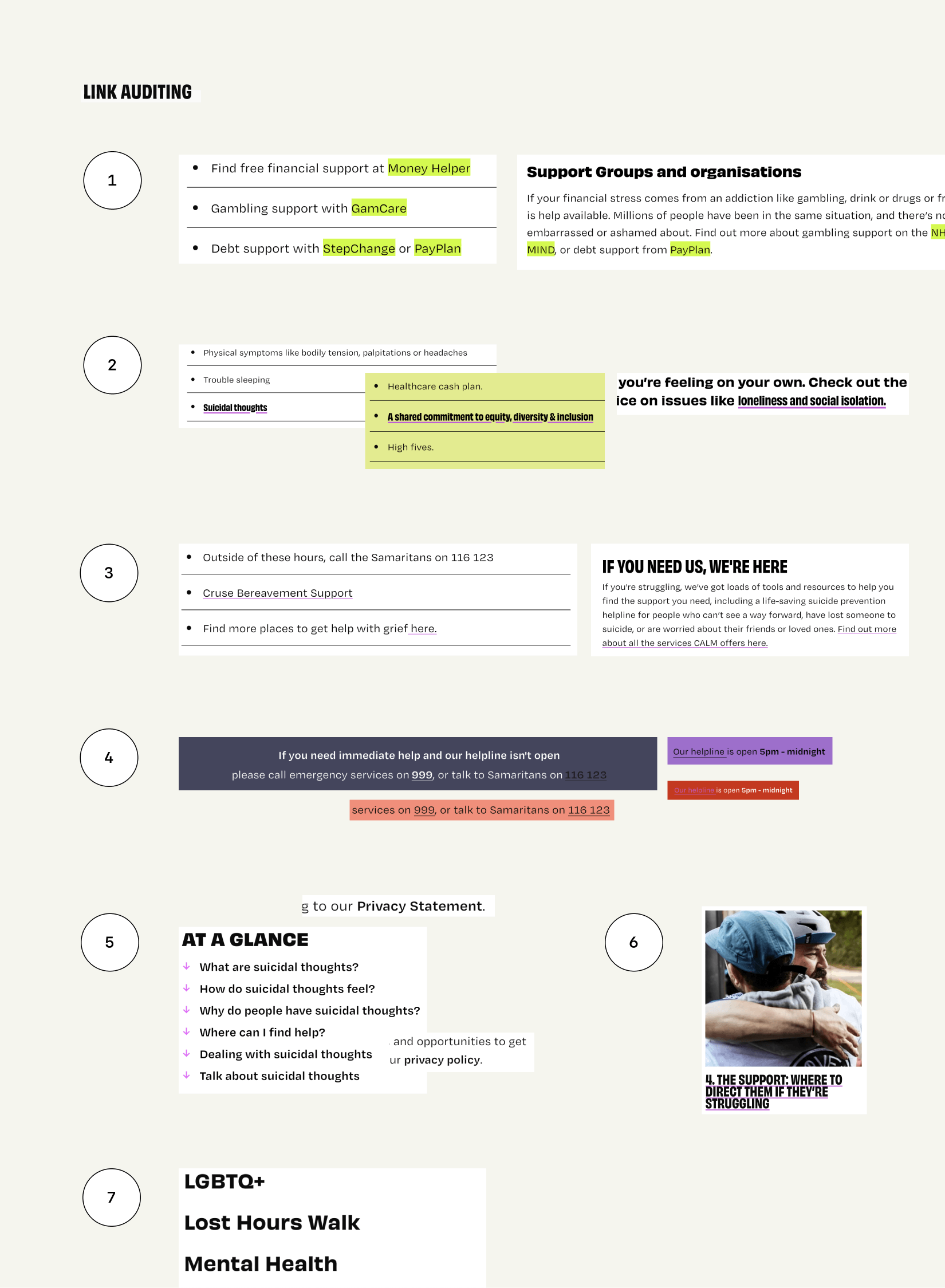
Conversation design is challenging (and really enjoyable!). It’s also much more complicated when the system has to respond intelligently. We started small therefore, without live interaction from the machine-side. To get things moving, I outlined five potential conversation starters, giving the rest of the flow a clear structure. CALM produced an initial draft, which I reviewed through the lenses of inclusiveness, flow, readability, and UX clarity. I then built a basic prototype to show how it would work, allowing the team to refine the copy further. Next, I translated the prototype into a detailed flow diagram, adding assurance messaging exits and completion screens that encouraged the next steps. After a couple of review cycles, we finalized the conversation, and the developers used the flow to code the rest of the system.
Designing the conversation interface
From there, we were able to apply a visual layer to show how the conversation could look and feel in context. I prototyped two options: one with a more refined design and a focused, immersive experience that concentrated the adult’s attention on the conversation; the other with a simpler, more straightforward UX that made it easier to get started, particularly suitable for less digitally confident users. CALM reasonably opted for the second option.
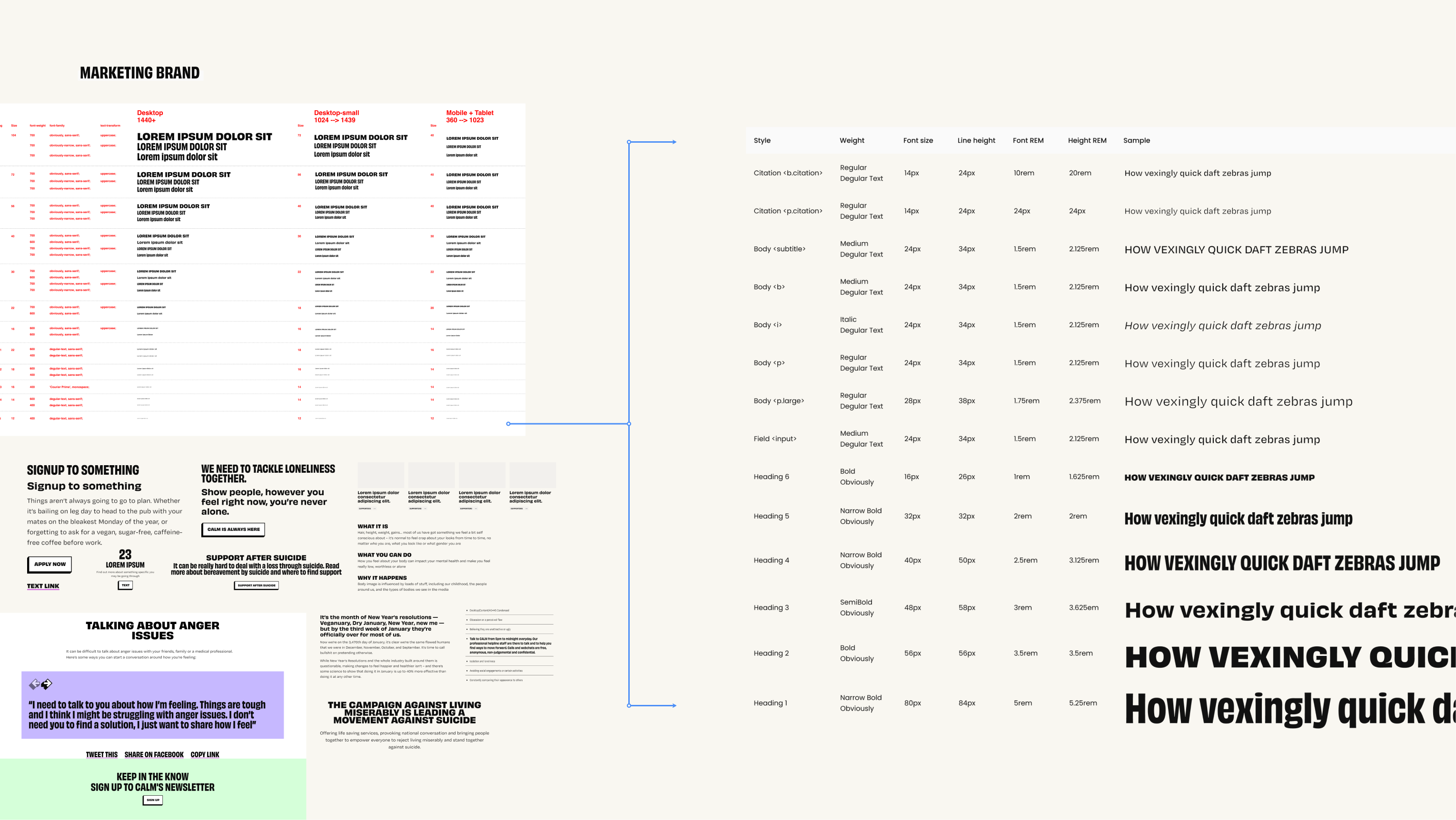
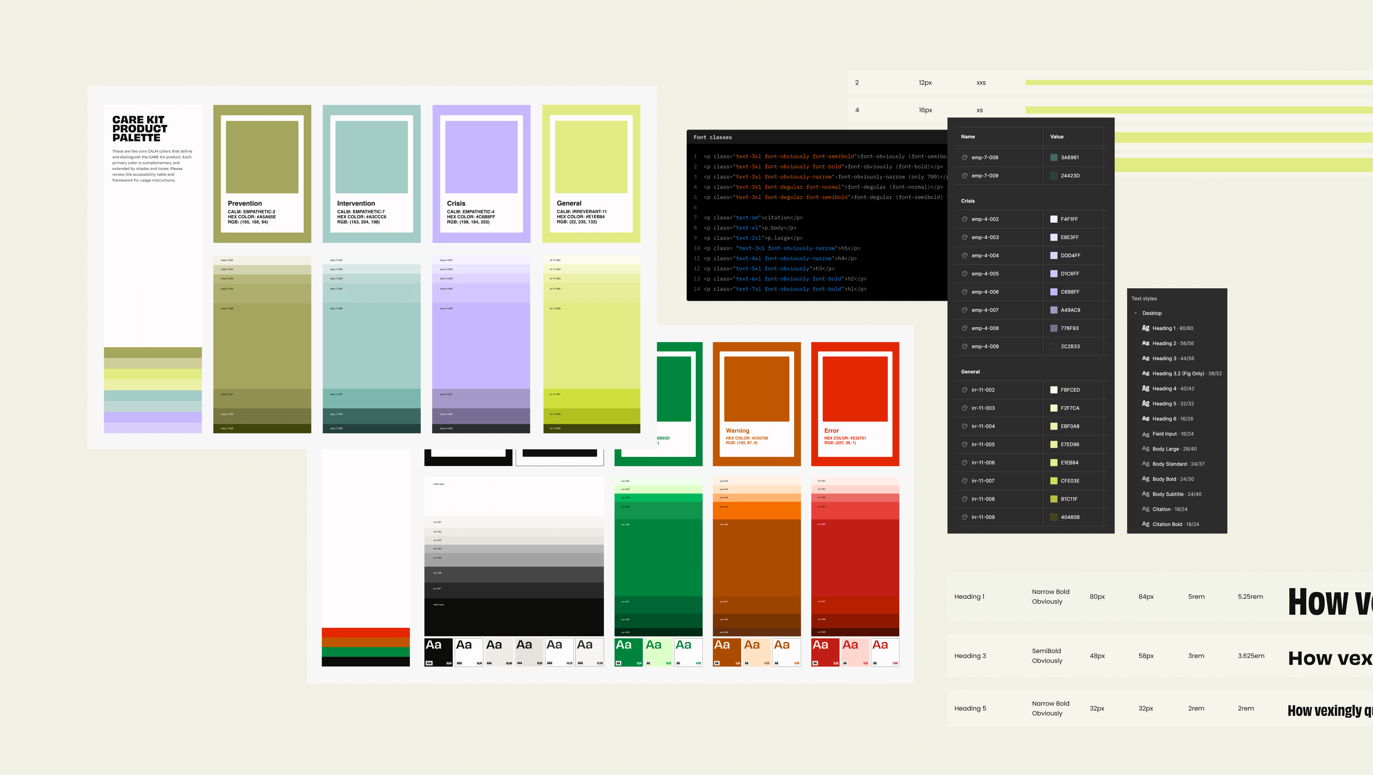
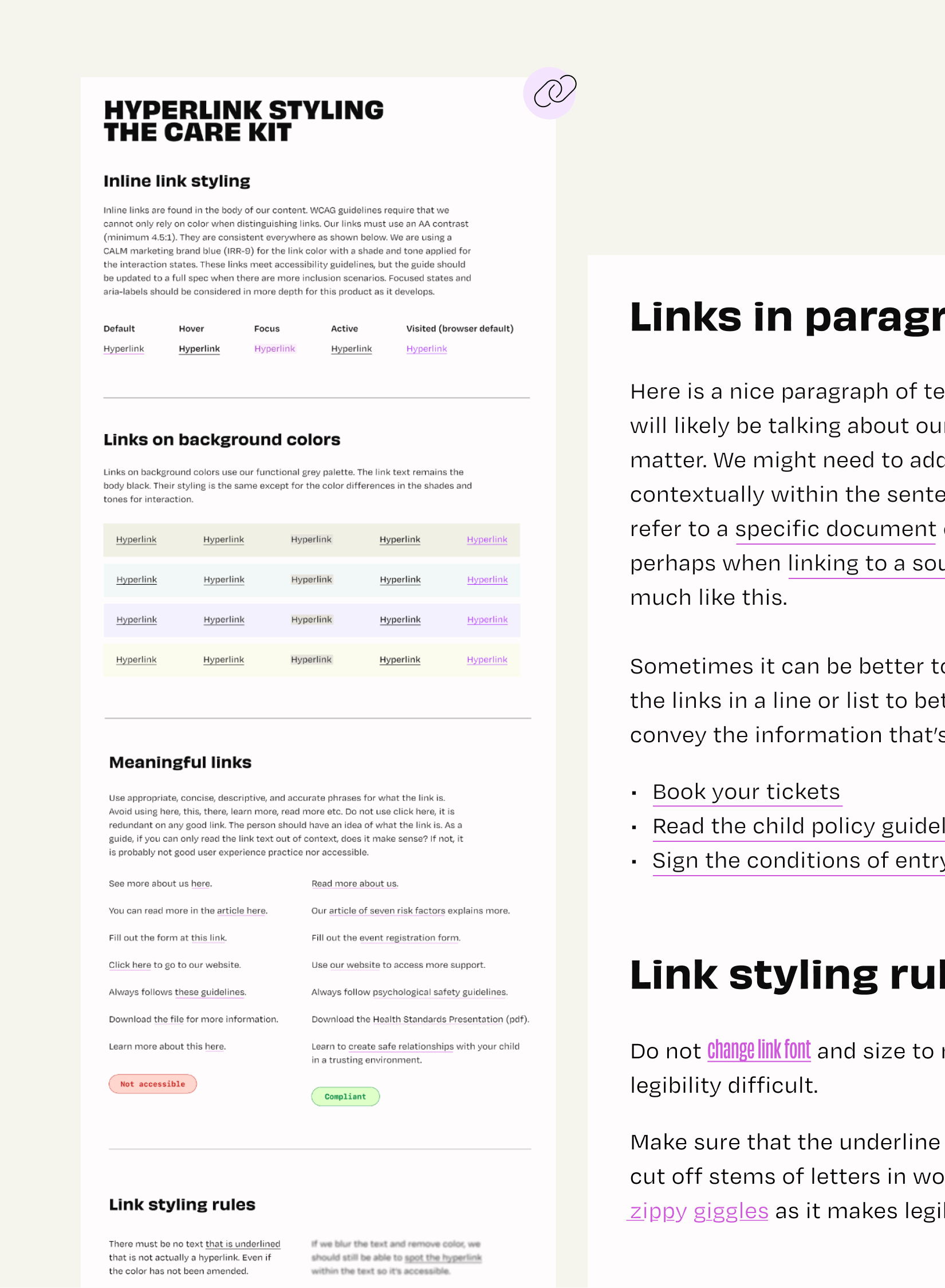
For new products built from a marketing brand, we often need to adapt and expand the visual system. For CALM, I audited their website and UI library, identifying where we needed to reduce core colors and add tones and shades for product use. As the content was likely to reach people in distress, and the interface was compact, I created a calm, clutter-free design aligned with CALM’s brand but distinct enough to support a product-led experience.
Create a product brand from a marketing brand
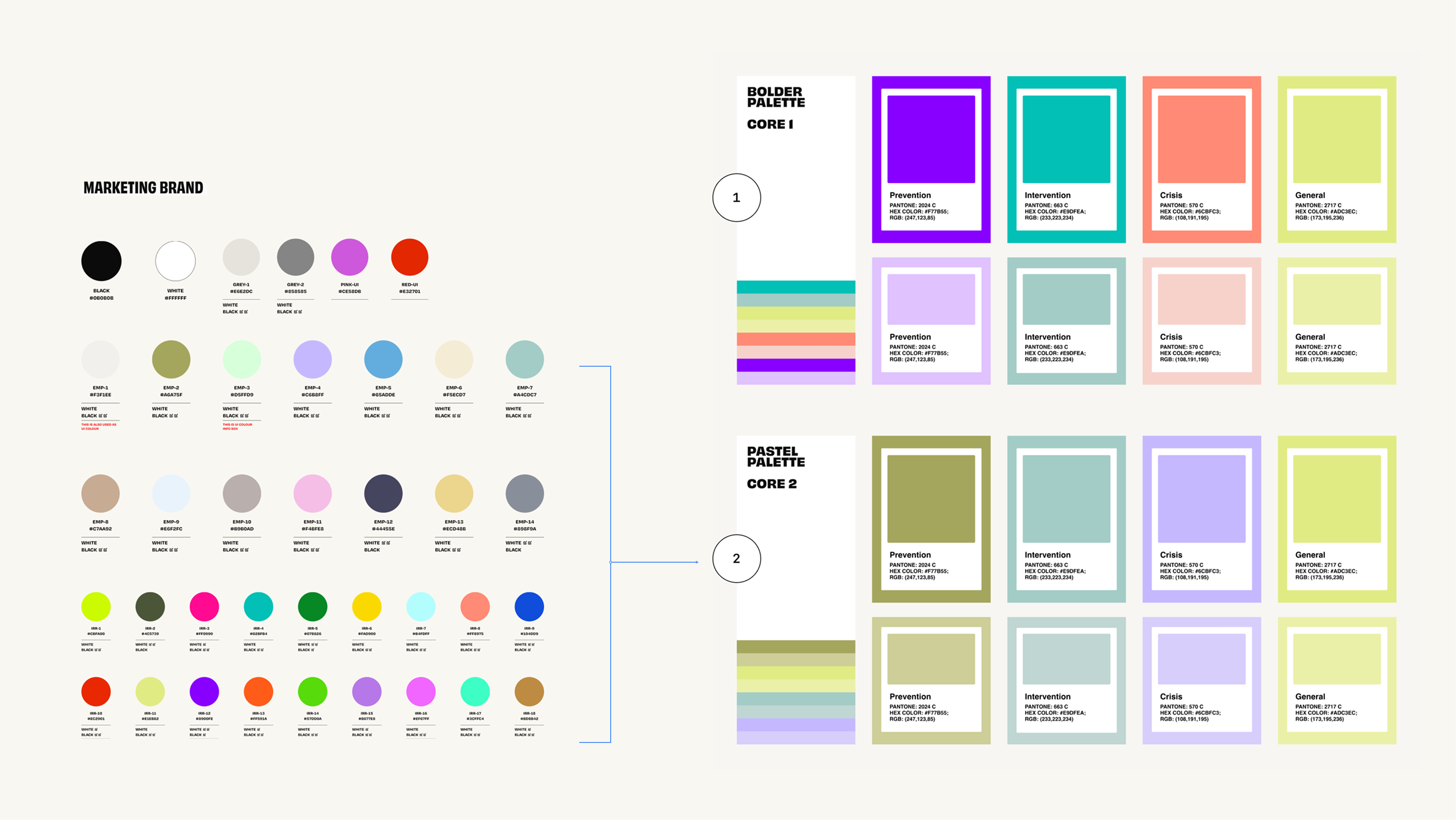
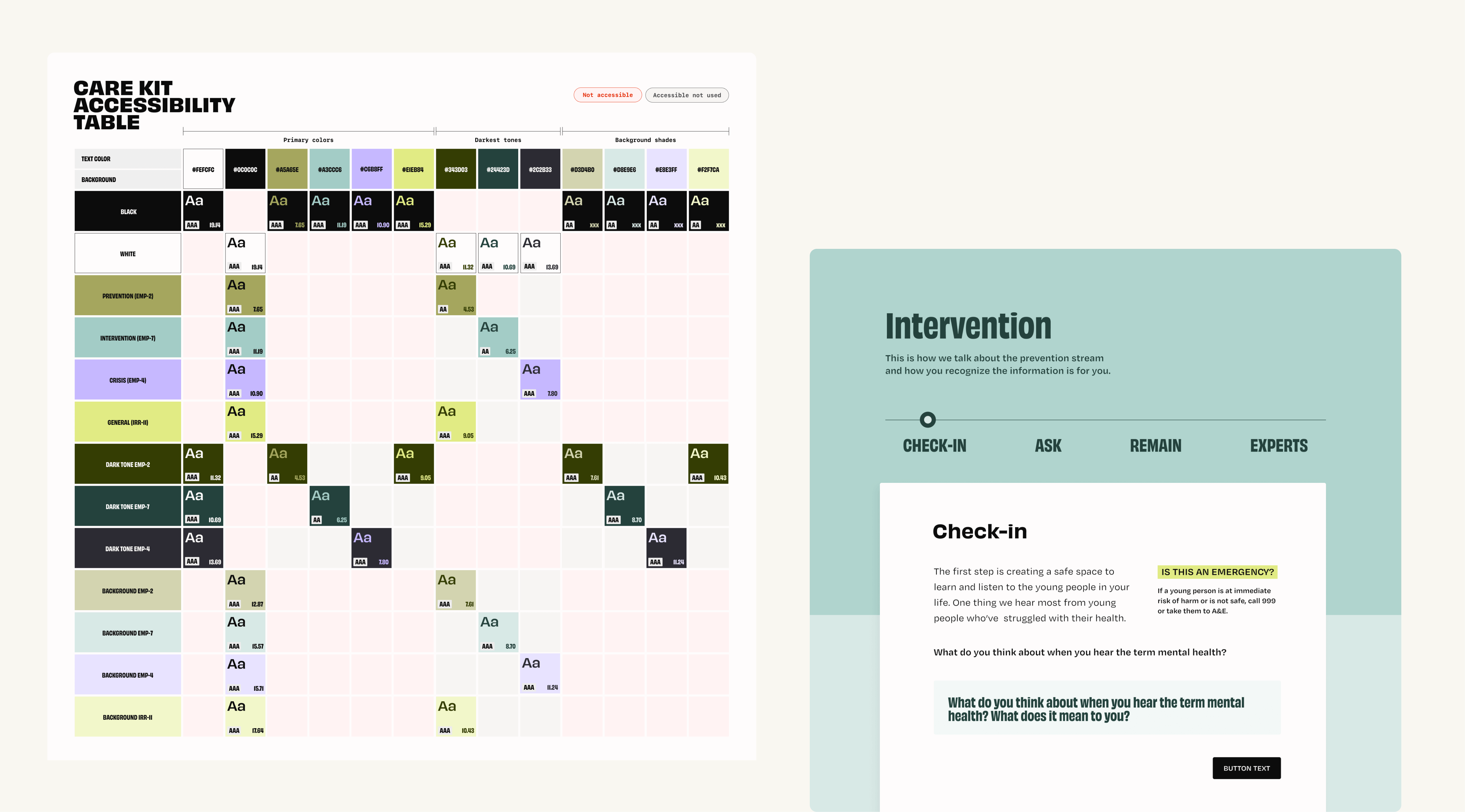
Developing an accessible design foundation
To allow the product to consistently improve on accessibility rather than needing to retrofit it (costing more over time), we designed and developed with accessibility from the start. With the intention that this product would grow, we set it up so it could easily scale.
Kit learning design
All our work was brought together through the online kit which followed CALM's three intervention stages. To incorporate active learning alongside passive methods, I collaborated with our engineers to develop three widgets, enabling CALM to select an appropriate learning component for each sub-module.
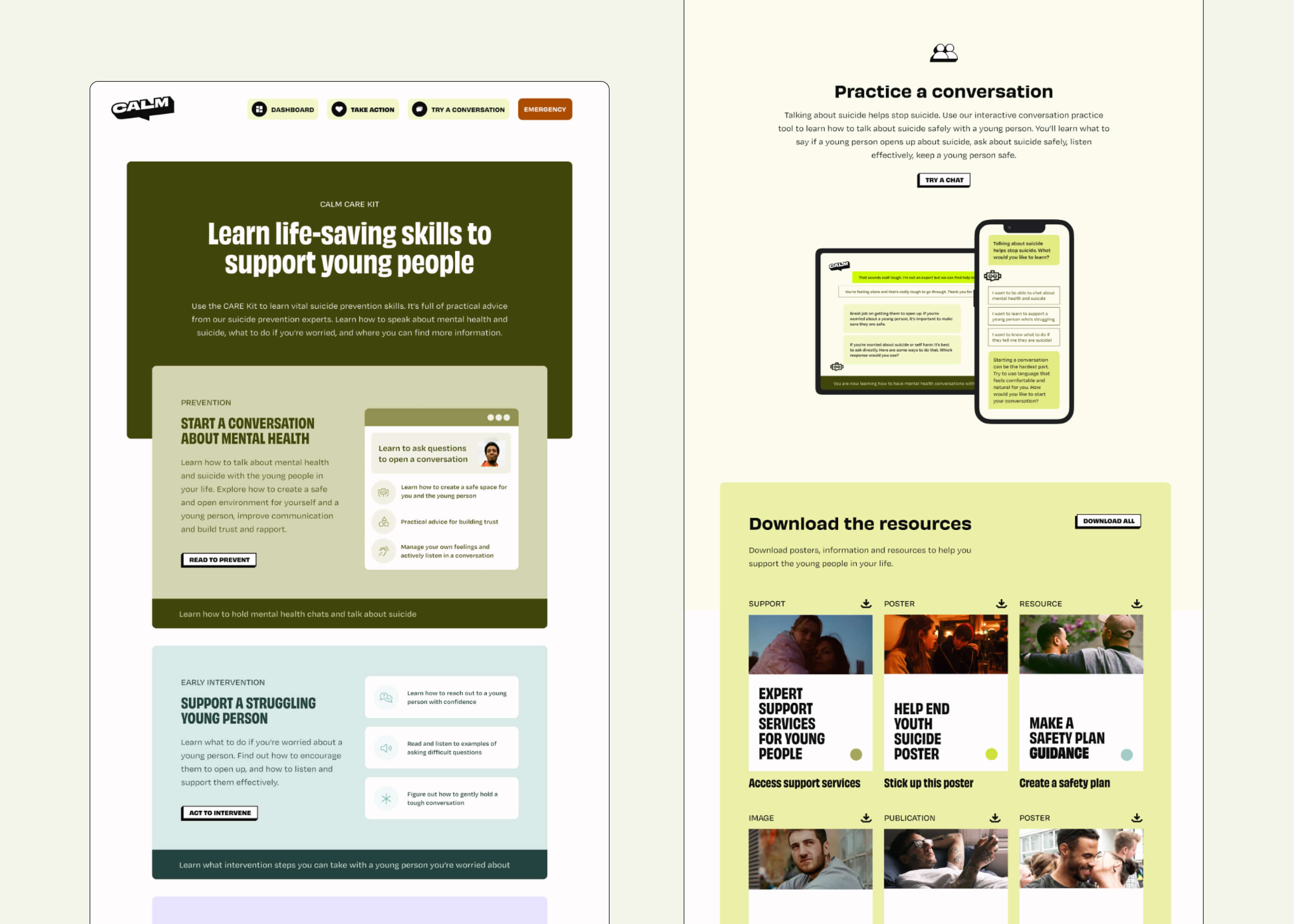
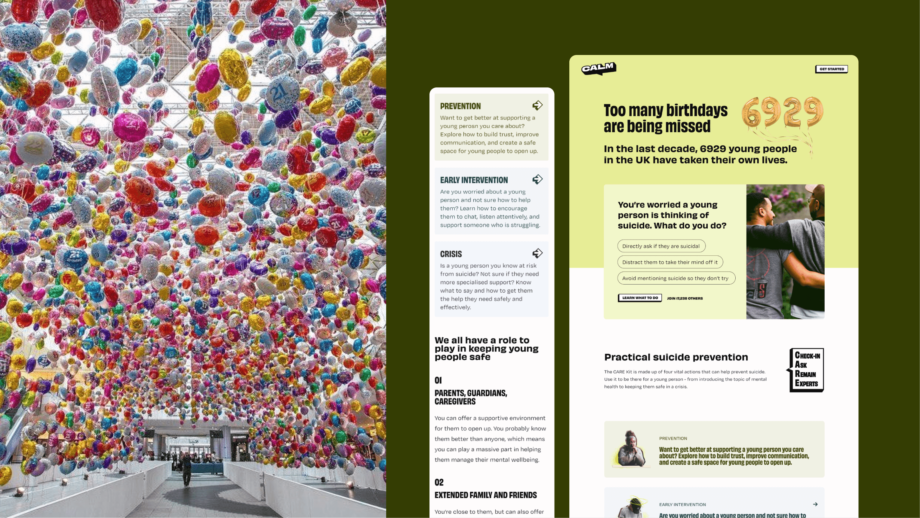
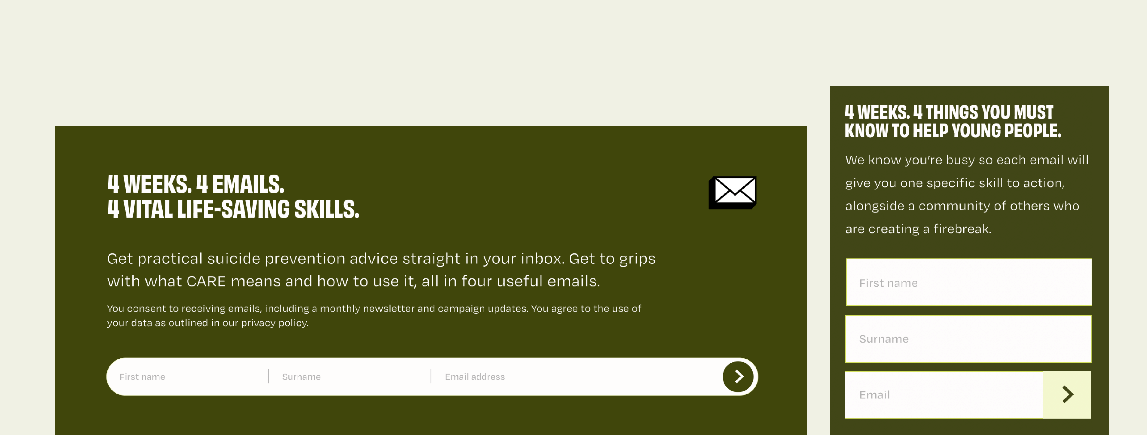
Finishing it off with an engaging landing page
The final step was enhancing the previously created landing page to effectively funnel users into the kit from various offline media campaigns. I wanted to introduce an interactive element at the start - something that would quickly prompt users to position themselves within a context we aimed to educate on. For digital campaigns, we recommended driving traffic to either the main landing page, the dashboard, or a custom landing page tailored to the specific partnership. That wrapped up our time and a launch that saw tens of thousands of adults interacting with the site in the first week.